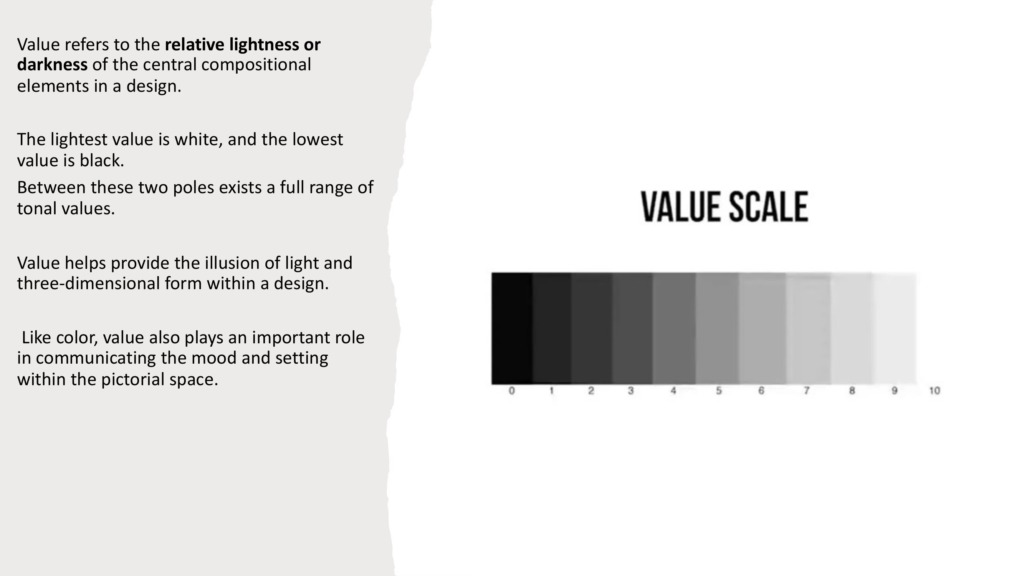
Let’s peel back the layers of great design. While color often gets all the attention, there’s a quiet powerhouse doing the heavy lifting behind the scenes: Value. It’s the simple spectrum between light and dark, and understanding it is about to completely change how you look at your canvas. 🌌
-
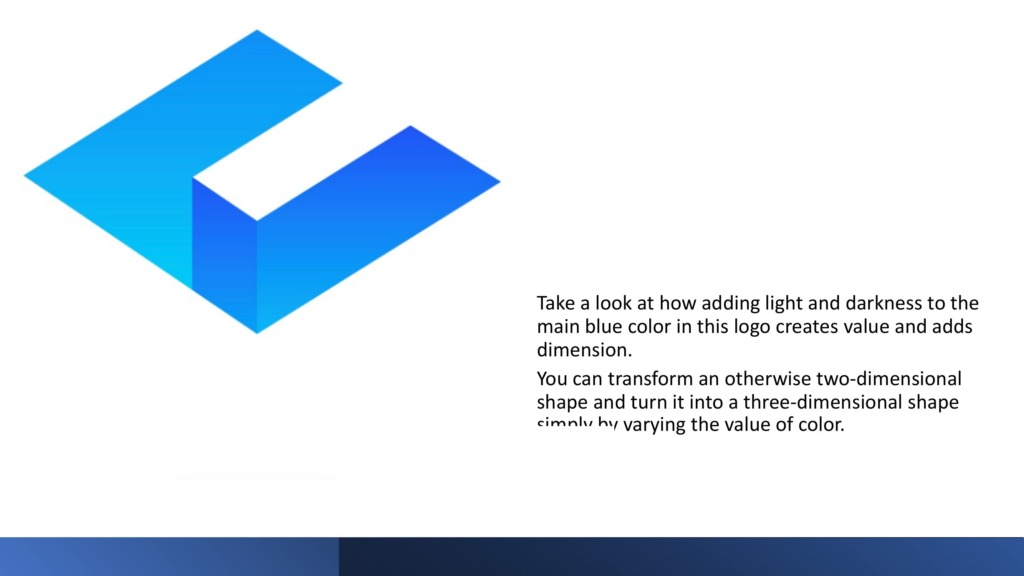
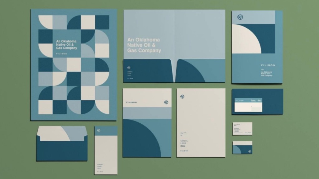
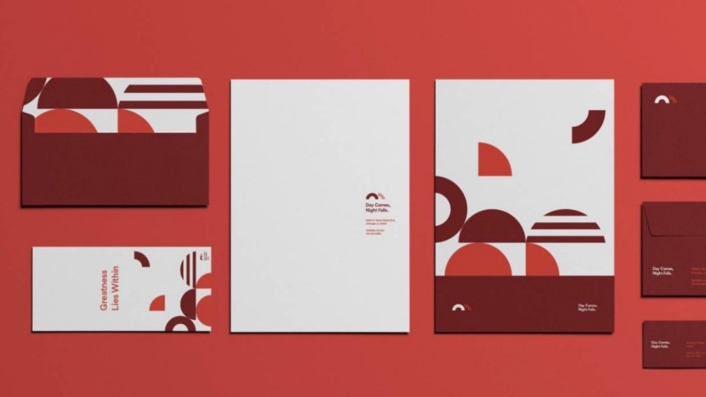
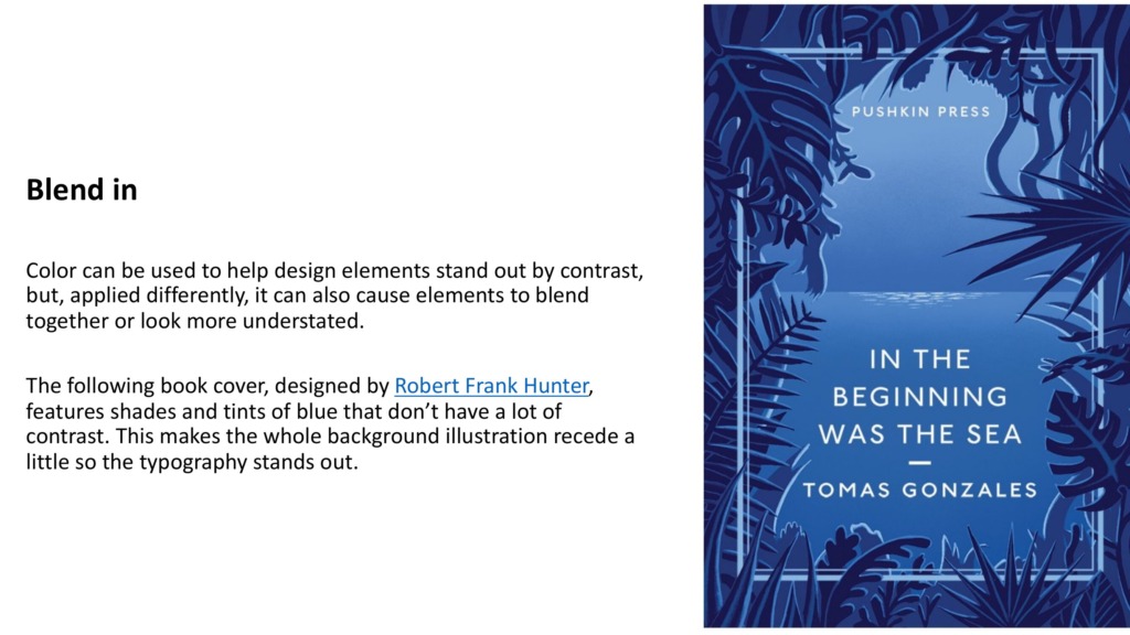
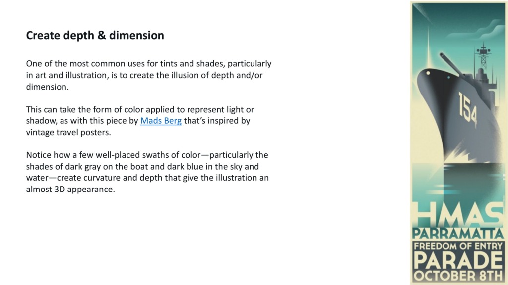
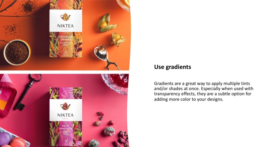
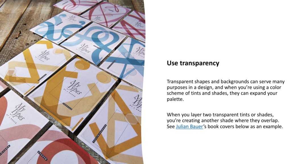
💡 Bringing Flat Art to Life: Value is how we trick the eye into seeing 3D depth on a flat 2D screen, adding realistic light and shadow to make shapes pop.
-
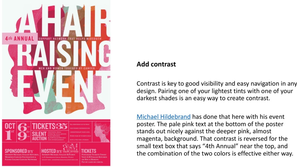
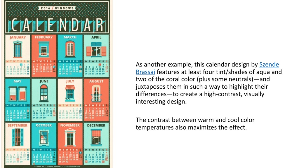
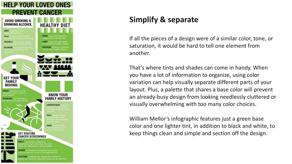
👁️ Directing the Viewer’s Journey: By placing high-contrast light and dark elements together, you instantly tell the eye exactly where to look first.
-
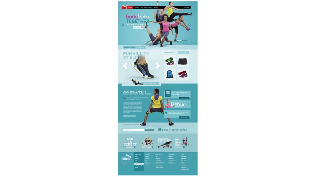
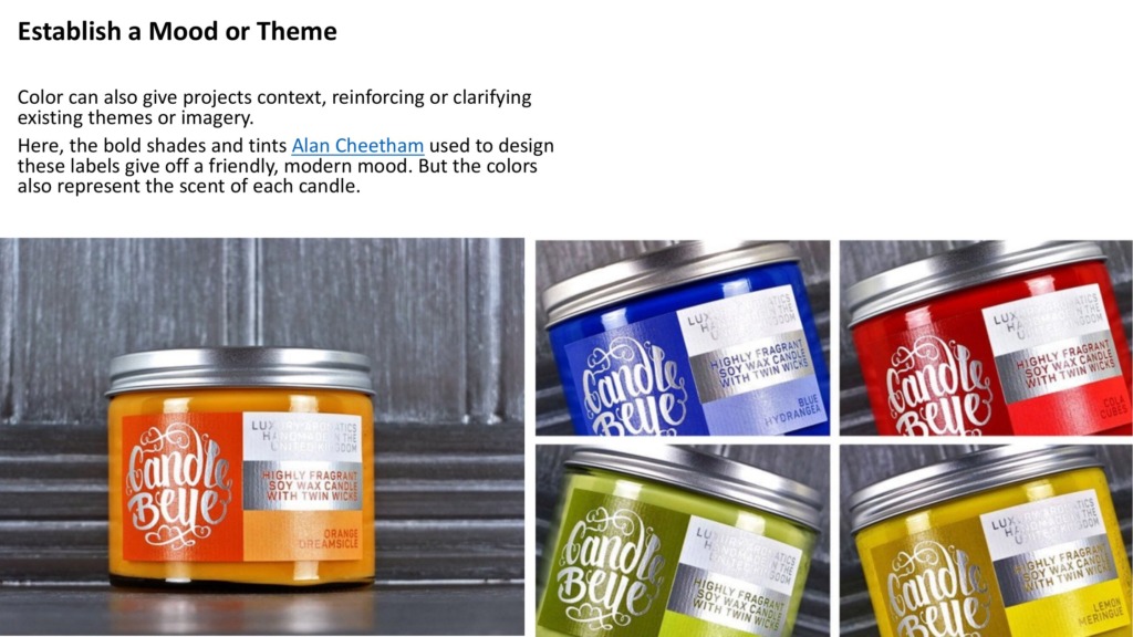
🎨 Setting the Ultimate Vibe: From moody, dark-themed interfaces to bright, energetic layouts, tonal values establish the emotional heartbeat of your project.
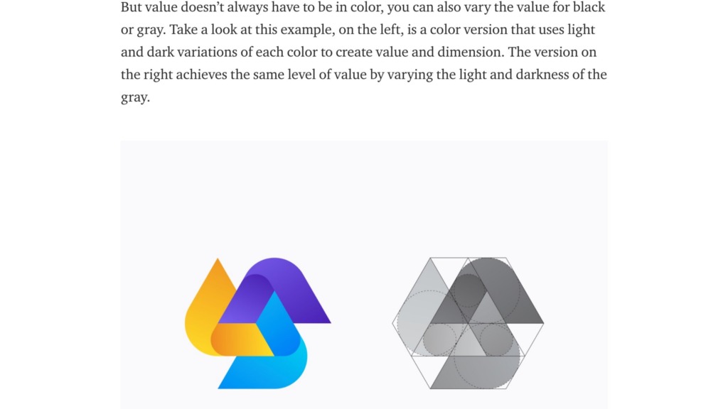

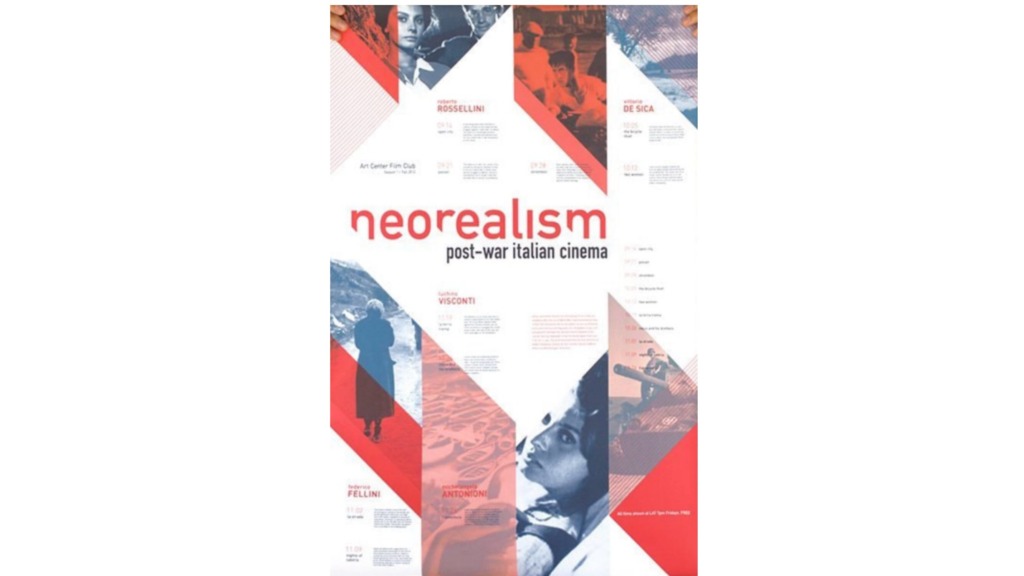
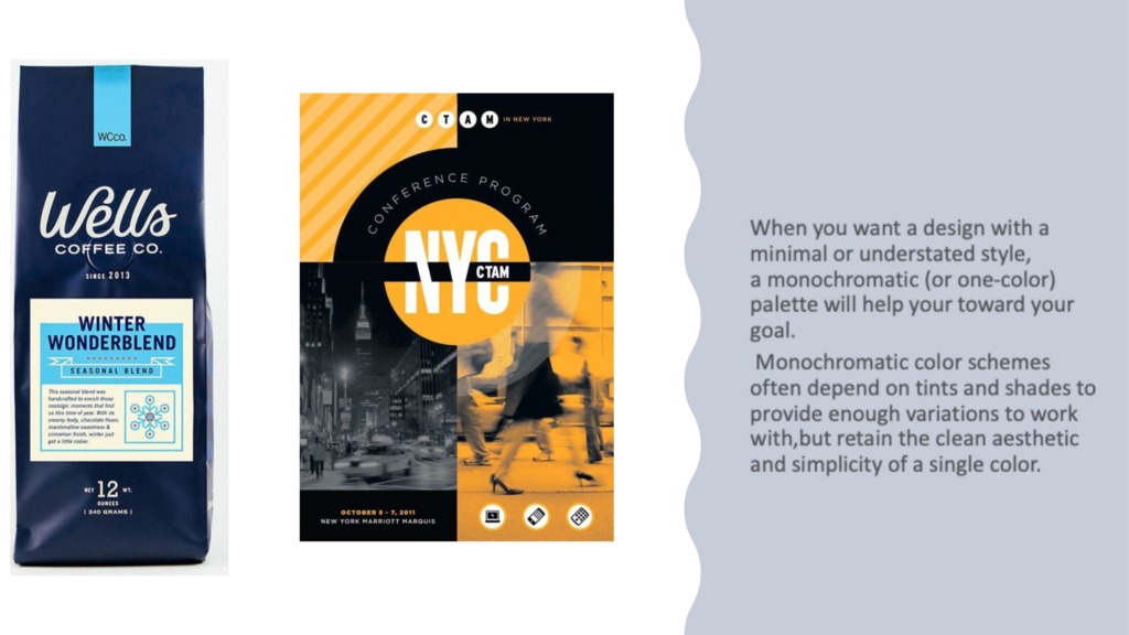
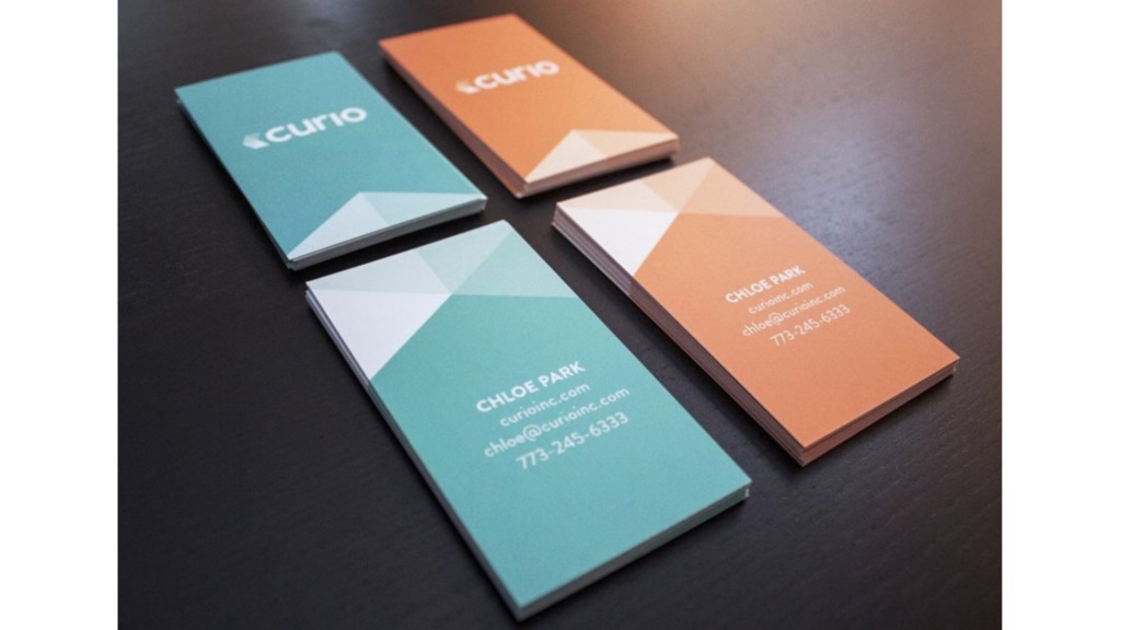

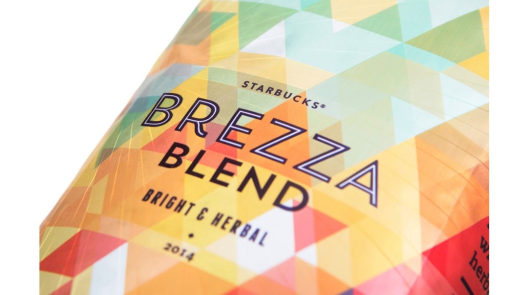

Next time you start a project, try stripping away the color first.
Master the light, and the rest of your layout will naturally fall into place. 🚀
Prepared by Ali Bakhit
#alibakhitdesign #DesignInsights #GraphicDesign #ValueInDesign #VisualHierarchy #ColorTheory #DesignEducation