Introduction
Contrast is one of the most dynamic and essential principles of design, injecting energy, readability, and structure into a visual piece. Without contrast, designs inherently become monotonous and flat. In this Design Insight, we analyze prominent examples across visual arts, architecture, and typography to explore the practical application of the 4 primary types of contrast and how bold visual distinctions effectively guide the viewer’s eye.
Case Examples & The 4 Core Types of Contrast
-
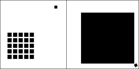
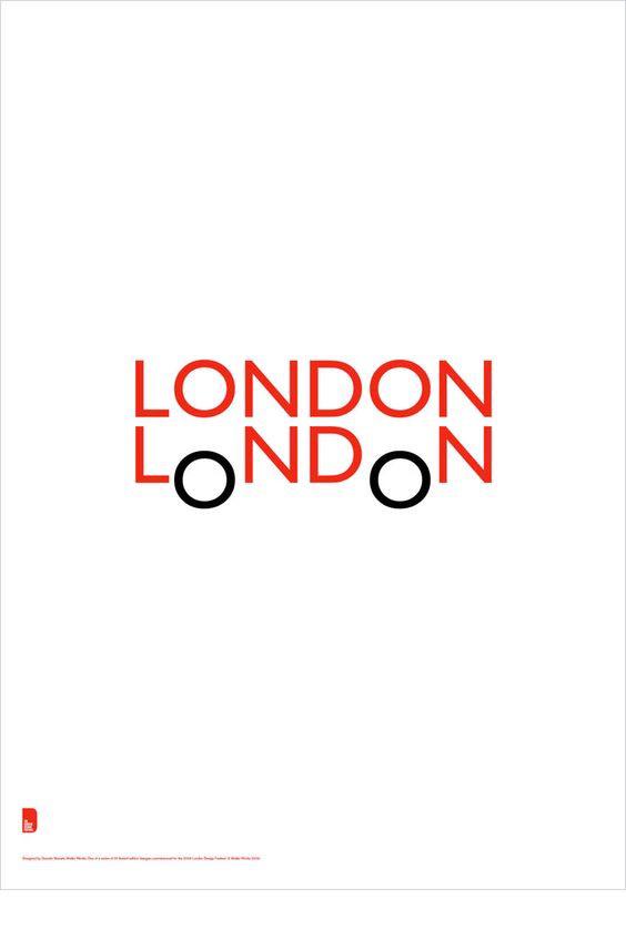
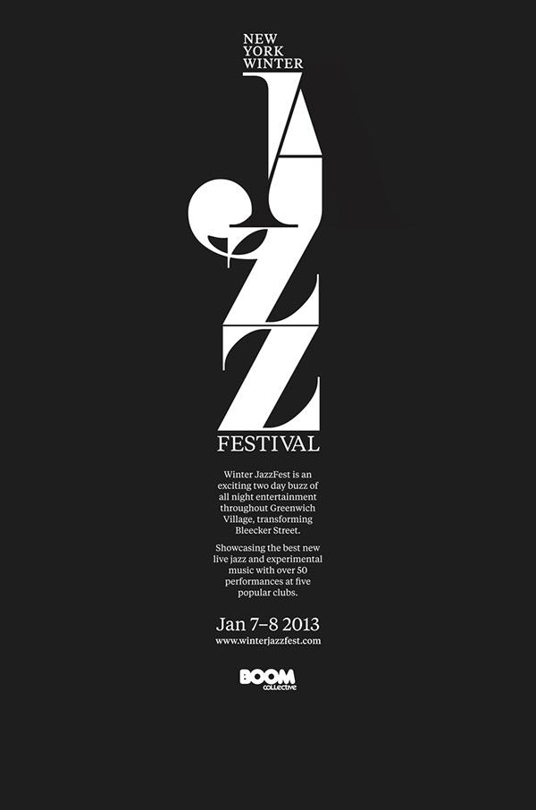
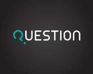
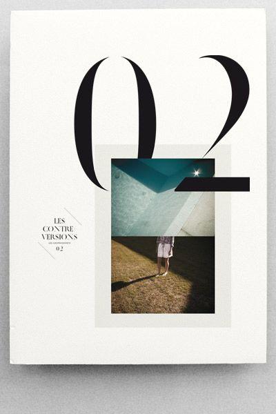
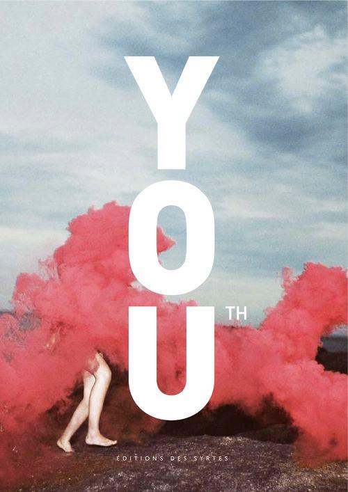
1. Contrast in Size & Scale: One of the most direct ways to establish a visual hierarchy is through dimensional scale. The human eye naturally gravitates toward the largest element first. In poster design and typography, scaling up a single letter or keyword instantly creates a powerful focal point, subconsciously signaling importance to the viewer.
-
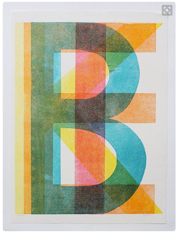
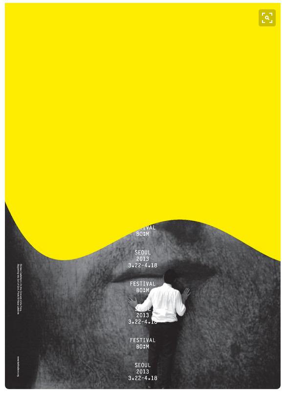
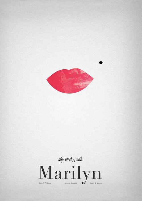
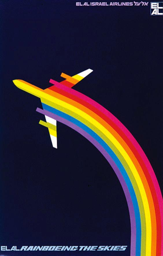
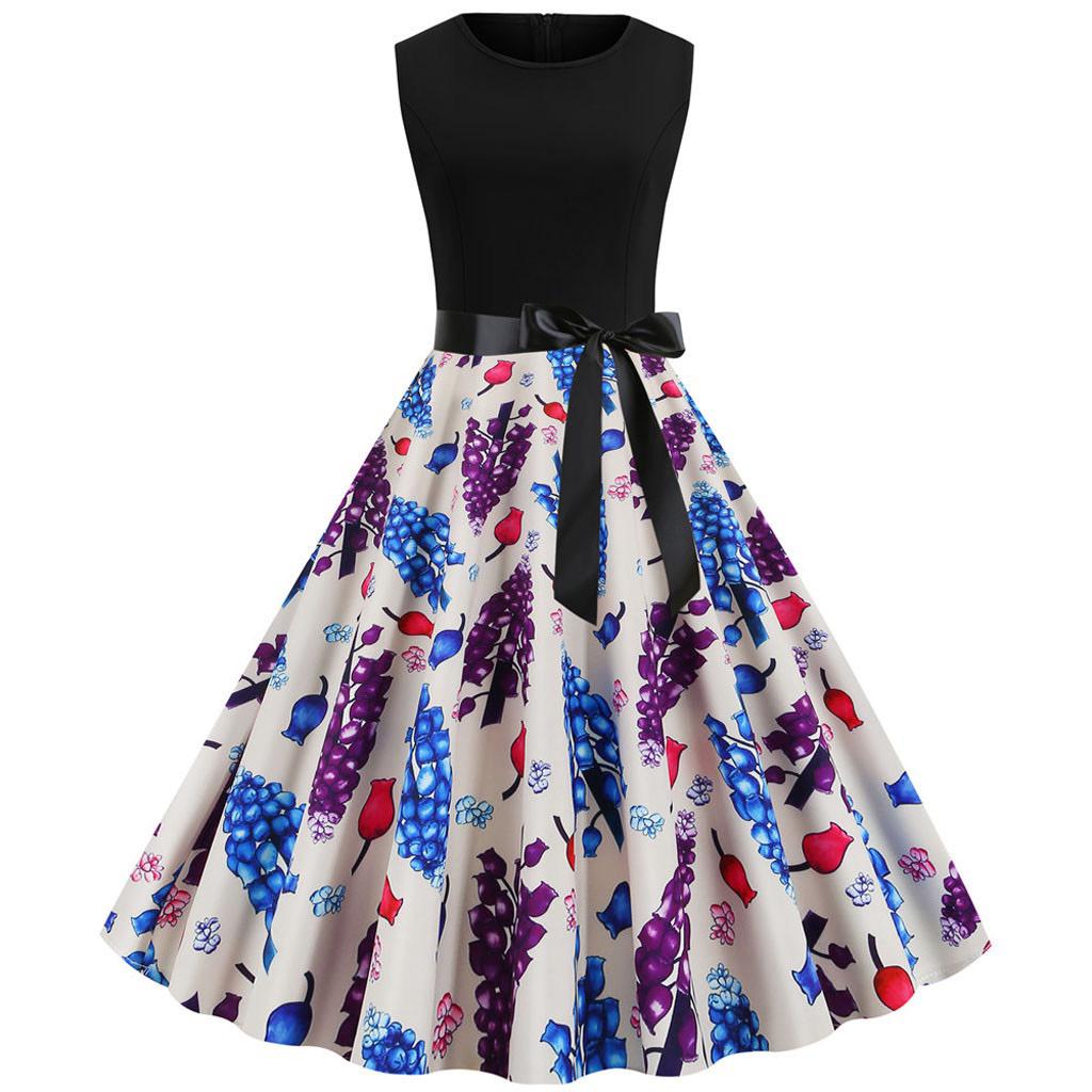
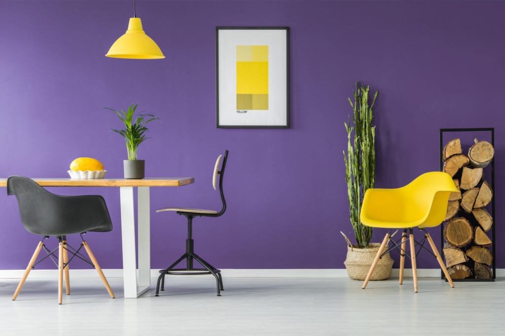
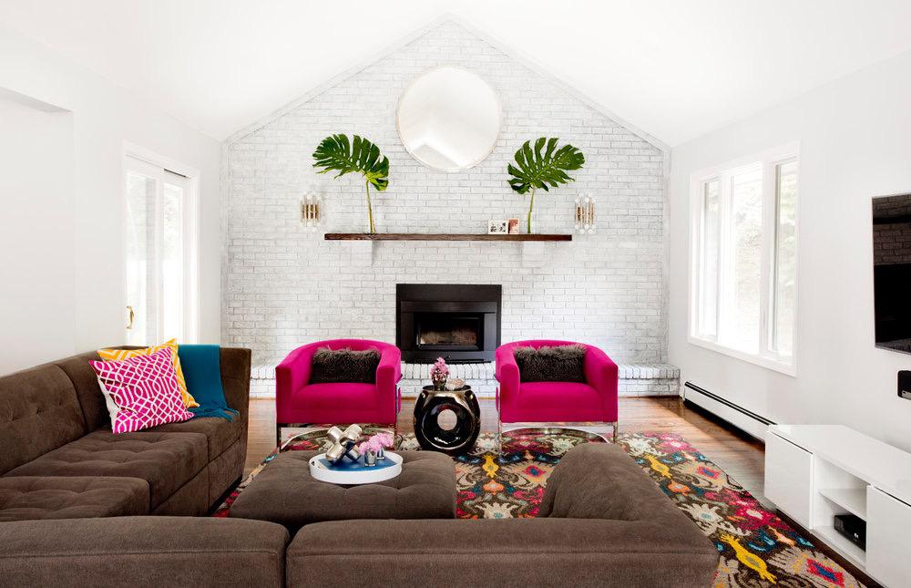
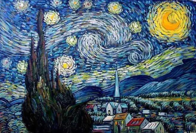
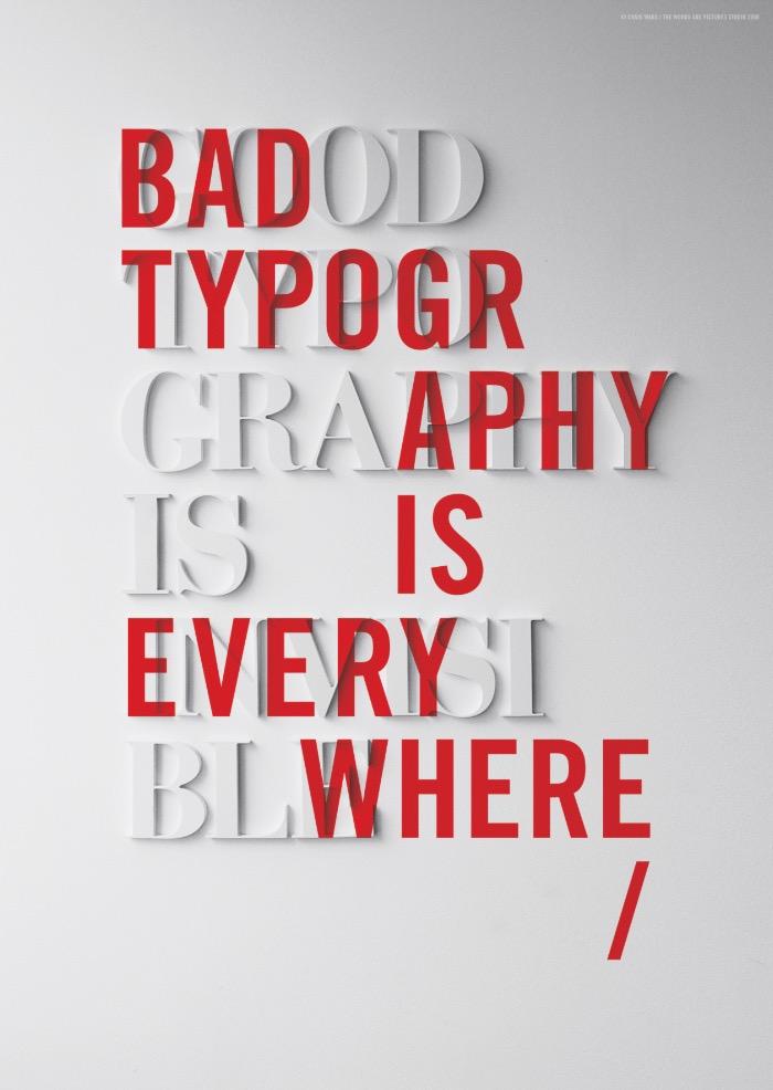
2. Contrast in Color & Hue: Color is a master tool for separation and emotional impact. This can manifest as opposing complementary colors on the wheel (like yellow against purple in interior spaces) or as a strategic “pop of color” within a monochrome palette (like a sharp red element against a gray background) to deliver an instant visual jolt.
-
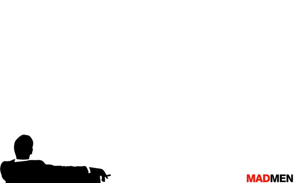
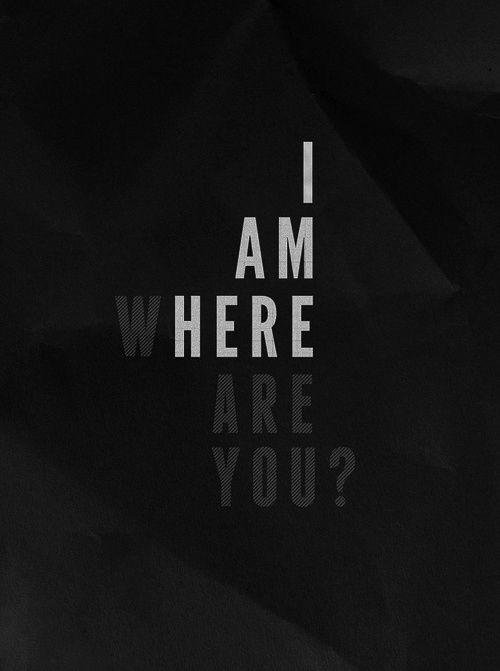
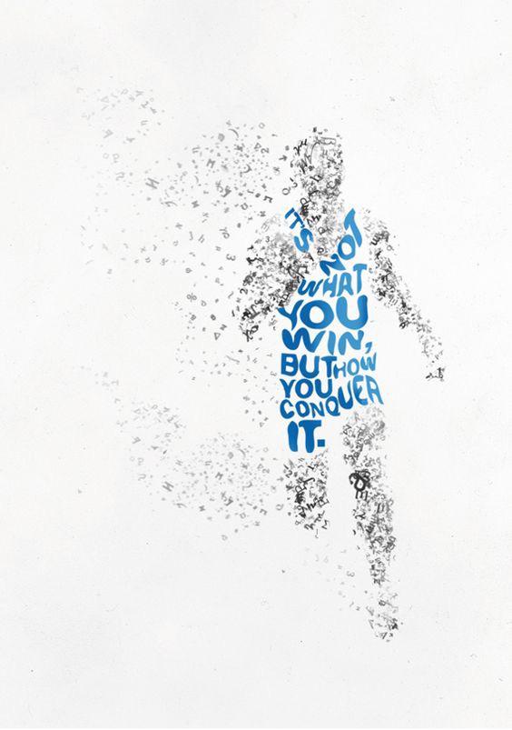
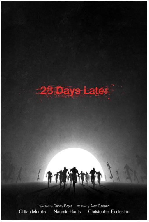
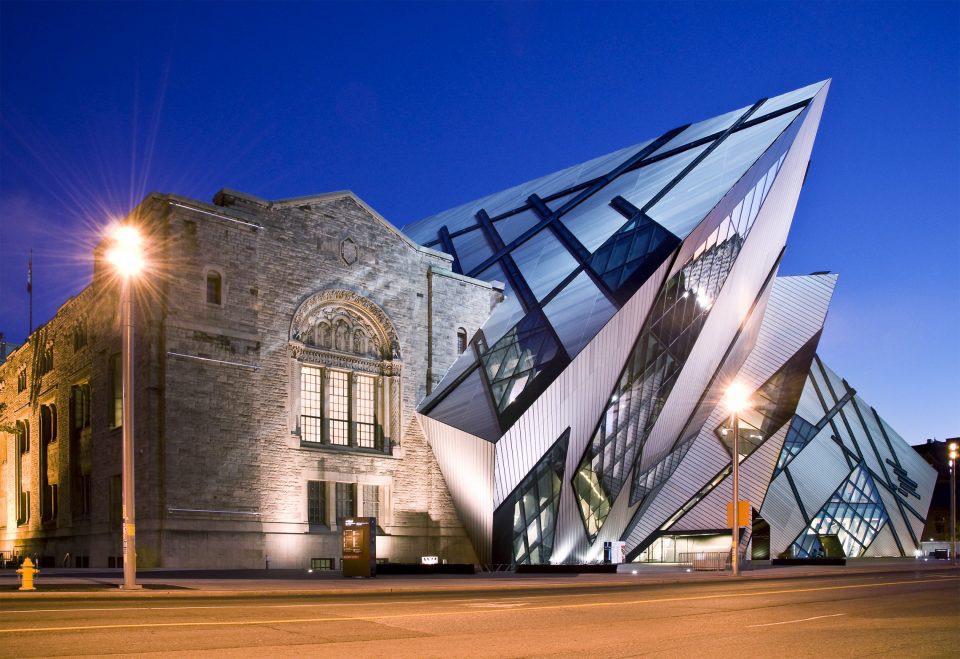
3. Contrast in Value & Tone: Value refers to the relative lightness or darkness of an element, independent of hue. Its most extreme form is the absolute juxtaposition of black and white. Whether it’s forming shapes using positive and negative space in fragmented typography, or capturing dramatic light steps in landscape photography and modern glass-and-stone architecture at night, tonal value is what defines raw form.
-
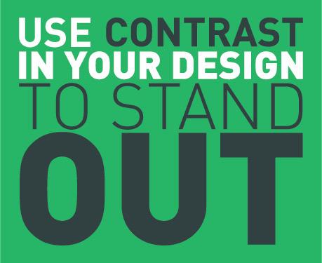
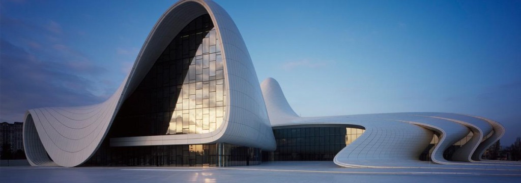
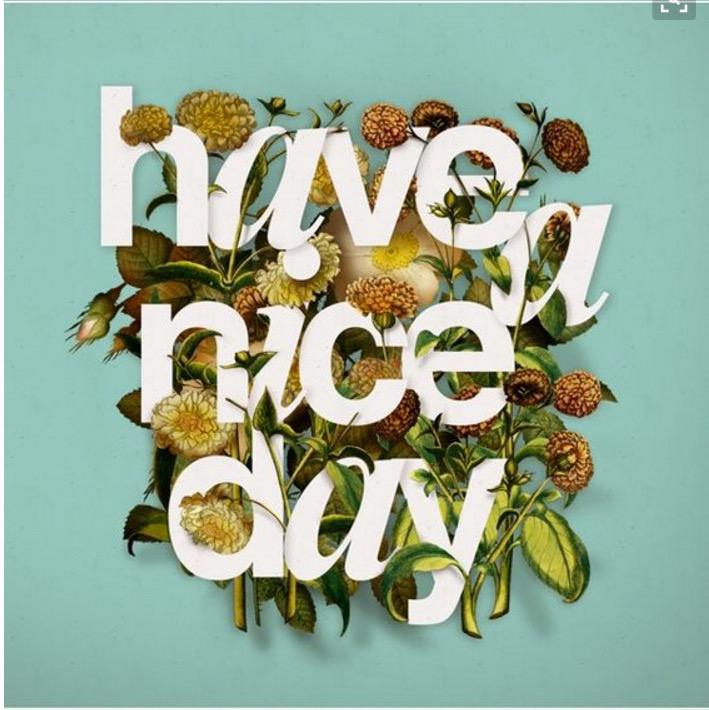
4. Contrast in Shape, Texture & Style: Juxtaposing entirely different structural patterns adds immense dynamics to a composition. This includes placing fluid, organic curves right next to sharp geometric angles in contemporary architecture, or pairing elegant serif typefaces with heavy, modern sans-serifs in layout design







Analytical Takeaway
For contrast to be effective, the distinction must be bold and intentional. Subtle or poorly executed contrast often looks like an oversight rather than a deliberate choice. Use contrast in your design to stand out.
Created by Ali Bakhit