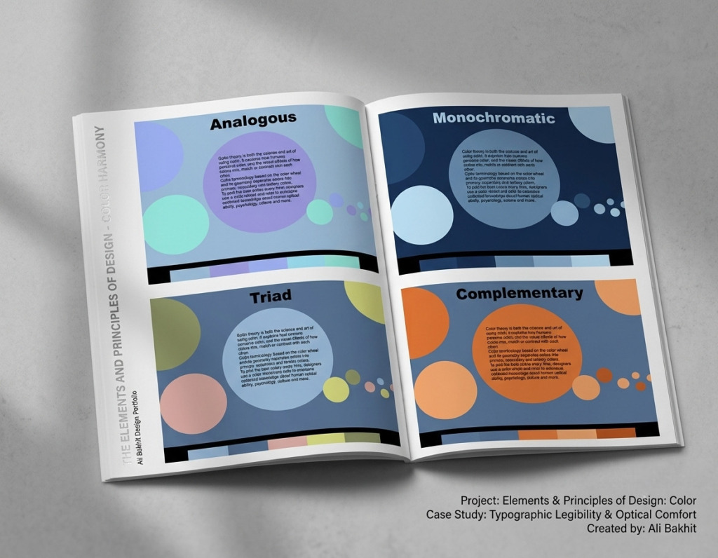
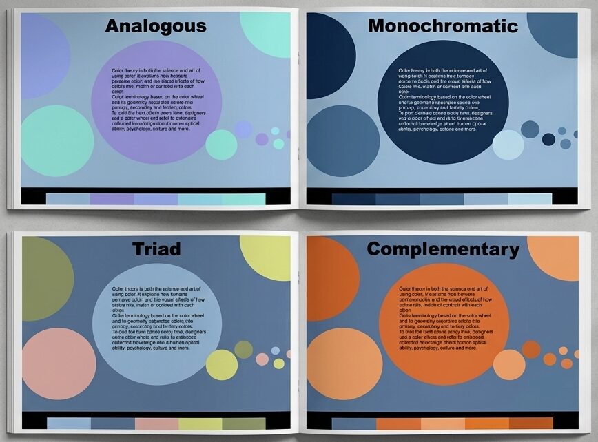
Every high-end design system requires an unshakeable foundation in color theory to ensure flawless communication across print and digital platforms. This case study demonstrates the technical implementation of mathematical color harmonies to balance high-impact aesthetic styling with strict typographic contrast standards.
🧩 The Challenge & Problem Statement
-
The Problem: Many visual layouts collapse because high-energy background colors cause severe optical vibration, rendering text illegible and straining the viewer’s eyes.
-
The Goal: To systematically engineer four distinct corporate color palettes using a fixed base hue, proving that complex color schemes can maintain perfect, accessible contrast with black typography.
🎛️ Tool Stack & Technical Production
-
🎨 Adobe Photoshop: Utilized for advanced pixel layer isolation, background geometry scaling, and exporting optimized layout assets.
-
⚙️ Adobe Color Wheel: Implemented to mathematically map exact degree separations for complex geometric color harmonies.
📊 Deep-Dive Production Analysis
-
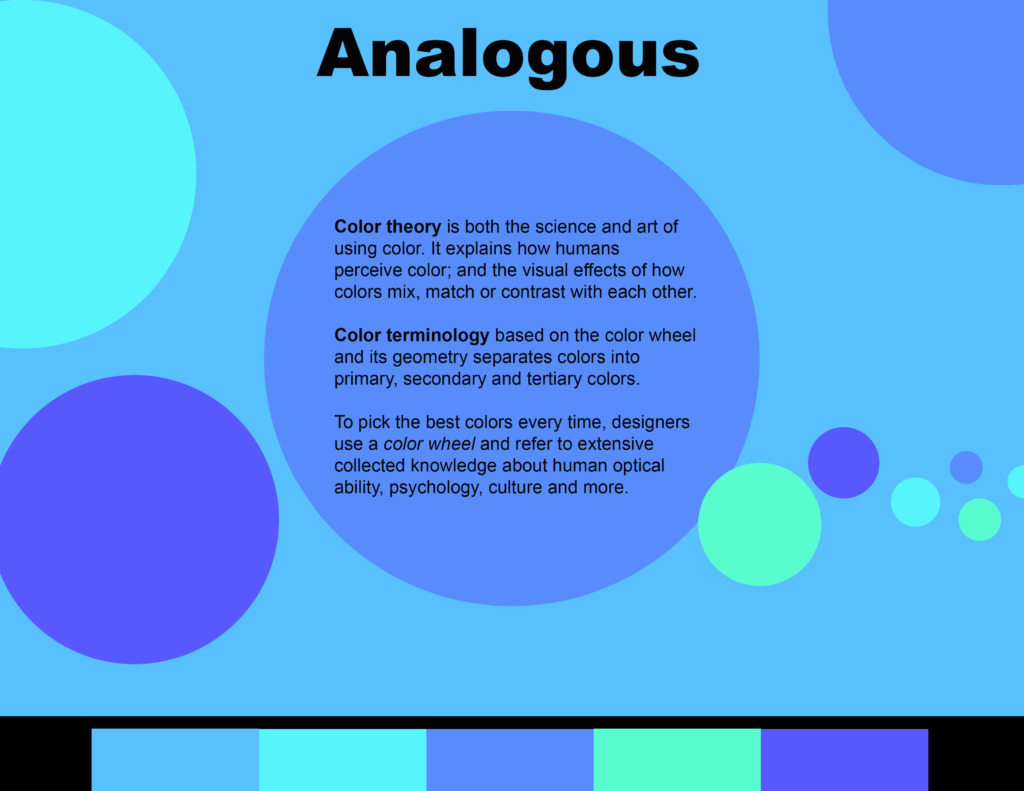
🧱 Analogous Framework: Merging adjacent color wheel coordinates to build a highly soothing, low-contrast layout structure that ensures fluid visual pacing.
-
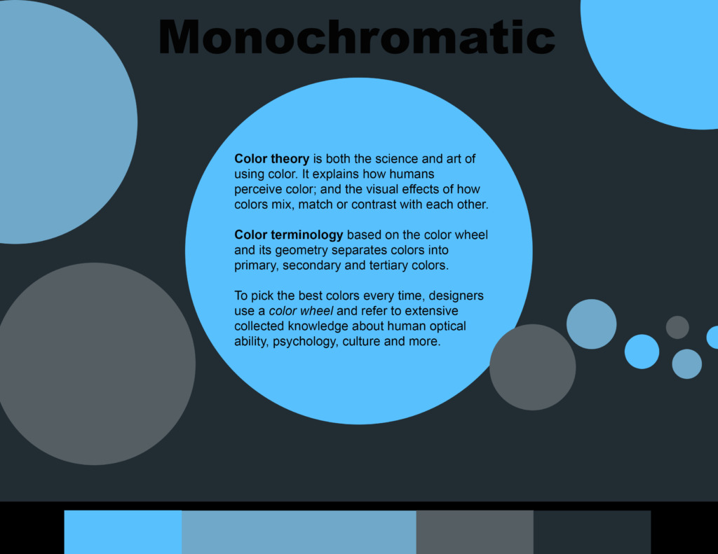
🌗 Monochromatic Value Scaling: Utilizing single-hue luminance shifting to provide deep structural layout dimensions without introducing distracting tones.
-
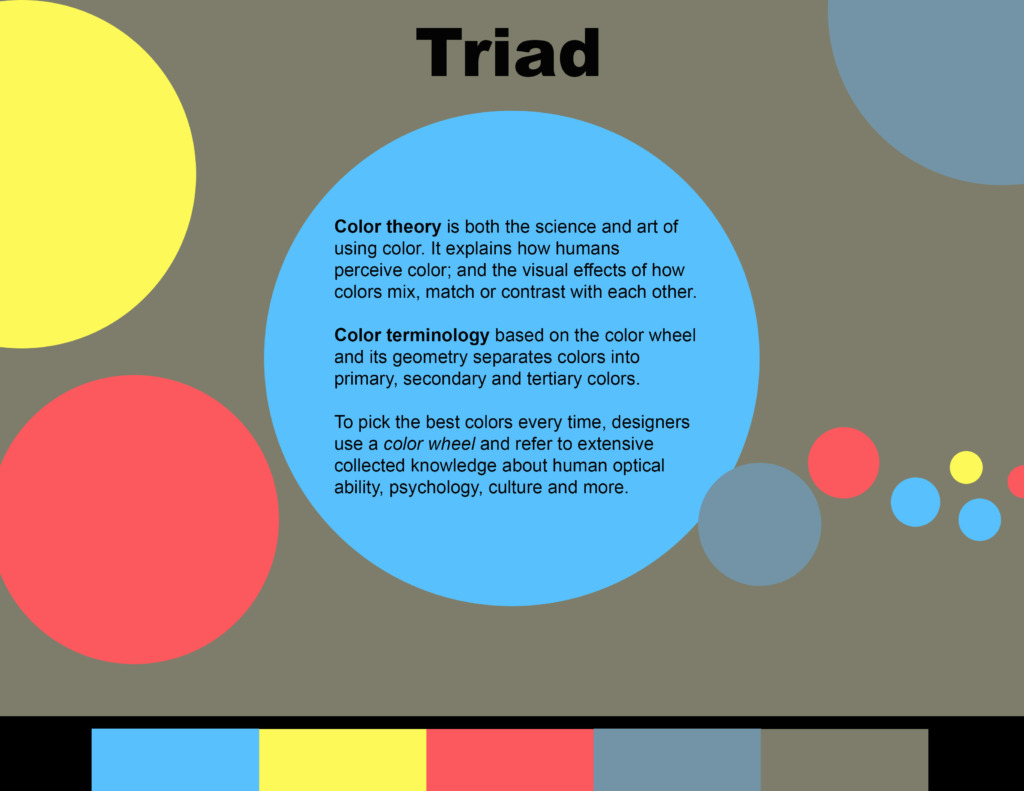
📐 Triad Geometric Balance: Coordinating three perfectly equidistant wheel positions to inject dynamic energy into a corporate spread while isolating content fields.
-
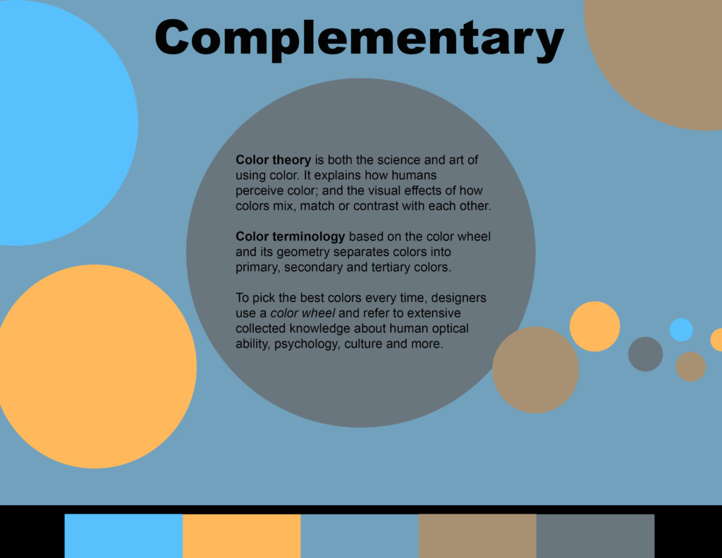
⚡ Complementary High-Contrast System: Pairing absolute polar opposites on the wheel, carefully balanced to prevent edge bleeding and visual vibration behind corporate text blocks.
💼 Created by: Ali Bakhit
#alibakhitdesign #GraphicDesign #CaseStudy #UIUXDesign #DesignSystem #AdobePhotoshop #BrandGuidelines #Typography #ColorTheory #VisualArts