Introduction
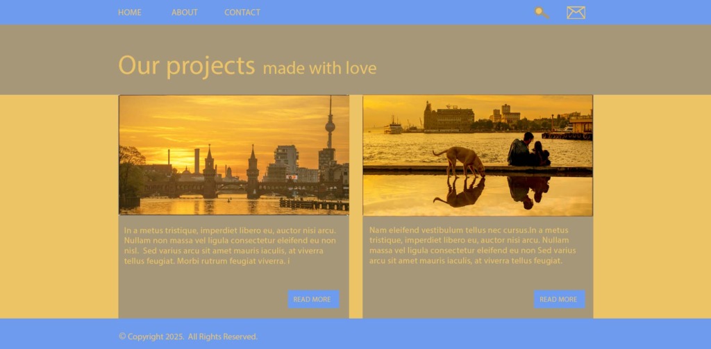
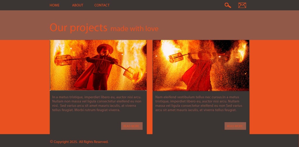
Welcome to the comprehensive design breakdown of this interface color architecture project. This project serves as a rigorous exploration of how dynamic color harmonies directly influence the user experience (UX) and visual hierarchy of a modern digital interface. Applied directly to a professional portfolio layout, this showcase demonstrates the strategic power of color discipline, accessibility standards, and advanced digital asset manipulation.
Core Project Objectives & Constraints
-
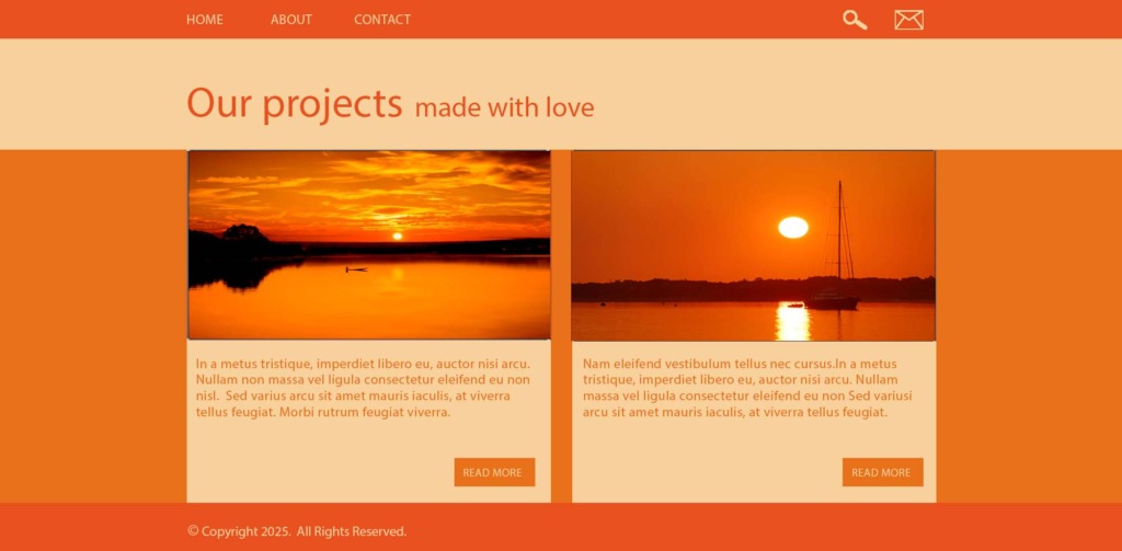
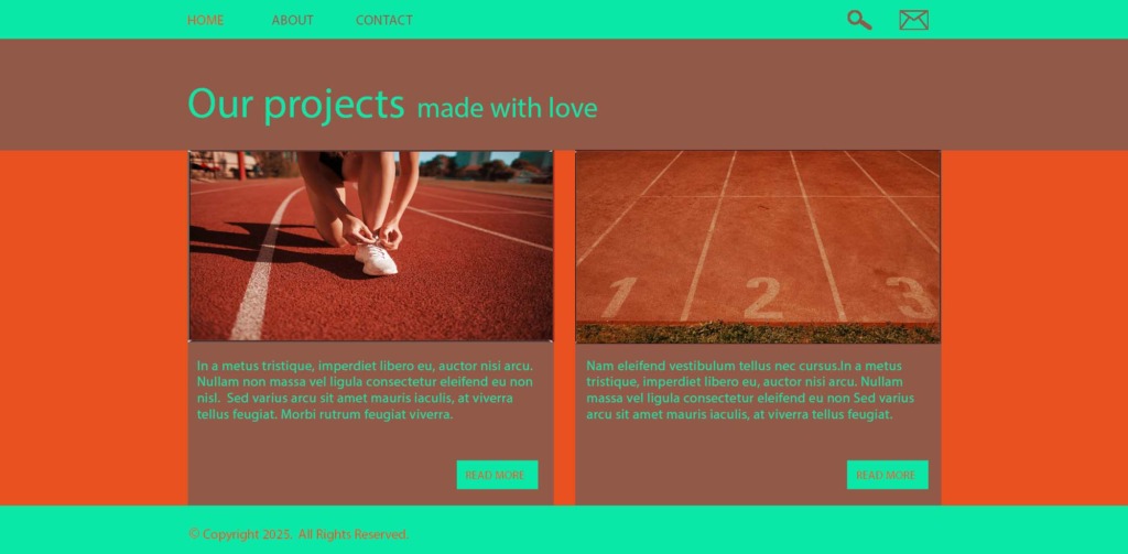
The 3-Color Limitation: Every single theme engineered in this project is strictly limited to a maximum of 3 hues to ensure absolute minimalism and high visual impact.
-
The No-Neutral Rule: Absolute black (#000000), absolute white (#FFFFFF), and pure neutral grays were completely banned from all typography and interface elements.
-
Accessibility First: All text elements utilize the extreme dark or light extensions of the active palette, ensuring maximum legibility and strict adherence to professional contrast ratios without relying on traditional monochrome tones.
-
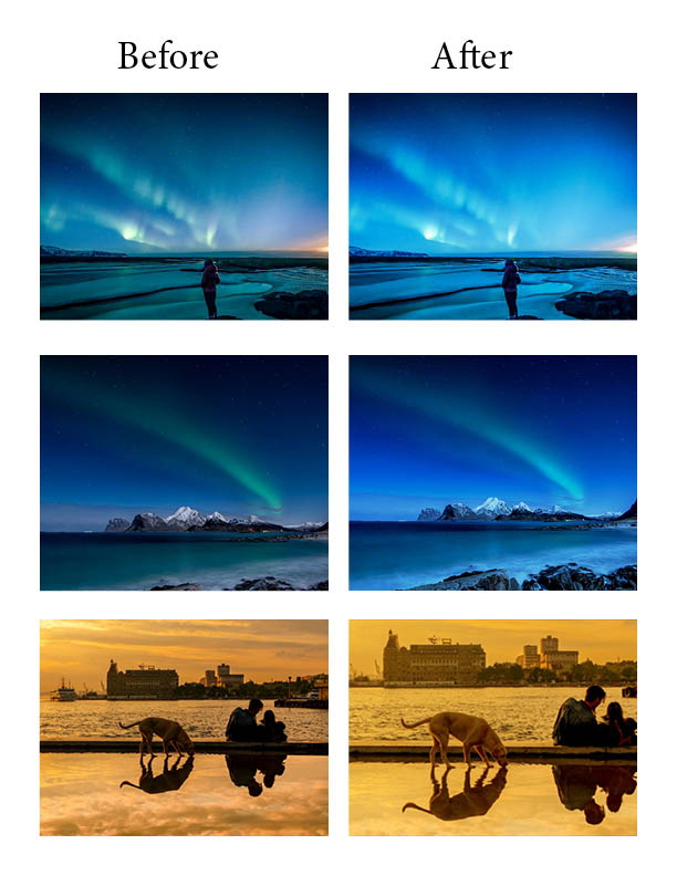
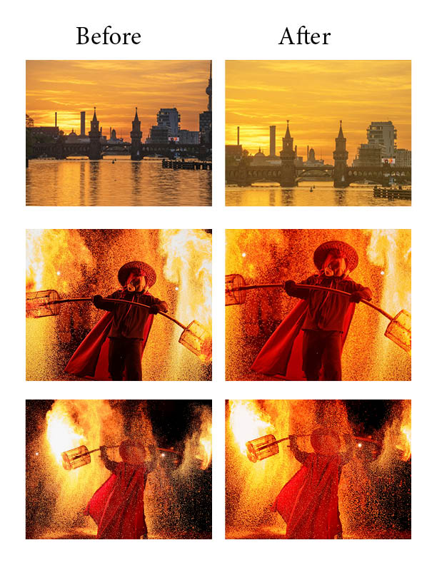
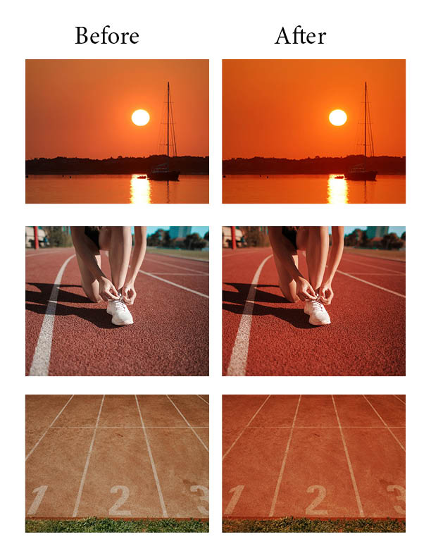
Visual Asset Integration: Every background illustration and embedded photograph was meticulously color-graded to perfectly inherit the exact hex codes of the active UI theme.
The Color Harmonies Explored
-
Cool Spectrum Layouts:
-
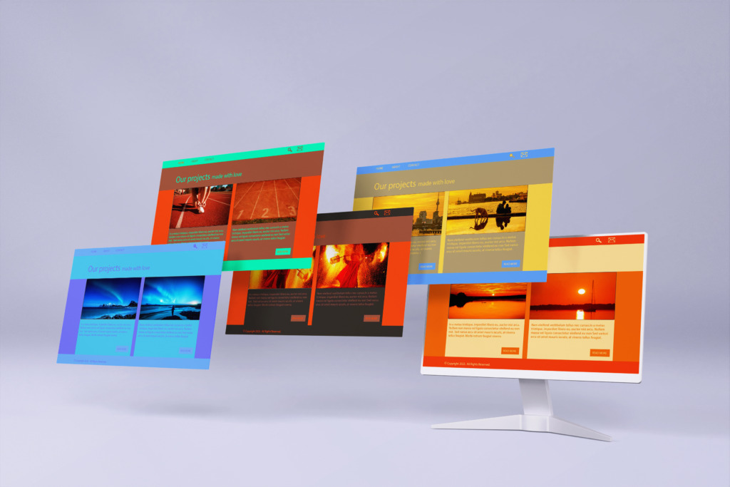
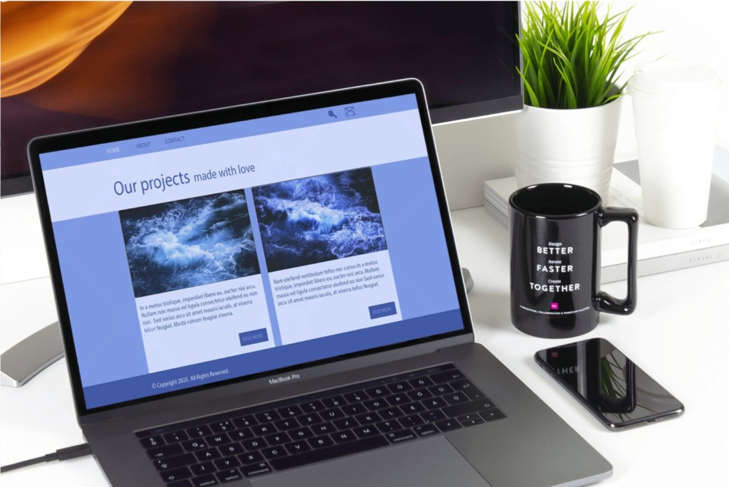
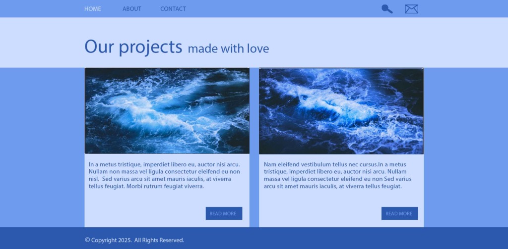
Monochromatic: Built entirely upon an oceanic blue base, leveraging varied brightness and saturation layers to create a calm, deeply cohesive, and focused environment.
-
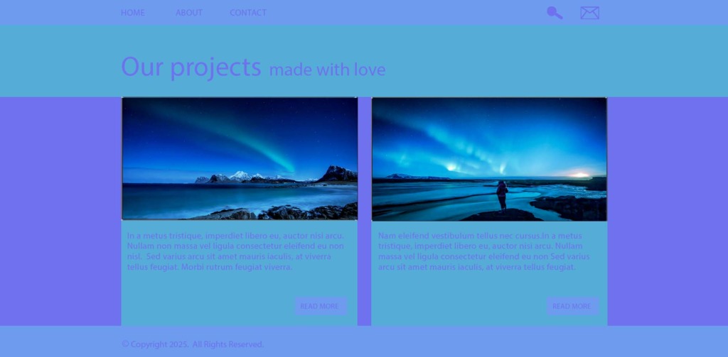
Analogous: A seamless blend of adjacent cool hues—deep blue, vibrant cyan, and soft purple—generating a natural, fluid visual gradient across the core layout.
-
Complementary: A striking juxtaposition of high-saturation midnight blue against a sharp amber-orange, reserved exclusively for primary interactive elements and Call-to-Action (CTA) buttons
-
Warm Spectrum Layouts:
-
Monochromatic: Formulated using rich burgundies and deep terracottas to simulate a highly premium, warm, and editorial aesthetic.
-
Analogous: An energetic triad combining intense crimson red, vivid sunburst orange, and a deeply saturated golden yellow to evoke high engagement.
-
Complementary: A bold pairing of a dominant scarlet red base with its direct cool opposite, a deep teal, which acts as a stabilizing structural anchor for the layout.
Advanced Graphic Manipulation & Sourcing
-
Photoshop Asset Engineering: To integrate the raw photographic assets (ranging from the Northern Lights to high-intensity fire performances), advanced digital manipulation was executed in Adobe Photoshop.
-
Gradient Mapping: Custom-coded Gradient Maps matched to the exact hex codes of the UI themes were mapped onto the luminosity values of the photos.
-
Non-Destructive Blending: Implemented multiple Solid Color adjustment layers controlled by precise masks using Multiply and Overlay modes, forcing the images to absorb the interface’s color DNA without losing texture or detail.
-
High-Fidelity Sourcing: All raw visual assets were sourced from professional platforms including Unsplash and Pexels.
Conclusion
Ultimately, this project proves that strict color discipline does not limit creativity—it enhances it. By replacing standard black-and-white text defaults with highly calculated palette extremes, the interface achieves a rare level of atmospheric continuity. This project stands as a definitive proof of concept for advanced UI color engineering and seamless digital asset integration.
Designed By: Ali Bakhit