Executive Summary
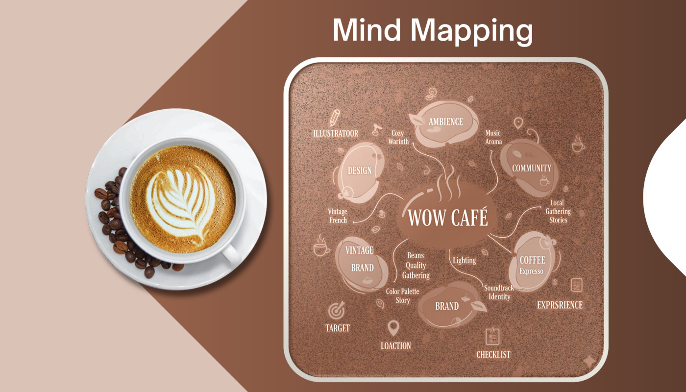
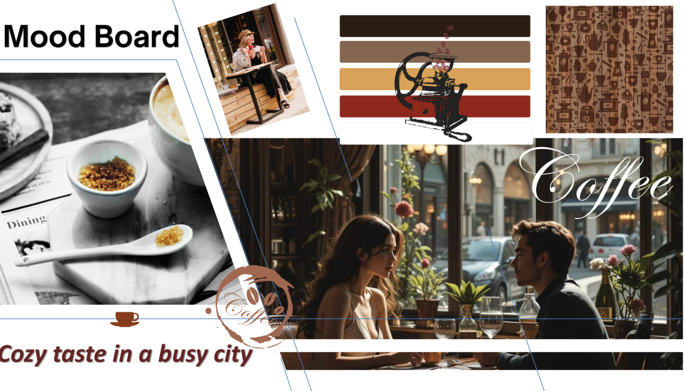
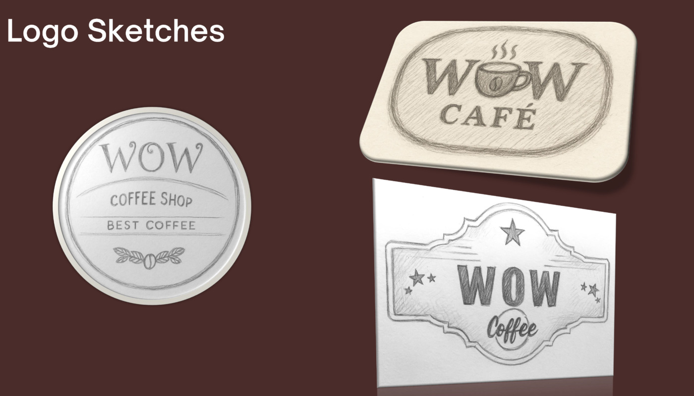
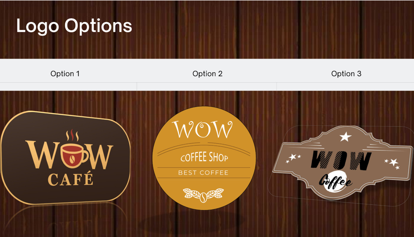
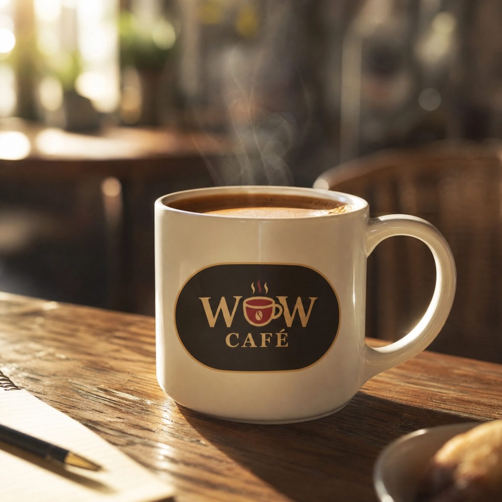
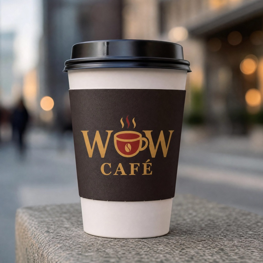
WOW CAFÉ is an artisanal, vintage French-inspired coffee shop concept designed for Montreal’s vibrant coffee culture. The identity blends Parisian heritage with modern urban hospitality, crafting an emotionally resonant and visually commanding brand mark.
The primary objective was to create a memorable emblem that moves beyond generic coffee shop visual tropes while maintaining immediate brand recognition, elegance, and multi-platform versatility.
The Strategic Concept & Naming Structure
The brand identity is built around the universal sensory expression of delight—“WOW!”—the exact reaction experienced when tasting exceptional coffee.
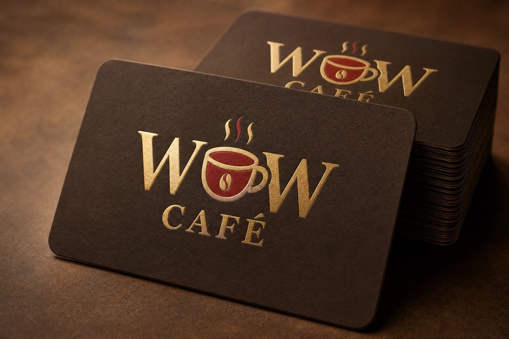
Key Conceptual Layers:
-
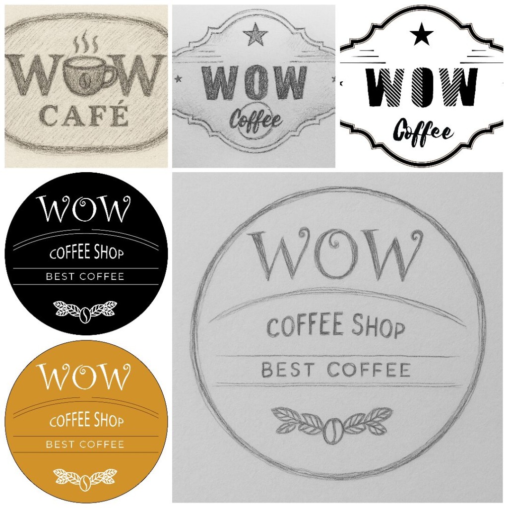
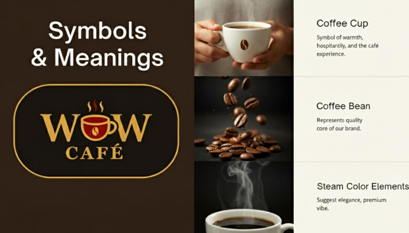
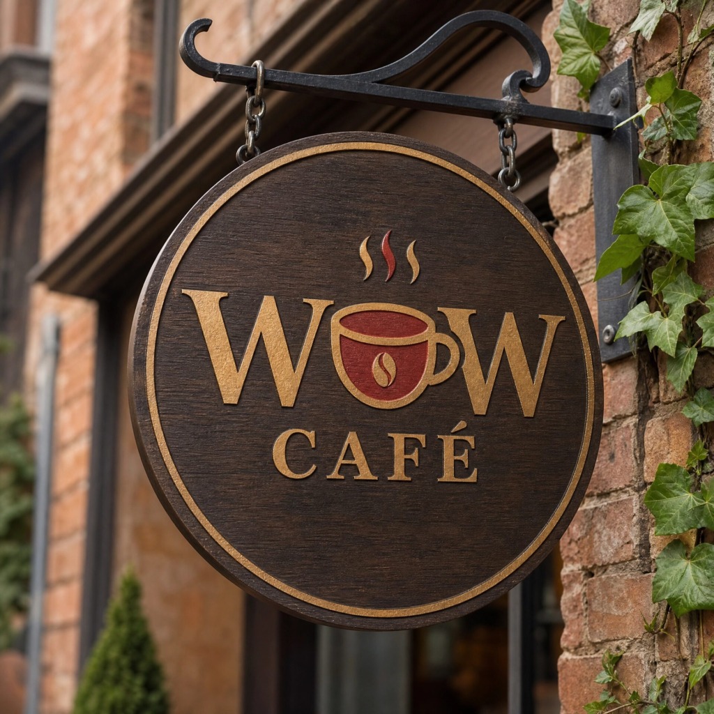
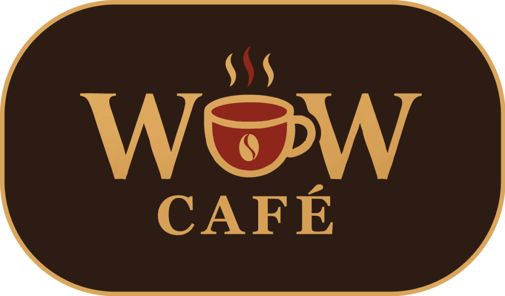
Embedded Symbolism: The central letterforms seamlessly integrate a stylized coffee cup containing a coffee bean core, turning the typography itself into a storytelling device.
-
Cultural Anchoring: The inclusion of the French accent (Accent Aigu) in “CAFÉ” directly honors Montreal’s bilingual heritage and authentic European café culture.
-
Sensory Hierarchy: The rising steam vectors guide the viewer’s eye naturally through the composition, creating movement and warmth within a balanced geometric structure.
Design System & Technical Workflow
The visual identity was executed through a meticulous multi-software pipeline to ensure vector precision, brand continuity, and production readiness:
-
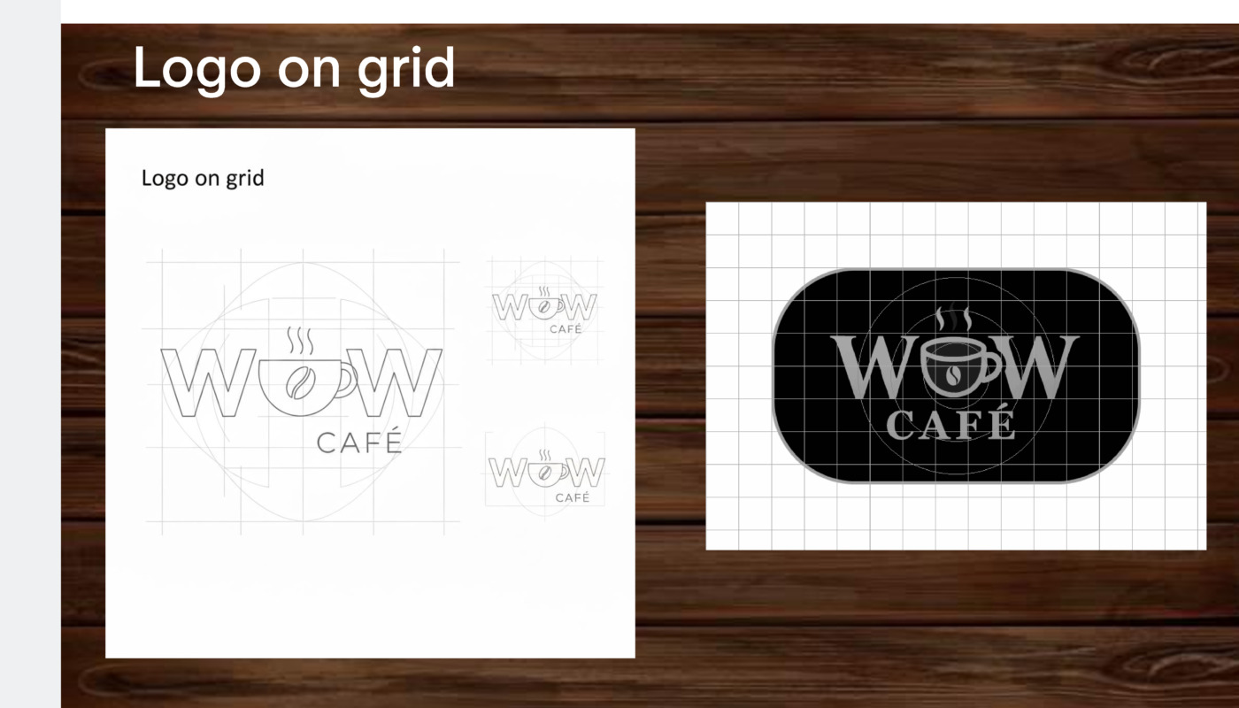
Adobe Illustrator: Used for master vector geometry, custom grid construction, pathfinder operations, typography customization, and anchor point optimization for scalable production.
-
Adobe Photoshop: Applied for high-fidelity brand mockups, color grading, surface texture mapping, and photorealistic context rendering.
-
Adobe InDesign: Employed for brand guidelines layout, typographic grid alignment, and structured presentation documentation.
Architectural & Emblem Design: The Oval Frame
The surrounding stadium/oval border serves a highly functional, structural role within the brand architecture:
-
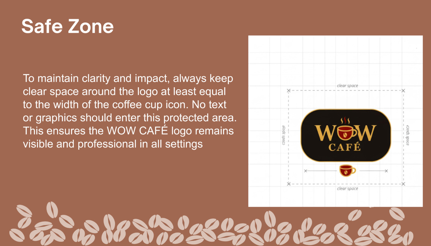
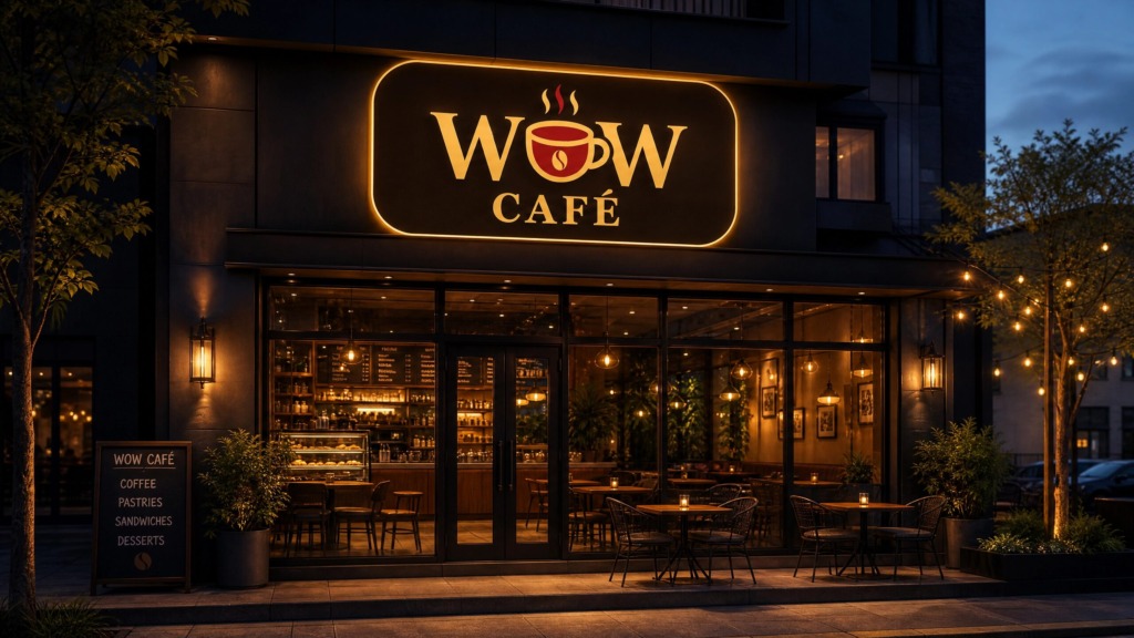
Brand Containment & Anchor: It provides a strong, self-contained silhouette that protects the mark across diverse backgrounds, from glass signage to dark-toned digital media.
-
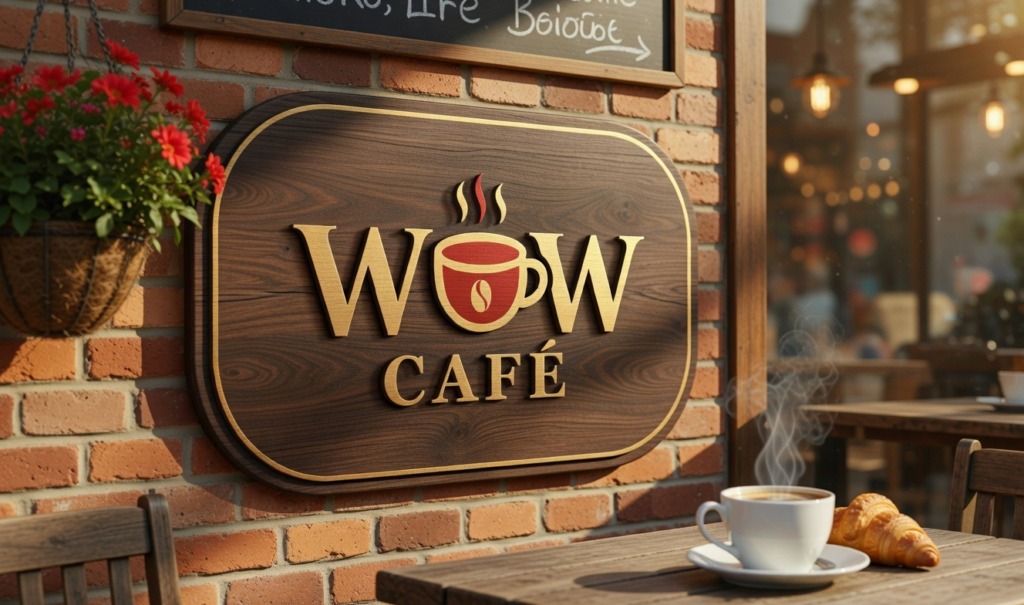
Heritage & Authenticity: It pays homage to classic French enamel café signs and traditional artisanal quality stamps, elevating the perceived value of the brand.
-
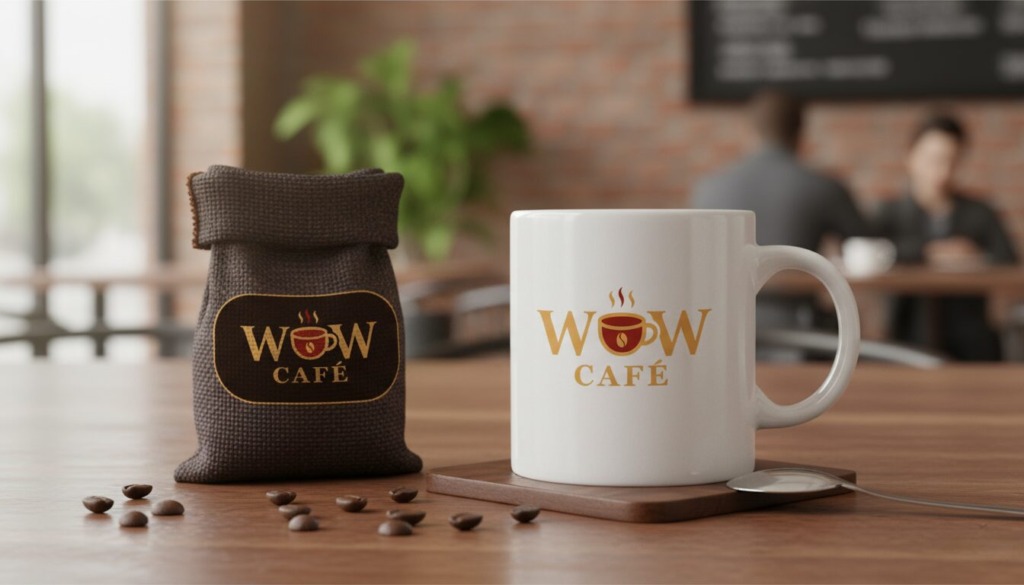
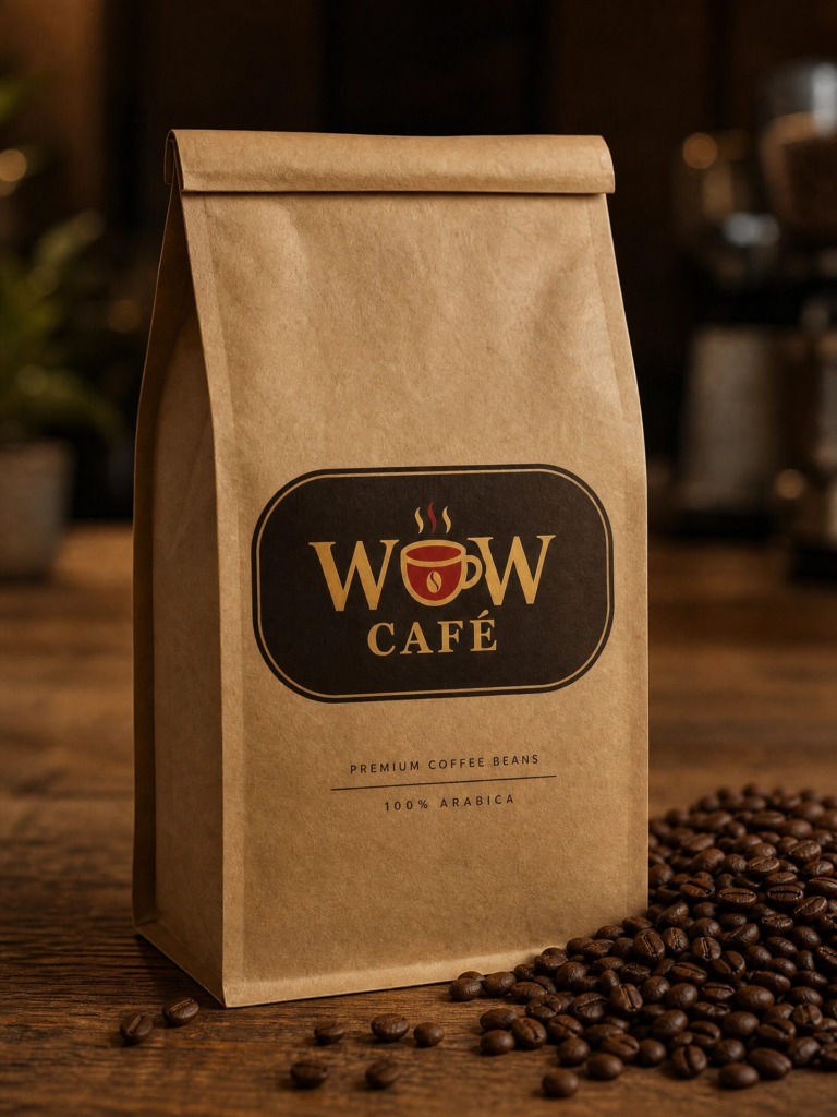
Scalability: The unified footprint guarantees high legibility across extreme scale variations, from small social avatars and coffee bag stamps to large-scale storefront window vinyls.
Color Psychology & Palette System
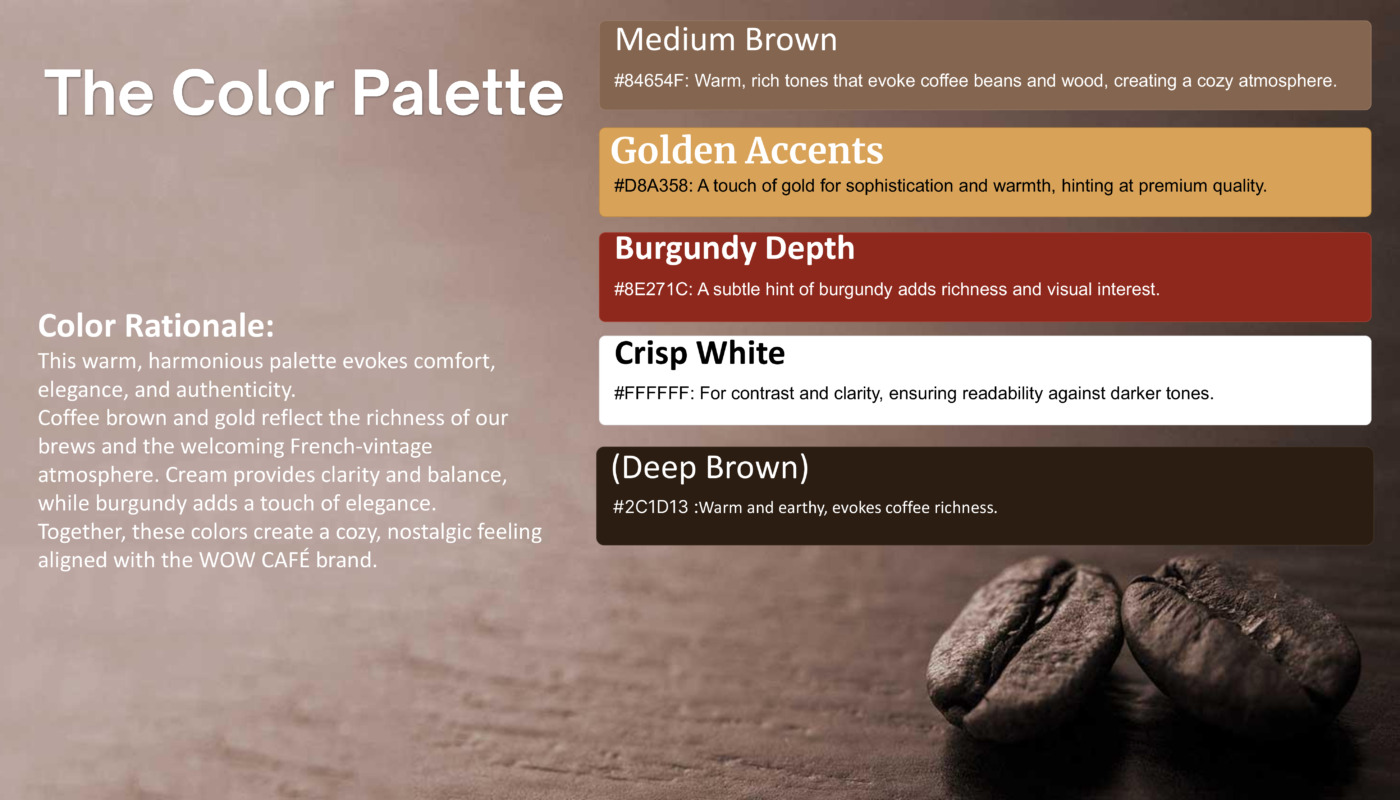
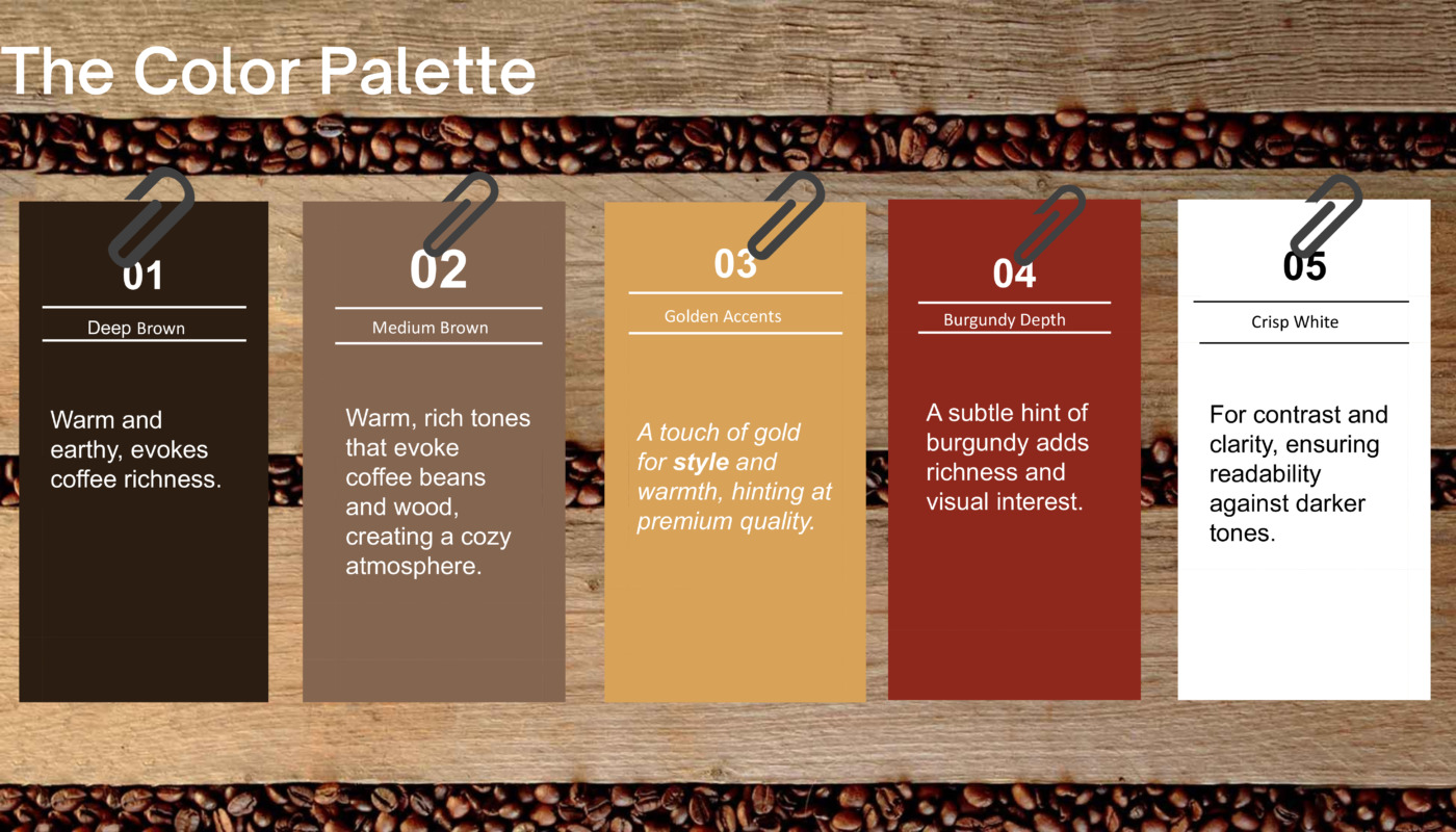
The palette relies on rich, organic tones that evoke warmth, craftsmanship, and premium ingredients:
-
Deep Espresso Brown (HEX: #2C1D13): The primary structural color, providing grounding, depth, and rich coffee association.
-
Accent Crimson Burgundy (HEX: #8E271C): Placed strategically on the central cup and steam trail to create an immediate visual focal point.
-
Vintage Warm Gold (HEX: #D8A358): Adds a subtle touch of elegance, luxury, and heritage framing.
-
Parchment Cream (HEX: #F5EBE6): Offers soft, organic contrast that avoids the harshness of pure bright white.
Typography & Customization
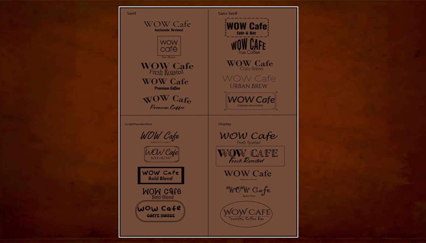
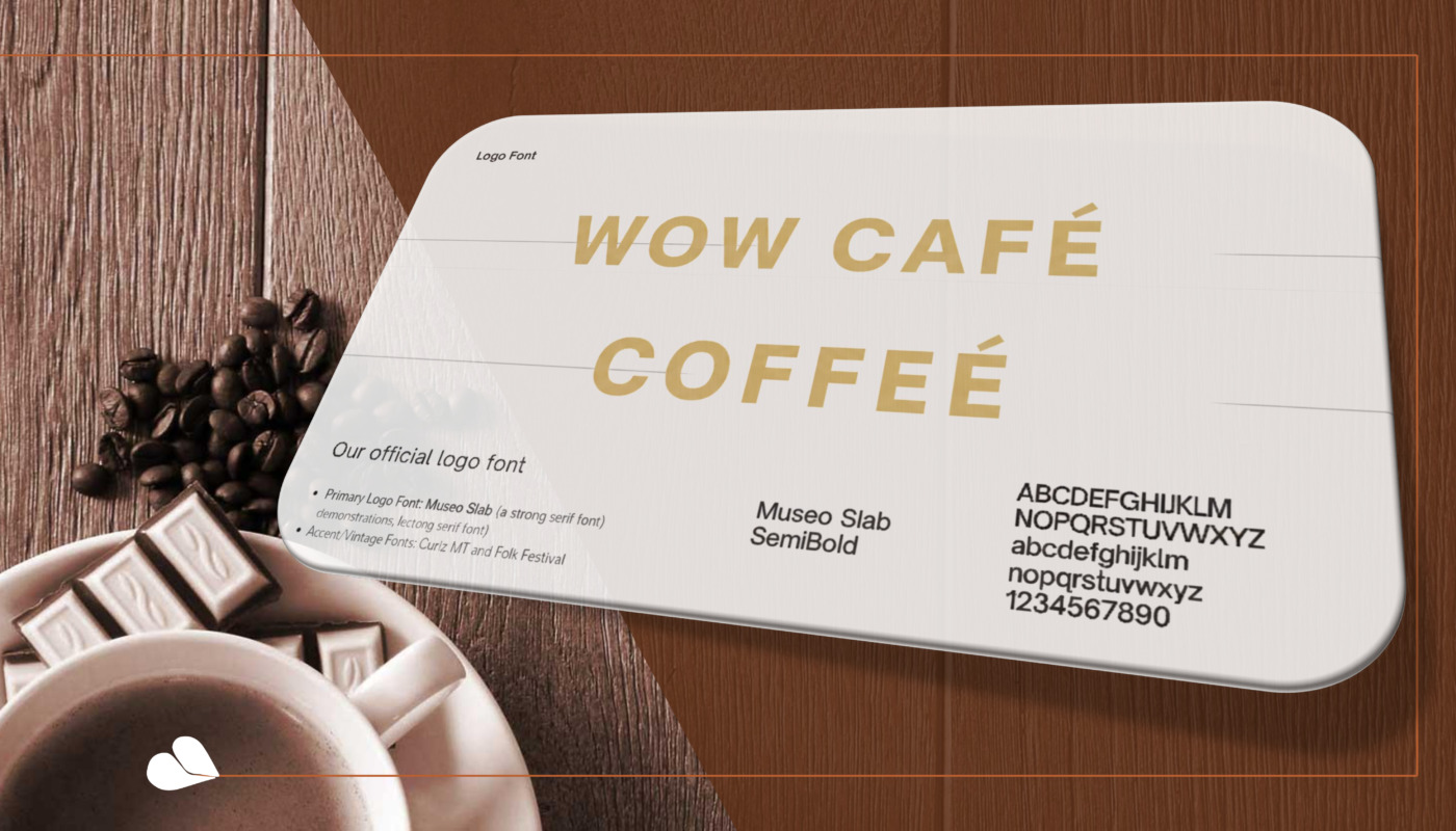
The logotype utilizes customized serif letterforms built on a strong geometric foundation. Tracking and kerning were manually calibrated to balance the optical weight of the central cup graphic, ensuring the mark remains perfectly steady whether vector-engraved, printed on kraft paper, or rendered digitally.
Old versions & The Process