Mobile Version
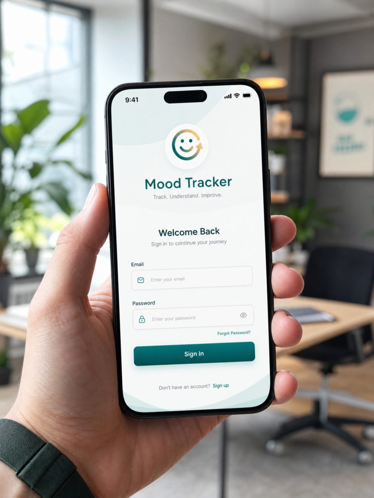
📌 Project Executive Summary
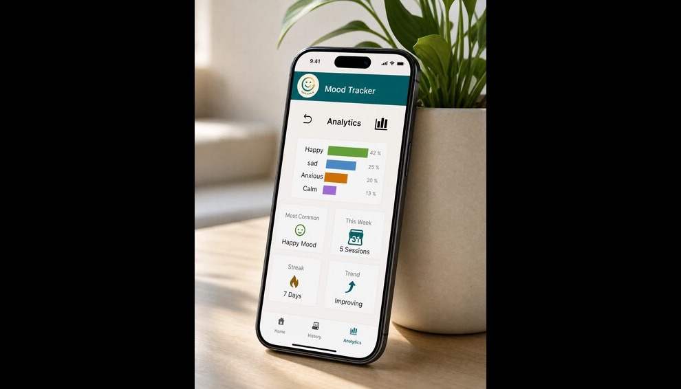
Mood Tracker is a comprehensive digital mental wellness platform engineered to empower users through daily emotional logging, longitudinal data visualization, and actionable psychological insights. The design ecosystem spans desktop and responsive mobile environments, bridging the gap between clinical mood monitoring tools and intuitive everyday personal applications.
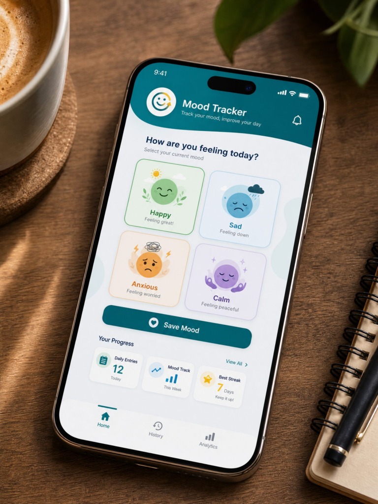
The goal was to transform complex emotional data into an approachable, elegant UI—eliminating entry friction, establishing clear visual hierarchies, and preserving high contrast and accessibility without sacrificing aesthetic warmth.
🎨 Design System & Tooling Infrastructure
1. Software Pipeline:
-
Figma: Core UI layout, auto-layout 5.0 systems, component variants, responsive desktop/mobile grid structures, interactive prototyping, and design token management.
-
Adobe Illustrator: Custom vector icon set creation, specialized glyph adjustments, custom mood avatar illustrations, and scalable graph geometry.
-
Adobe Photoshop: High-fidelity UI mockup generation, surface texture integration, realistic glassmorphism/shadow pass compositing, and promotional asset rendering.
-
Adobe InDesign: Comprehensive Design System documentation, layout grid export, and print-ready presentation sheets.
Web Version
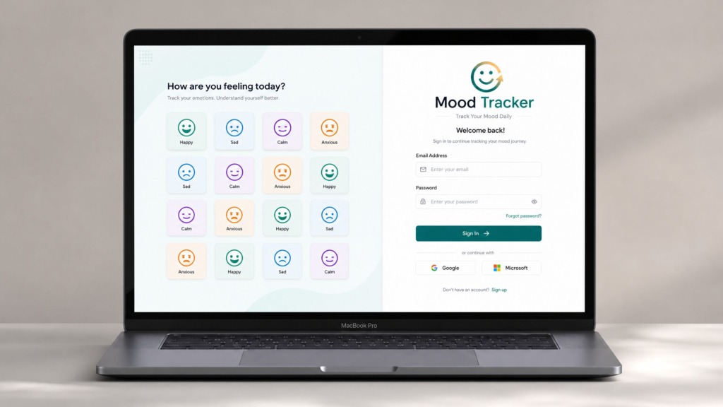
2. Color Psychology & Accessibility:
-
Deep Teal (HEX: #0A686D): Primary structural brand color representing stability, mindfulness, and clarity.
-
Emerald Growth (HEX: #4CAF50): Indicates positive emotional states (Happy) and upward streak metrics.
-
Soft Blue (HEX: #4285F4): Represents reflective/sad states with high legibility.
-
Warm Amber (HEX: #FF9800): Strategic highlight for anxiety tracking and streak notifications.
-
Calm Lavender (HEX: #9C27B0): Denotes meditative and balanced emotional states.
-
Background Porcelain (HEX: #F8FAFC): Soft off-white to eliminate eye strain during night check-ins.
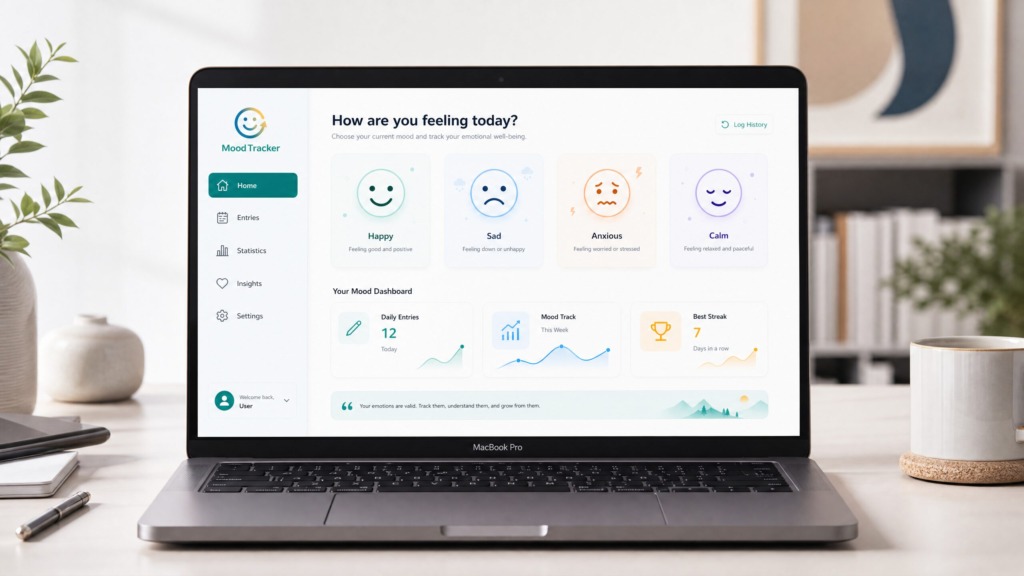
3. Typography & Micro-Interactions:
-
Primary Typeface: Inter / Plus Jakarta Sans with clean geometric proportions, high x-height for readability across small screens, and strict optical kerning.
-
Visual Hierarchy: Display Bold (28px) for primary greetings, Semibold (18px) for card titles, Regular (14px) for body copy, and Medium (12px) for micro-labels.
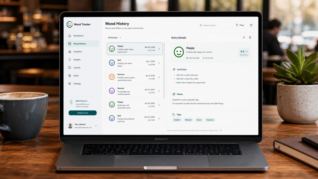
🛠️ UX Architecture & Key Features
-
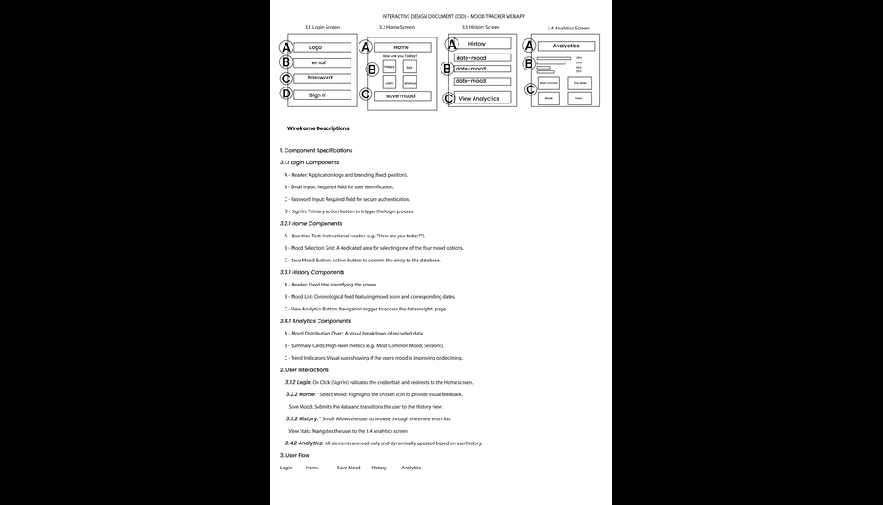
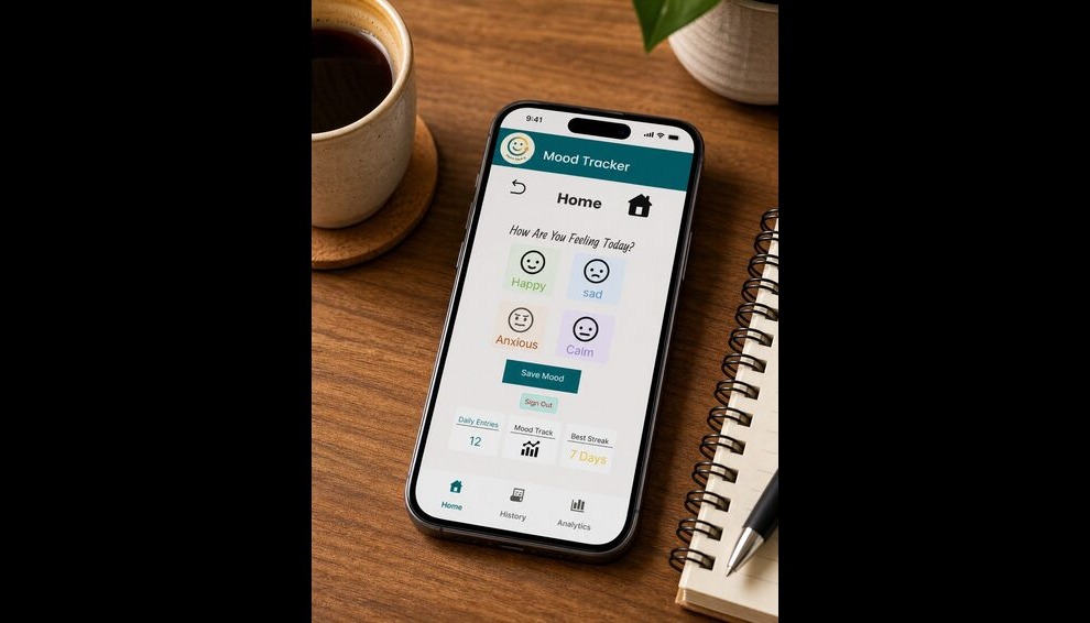
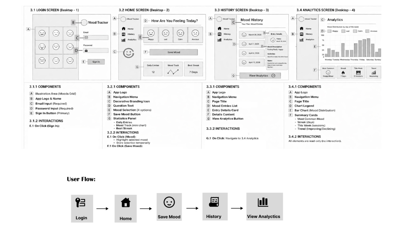
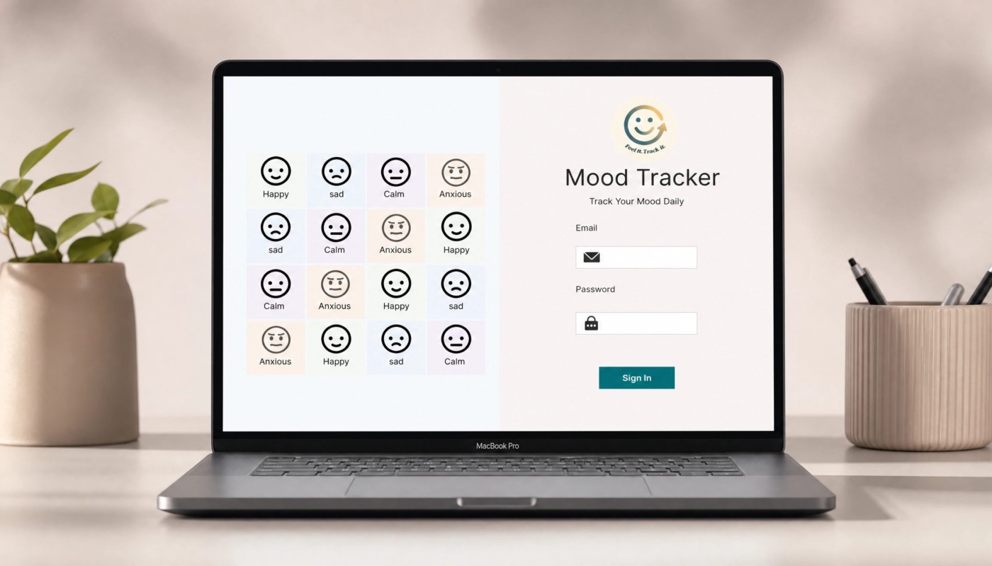
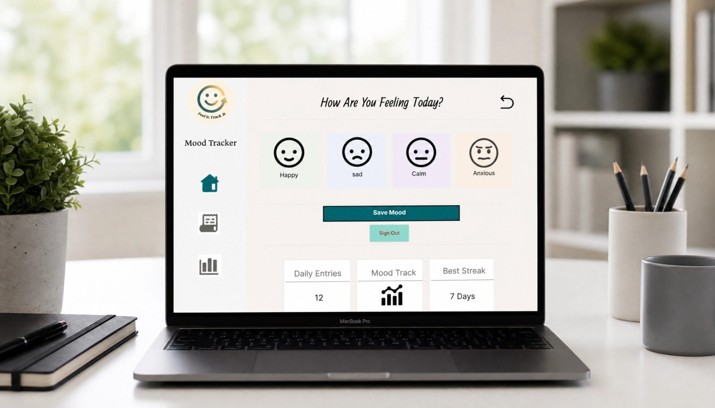
Instant Emotion Check-In: Tactile mood cards utilizing custom-illustrated vector faces with distinct color accents to ensure rapid, zero-friction input.
-
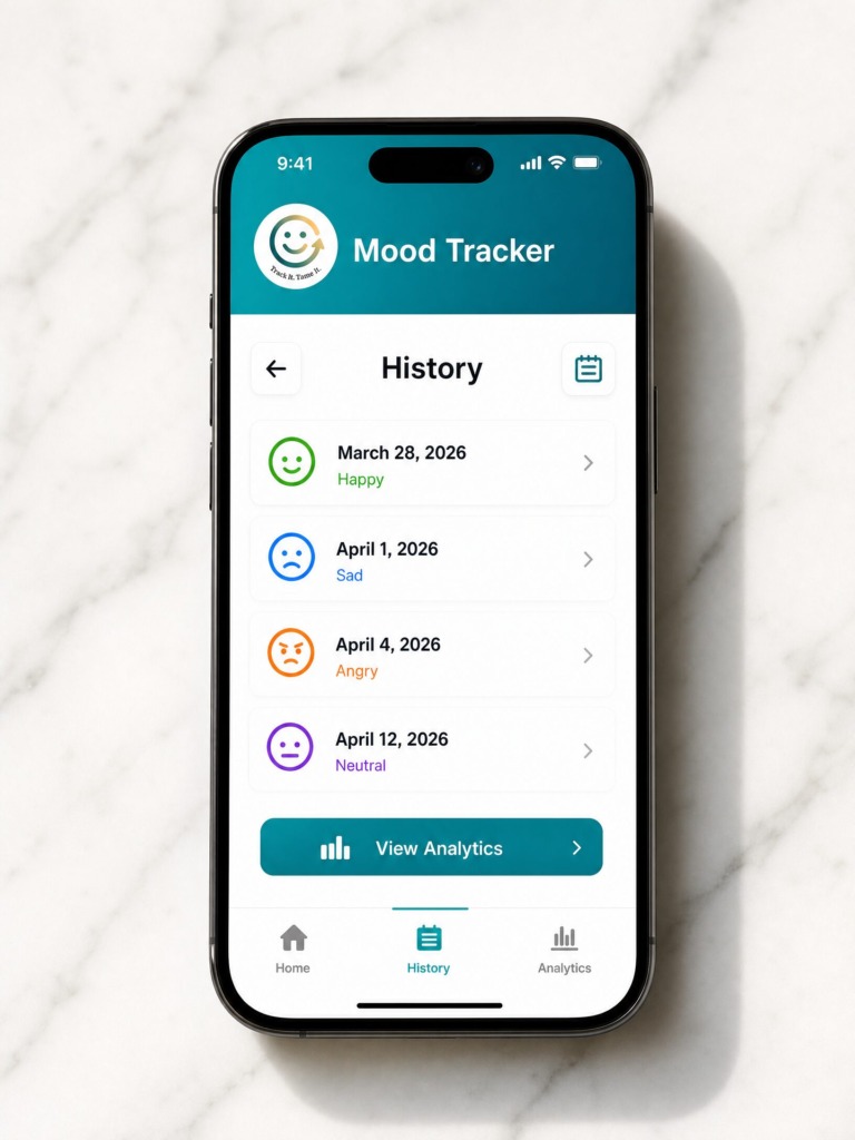
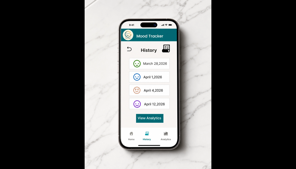
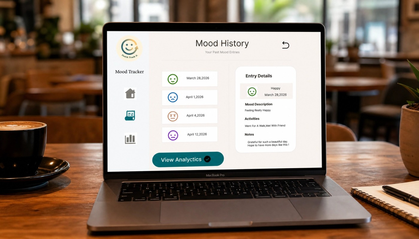
Contextual History Log: Detailed entries linking daily moods with specific activities, journal notes, and custom metadata tags.
-
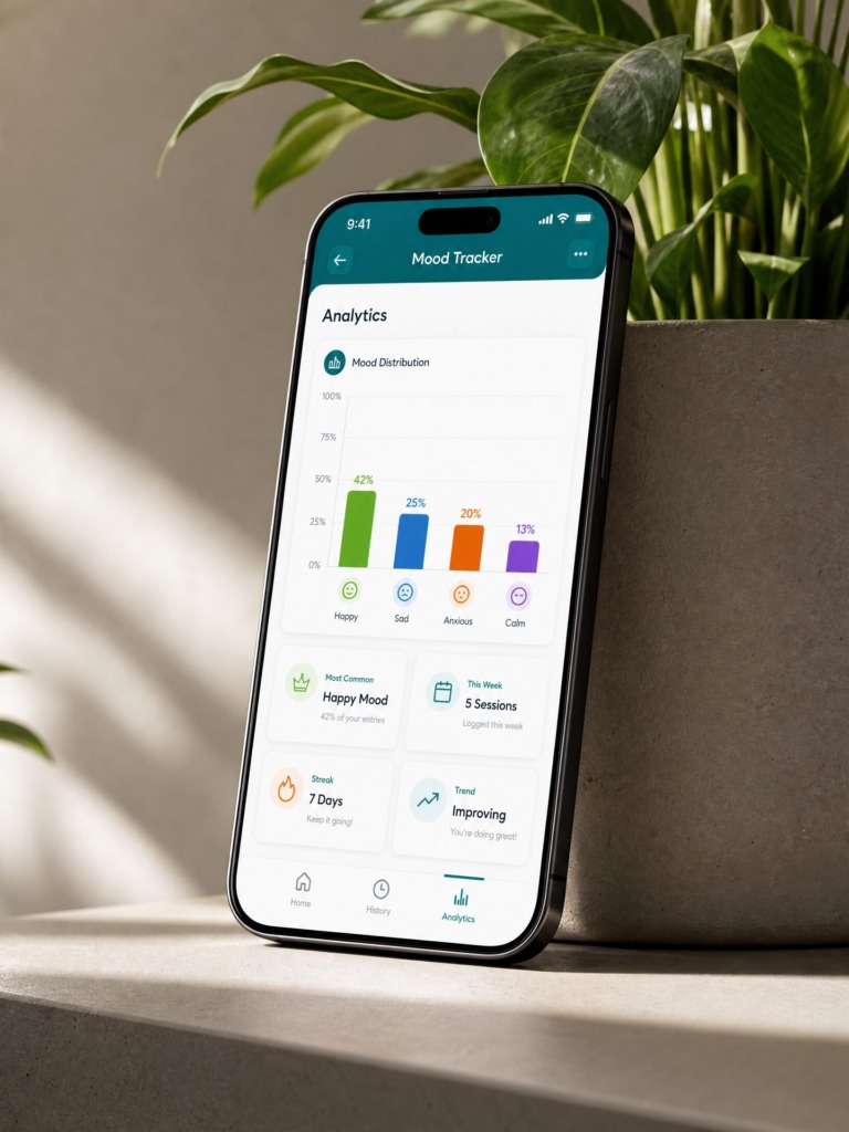
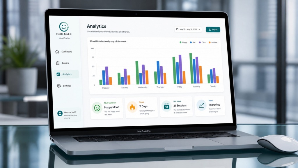
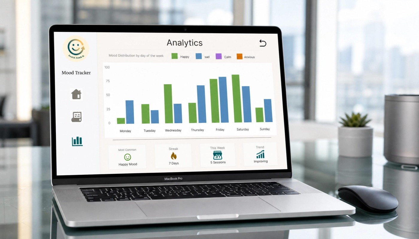
Longitudinal Data Analytics: Custom bar charts and trendlines evaluating weekly/monthly mood distributions, identifying triggers, and tracking active check-in streaks.
-
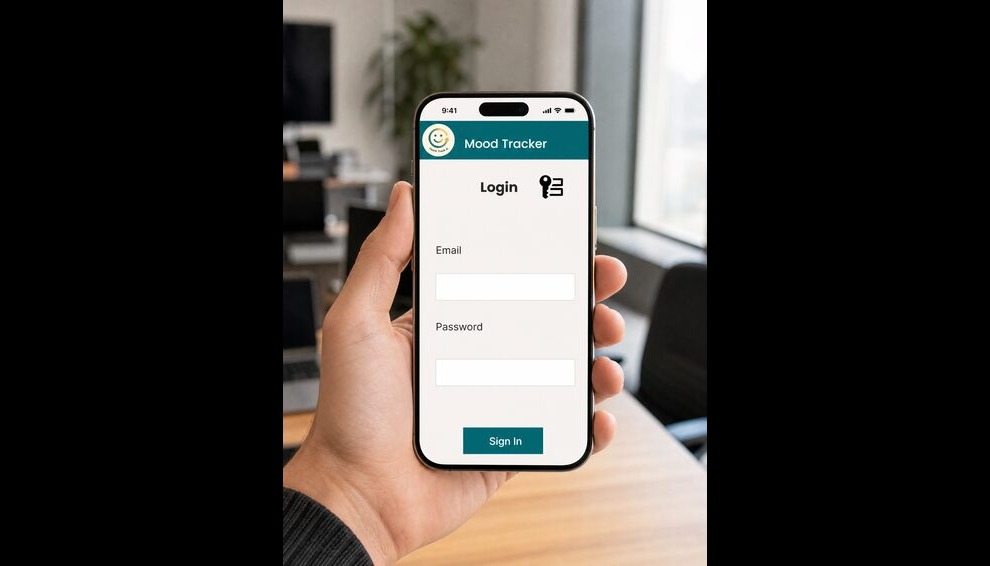
Cross-Platform Parity: Seamless transition between a full desktop dashboard with side-navigation and a streamlined mobile interface with a fixed bottom tab bar.
 Old Versions & The Process
Check out the videos