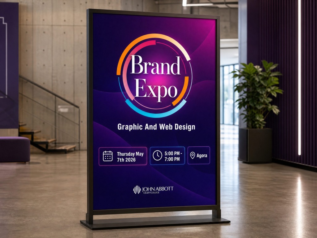
📌 Executive Overview & Design Concept
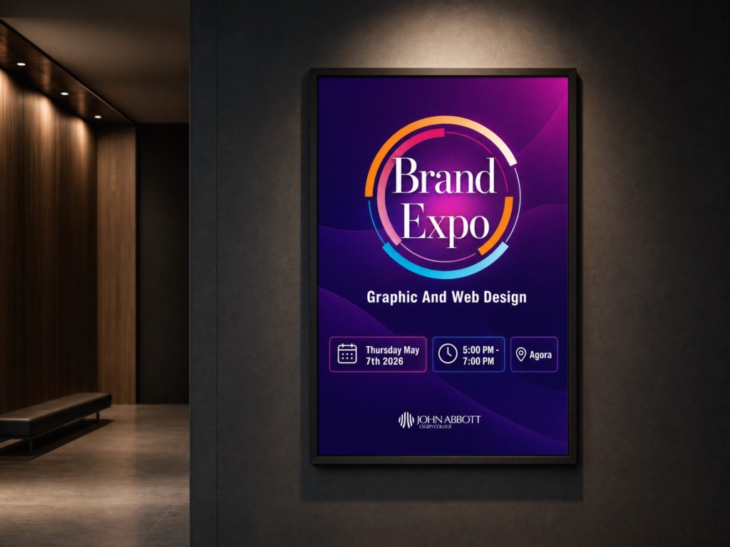
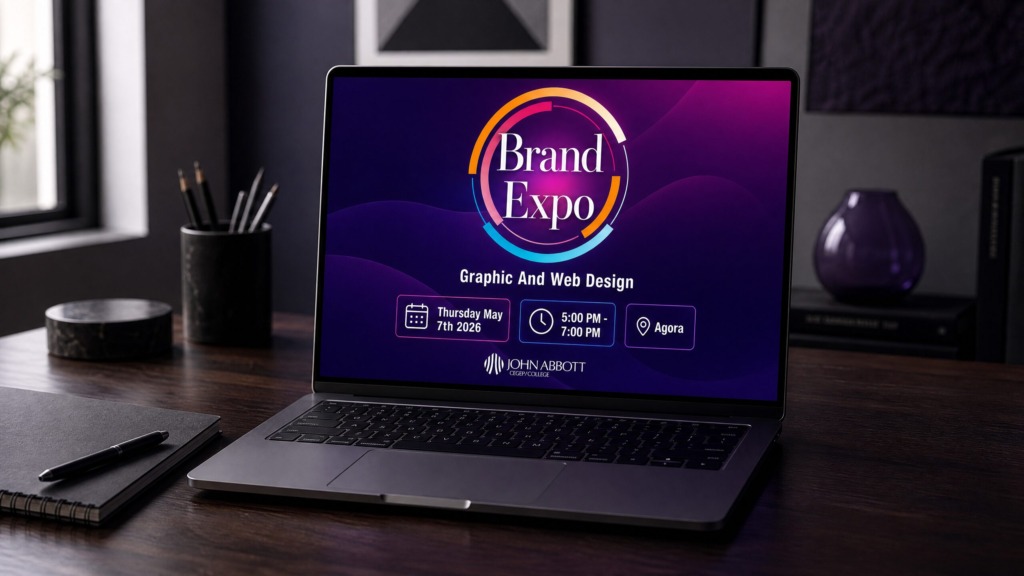
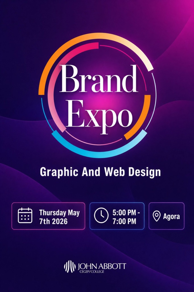
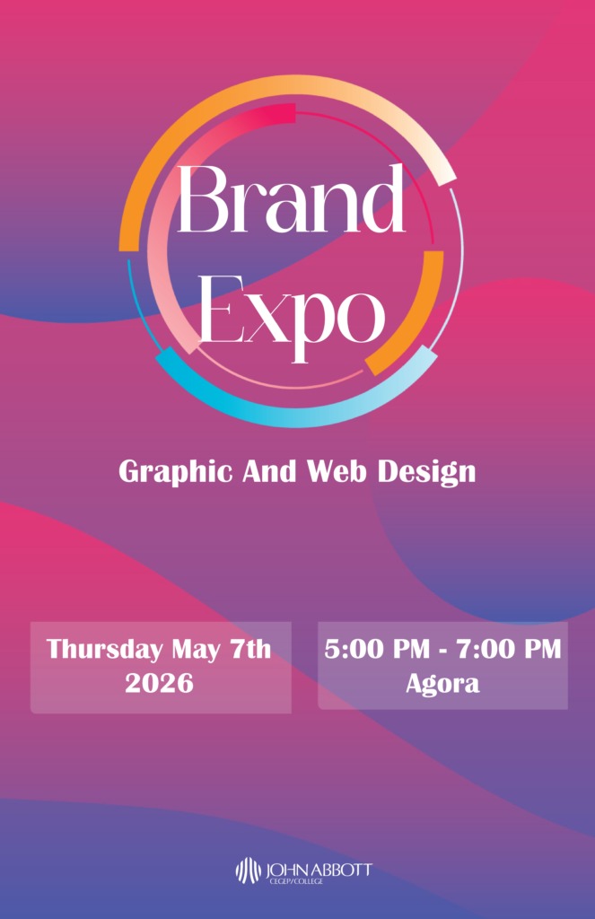
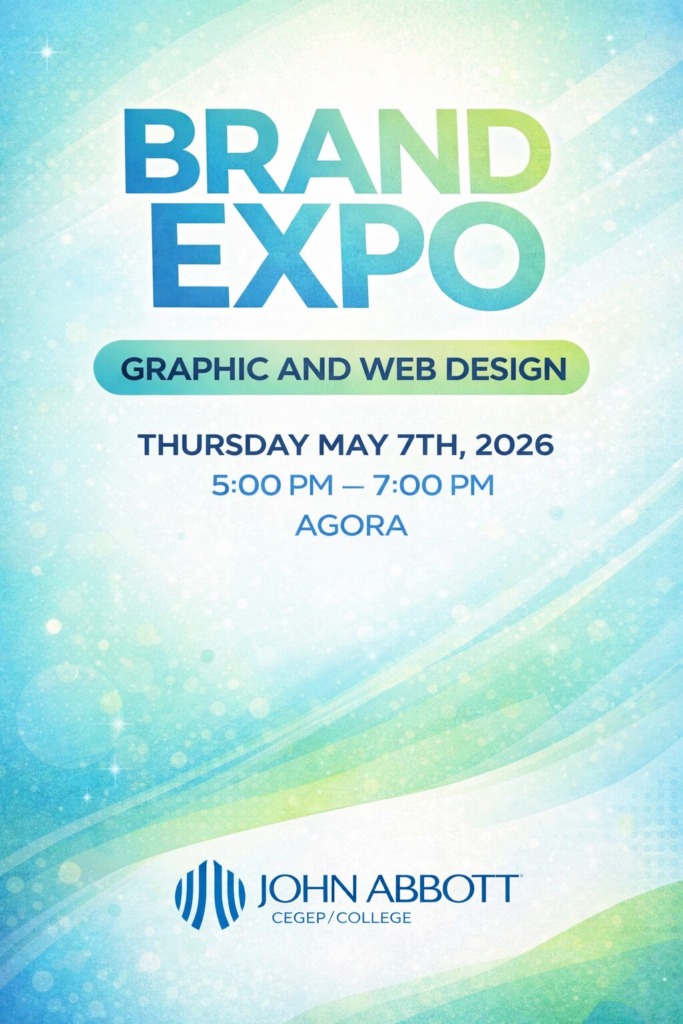
The Brand Expo Violet Edition Poster is a sleek, modern promotional artwork designed for an elite graphic and web design exhibition. Built on a foundation of deep violet gradients and flowing vector rings, the design establishes visual sophistication and focus.
-
💡 The Conceptual Idea (Geometric Fluidity & Focus): The central overlapping vector rings symbolise the multidimensional nature of graphic and web design. By encapsulating the high-contrast serif headline “Brand Expo” within luminous circles, the poster draws the viewer’s eye directly to the core event details, balancing artistic expression with high-readability communication.
DESIGN PHILOSOPHY & VISUAL METAPHOR
The visual story centers on “Geometric Fluidity & Focal Focus”:
-
Concentric Vector Rings: The overlapping, luminous circular paths represent the intertwined disciplines of modern design—UI/UX design, editorial layout, vector illustration, and interactive web architecture.
-
Central Typographic Anchor: Enclosing the classic serif headline “Brand Expo” within concentric line-art creates an optical focal point that guides the viewer’s eye smoothly from the center title downward to the structured event details.
-
Imperial Violet Palette: Deep purple tones evoke depth, luxury, and digital innovation, offering an alternative to standard corporate event layouts.
TARGET AUDIENCE & STRATEGIC INTENT
To ensure maximum engagement and conversion (event attendance), the visual hierarchy was engineered around three key demographic groups:
-
Creative Directors & Industry Agencies: Seeking high-level aesthetic polish, typographic discipline, and modern visual execution.
-
Design Students & Emerging Talent: Drawn to vibrant color gradients, dynamic geometric line-art, and contemporary layout trends.
-
Academic Leadership & Event Attendees: Requiring immediate clarity regarding essential event metadata (Date, Time, and Venue).
🛠️ Multi-Software Technical Workflow & Execution
🅰️ Step 1: Adobe InDesign (Editorial Grid, Layout Architecture & Prepress)
-
Master Layout Setup: Engineered a standardized 11 x 17 inch artwork document with 0.125-inch industrial print bleeds on all sides and a 0.5-inch inner safety margin to prevent text clipping during trim execution.
-
Modular 3-Box Metadata System: Designed three clean, icon-anchored background containers at the base of the poster to house critical event parameters:
-
Date Block: Thursday May 7th 2026
-
Time Block: 5:00 PM – 7:00 PM
-
Location Block: Agora
-
-
Paragraph & Character Styles: Established unified text hierarchy rules to ensure optical balance across headline, subhead (“Graphic And Web Design”), and metadata blocks.
-
Preflight Management: Executed full preflight checks to confirm link integrity, vector path rendering, and CMYK color space conversion.
🅱️ Step 2: Adobe Illustrator (Vector Geometry & Iconography)
-
Concentric Line-Art Geometry: Constructed the fluid circular shapes using the Pen Tool, Ellipse Tool, and custom stroke profiles. Applied varying stroke weights to simulate depth and motion.
-
Anchor Point Optimization: Cleaned up vector nodes using the Direct Selection Tool to guarantee sharp, scalable vectors for large-format print outputs.
-
Custom Icon Architecture: Drawn crisp vector icons for the calendar, clock, and map location pin, aligning their stroke weights with the primary graphic elements.
🅒 Step 3: Adobe Photoshop (Lighting, Color Grading & Compositing)
-
Color Temperature & Gradients: Blended rich imperial violet (#2e1065) with vibrant magenta (#c026d3) using non-destructive Gradient Map and Curves adjustment layers.
-
Radial Lighting Pass: Applied a soft radial spotlight behind the main title using a low-hardness Soft Brush set to Screen blending mode, increasing mid-tone contrast behind text for enhanced readability.
-
Anti-Banding Grain Pass: Applied a subtle 2% noise layer to eliminate color banding across deep gradient spans during offset printing.
PRODUCTION, PREPRESS & PRINT SPECIFICATIONS
To ensure flawless physical production at the printer, the document adheres to standard industrial press guidelines:
-
Final Trim Size: 11″ x 17″ (Tabloid / Poster)
-
Full Bleed Size: 11.25″ x 17.25″ (Includes 0.125″ trim allowance)
-
Safety Margin: 0.5″ inside live trim edge
-
Color Profile: Coated FOGRA39 / GRACoL2006 (CMYK conversion)
-
Resolution: 300 DPI at 100% scale
-
File Output: PDF/X-1a:2001 (High-resolution print export with embedded fonts and crop marks)
🎨 Color Palette Breakdown
-
🟣 Imperial Purple (Primary Base): HEX #2e1065 | RGB: 46, 16, 101 | CMYK: 85, 100, 25, 40 — Provides a deep, authoritative backdrop.
-
🌺 Vibrant Magenta (Secondary Highlight): HEX #c026d3 | RGB: 192, 38, 211 | CMYK: 35, 90, 0, 0 — Adds energy, movement, and visual warmth.
-
⚪ Pure High-Contrast White: HEX #ffffff | RGB: 255, 255, 255 | CMYK: 0, 0, 0, 0 — Guarantees crisp, effortless legibility.
-
🟡 Warm Amber Accent: HEX #f59e0b | RGB: 245, 158, 11 | CMYK: 0, 40, 95, 0 — Used for secondary vector rings and subtle highlights.
CHALLENGES & SENIOR DESIGN SOLUTIONS
⚠️ Challenge 1: Legibility Over Dark Complex Gradients
-
Problem: Deep purple and magenta background gradients can lower contrast, causing thin serifs and body text to bleed into the backdrop.
-
Solution: Introduced structured, solid-tone container boxes for lower metadata and added a soft radial spotlight behind the central title in Photoshop to isolate text from background noise.
⚠️ Challenge 2: Vector Alignment & Stroke Scaling
-
Problem: Complex stroke profiles scaled incorrectly when moving assets between Illustrator and InDesign.
-
Solution: Linked native Illustrator (.AI) vector smart objects directly into InDesign frames, ensuring non-destructive real-time updates and fixed stroke weight ratios.
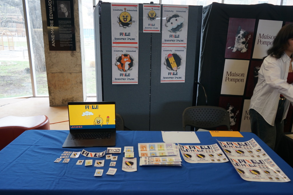
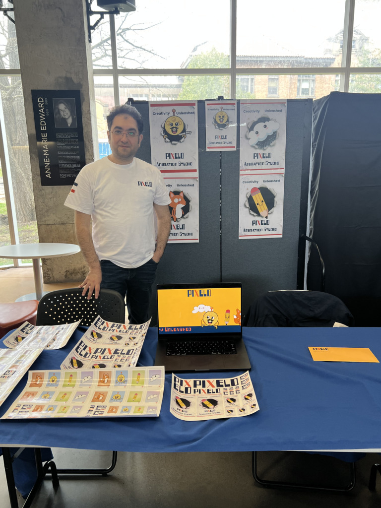
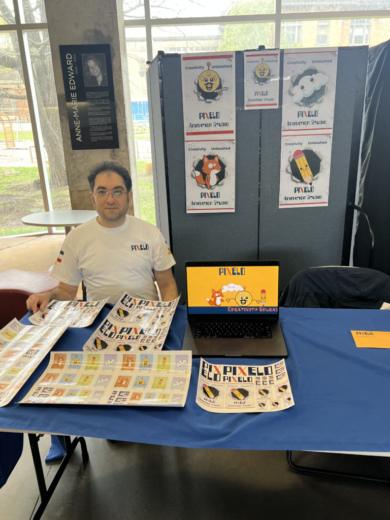
Pixelo Animation Studio Exhibition & Merch Showcase at Brand Expo 2026
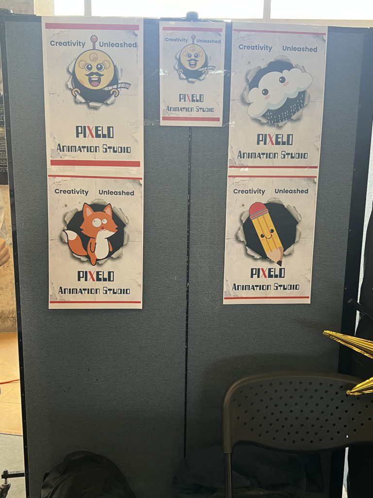
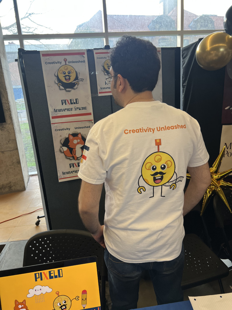
Pixelo Animation Studio was proud to present its complete brand identity ecosystem at this year’s Brand Expo. Our exhibition booth featured a fully integrated display of physical merchandise, print collateral, and original character designs created to engage visitors and industry professionals.
Key Highlights of the Pixelo Booth Setup:
-
Custom Character Apparel: Official Pixelo t-shirts showcasing our four signature vector mascot characters (The Fox, The Cloud, The Film Operator, and The Pencil).
-
Die-Cut Sticker Collection: A custom sticker series featuring our four core characters, alongside exclusive sticker designs from our Canada Post Stamp collection and event poster graphics.
-
Large-Format Event Collateral: Exhibition posters (11×17) and editorial studio brochures introducing Pixelo’s animation pipeline and brand visual language.
Here is a visual recap of our booth setup, custom merch, and highlights from the expo floor!
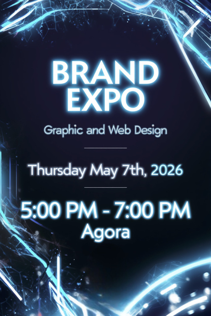
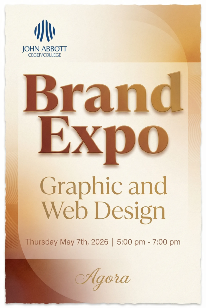
Old Versions
Check The Videos
Designed by Ali Bakhit