I’m starting a new series sharing the “Design Fundamentals” I use in my daily projects. First up: Typography Classifications.
In this quick guide, we’ll look at the basics from my latest study:
-
-
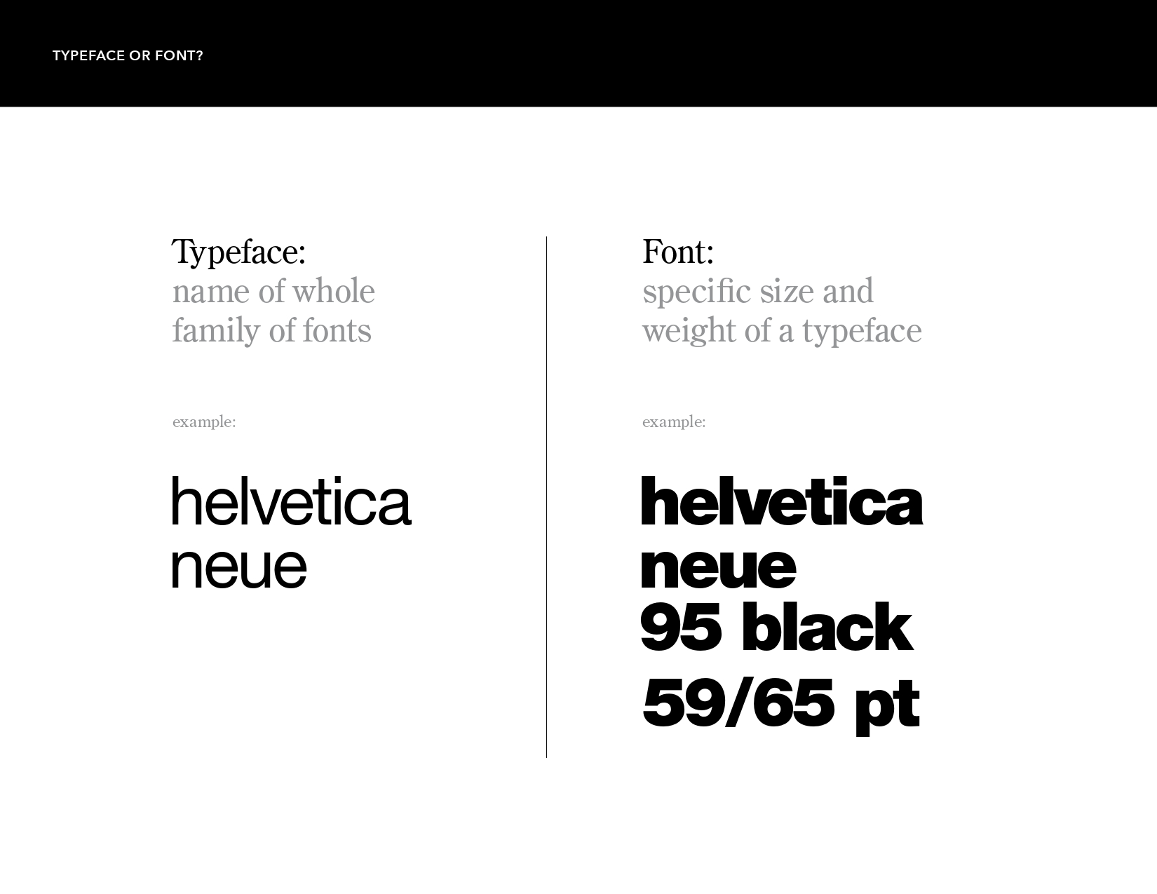
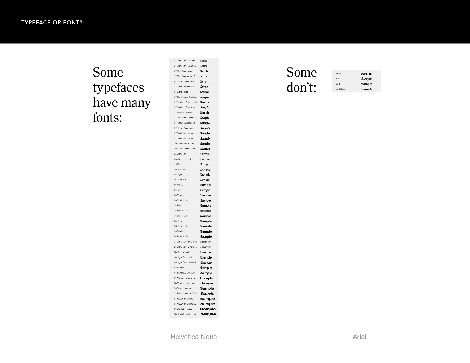
Typeface vs. Font: Ever wondered why they aren’t the same? A Typeface is the name of the whole family , while a Font is a specific size and weight within that family.
-
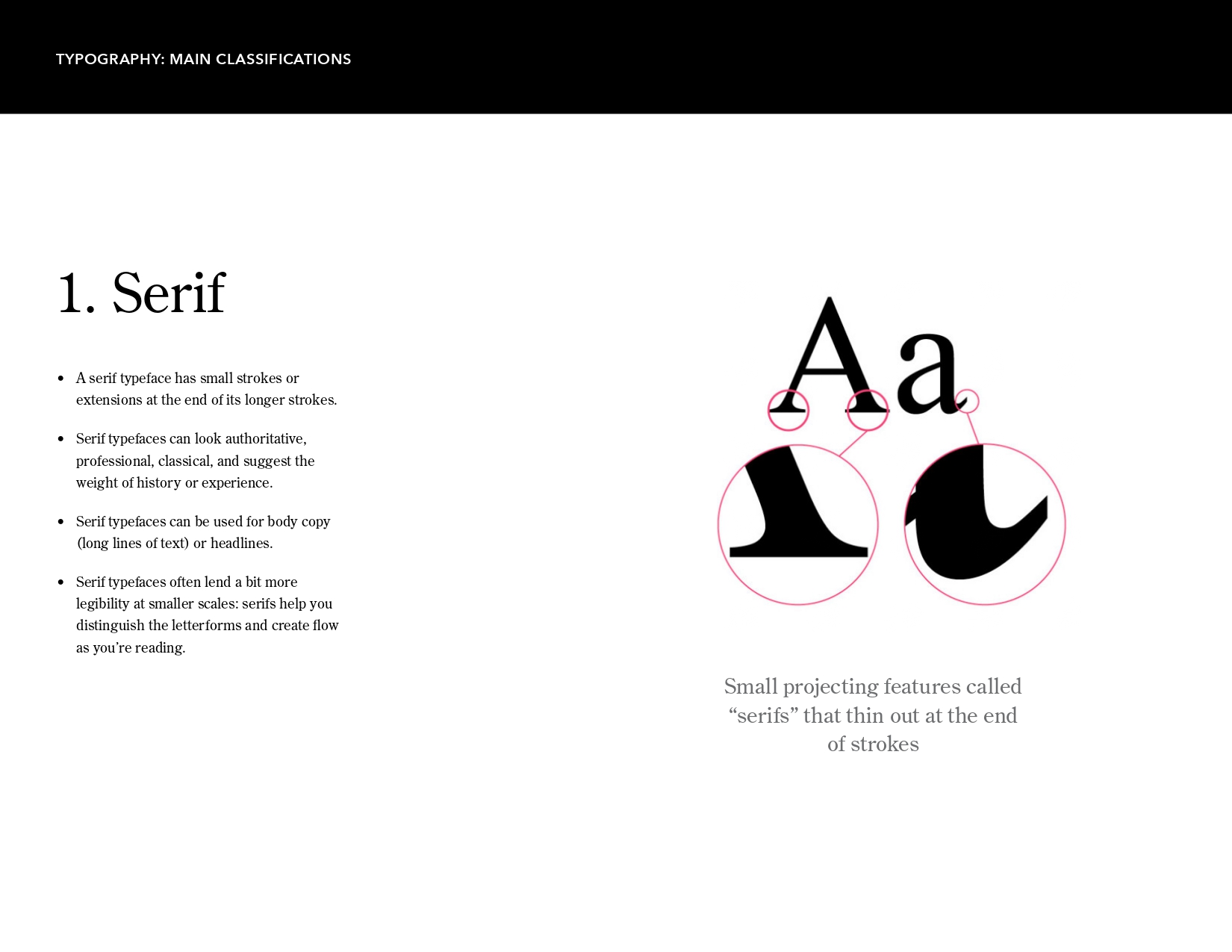
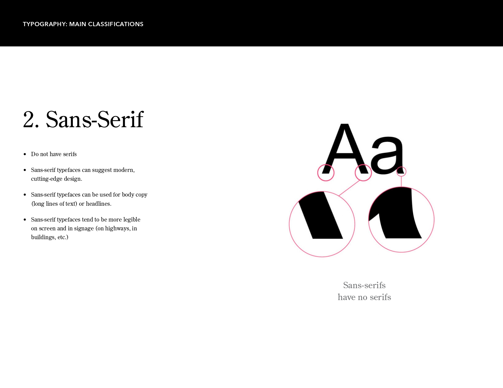
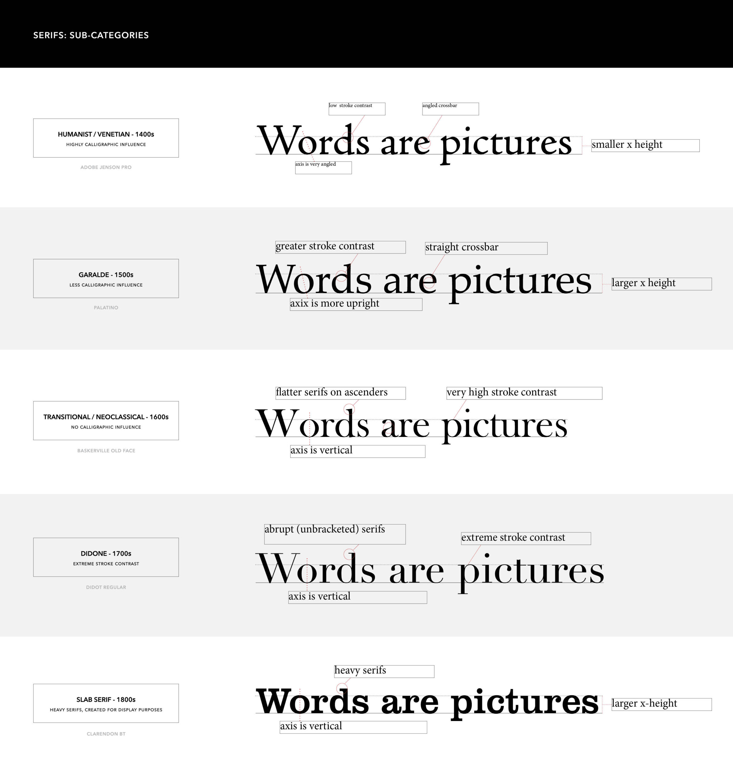
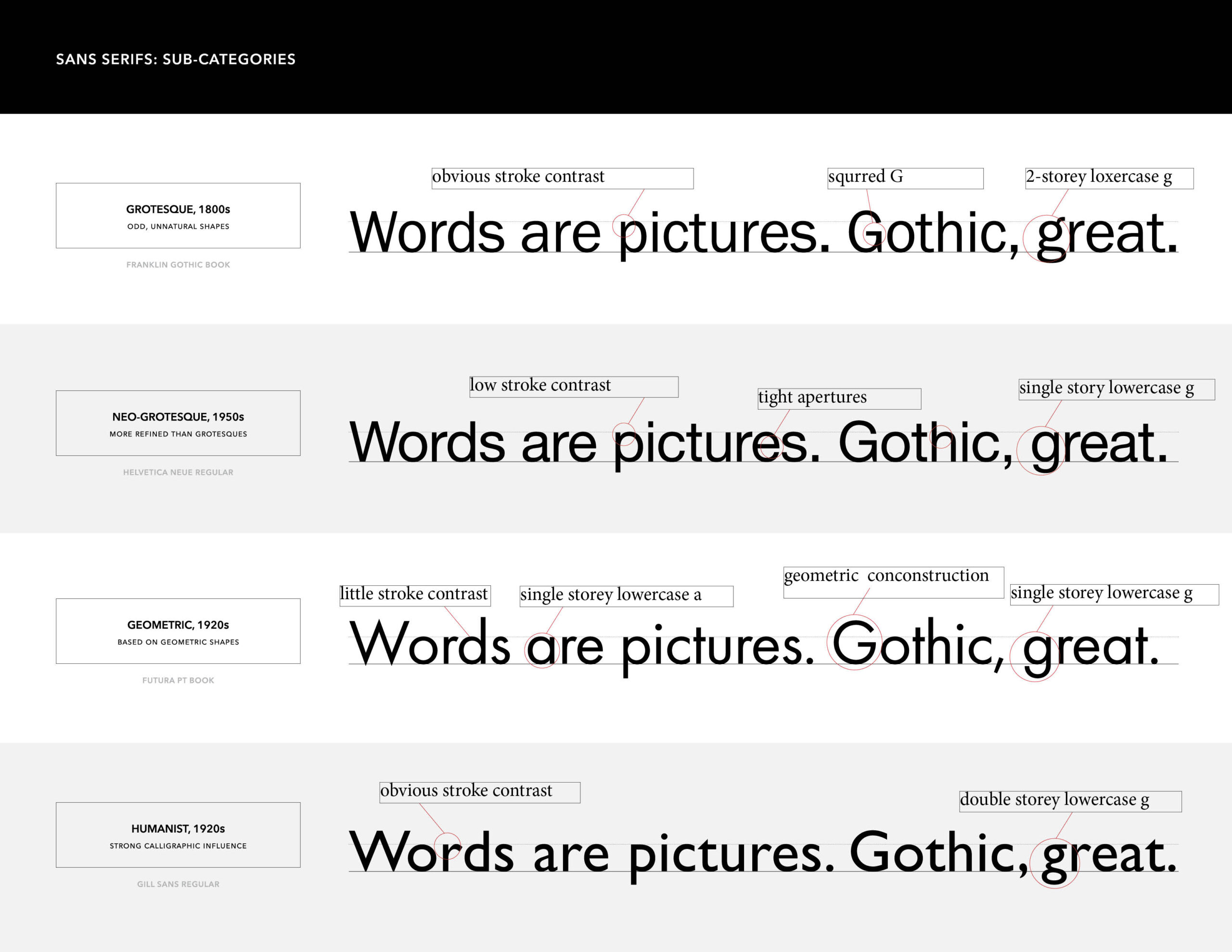
Serif vs. Sans-Serif: Choosing between the “authoritative and professional” look of Serifs or the “modern and cutting-edge” feel of Sans-Serifs.
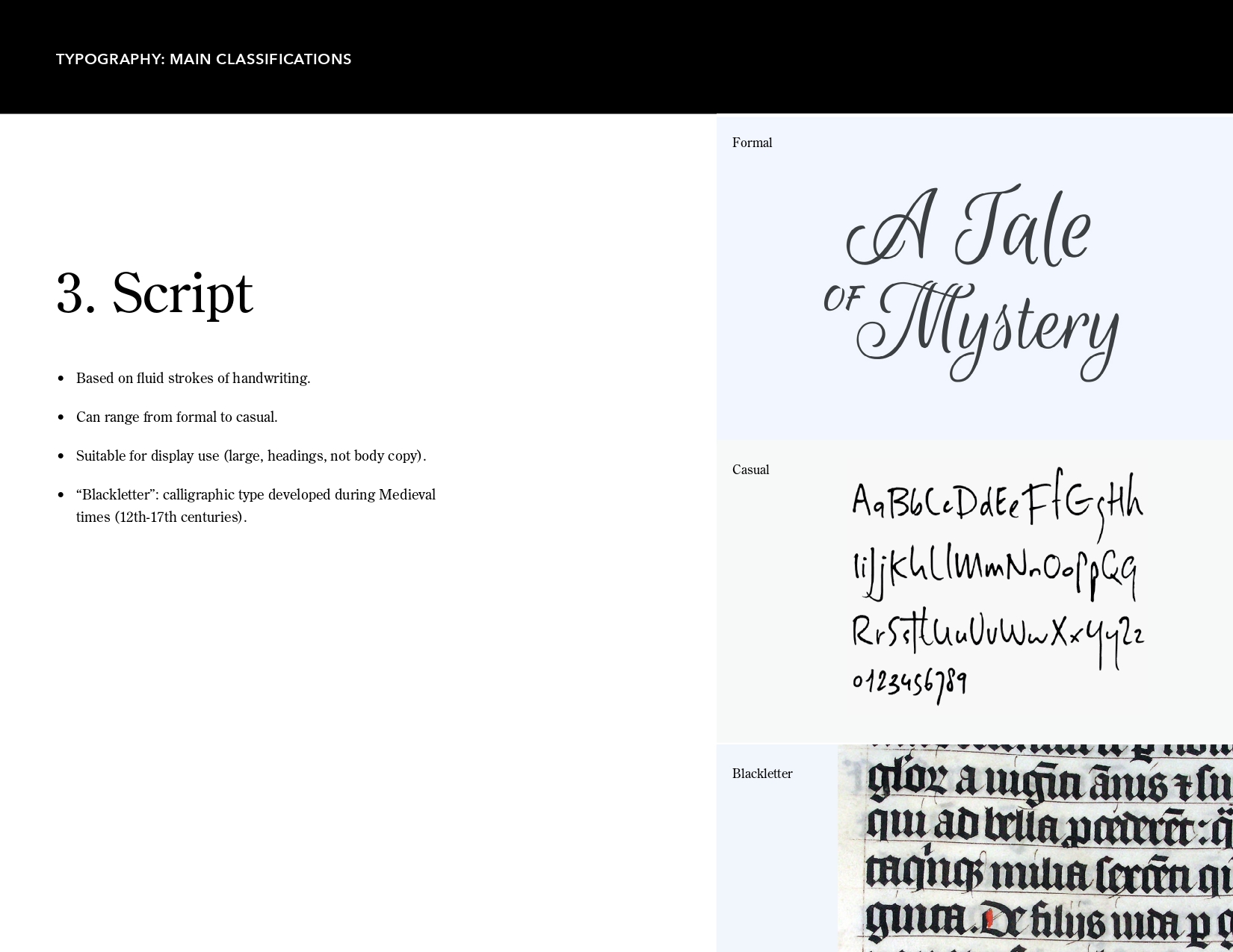
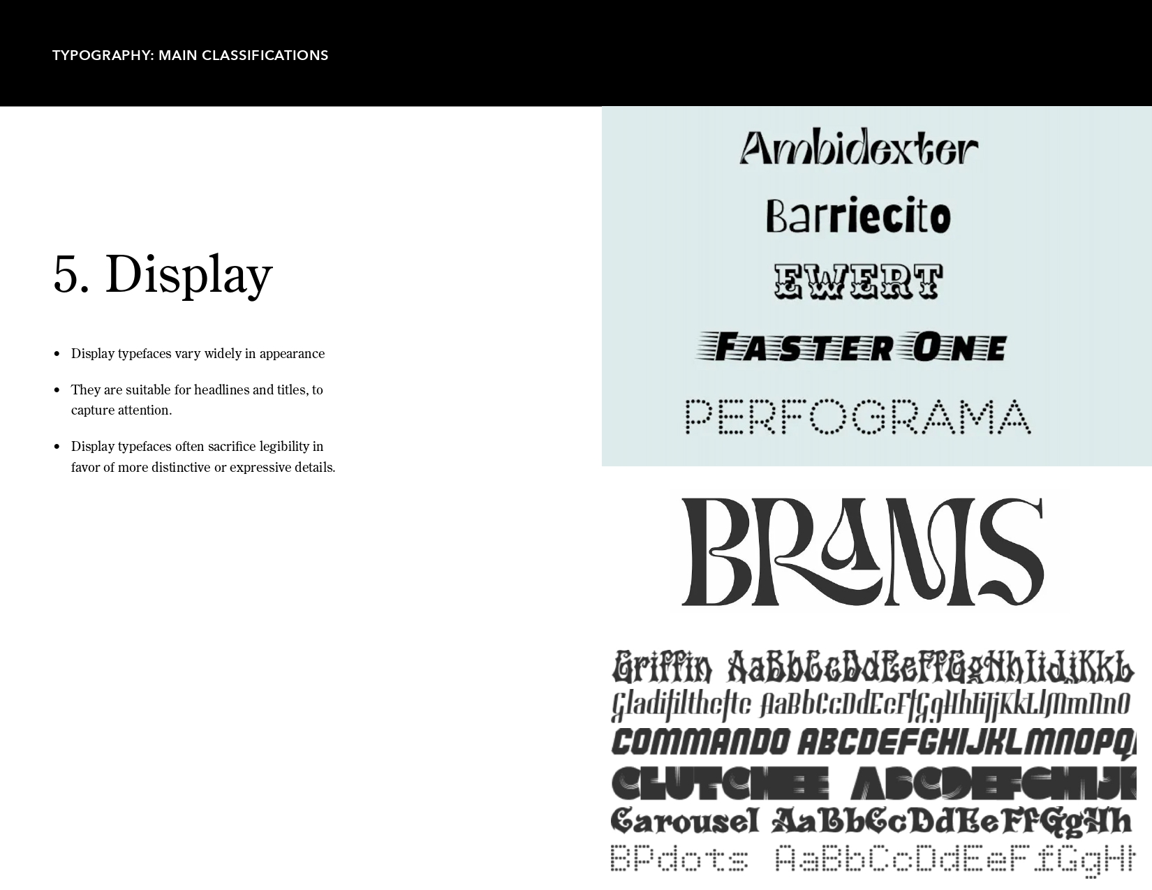
- Scripts & Display: When to use fluid, calligraphic strokes or expressive Display fonts to grab attention in headlines.
-
-
-
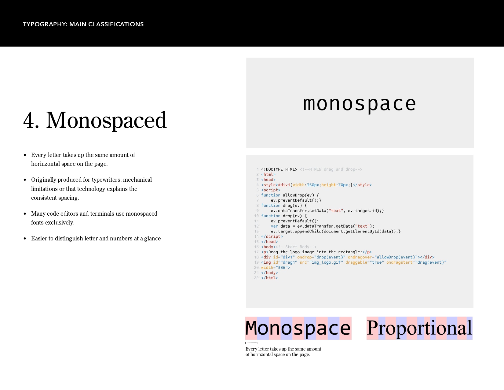
Monospaced: Why having every letter take up the same horizontal space is a game-changer for code.
Typography isn’t just about reading; it’s about the “feeling” of the words. Hope this helps your next project!
-