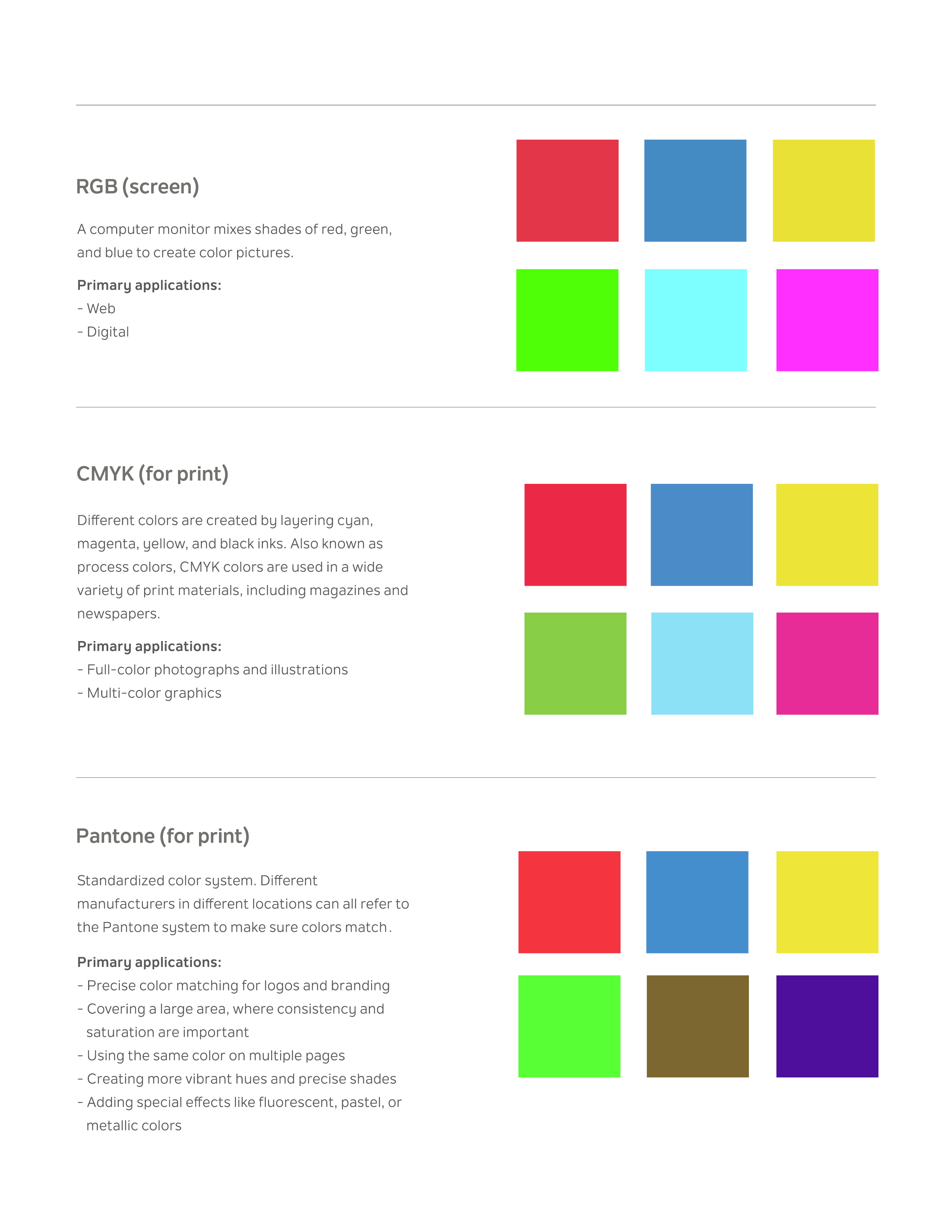
“Mastering color is about more than just aesthetics; it’s about technical precision. Whether a design is destined for a glowing screen or a physical printing press, choosing the right color model is critical. In this guide, I break down the three essential systems every professional designer must master to ensure consistency from pixel to paper.”
- RGB (Red, Green, Blue): Designed for digital screens, using light to create vibrant color pictures. Primary applications include web and digital platforms.
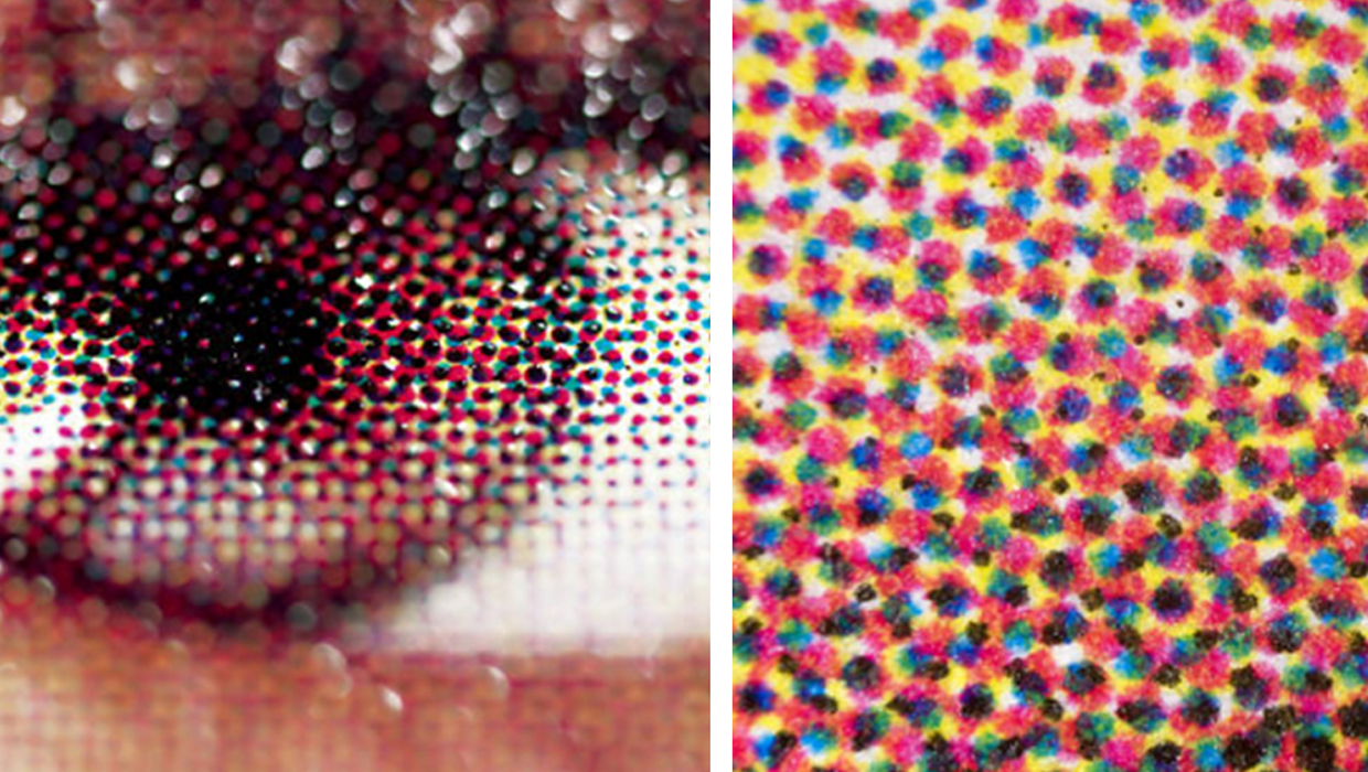
- CMYK (Cyan, Magenta, Yellow, Black): The standard for print materials, created by layering four process inks. Best for brochures, magazines, and physical branding.
- Pantone (PMS): A standardized color system for precise matching. Essential for corporate logos and specialized printing tasks where consistency is non-negotiable