
Concept: “Design is not just about aesthetics; it is about functional communication. In my work, I prioritize the science of typography to ensure every message is delivered with clarity. This study explores the technical factors that differentiate a ‘pretty’ font from a ‘functional’ one.”
Technical Pillars (Based on the Standards):
-
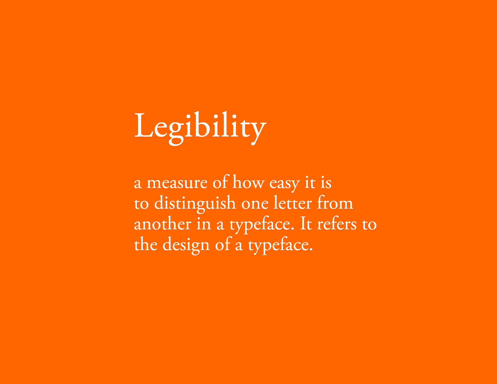
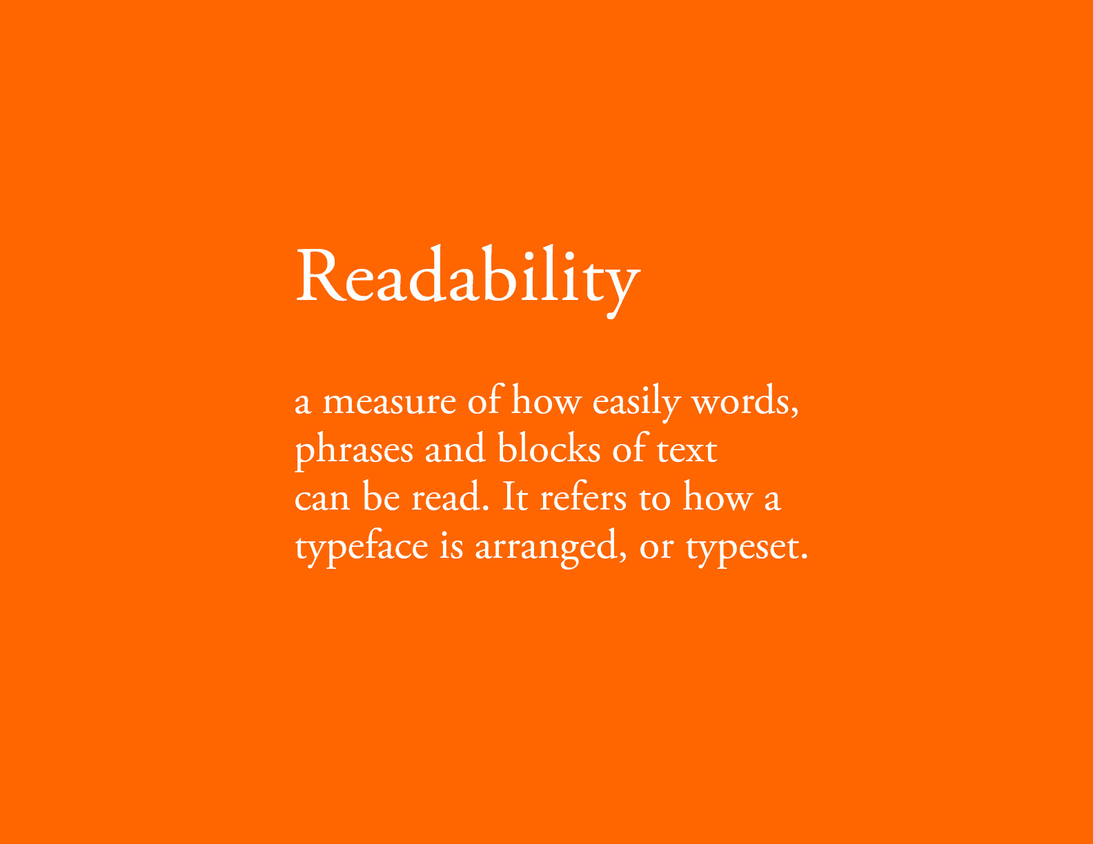
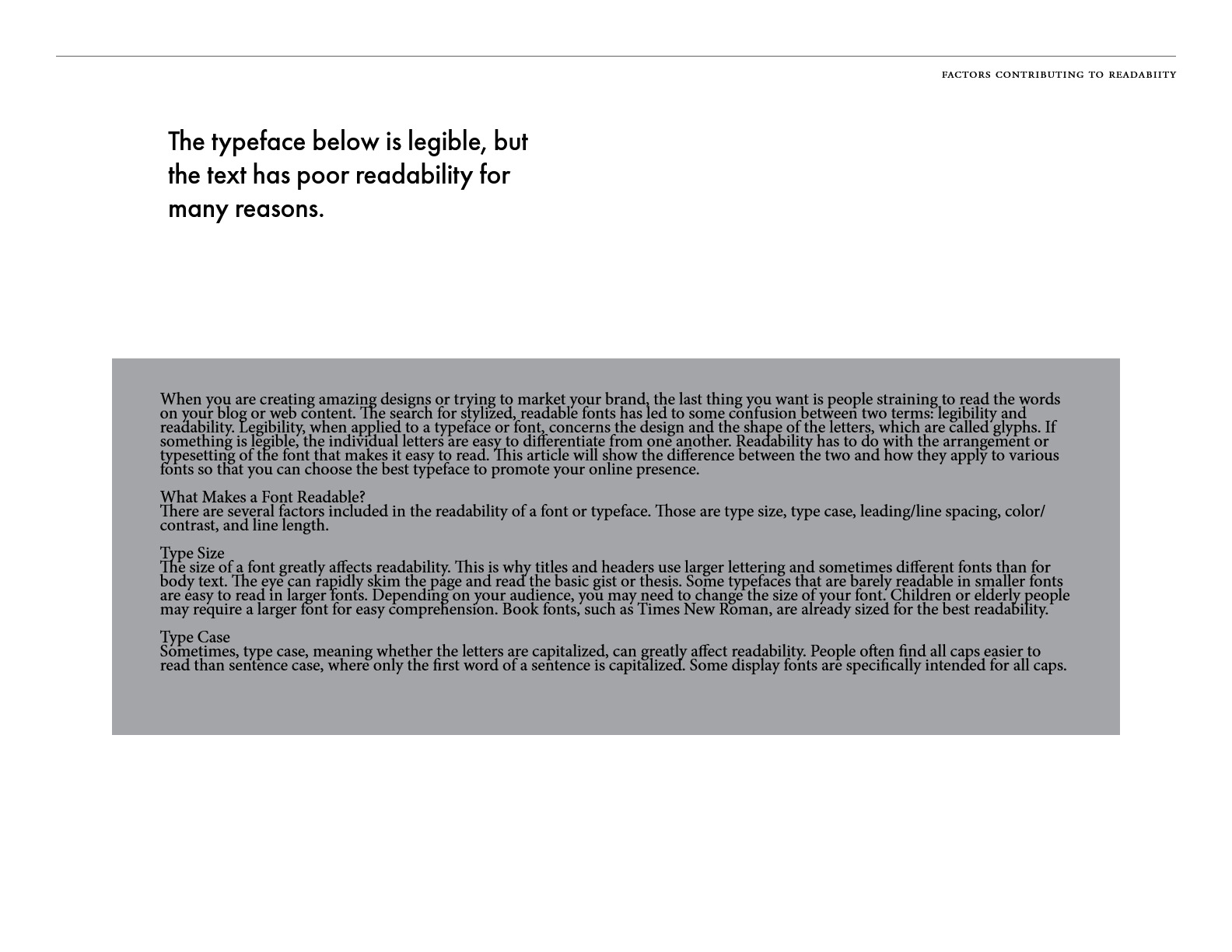
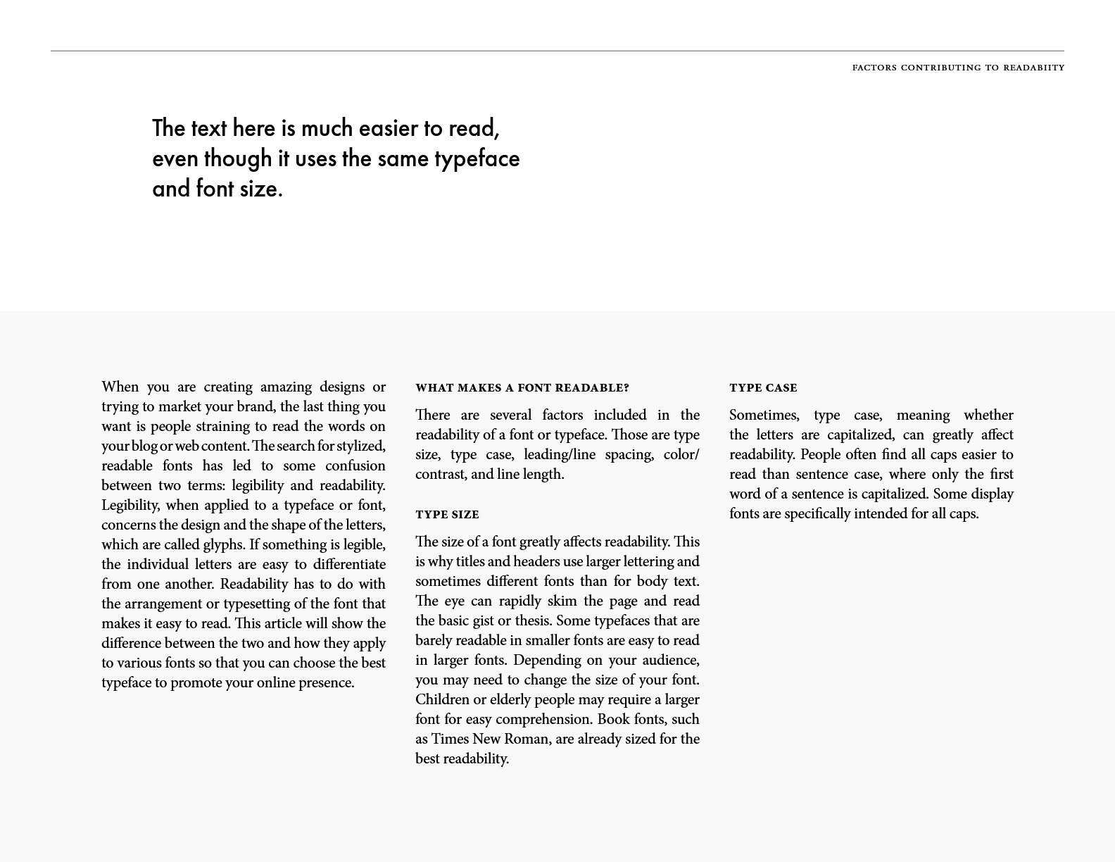
Legibility vs. Readability:
-
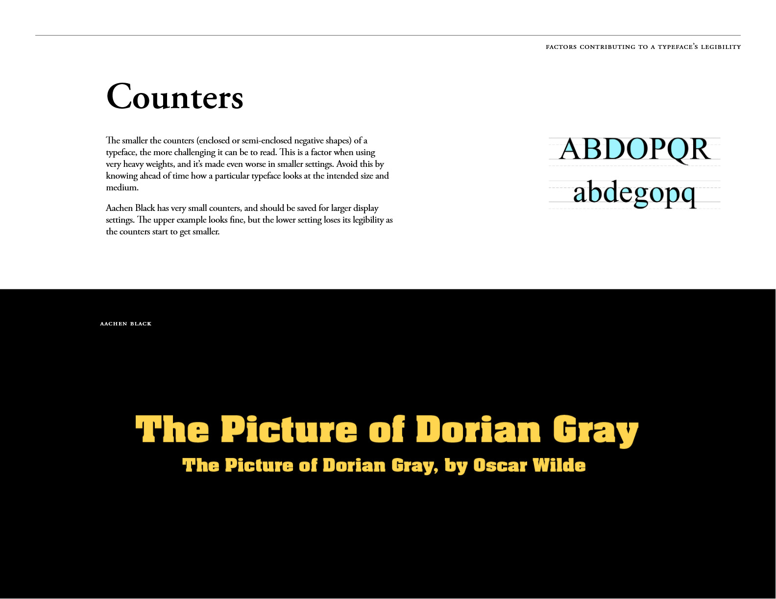
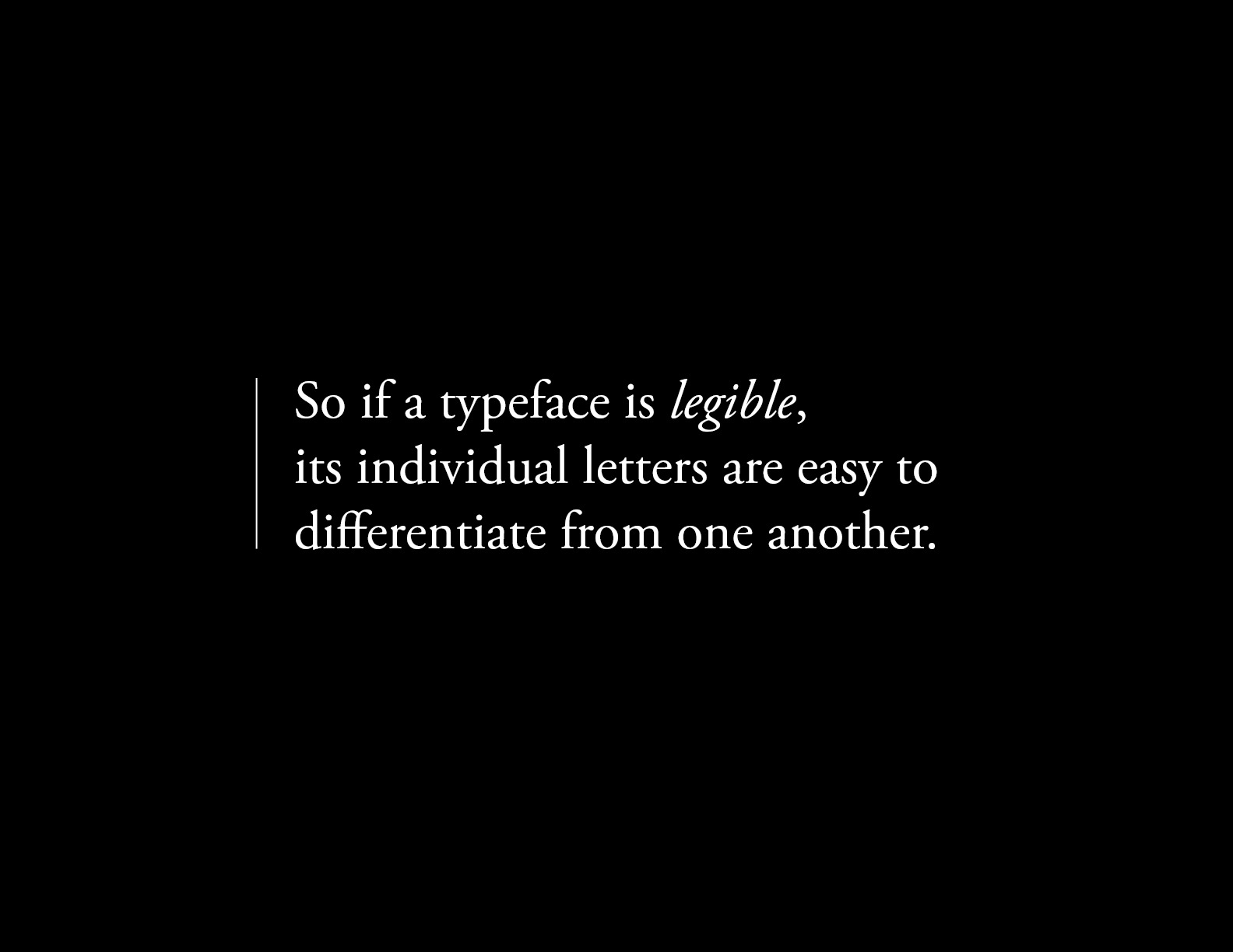
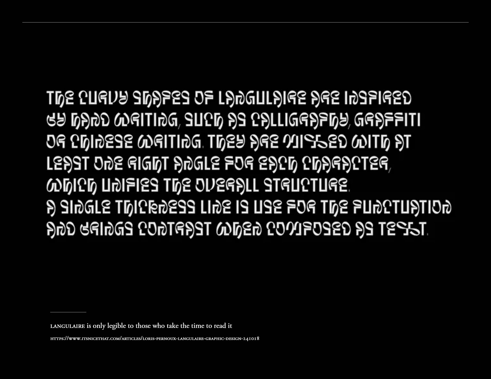
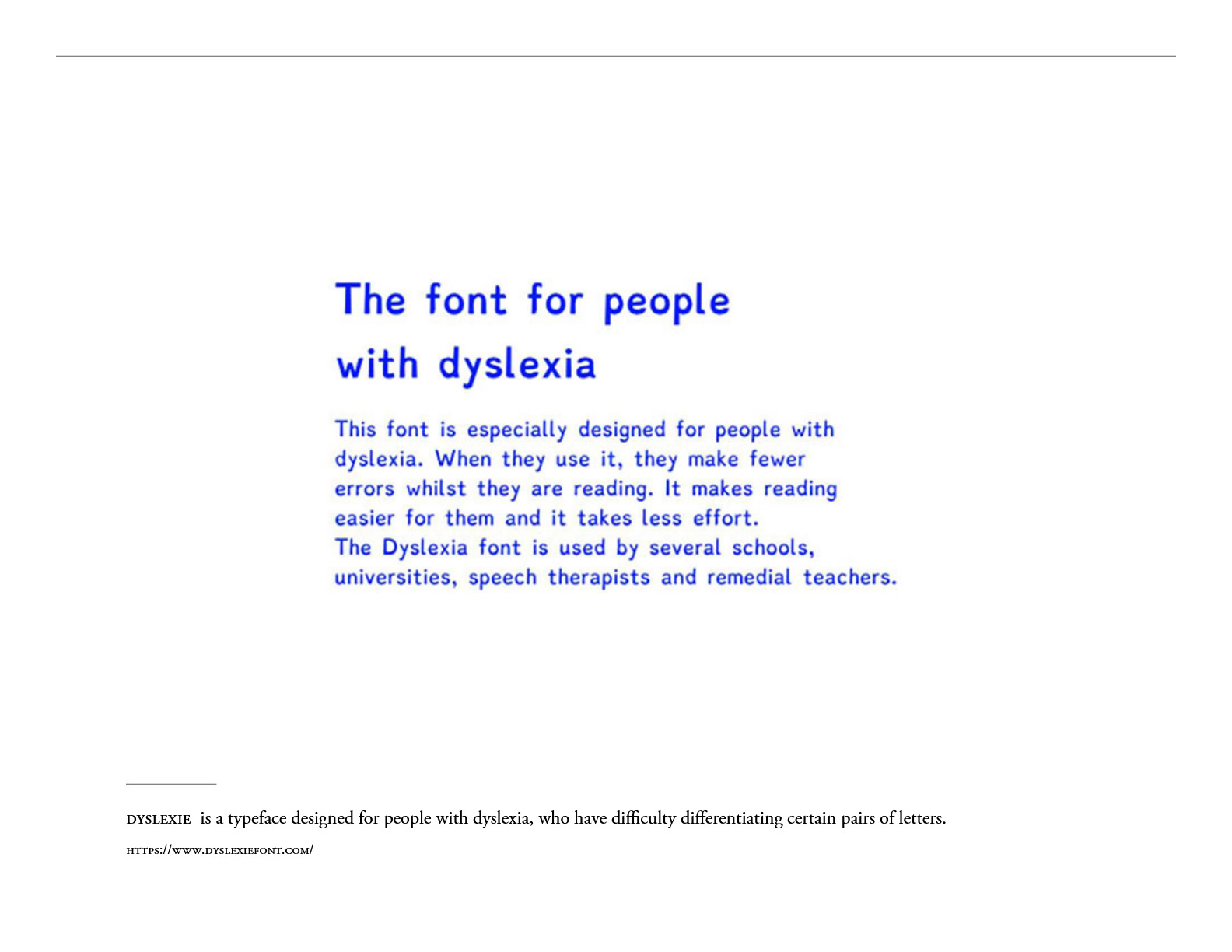
Legibility: Focuses on the typeface design—how easily one character can be distinguished from another.
-
Readability: Focuses on the arrangement—how the designer manages line spacing (Leading), line length, and contrast to ensure a comfortable reading experience.
-
-
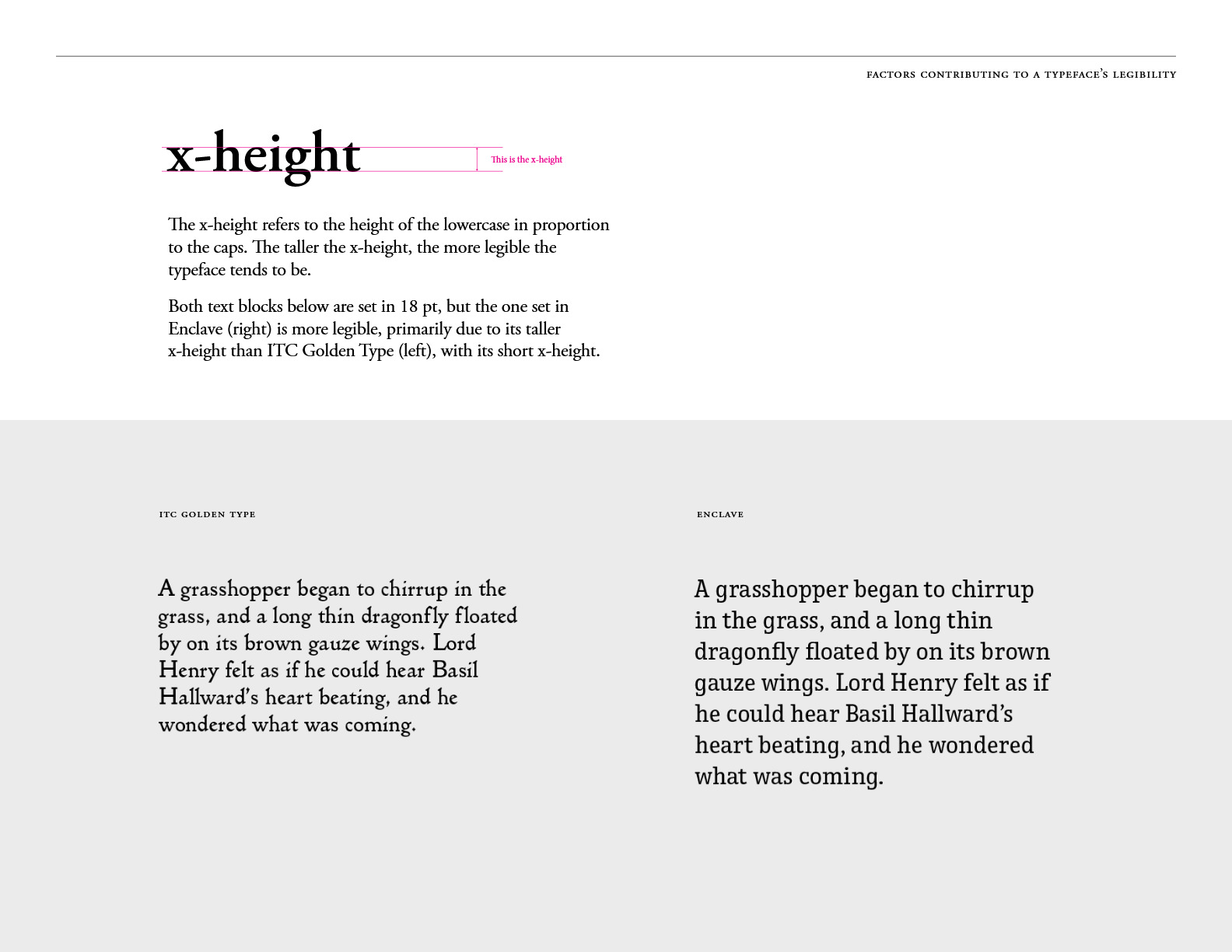
The x-height Factor:
-
“Through my research, I’ve implemented the ‘x-height’ rule: typefaces with taller lowercase proportions significantly improve legibility, especially in small-scale print or mobile displays.”
-
Visual Case Study (Analysis of the 2 Samples):
-
-
-
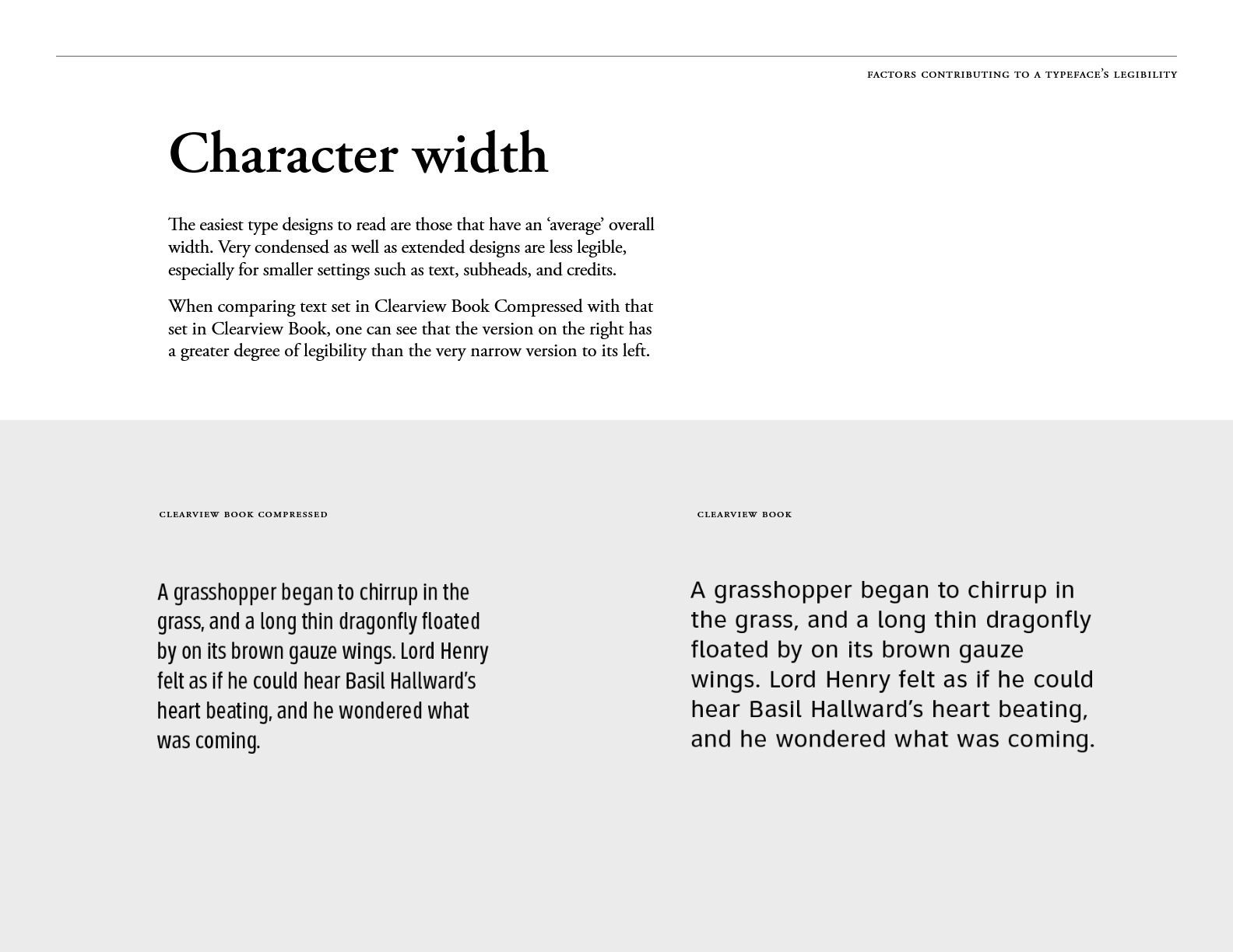
The Constraint: Comparing condensed vs. optimized character widths.
-
The Result: As shown in my visual analysis, condensed typefaces reduce reading speed. I select font widths that provide a balanced rhythm, ensuring the eye moves effortlessly across the text.
-
-
Core Principles in My Design Workflow:
-
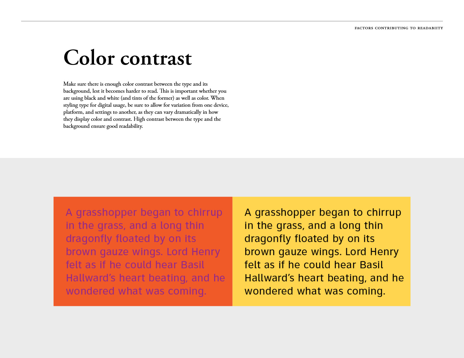
High Color Contrast: Ensuring a strict ratio between type and background for accessibility.
-
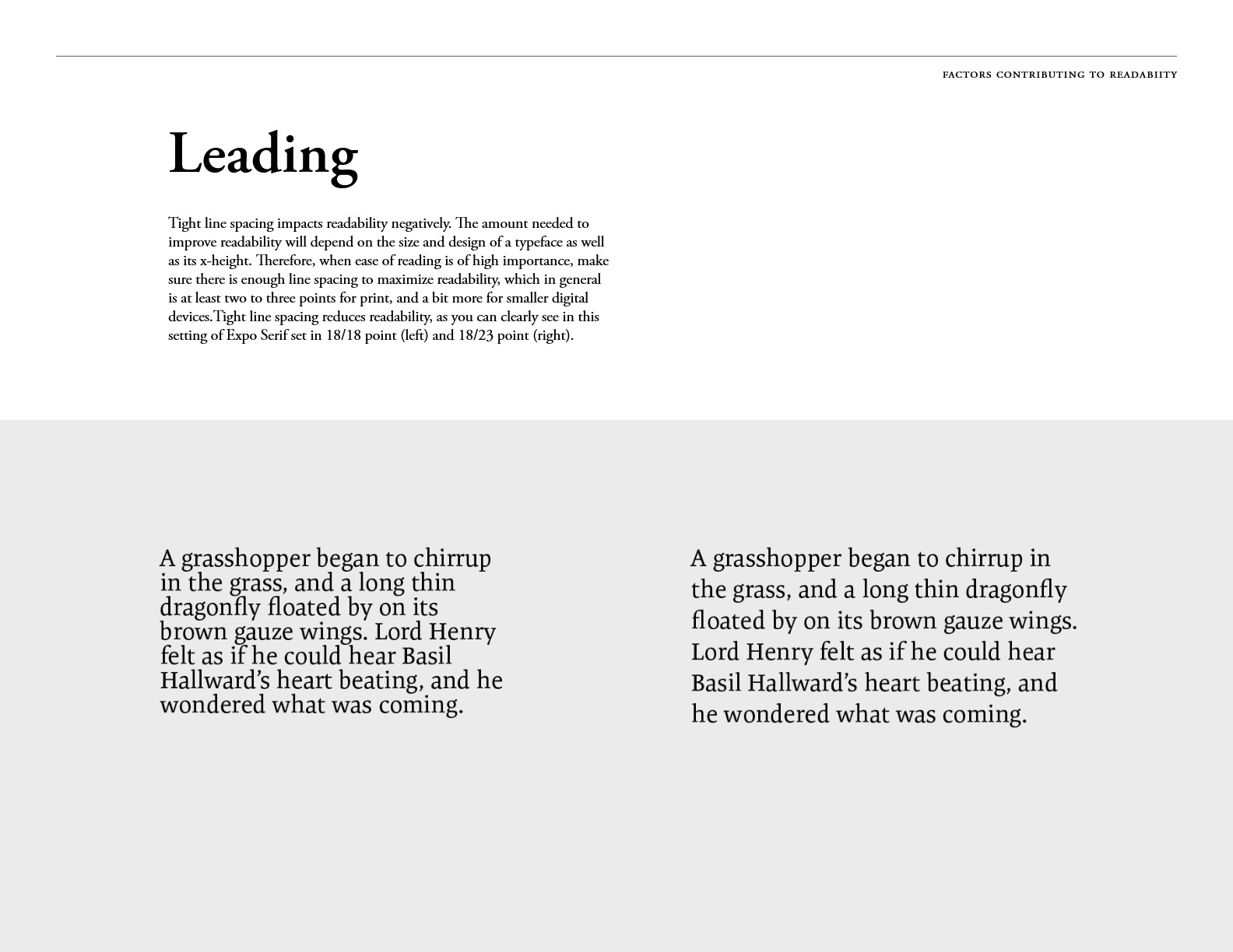
Optimized Leading: Setting line spacing (usually 2-3 points above font size) to prevent visual fatigue.
-
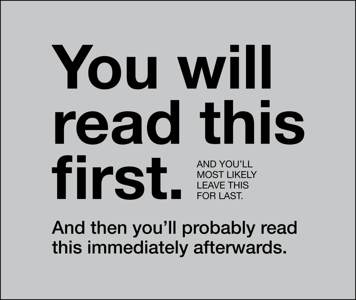
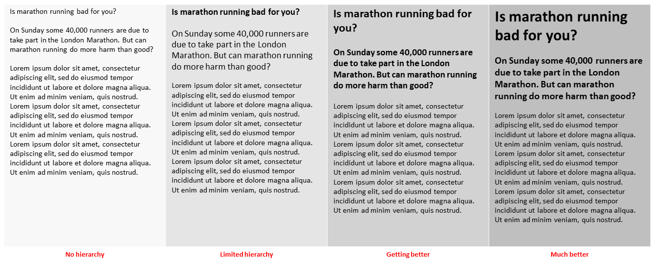
Strategic Hierarchy: Using weight and scale to guide the reader to the most important information first.