
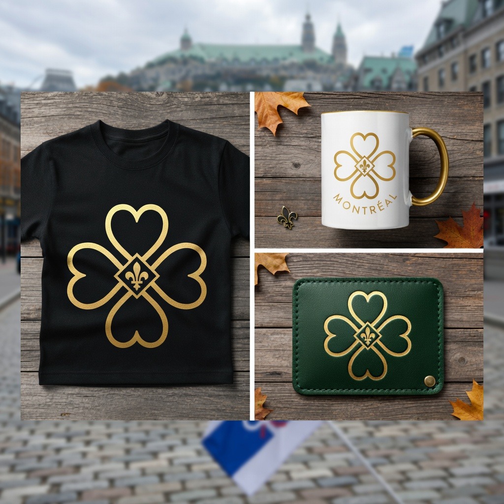
Ville-Marie sits as the historic, cultural, and financial heart of Montréal. This visual identity system redefines the borough’s civic presence—combining traditional heraldic references with clean, modern vector symmetry to create a highly adaptabl
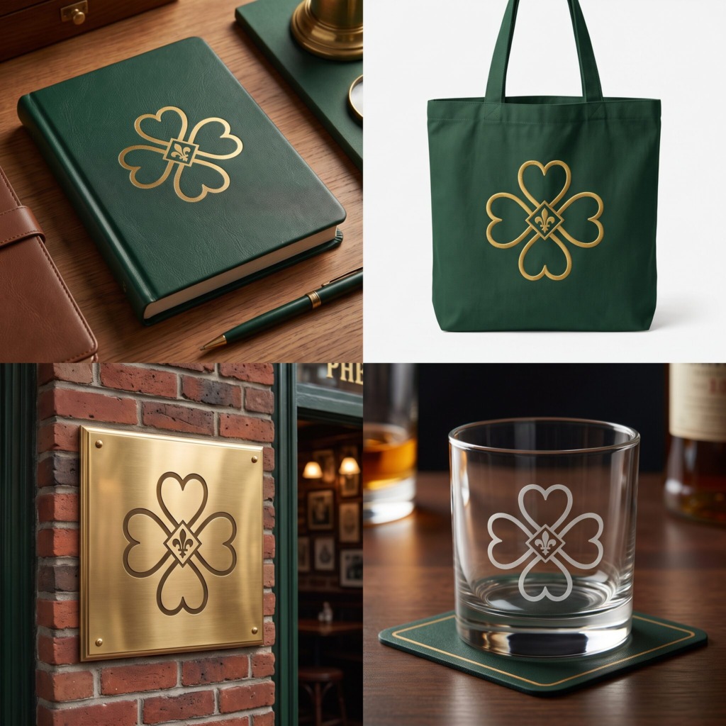
🏛️ DESIGN METHODOLOGY & SOFTWARE STACK
-
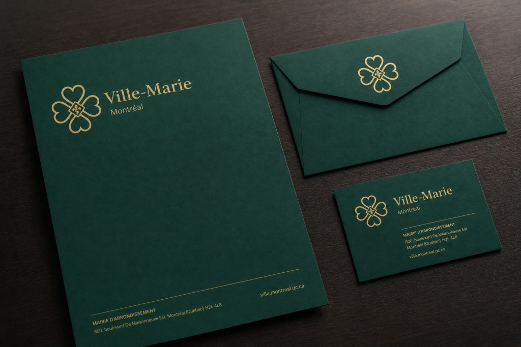
✒️ Vector Architecture (Adobe Illustrator): Constructed using precision grids and geometric alignment. The primary mark balances an extended four-leaf outline (referencing Montréal’s historic Irish Shamrock) around a centered Fleur-de-lis set within a geometric diamond frame.
-
🎨 Color Theory & Surface Rendering (Adobe Photoshop): Rendered in a civic palette—Deep Emerald Green representing sustainable urban spaces paired with Historic Metallic Gold for heritage prestige. Photoshop was used to build high-resolution surface textures, light maps, and real-world environmental mockups.
-
📐 Layout & Editorial Grid System (Adobe InDesign): Applied across multi-page brand guidelines, stationery systems, and municipal print collateral to enforce consistent layout grids and visual hierarchy.
-
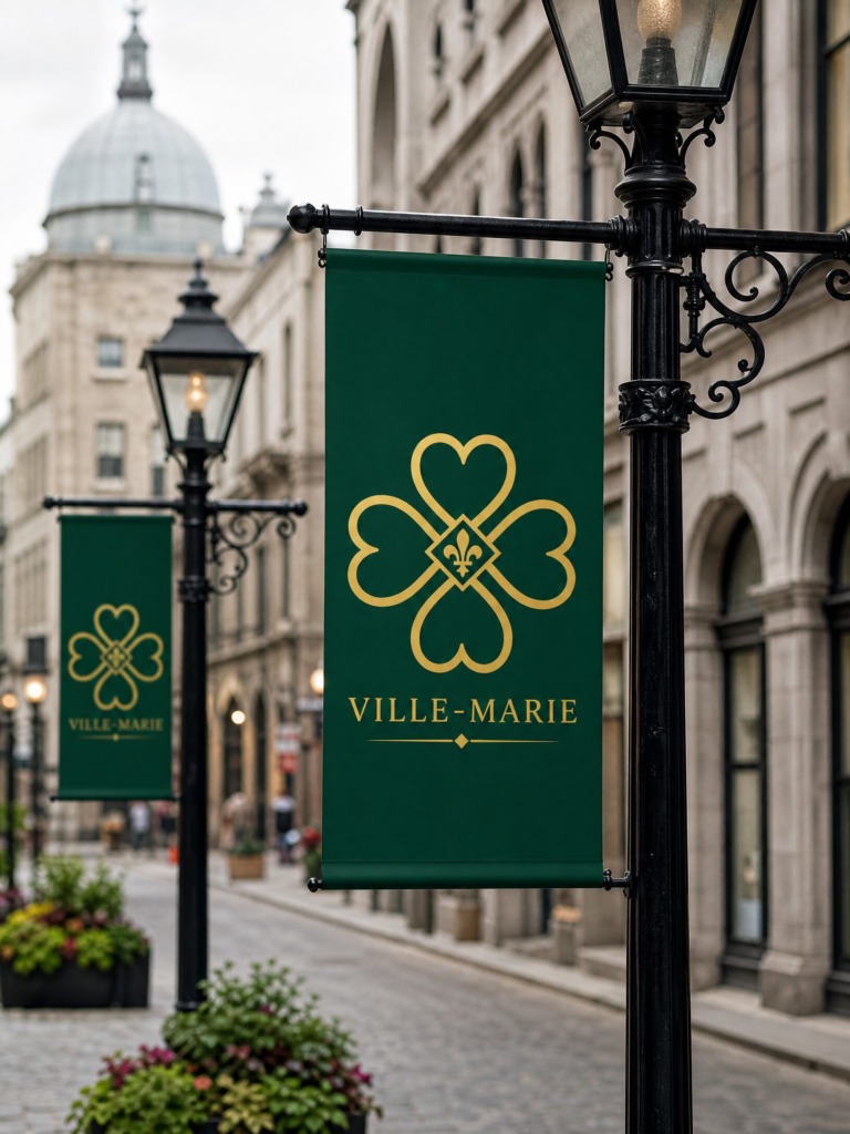
🖼️ Asset Curation & Photographic Enhancement: Sourced architectural and urban backdrops via Unsplash and Pexels, adjusting tone curves and applying subtle color overlays in Photoshop to maintain text and symbol legibility.
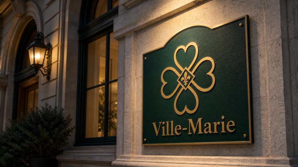
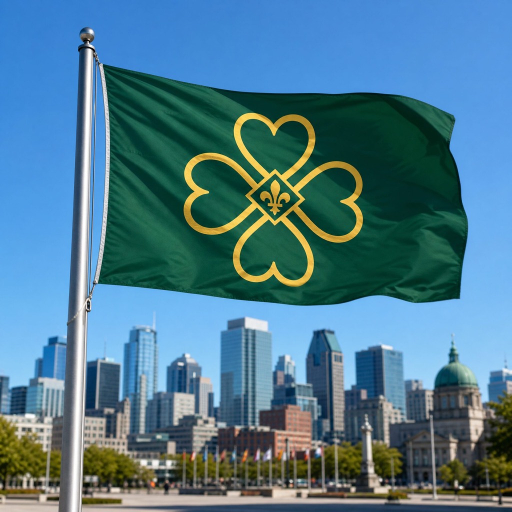
⚜️ SYMBOLIC INTEGRATION & BRAND LOCKUP
-
☘️ Four-Leaf Contour: Honors the Shamrock motif embedded within Montréal’s official heraldry.
-
⚜️ Central Fleur-de-lis: Represents the enduring French cultural identity at the core of Quebec.
-
🔤 Modular Lockup Flexibility: Engineered both as a standalone geometric brandmark for digital icons/merchandise and as a complete combination mark featuring clean typography for official civic communications.
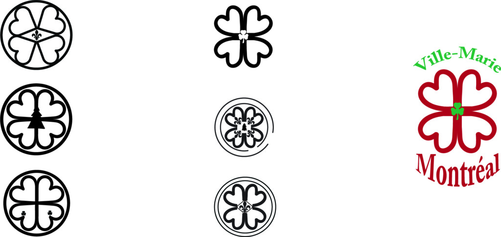
Old Versions
🎯 PROJECT OUTCOME
The finalized Ville-Marie visual identity delivers a scalable, timeless municipal mark built to perform seamlessly across digital platforms, physical signage, and print infrastructure.