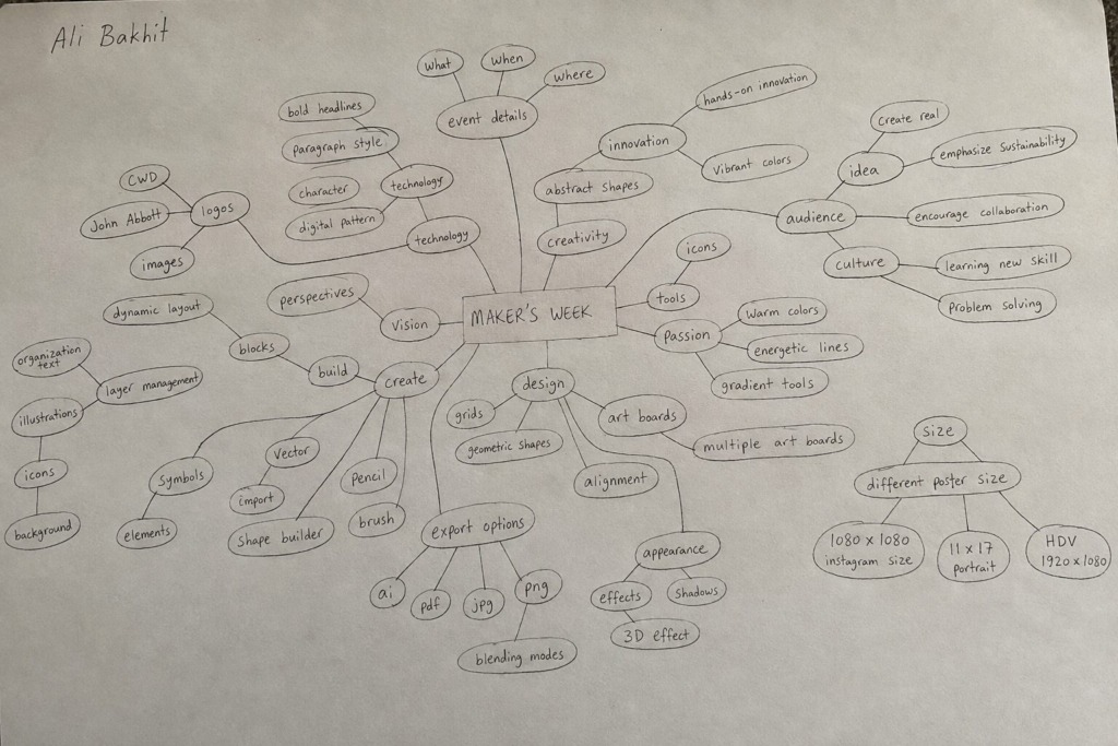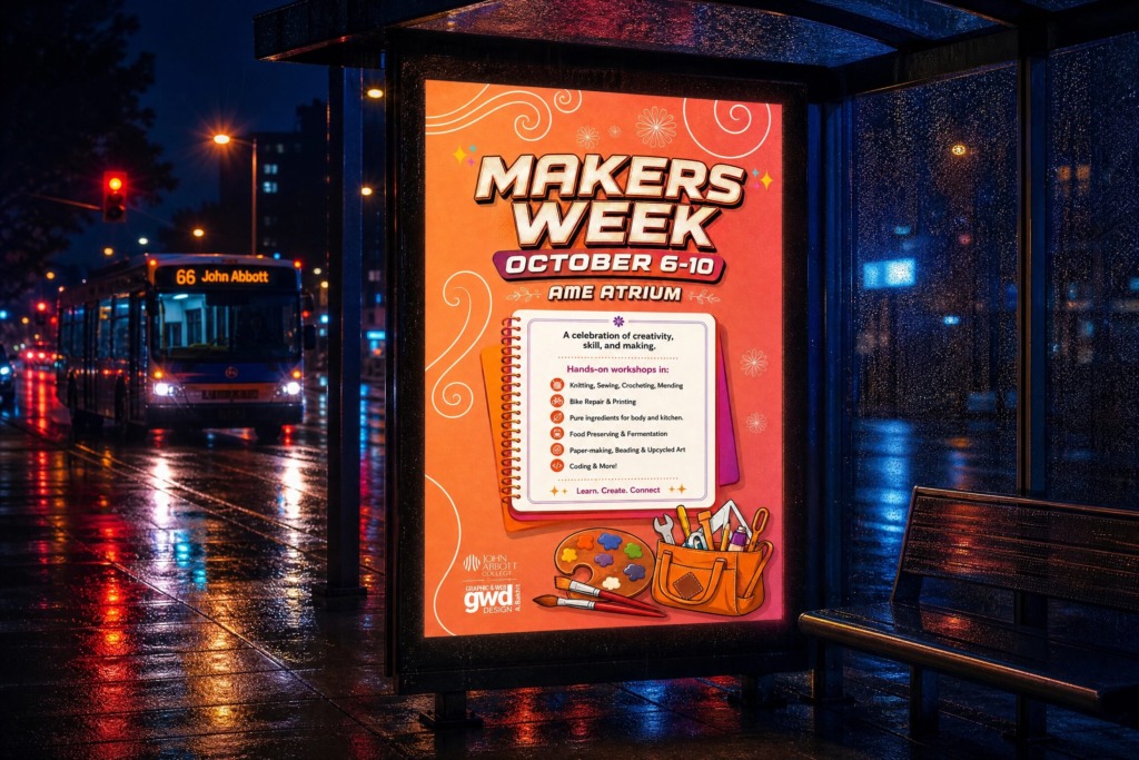
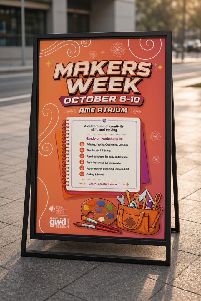
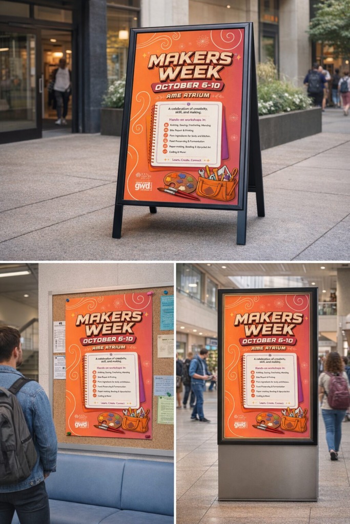
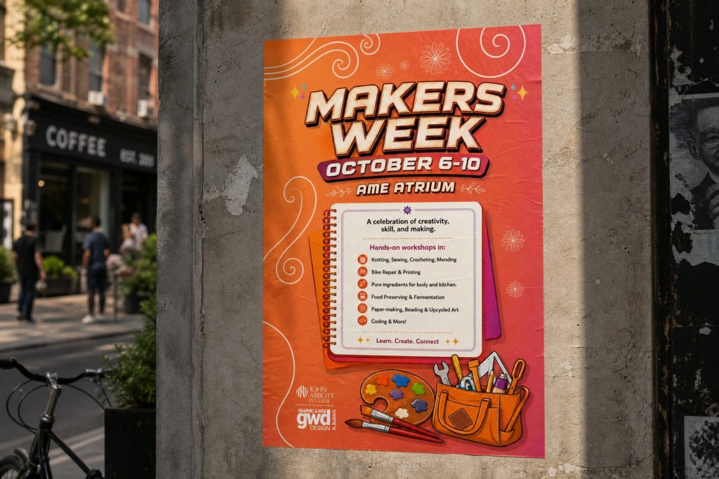
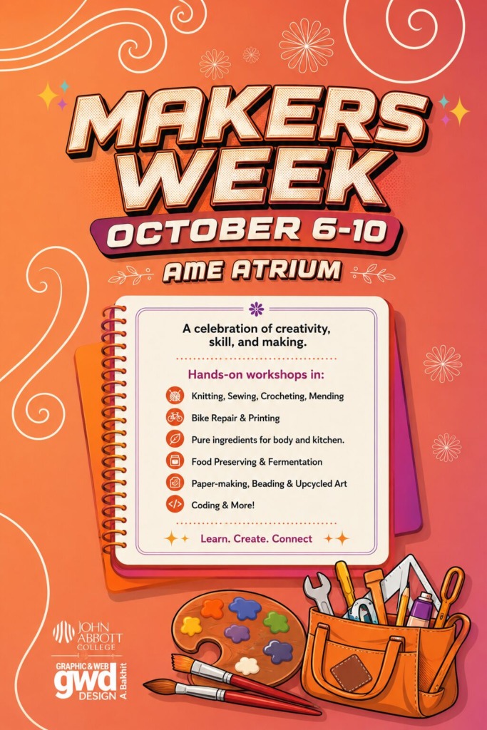
The core visual objective of the Makers Week event design system was to craft an inviting, energetic, and highly readable promotional campaign. The challenge required translating a multi-disciplinary event—encompassing traditional handcrafts, culinary arts, upcycled design, and digital coding—into a unified visual hero poster that drives community engagement and event attendance.
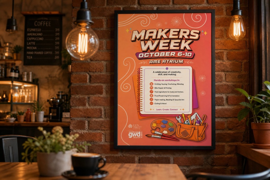
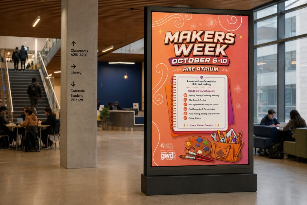
Through methodical typographic hierarchy, custom vector asset engineering, warm color psychology, and multi-software digital processing, the resulting poster establishes a perfect balance between tactile creative nostalgia and modern graphic polish.
🎨 COLOR ARCHITECTURE & VISUAL PSYCHOLOGY
-
Terracotta & Coral Warmth: The main background gradienttransitions from rich terracotta orange to soft peach and coral. This warm palette was selected to evoke human creativity, hands-on craft energy, and approachable community warmth.
-
Contrast & Legibility: A deep wine-red accent hue was introduced in the sub-headers and notebook borders to ground the bright background tones, ensuring all visual focal points remain sharp under various lighting conditions.
-
Tactile Paper Aesthetic: A cream-colored notebook card acts as the central focal point, breaking up the background gradient and creating an authentic “creative workspace” feel.
🛠️ TECHNICAL METHODOLOGY & SOFTWARE PIPELINE
-
Conceptual Layout & Wireframing: Initial spatial planning was executed to determine the visual weight between the headline typography, central information container, and bottom illustration cluster.
-
Vector Asset Engineering (Adobe Illustrator): All craft tools, paintbrushes, color palettes, and custom icon badging were drawn in Adobe Illustrator. Sharp vector paths were constructed for the workshop list icons (knitting yarn, bike gear, leaves, jar, paper sheet, code brackets) to guarantee scalability across print and digital media formats.
-
Image Compositing & Color Grading (Adobe Photoshop): Photoshop was utilized for texture integration, tone matching, and multi-layered color correction. Color overlay layers and subtle drop-shadow masks were applied behind the notebook and tool bag to build tactile depth without cluttering the typography.
-
Color Reference & Asset Sourcing: Curated swatch references were sourced from moodboard sites like Adobe Color and Behance to establish a nostalgic autumn-craft spectrum, while high-resolution paper textures were composited into the background.
⚡ DESIGN CHALLENGES & TECHNICAL SOLUTIONS
-
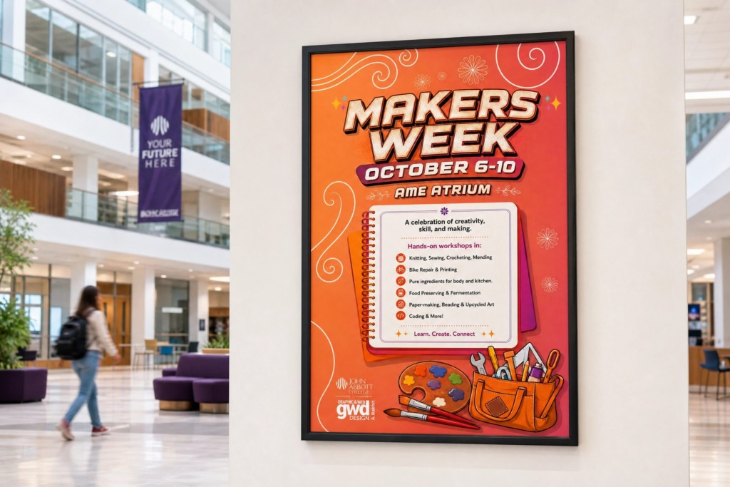
Resolving Typographic Conflicts: The initial design layout suffered from competing display fonts. This was resolved by establishing a strict 3-tier font system: a retro 3D dimensional display typeface for the main header (MAKERS WEEK), a bold geometric sans-serif for event details (OCTOBER 6-10 / AME ATRIUM), and a clean modern sans-serif for the workshop bullet points inside the notebook.
-
Organizing Multi-Category Content: Rather than displaying an unformatted text block, the 6 core workshop categories were arranged into a clean, icon-anchored vertical grid inside the notebook container with consistent dot-leader dividers.
-
Brand Alignment & Logo Anchoring: Official sponsor marks—including the John Abbott College mark and custom GWD Design logo—were unified with consistent padding in the lower-left corner, anchoring the composition professionally.
📐 TECHNICAL SPECIFICATIONS
-
Primary Accent Palette: Hex #E05A36 (Terracotta), Hex #F79467 (Peach), Hex #5C1D24 (Deep Wine)
-
Grid System: Centered Single-Column Vertical Hierarchy
-
Print Resolution: 300 DPI / CMYK Ready
-
Digital Presentation: RGB / 8k Master Asset
-
Production Stack: Adobe Illustrator, Adobe Photoshop, Figma
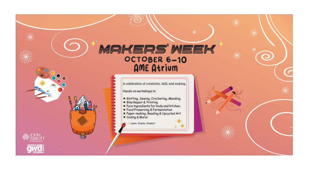
Old Versions:
“Great event branding translates diverse human activities into a single cohesive visual story.”
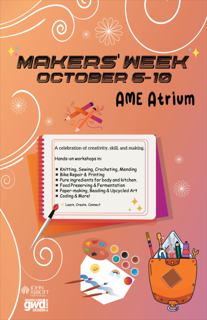
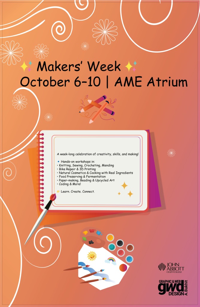
Brain Storming: