💎 Breaking the Grid: A Professional Case Study on Editorial Poster Architecture & Typographic Expressionism
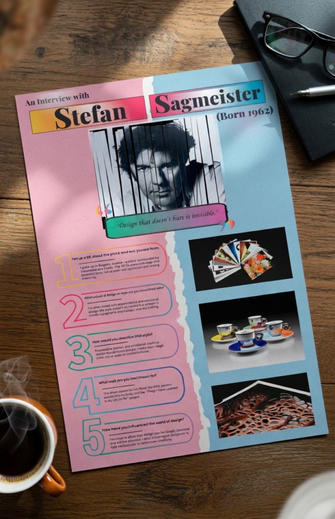
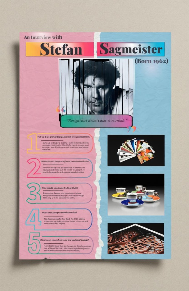
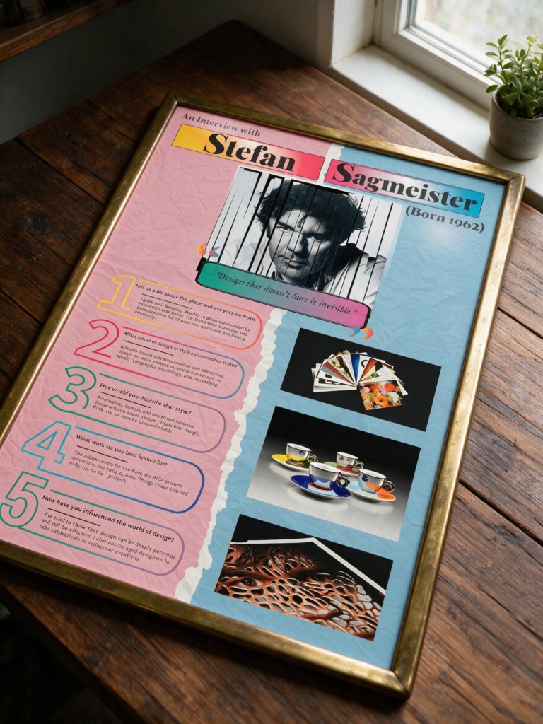
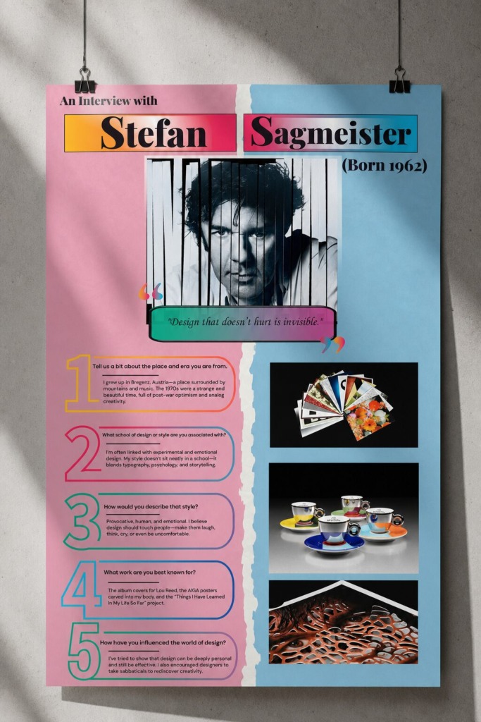
In high-end visual communication, a professional poster layout must do more than organize raw data; it must visually embody the psychological substance of its subject. This comprehensive case study analyzes the engineering of a premium 11 in 17 in large-format project titled “Designer Interview: Stefan Sagmeister”. Designed completely around the iconoclastic methodology of the featured master, the core objective was to establish a perfect balance between disruptive, emotional artistry and tight, grid-based legibility.
The primary design challenge centered around creating an aggressive, tactile visual poster layout while maintaining seamless multi-software alignment and preservation of absolute text readability over highly textured canvas layers.
🚀 The Core Strategic Framework:
-
🎯 Aesthetic Convergence: Building a unified poster narrative where structural content organization directly reflects the raw, provocative soul of the featured subject.
-
👁️ Readability Over Chaos: Solving complex layout conflicts by embedding high-contrast structural containment elements beneath copy blocks, preserving typographic hierarchy.
-
🤝 Commercial Adaptability: Demonstrating how experimental design methods can be captured inside clean, publication-ready poster layouts without losing their artistic edge.
🛠️ Advanced Technical Execution & Cross-Software Workflow:
-
🎨 Tactile Asset Manipulation (Adobe Photoshop): Sourced raw editorial portrait photography and structural texture maps from premium digital libraries. To manifest the signature physical slash-and-cut style, the portrait was treated with precise vector masks and slicing techniques. Implemented multi-layered adjustment configurations to balance color fidelity, utilizing a sophisticated palette consisting of a vivid dual-gradient split of hyper-saturated pink
FF5E97to amber and cyan to deep turquoise, overlaid on an organic, crumpled-paper background map. -
📐 Vector Wireframing & Geometric Assets (Adobe Illustrator): Engineered custom number glyphs (1 through 5) with vibrant multi-color vector gradient fills to anchor each Q&A section. These numeral frames serve as explicit visual anchors to control eye flow across the multi-column poster, keeping the layout perfectly indexed while adopting an avant-garde tone.
-
🗂️ Typography Systems & Grid Engineering (Adobe InDesign): Assembled the overarching “Designer Interview: Stefan Sagmeister” poster on a precise 11 in times 17 in document grid. Established high-contrast typography hierarchy by setting headers in a commanding, high-stroke serif font reminiscent of premium editorial formats, contrasted with ultra-legible, modern sans-serif body text. Solved the problem of back-texture bleeding by framing text within clean bounding cards wrapped in fine color-coded borders, successfully honoring the “CRAP” design principles (Contrast, Repetition, Alignment, Proximity).
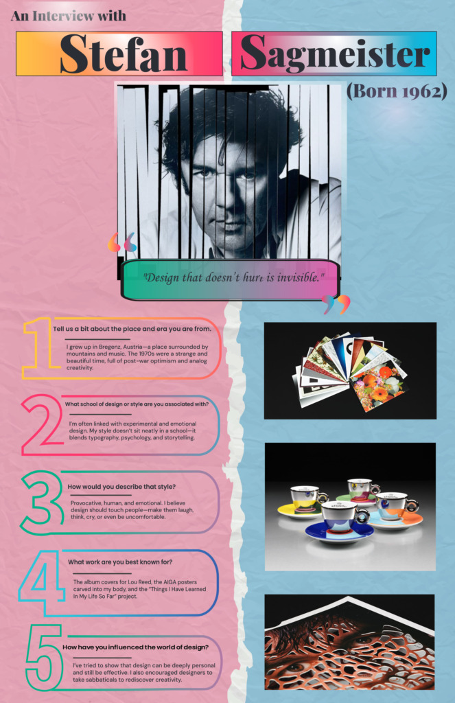
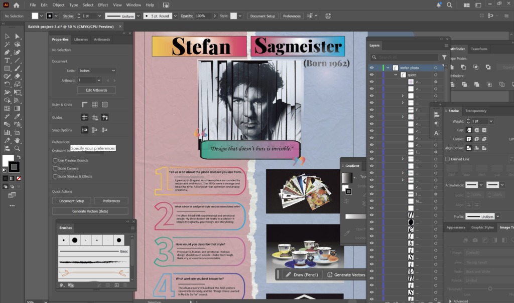
Every compositional choice—from the central torn-paper split to the glowing drop-quote container reading “Design that doesn’t hurt is invisible”—demonstrates a strict balance between absolute production control and raw creative exploration on this high-end poster.
✨ Designed by Ali Bakhit
#alibakhitdesign #GraphicDesignPortfolio #CaseStudy #PosterDesign #TypographyInspiration #StefanSagmeister #DesignerInterview #AdobeInDesign #PhotoshopArt #VisualHierarchy #PrintLayout