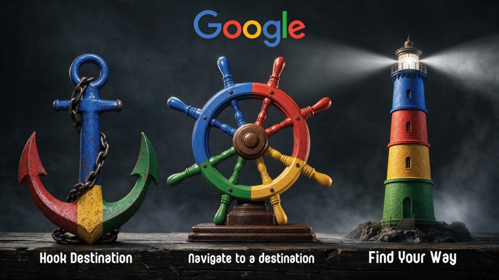
In commercial advertising and visual identity strategy, creating a cohesive print campaign requires translating abstract utility concepts into striking visual metaphors. This case study details the complete end-to-end creative direction, photo manipulation, vector integration, and campaign execution for a series of three promotional posters designed for Google: “Find Your Way”, “Hook Destination”, and “Navigate to a Destination”.
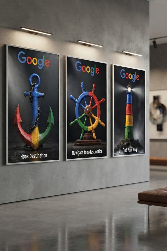
The core objective was to construct a unified ad campaign that positions Google Maps and navigation tools as essential everyday guidance devices. By reimagining familiar maritime and nautical objects—a lighthouse, an anchor, and a ship’s steering wheel—through Google’s iconic four-color identity palette, the campaign bridges classic guidance iconography with modern digital navigation.
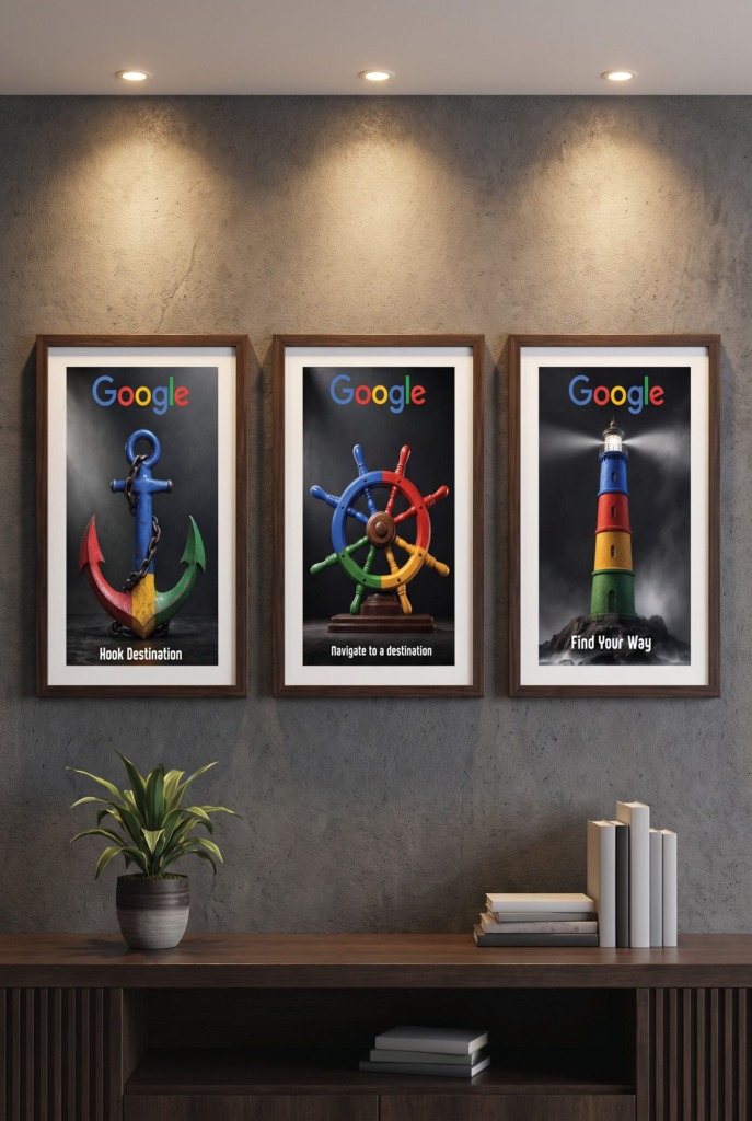
🌐 CONCEPTUAL STRATEGY & METAPHORICAL VISION
-
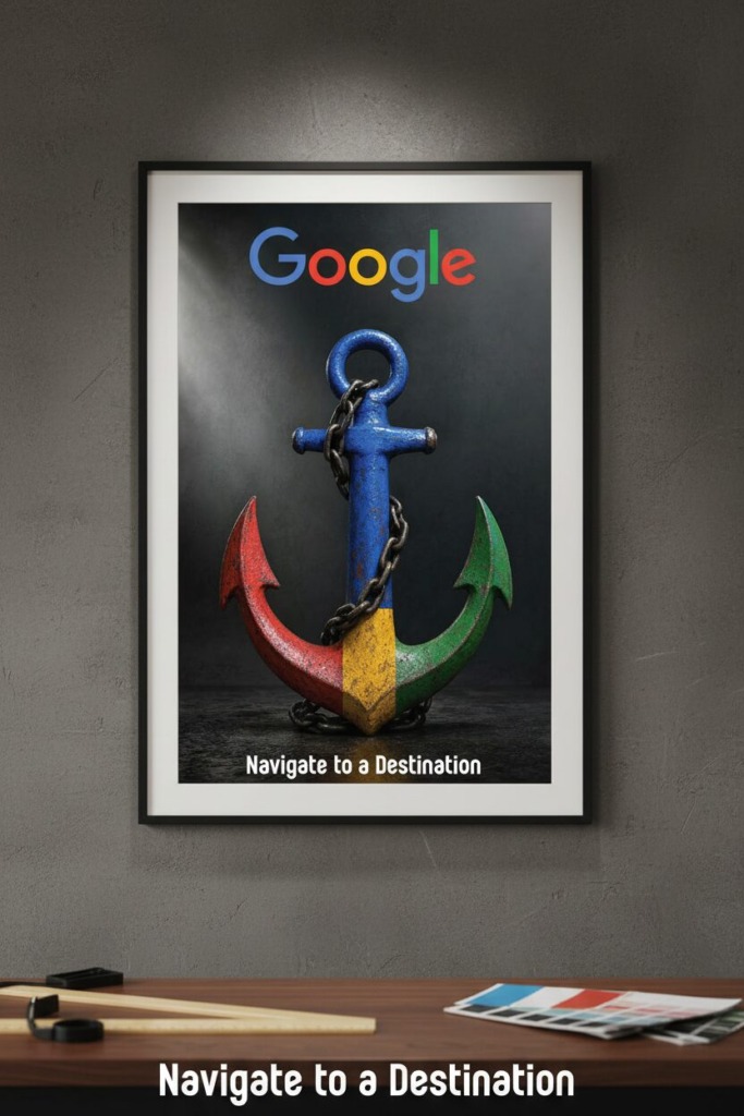
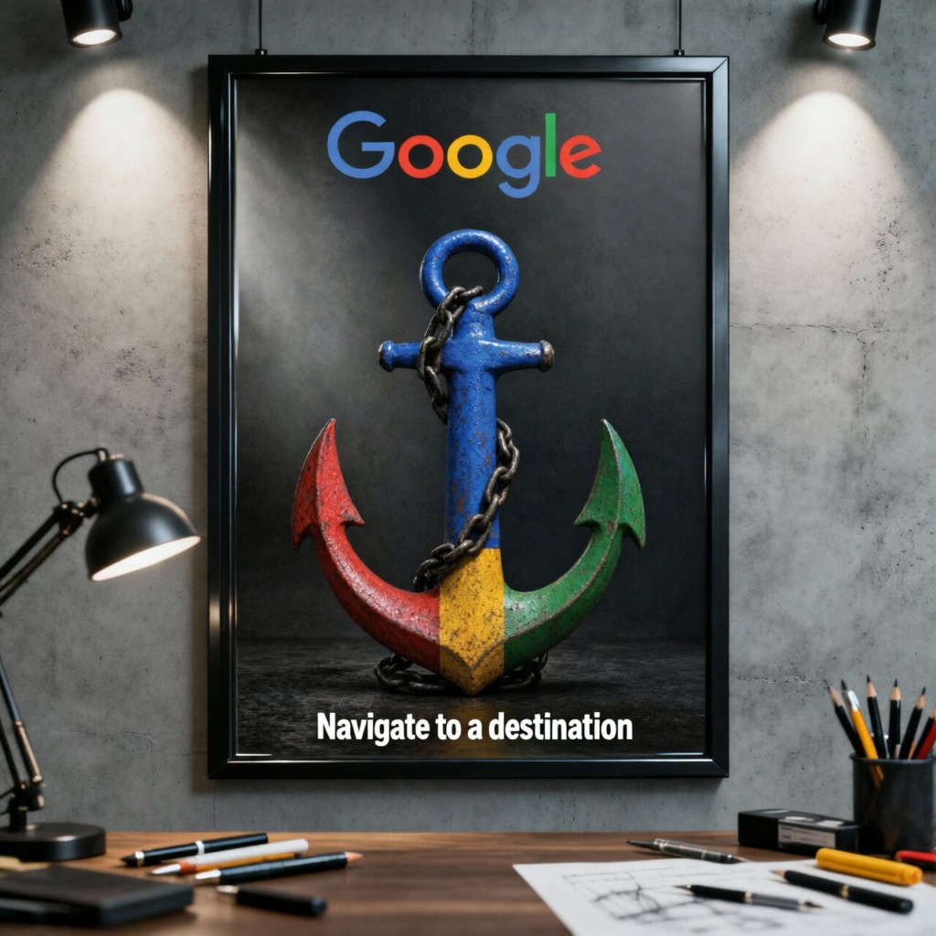
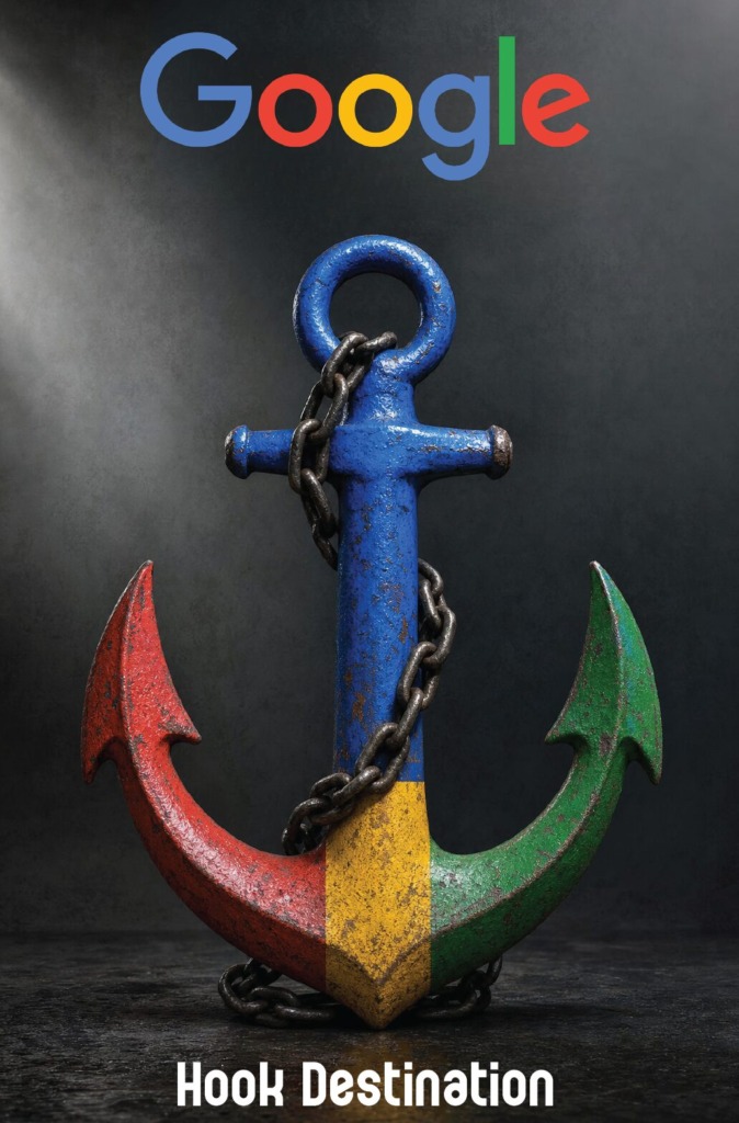
⚓ Google – Hook Destination (The Anchor Metaphor): Utilizes a solid metallic anchor rendered in Google’s primary colors (Blue #4285F4, Red #EA4335, Yellow #FBBC05, Green #34A853) to symbolize arriving at a fixed, secure destination. It conveys stability, precision, and finality when pinning a location on Google Maps.
-
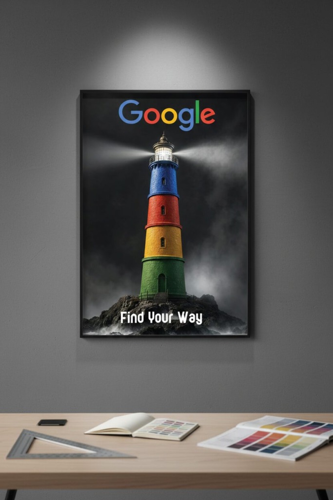
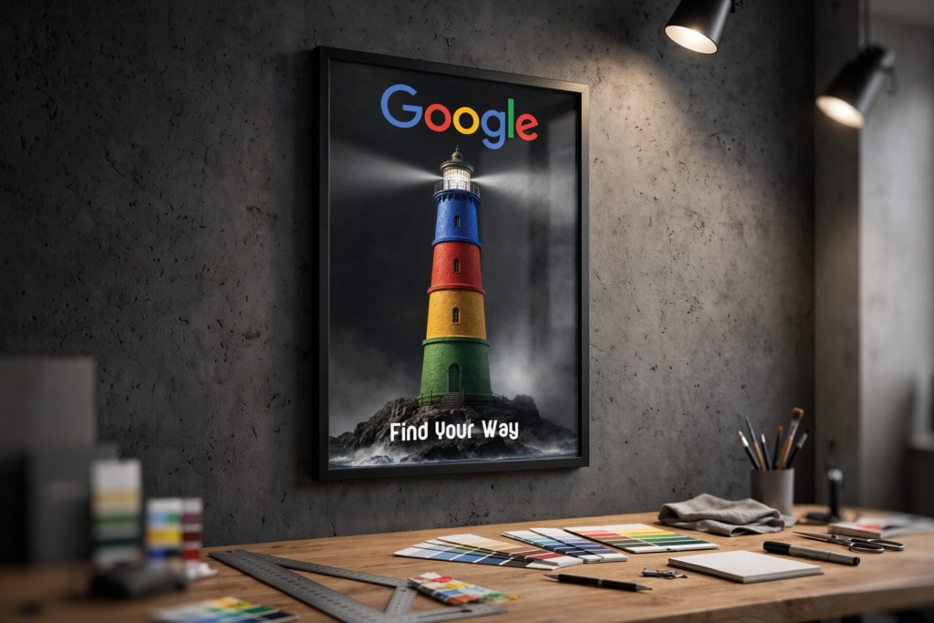
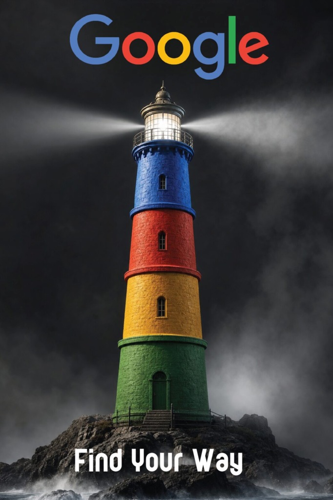
🗼 Google – Find Your Way (The Lighthouse Metaphor): Features a high-contrast illuminated lighthouse styled with Google’s color sequence, projecting a beam of clarity through dark fog. It represents guidance, direction, and illumination in unfamiliar surroundings.
-
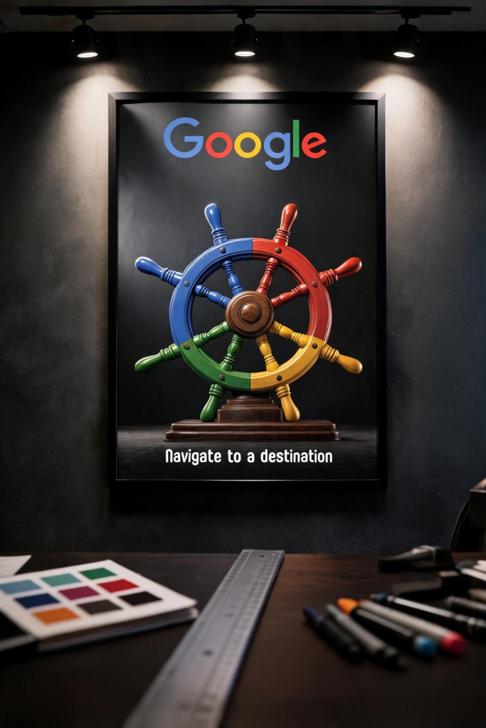
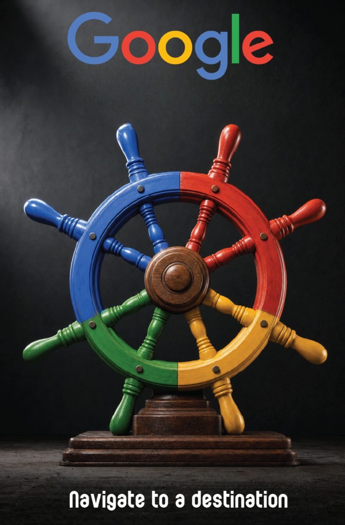
☸️ Google – Navigate to a Destination (The Ship Wheel Metaphor): Incorporates a wooden ship’s steering wheel divided into Google’s color quadrant, representing user control, route maneuvering, and active exploration.
🧗 TECHNICAL CHALLENGES & DESIGN OBSTACLES
-
🧩 Unified Campaign Aesthetics: Maintaining consistent lighting, texture depth, tonal scale, and color distribution across three distinct physical objects (wood, metal, and painted stone).
-
📸 Color Layer Isolation & Asset Integration: Sourcing raw, high-resolution imagery and using advanced Photoshop masking to apply custom color layers without losing natural shadows, specular highlights, or surface textures.
-
👁️ Visual Balance & Minimalist Typography: Placing high-contrast primary headlines (“Find Your Way”, “Hook Destination”, “Navigate to a Destination”) and official Google branding without cluttering the dark, atmospheric backgrounds.
🛠️ SOFTWARE STACK & TECHNICAL WORKFLOW
-
🎨 Adobe Photoshop: Served as the primary photo manipulation environment. Advanced techniques included multi-pass layer masking, blend modes (Multiply, Overlay, and Soft Light), frequency separation, color balance curve tuning, and shadow reconstruction to apply Google’s primary colors onto physical textures realistically.
-
✏️ Adobe Illustrator: Used for vector logo placement, vector path adjustments, typography kerning, asset alignment, and preparing master layout structures.
-
📰 Prepress & Color Calibration: Converted assets into 100% CMYK color space for print consistency, preserving deep rich blacks (#000000 / CMYK rich black) and sharp white typography contrast.
TURNING GOOGLE BRAND COLORS INTO METAPHORICAL AD CAMPAIGNS
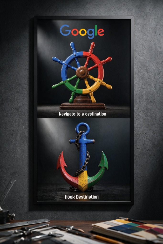
Old Versions:
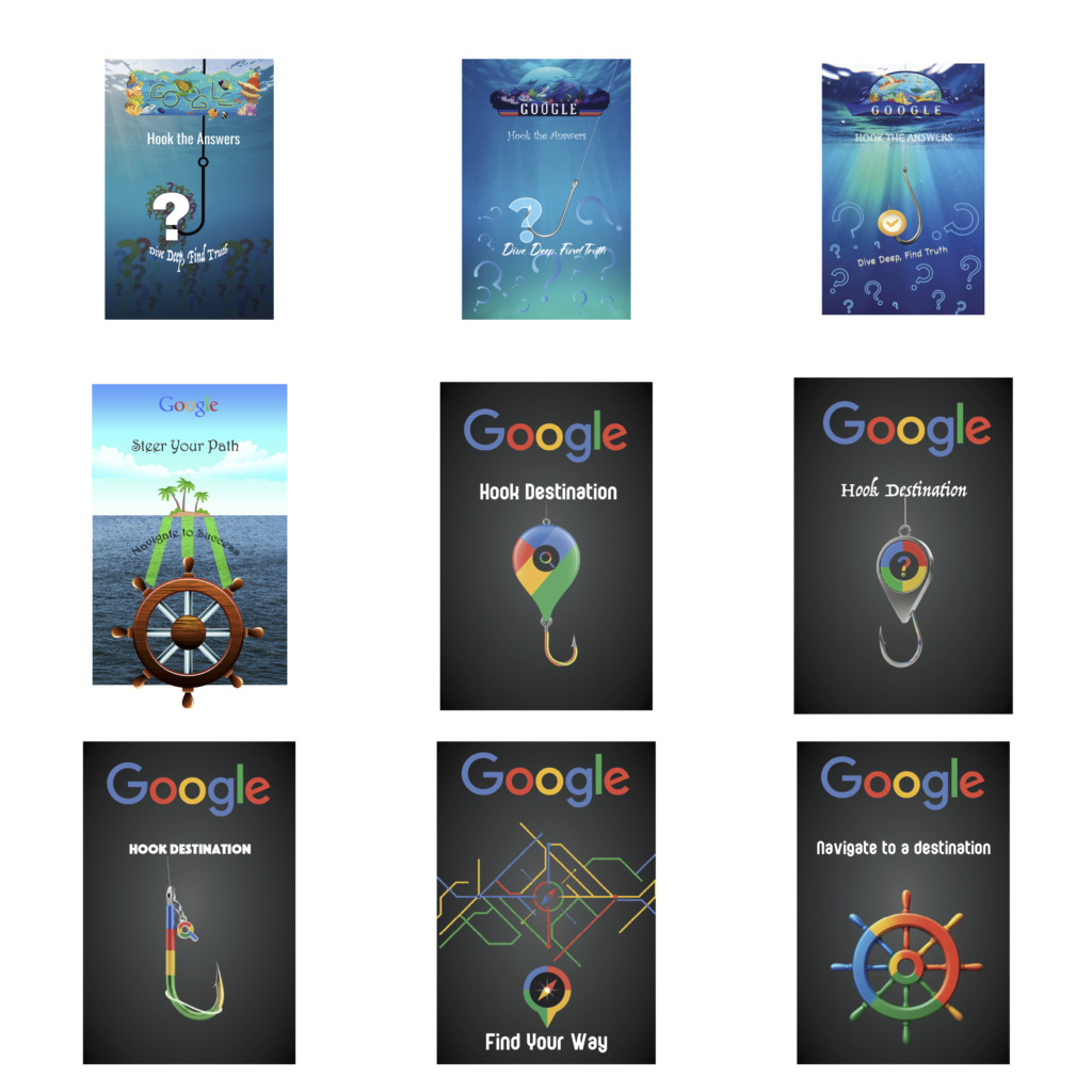
📐 PRINT & CAMPAIGN SPECIFICATIONS
-
📏 Poster Dimensions: Built on standard 11 x 17 inches tabloid vertical format per poster.
-
✂️ Bleeds & Margins: 0.125 inch outer bleed with 0.5 inch interior safe margins for clean edge trimming.
-
🖨️ Color & Output: 100% CMYK color profile, 300 DPI high-resolution linked graphics, exported as print-ready PDF files with active crop marks.
Every visual choice, mask layer adjustment, lighting direction, and color split demonstrates complete command over conceptual campaign advertising, photo manipulation, and print production.