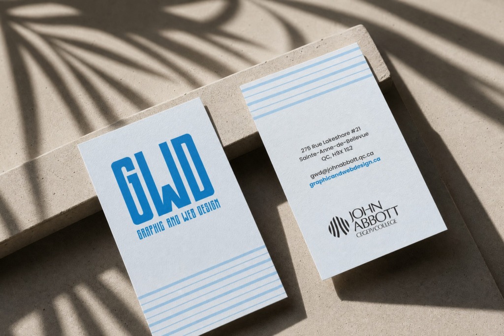
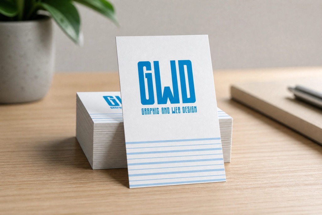
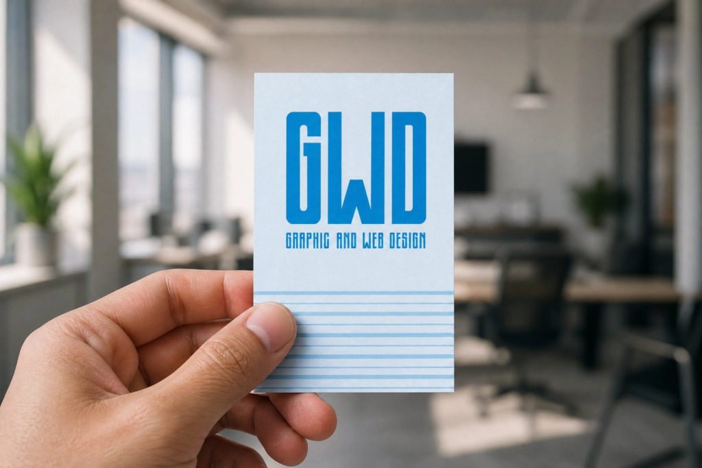
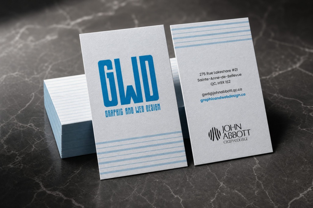
In high-end brand identity engineering, designing a minimalist 2 x 3.5 inches vertical business card requires balancing clean typography, precise color psychology, and structural harmony. This case study details the complete vector design, color palette curation, linear pattern development, and prepress execution for the Graphic and Web Design (GWD) Corporate Business Card.
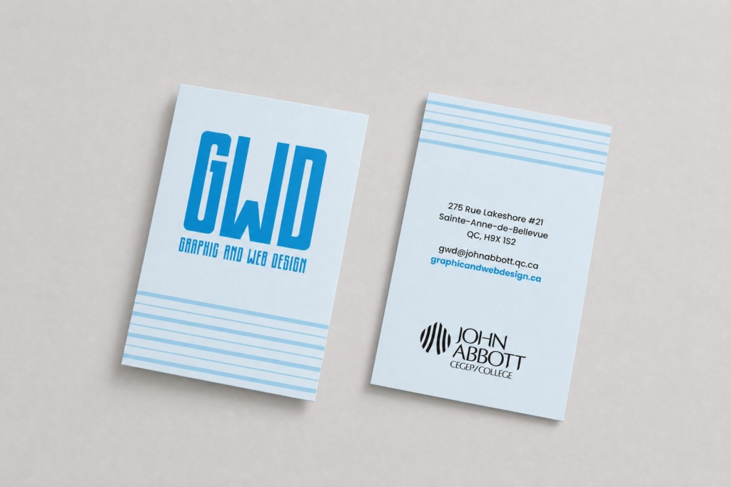
The primary objective was to extend the custom “GWD” brandmark into a functional, highly readable, and calm physical brand touchpoint. By leveraging a soft, classic three-tone blue color system, structured decorative linear patterns, and centered typographic alignment, the layout achieves an elegant, professional, and timeless ae
🌐 CREATIVE VISION & COLOR PSYCHOLOGY
-
💙 Tranquil Three-Tone Blue Palette: Carefully selected three distinct shades of blue to evoke feelings of clarity, professionalism, and calmness:
-
Soft Ice Blue: Serves as the soothing background canvas across both front and back cover faces.
-
Vibrant Cerulean Blue: Highlights the main “GWD” monogram, supporting sub-headlines, and active website hyperlink graphics.
-
Subtle Horizon Blue: Applied to the decorative linear stripe pattern to add subtle visual rhythm without competing with body copy.
-
-
🎴 Dual-Sided Spatial Division:
-
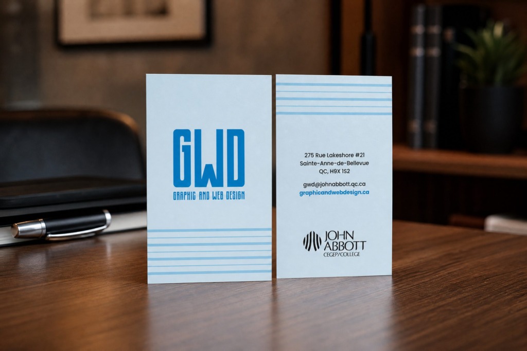
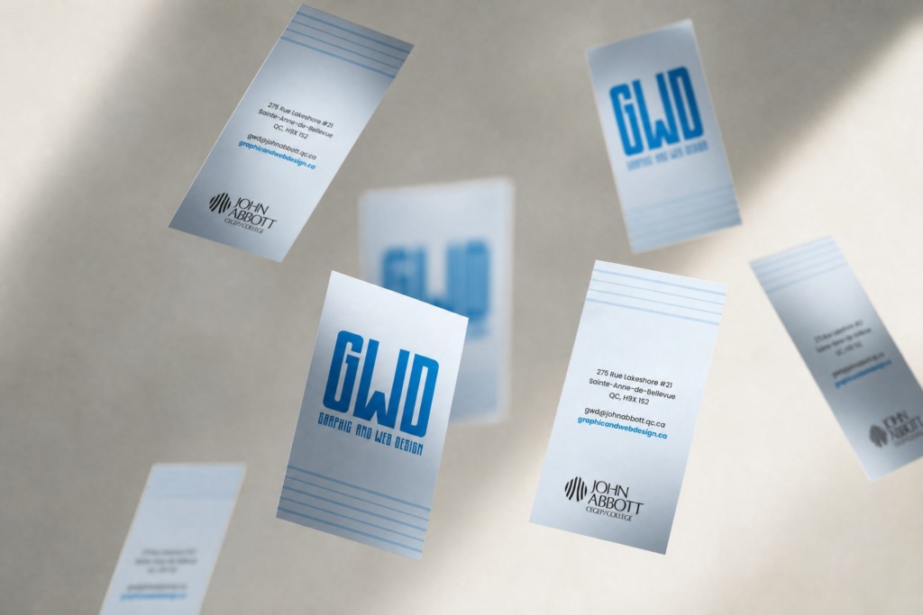
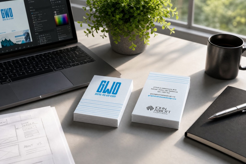
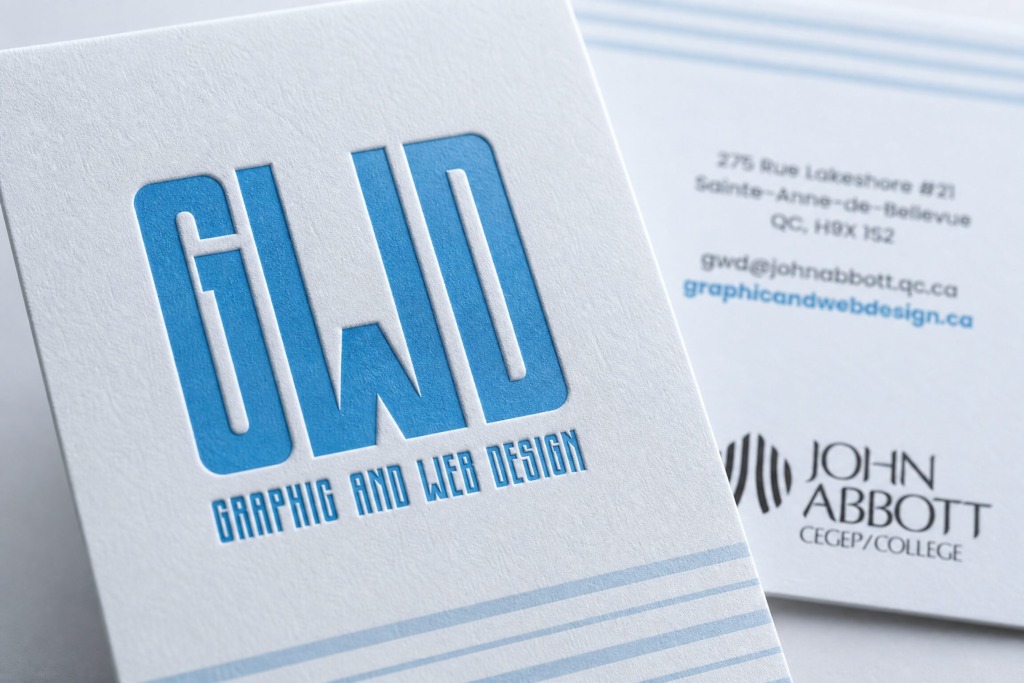
Front Cover: Focuses purely on brand presence, featuring the prominent “GWD” monogram and “GRAPHIC AND WEB DESIGN” descriptor, grounded by a horizontal linear stripe pattern along the bottom border.
-
Back Cover: Houses all essential contact details (address, email, website) in clean, centered sans-serif typography, anchored at the bottom by the official institutional mark.
-
-
📐 Linear Decorative Pattern: Integrated a custom geometric line pattern across the layout margins to create visual stability and subtle decorative structure.
🧗 TECHNICAL CHALLENGES & DESIGN OBSTACLES
-
🧩 Micro-Typography & Alignment: Achieving optical balance across centered text blocks (address, email, and web URL) within a narrow 2-inch vertical width while maintaining generous white space margins.
-
👁️ Contrast Preservation Across Tonal Layers: Ensuring the cerulean blue text and dark institutional logo remain fully readable against the soft ice blue background layer.
-
🖨️ Prepress Bleed & Trim Accuracy: Setting up precise 0.125-inch bleed boundaries and safe margins in Adobe Illustrator to prevent decorative stripes from shifting or cutting off during high-speed offset printing.
🛠️ SOFTWARE STACK & TECHNICAL WORKFLOW
-
✏️ Adobe Illustrator: Served as the primary vector creation suite. Used for building exact 2 x 3.5 inches artboards, path alignment, stroke weight calibration for decorative stripes, kerning, and master template setup.
-
📰 Adobe InDesign: Utilized for typographic grid structure verification, master page setup, and managing multi-page print collateral layouts.
-
🎨 Adobe Photoshop: Applied for real-world tactile mockup testing, paper grain texture overlays, lighting depth adjustments, and rendering 300 DPI high-resolution presentation imagery
📐 PRINT & PREPRESS SPECIFICATIONS
-
📏 Card Format: 2 x 3.5 inches vertical orientation (portrait orientation).
-
✂️ Bleeds & Safety: 0.125-inch outer trim bleed with 0.1875-inch interior safety margins.
-
🖨️ Color & Output: 100% CMYK vector color profiles, 300 DPI high-resolution asset links, exported as press-ready PDF/X-1a files with crop marks.
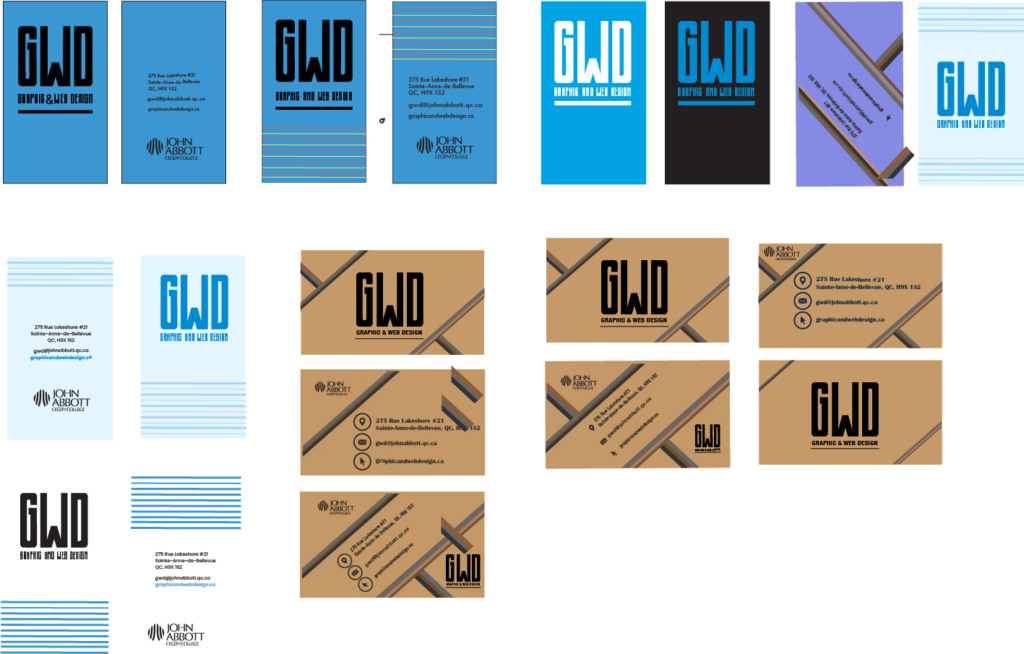
Old Versions:
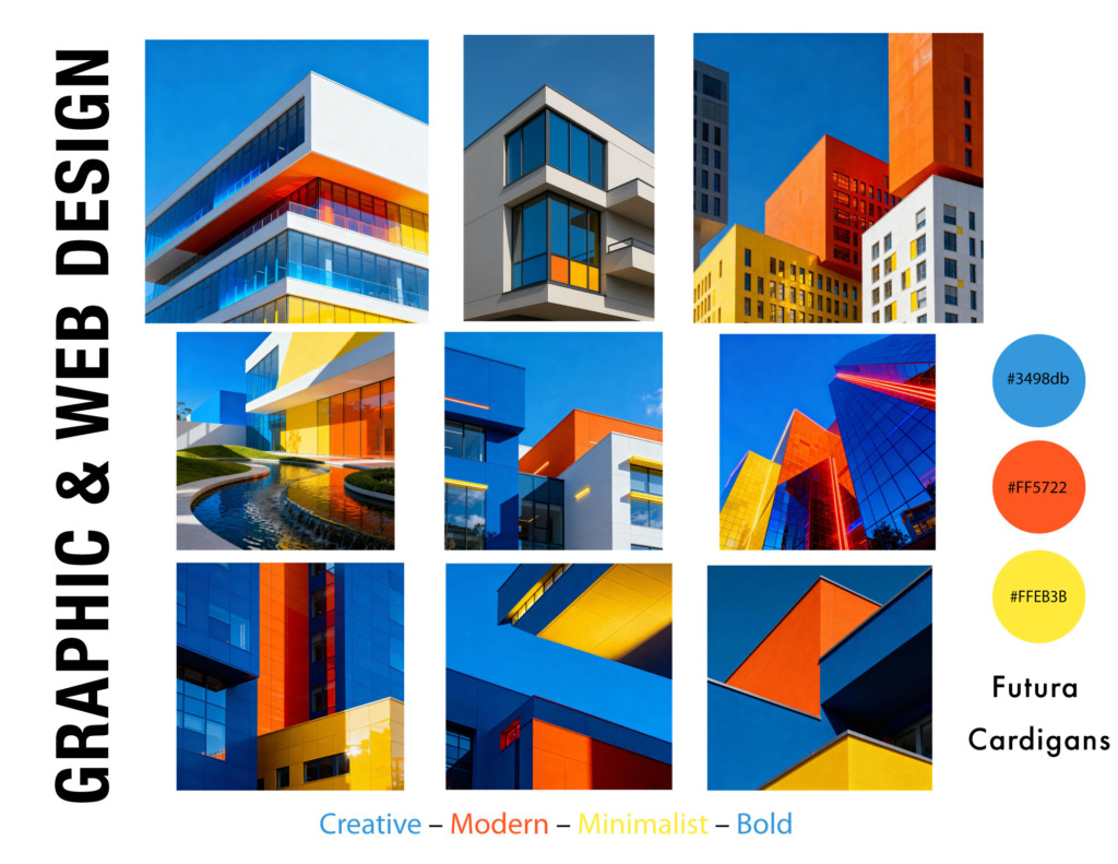
MoodBoard:
Every line weight choice, color step, and typographic space proves complete command over brand extension, prepress mechanics, and minimalist identity design.