🏷️ Strategic Packaging Redesign & Brand Swap Architecture: Commercial Identity Engineering
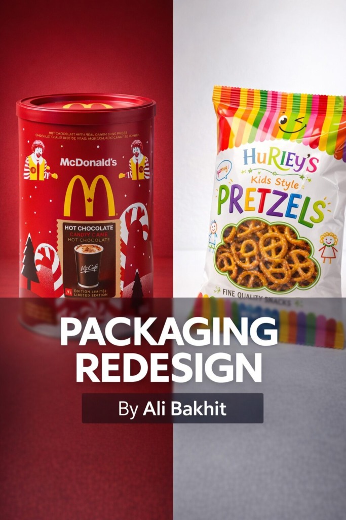
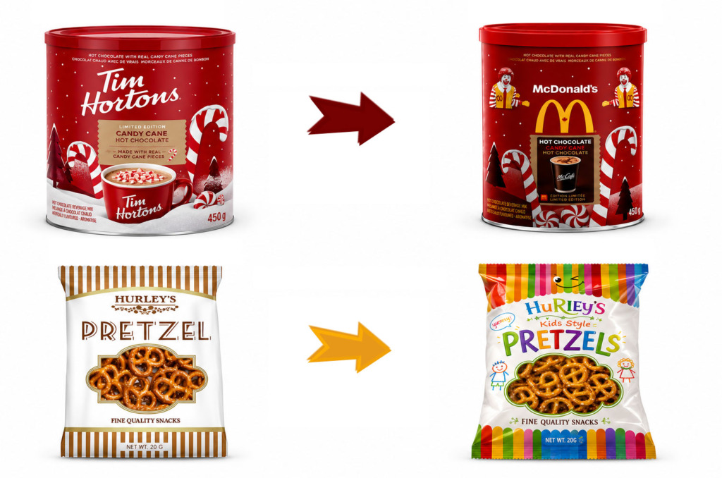
In contemporary commercial product packaging and visual communications, re-engineering an established brand’s identity requires a balance between brand equity, target audience psychology, and disciplined layout architecture. This comprehensive case study analyzes the visual reconstruction, structural packaging redesign, and brand-swap strategies executed across two distinct fast-moving consumer goods (FMCG) packaging concepts: Tim Hortons to McDonald’s Holiday Hot Chocolate Tin and Hurley’s Traditional Pretzels to Hurley’s Kids Style Pretzels. 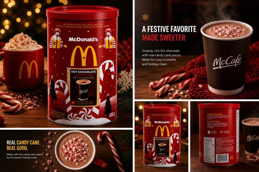
The core creative objective was to execute strategic packaging transformations that alter target audience demographics while maintaining shelf impact, brand recognition, and structural legibility.
-
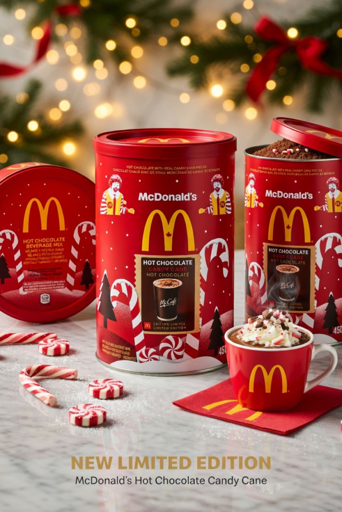
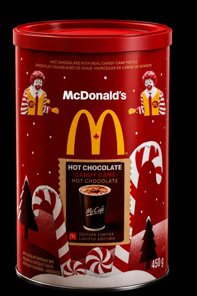
☕ Strategic Brand Identity Swap: Re-imagining Tim Hortons’ traditional, warm, cozy café aesthetic into McDonald’s high-energy, fast-paced, pop-culture branding system on a 450 g holiday tin.
-
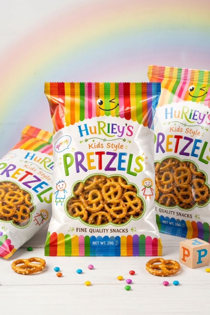
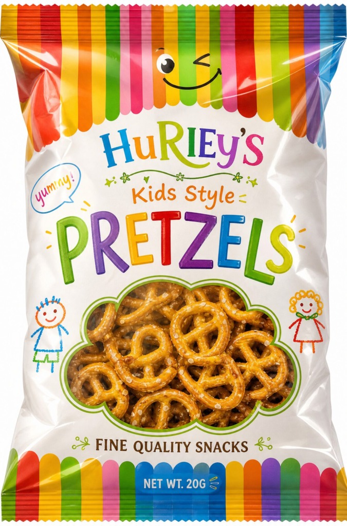
🎯 Child-Centric Market Expansion: Redesigning Hurley’s Pretzel packaging from a classic adult-oriented snack into a vibrant, high-energy “Kids Style” impulse buy to capture younger demographics.
-
📐 Packaging Layout Hierarchy: Re-architecting label zones, playful window die-cuts, and lively typography structures for optimal retail shelf visibility.
-
📸 Image Processing & Asset Compositing (Adobe Photoshop): High-resolution product mockups and raw asset layers were processed in Photoshop. For the Tim Hortons to McDonald’s Brand Swap, the initial Tim Hortons design was transformed into an iconic McDonald’s brand system. Layer masks isolated the 450 g tin, followed by color grading to apply McDonald’s signature bold red background, golden arches logo, and Ronald McDonald character graphics. The central focus was updated to a realistic McCafé hot chocolate cup with festive candy cane framing, drop-shadow mapping, and highlight overlays for depth.
-
🎨 Vector Graphics & Playful Illustration Systems (Adobe Illustrator): For the Hurley’s Kids Style Pretzel Redesign, vibrant custom vector graphics were engineered in Illustrator to create an engaging, child-friendly look. Custom hand-drawn style character doodles, bright rainbow-striped borders, and a custom smiley-face pretzel window die-cut were created using precise bezier curves. Color palettes were transitioned to an energetic spectrum of bright yellow, green, blue, and pink to maximize appeal on lower grocery shelves.
-
🔤 Typographic Engineering & Typeface Selection: Typography systems were restructured across both assets to establish clear visual reading orders. For the Hurley’s Kids Redesign, the headline type shifted to playful, informal fonts like Bradley (“Kids Style”) paired with colorful lettering for “PRETZELS” and Georgia for sub-headings to maintain parent trust. On the McDonald’s Hot Chocolate Tin, clean modern display typography was paired with formal serifs like Baskerville and Academy Engraved LET for upper label details to preserve product legibility over busy festive backgrounds.
-
📰 Prepress & Packaging Finalization (Adobe InDesign): The complete label vector files were assembled within InDesign to lock mechanical dielines, bleed margins, and CMYK print color profiles. Die-cut window shapes for the pretzel bag were optimized to offer clear visibility of the product inside, establishing consumer trust through visual transparency.
⚡Executing High-Impact Packaging Redesigns & Brand Swaps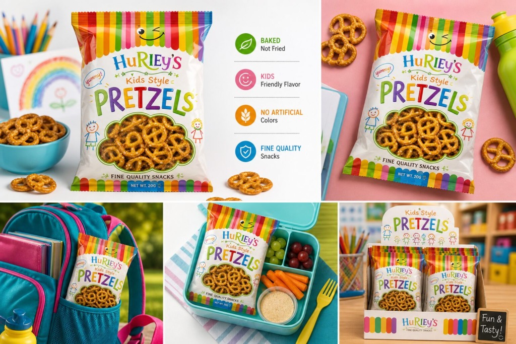
Every production choice—from color grading and vector dieline adjustments to precise font pairings—demonstrates complete technical command over FMCG packaging design, brand strategy, and commercial print preparation.
Designed by Ali Bakhit
#alibakhitdesign #GraphicDesignPortfolio #CaseStudy #PackagingDesign #BrandRedesign #VisualHierarchy #GraphicDesigner #AdobePhotoshop #AdobeIllustrator #InDesignWorkflow #BrandIdentity #ProductPackaging #FMCGDesign #TypographyArchitecture #KidsPackaging #PrepressDesign