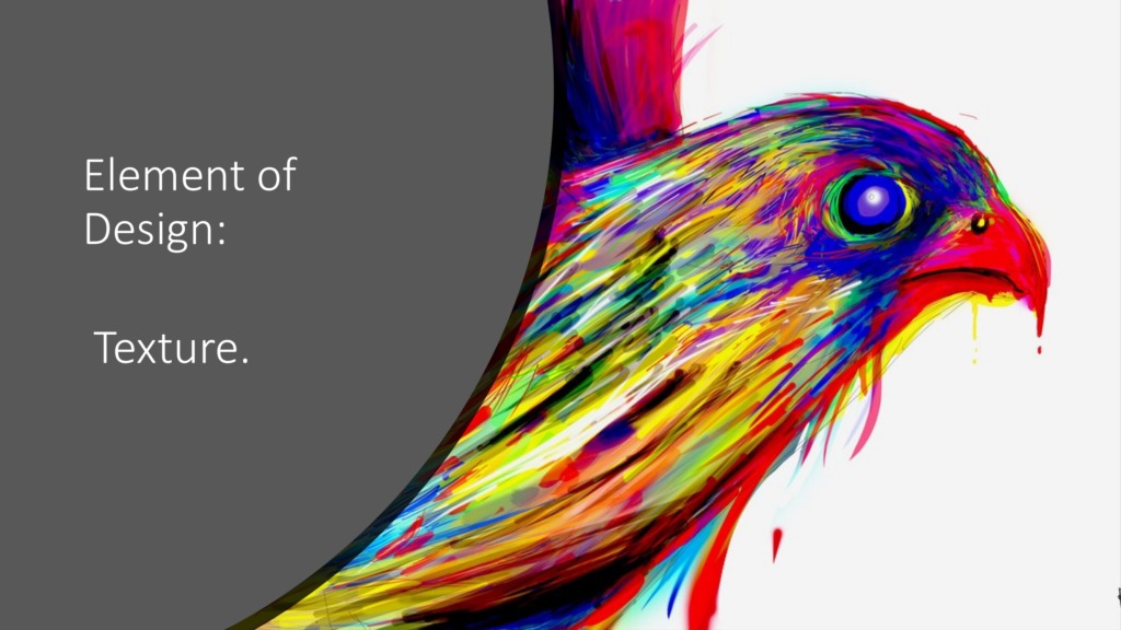
👁️ The Hidden Layer of Design
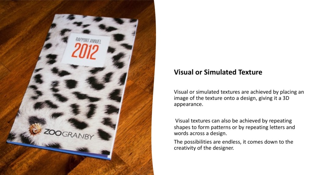
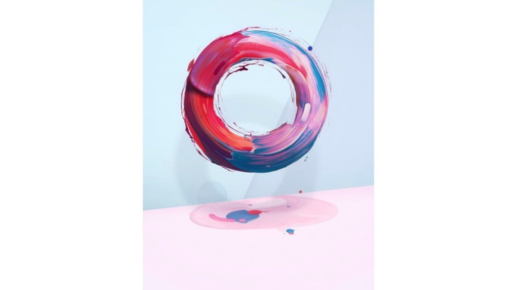
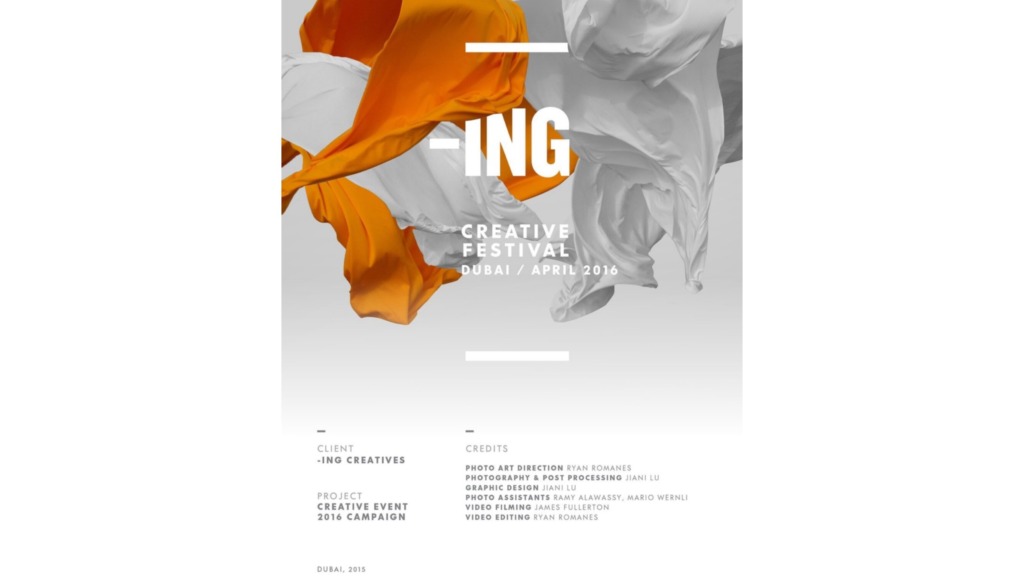
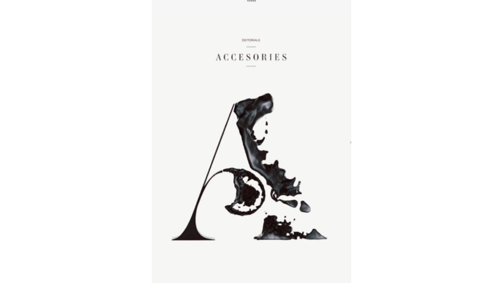
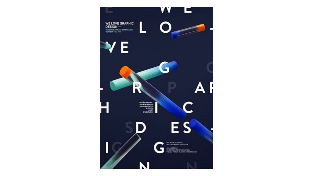
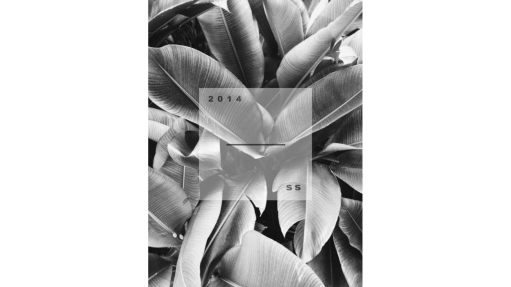
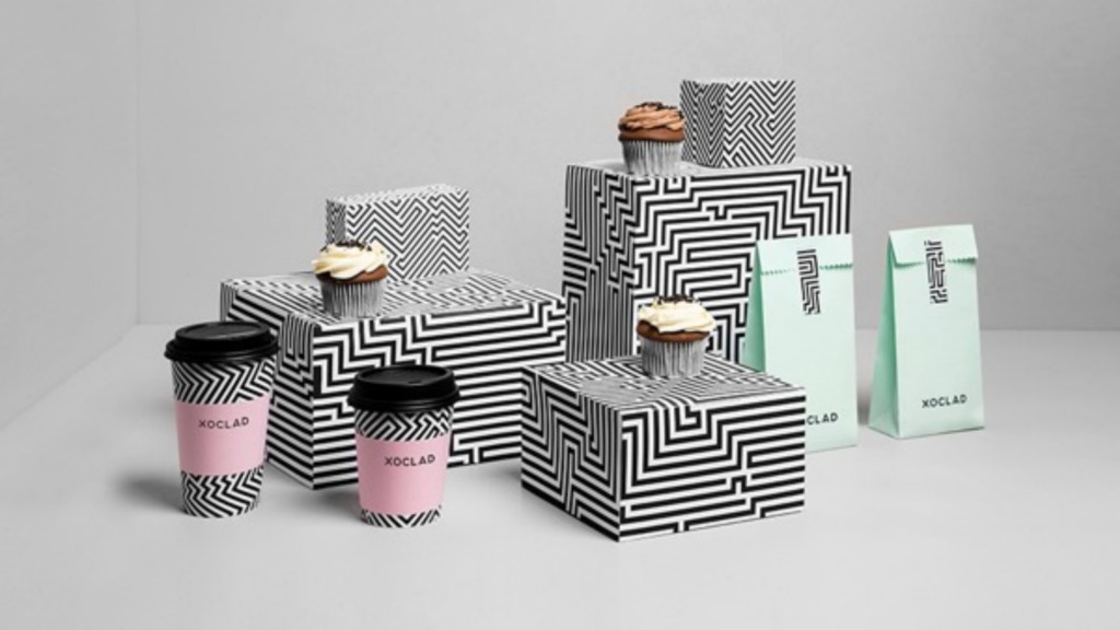
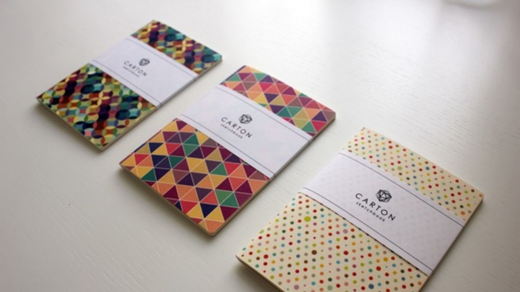
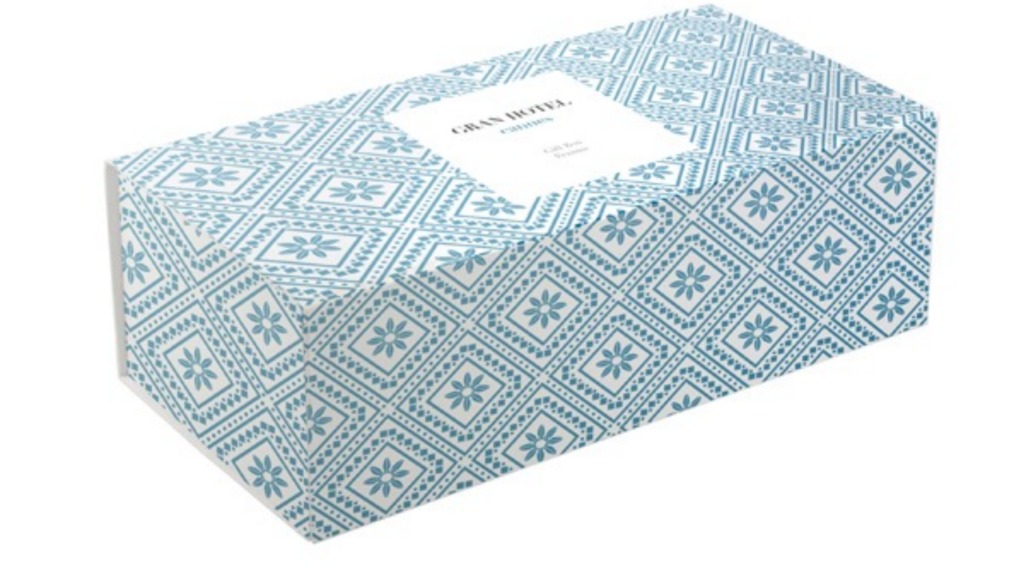
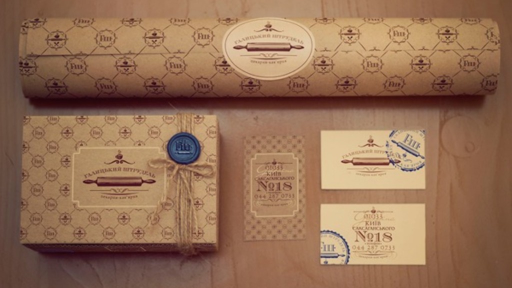
Every time we look at a layout, our brain doesn’t just process shapes—it actively tries to “feel” the surface. Even on a flat digital screen, a subtle grain or a simulated paper texture triggers a tactile memory in our minds. In professional design, this isn’t just an extra detail; it is a strategic tool that anchors your visual elements, guides the viewer’s eye, and instantly elevates a minimalist project from looking empty to looking premium.
📄 The Physical Touchpoint
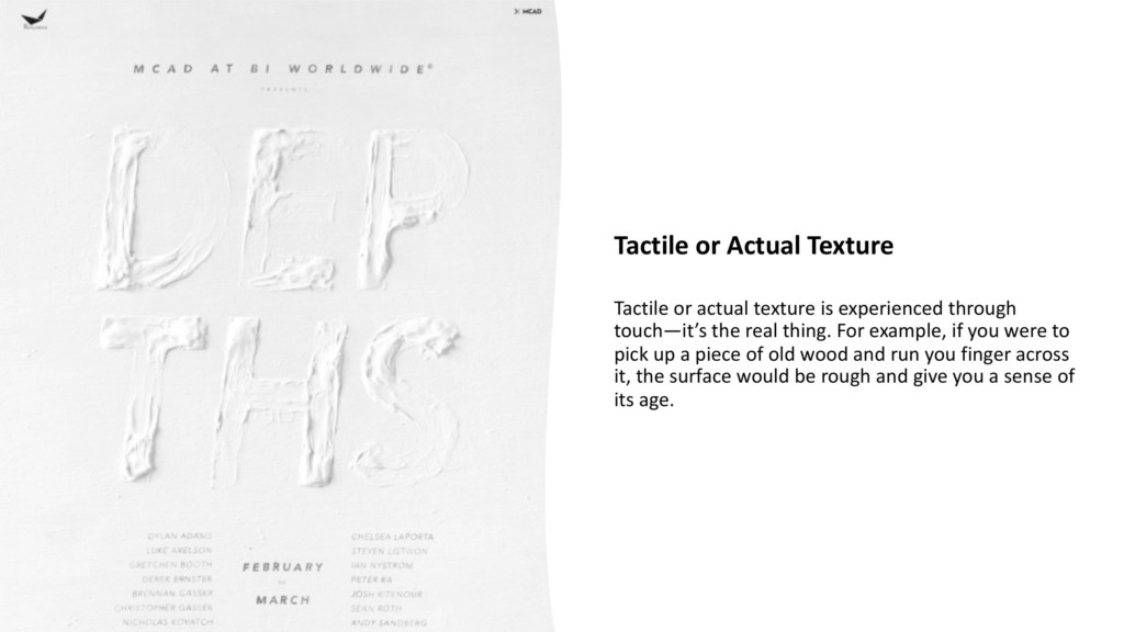
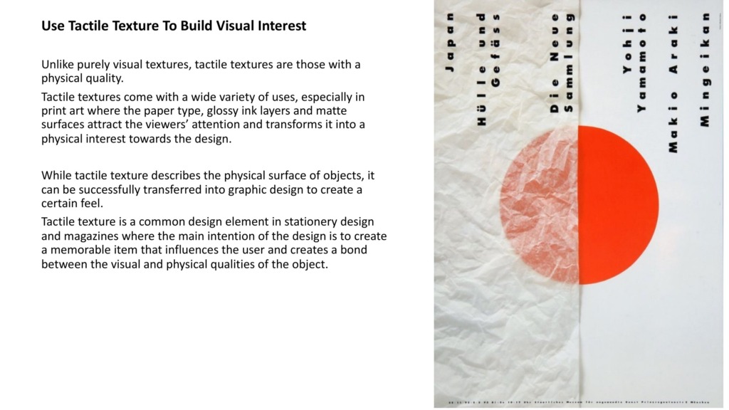
When your work leaves the screen and enters the physical world, the texture becomes the ultimate brand handshake:
-
Blind Debossing: Physically pressing into the paper fibers to create elegant, shadow-casting depth.
-
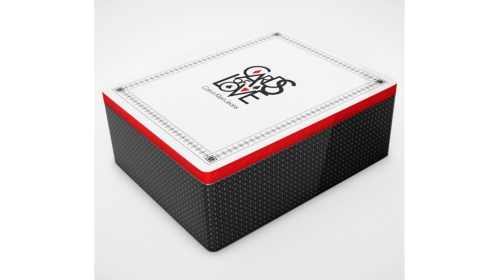
Selective Spot UV: Creating a sharp sensory contrast between velvety matte lamination and high-gloss surfaces.
-
Foil Stamping: Introducing reflective, metallic textures to give packaging and business cards a premium feel.


🎨 The Electric Contrast: Analog Meets Vector
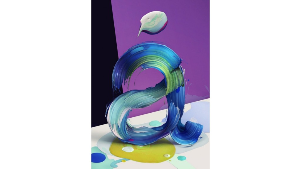
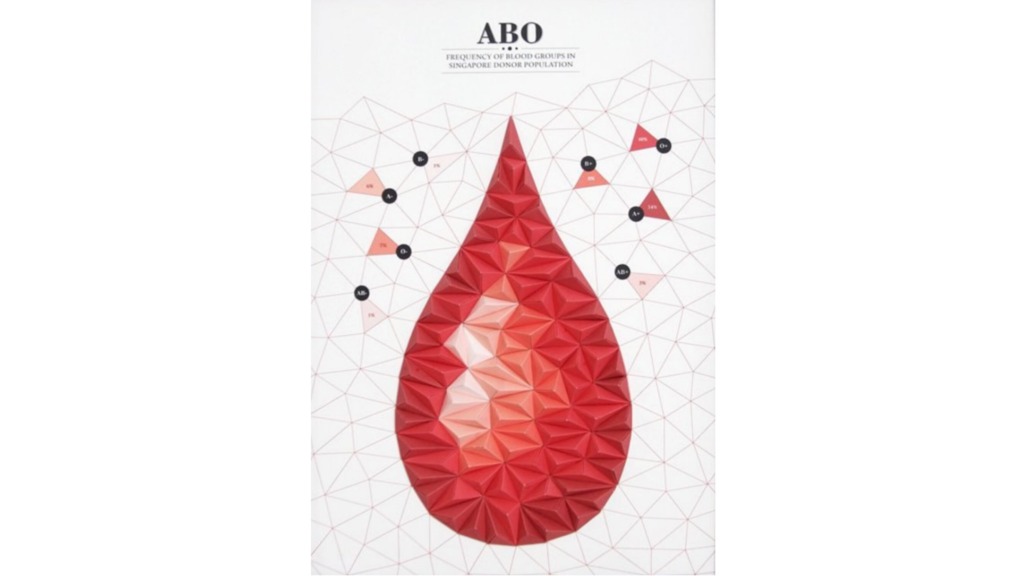
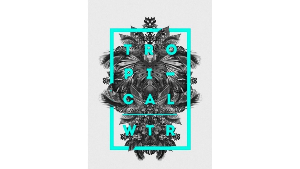
One of the most exciting ways to bring character to your digital canvas is by combining raw, hands-on techniques with clean software precision:
-
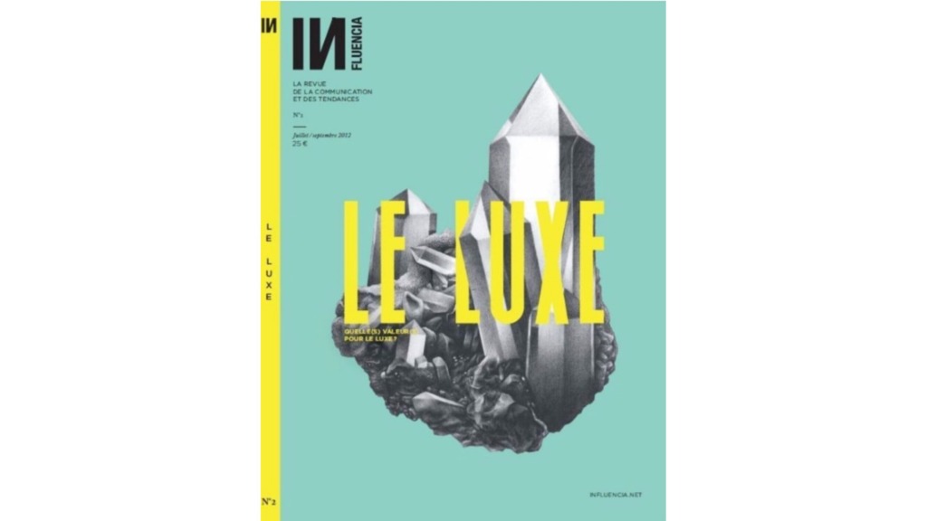
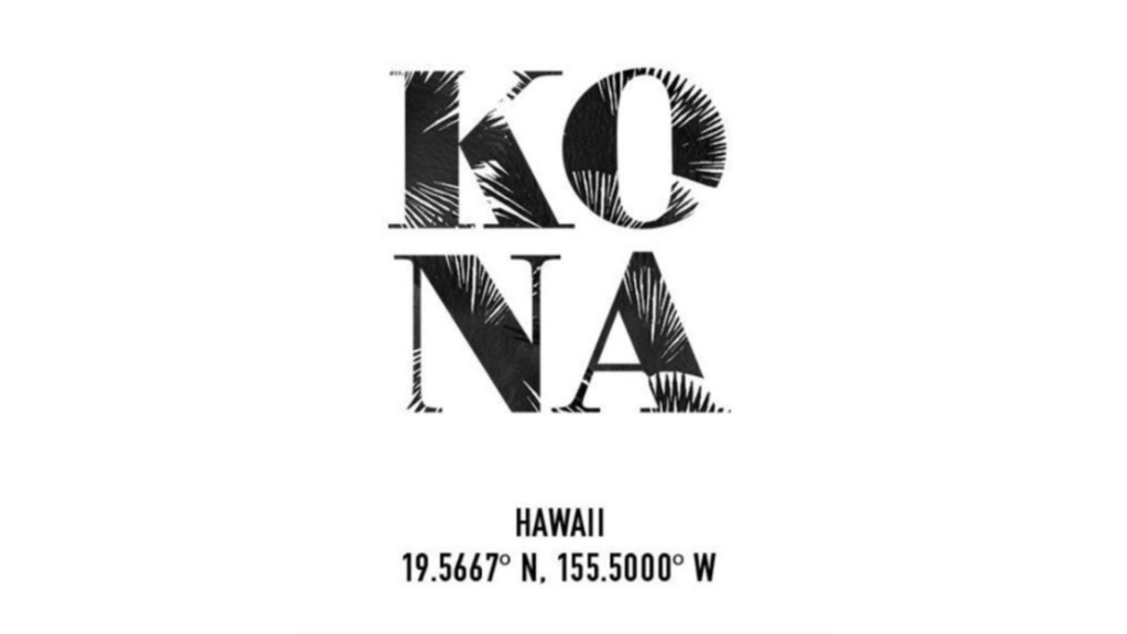
The Frottage Effect: Bringing the traditional art of physical surface rubbing (frottage) into Adobe Illustrator.
-
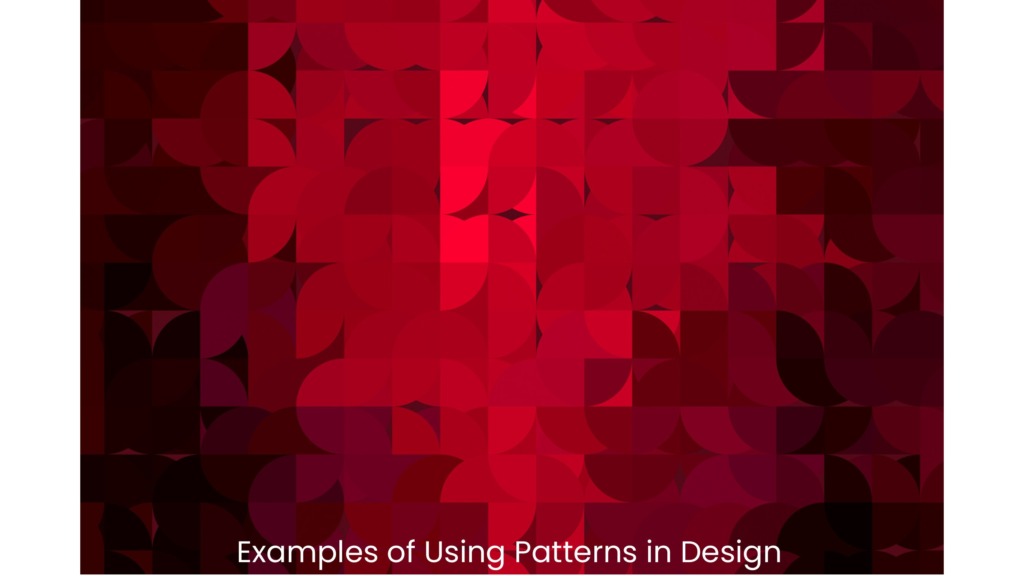
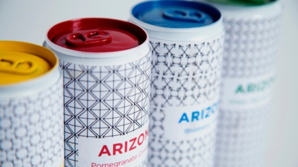
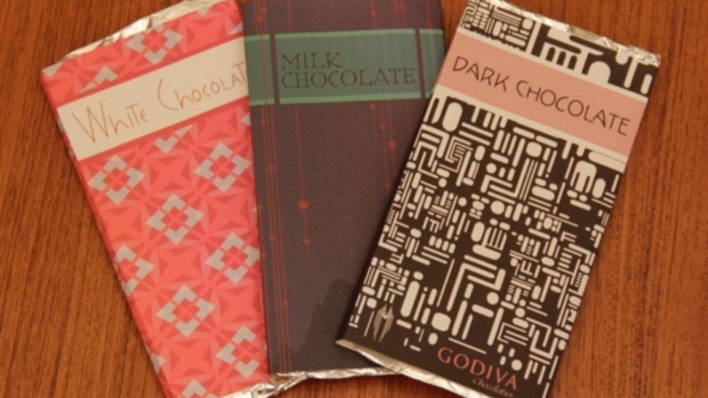
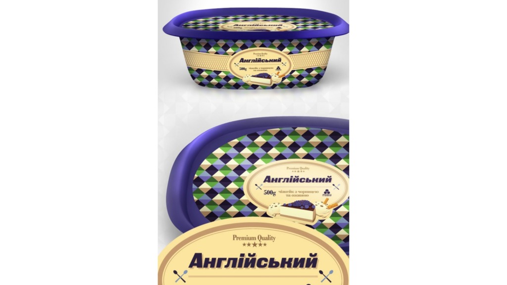
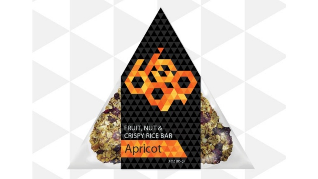
The Power of Contrast: Overlaying rough, noisy textures behind razor-sharp geometric vector paths.
-
Organic Identity: Injecting a gritty, human touch into clean layouts to give your portfolio an authentic, high-end edge.
🛠️ Crafting Realism with Pixels
In high-end digital compositing and photomontage, believable texture is what separates amateur work from a masterpiece:
-
Depth Over Opacity: Never just lower the opacity of a texture; map it to the environment.
-
Photoshop Blending: Utilizing Overlay or Hard Light blend modes to seamlessly merge textures.
-
Displacement Mapping: Using displacement maps in Photoshop to realistically wrap a rough stone wall texture around light and underlying geometry.
✒️ The Final Impression
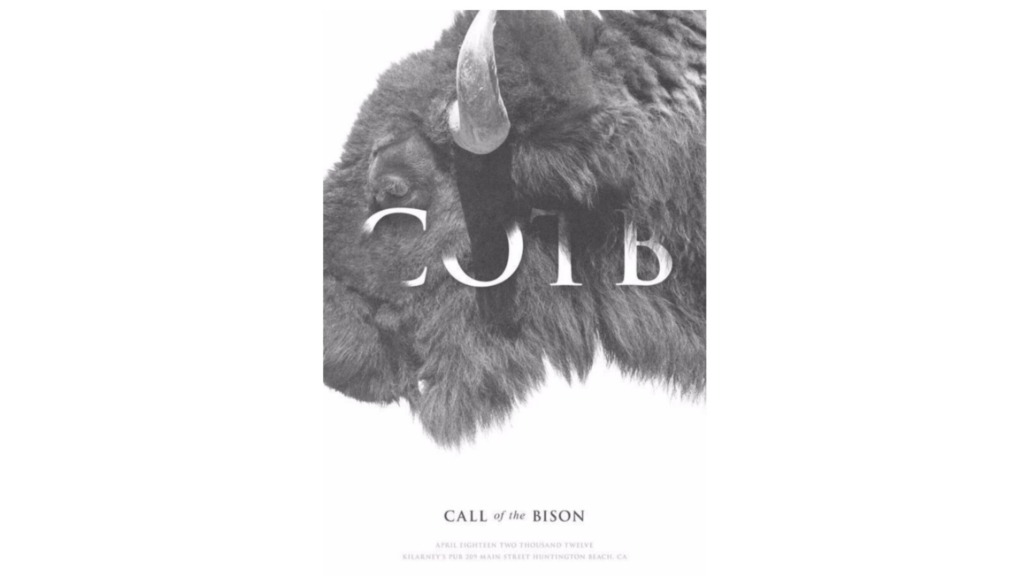
At the end of the day, texture is the quiet soul of a minimalist design. It should never scream for attention or clutter your layout; its job is to work silently in the background, making sure the viewer feels the quality, depth, and intention of your work the moment they lay eyes on it.
Prepared by Ali Bakhit
#alibakhitdesign #DesignInsight #GraphicDesign #VisualTexture #Frottage #PrintDesign #MinimalistAesthetic