Behind the Design Strategy: Establishing Hierarchy through Contrast
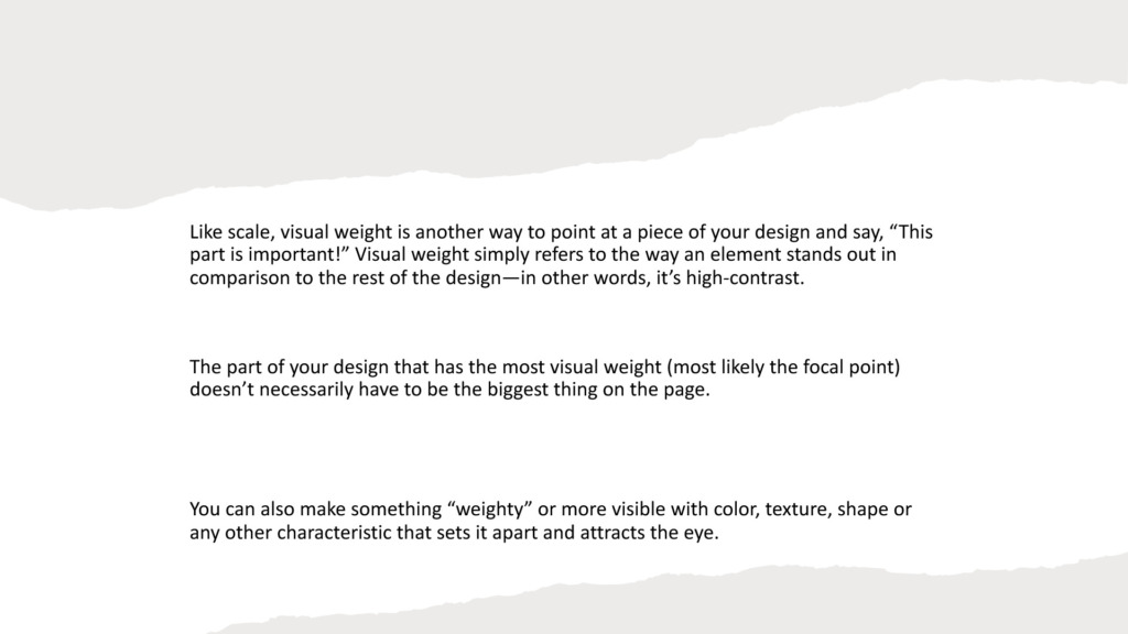
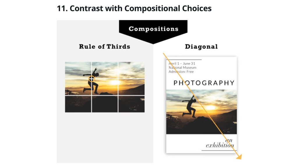
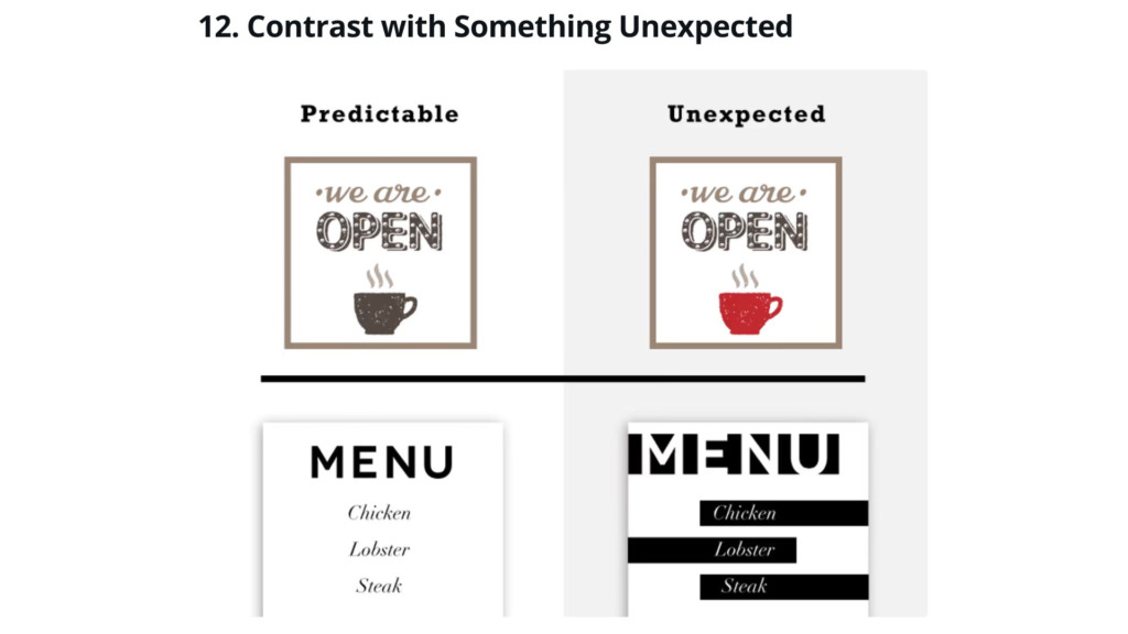
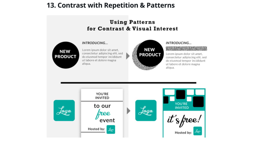
The Challenge: A project had a layout where all elements carried the same visual weight. This lack of “focal point” made the design look flat and boring, failing to guide the user toward the primary Call to Action (CTA).
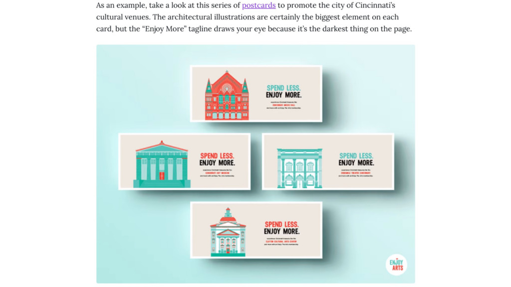
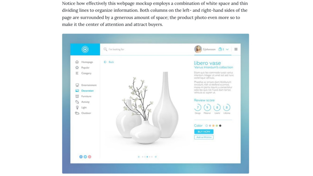
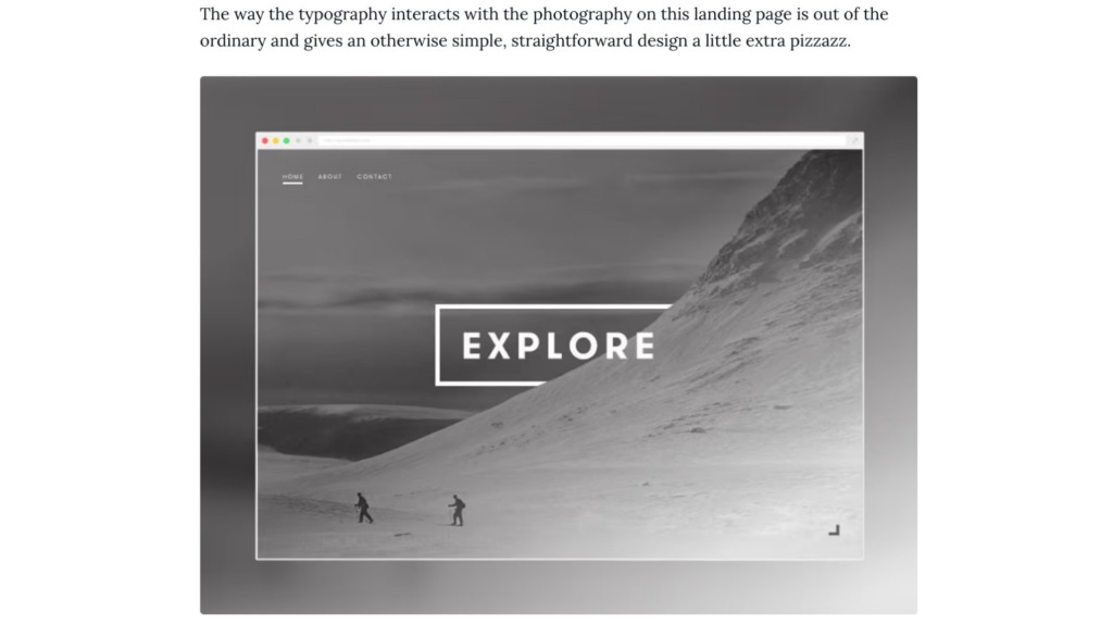
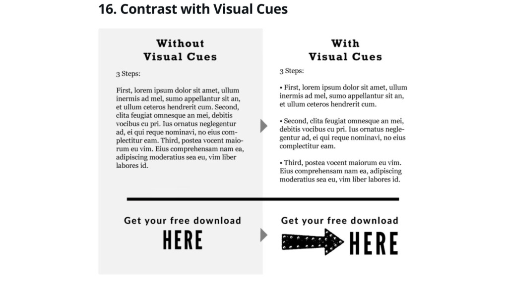
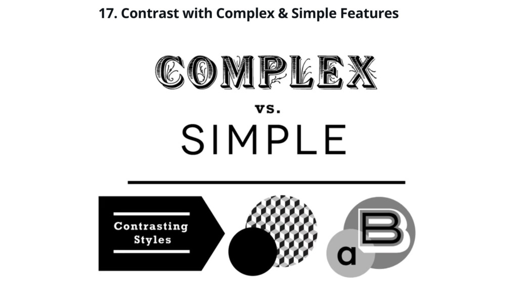
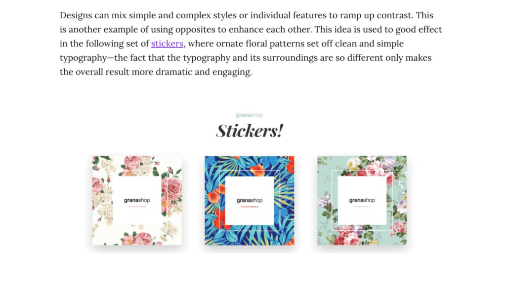
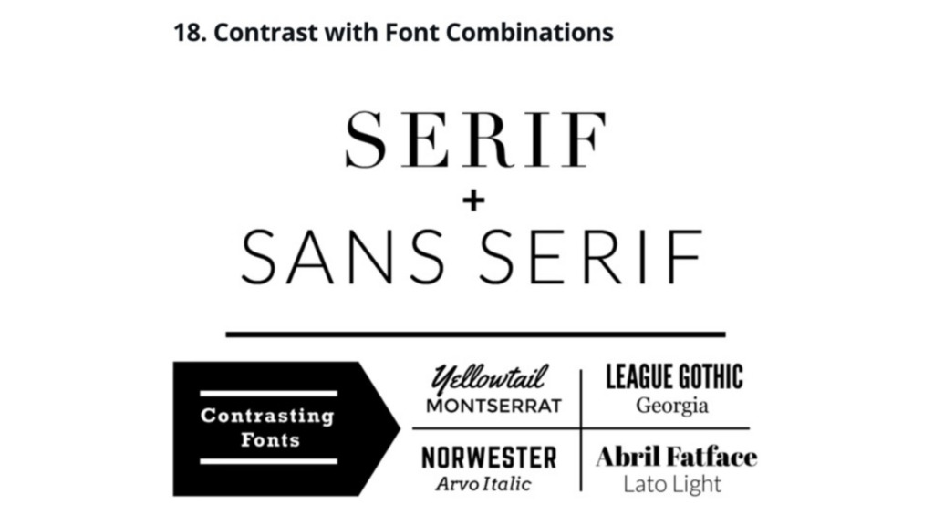
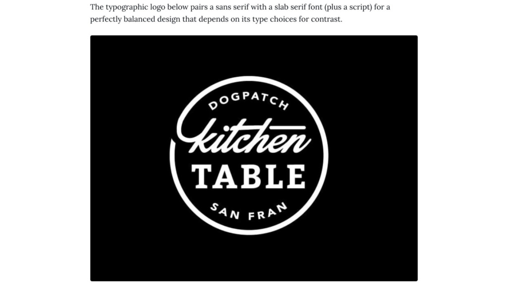
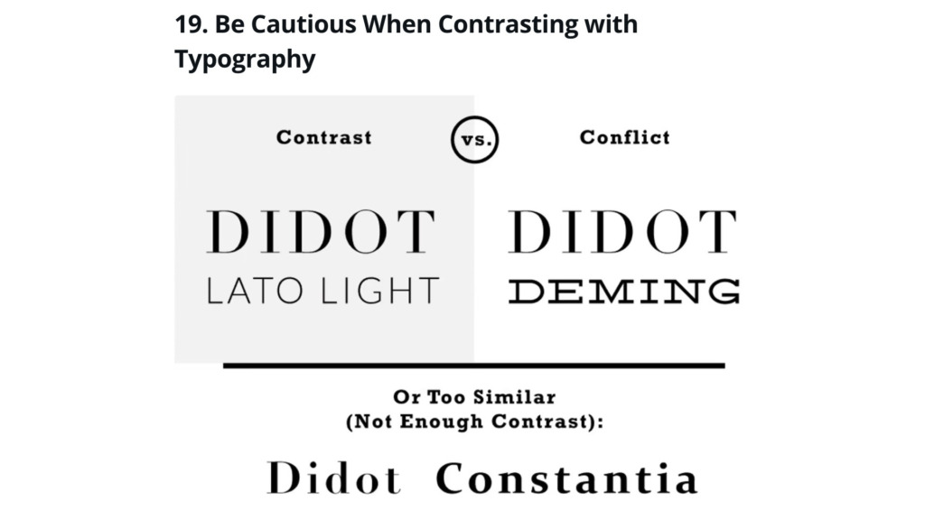
The Solution: I implemented high-contrast values using both color and scale. By pairing a bold, dark typeface against a light, neutral background and using a “Pop” color for the main action button, I created an undeniable focal point.
The Process: I began by mapping out the information hierarchy. In Photoshop, I experimented with different color values (Lighter vs. Darker) to see which combination provided the best readability. Finally, I coded the structural hierarchy in Visual Studio using CSS variables to maintain consistent contrast levels across the entire platform.
The Result: A dynamic and engaging interface that captures attention instantly. The contrast “spiced up” the layout while making the navigation 70% more intuitive for the user.
Designed and Developed by Ali Bakhit