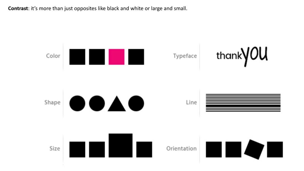
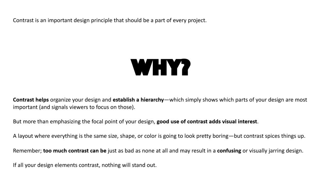
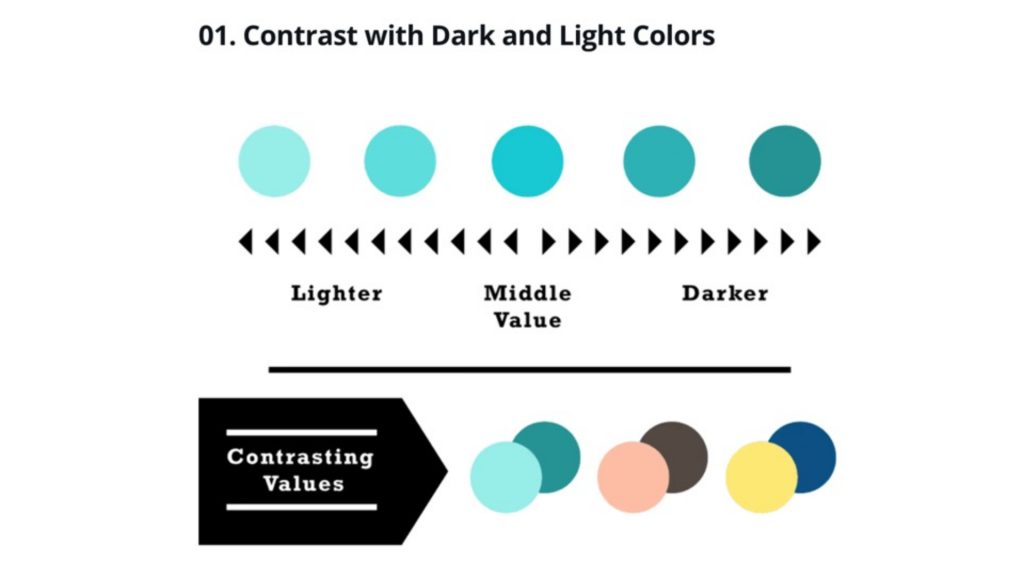
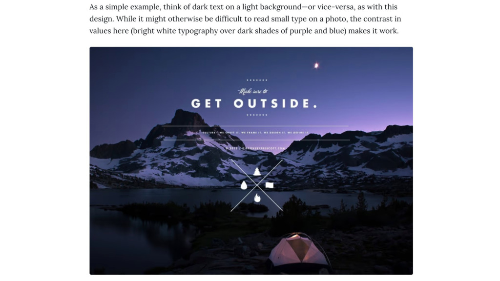
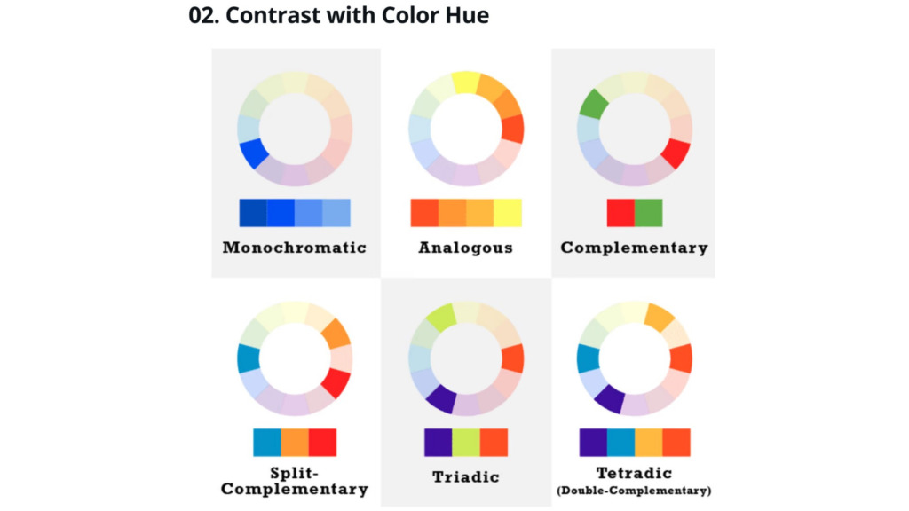
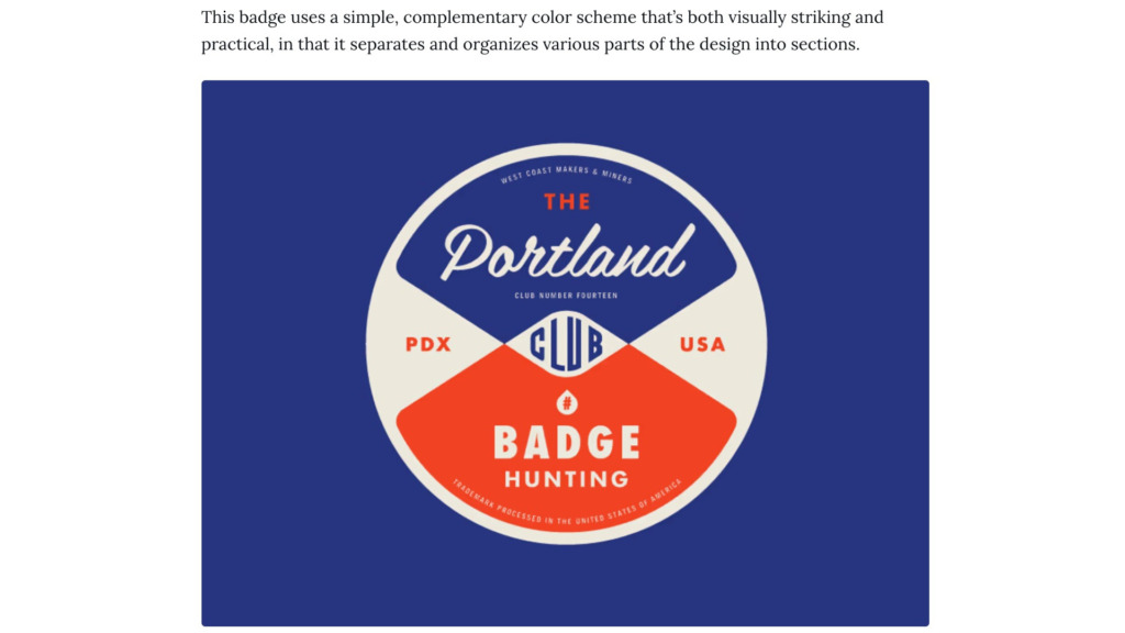
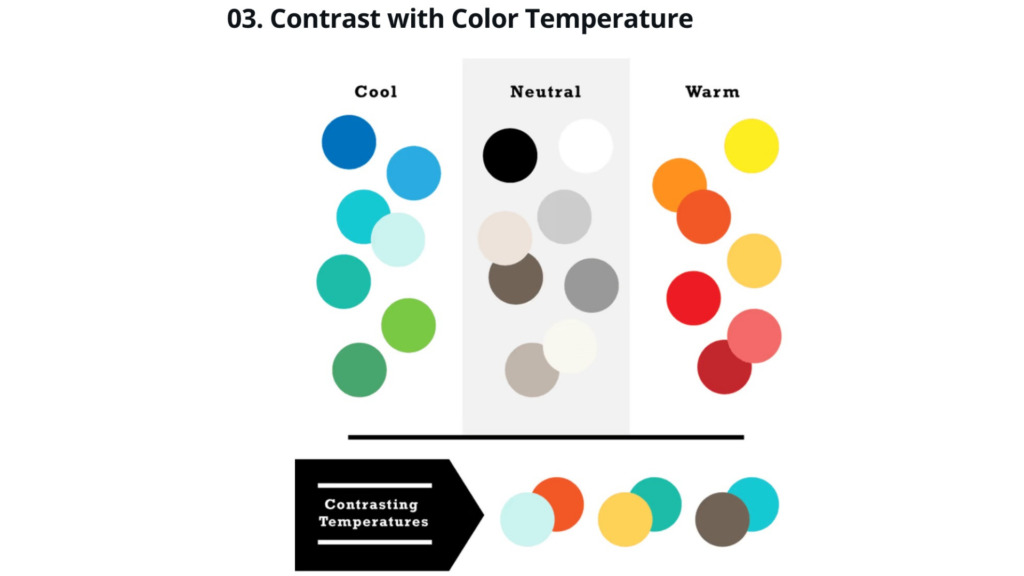
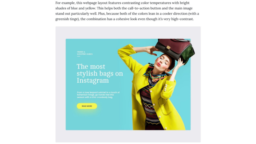
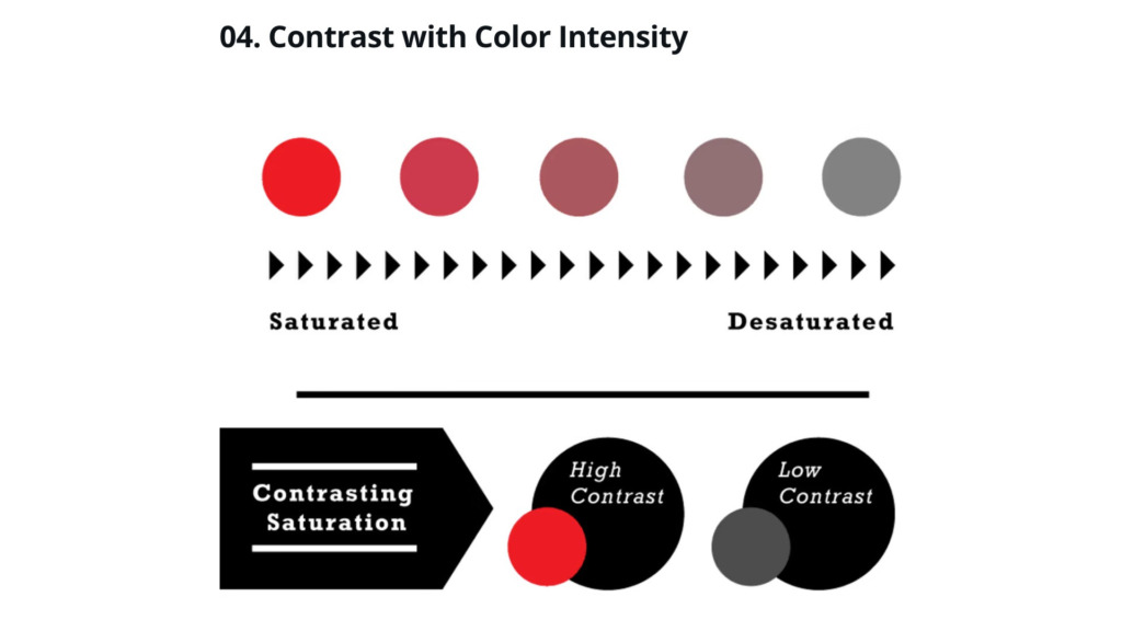
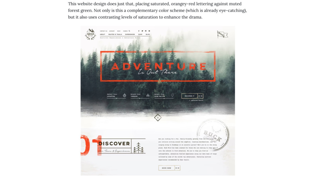
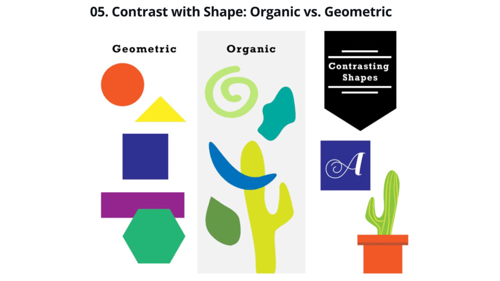
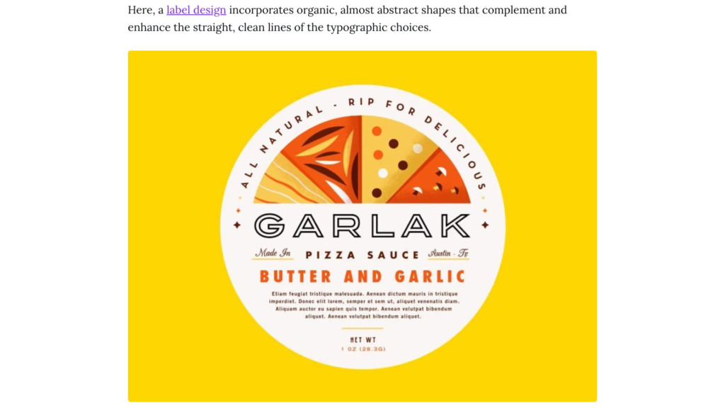
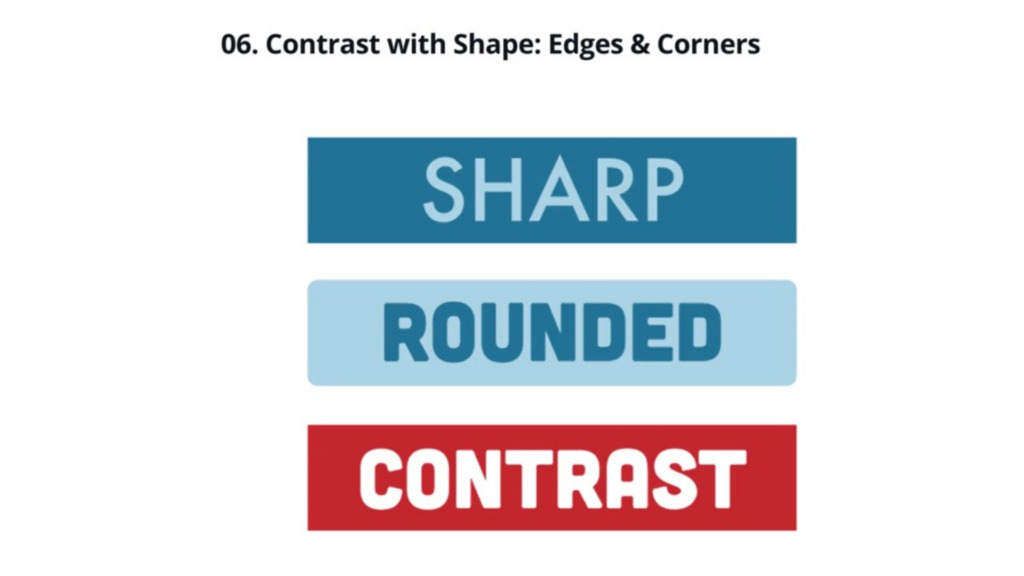
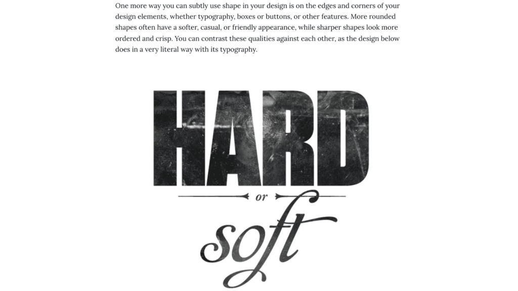
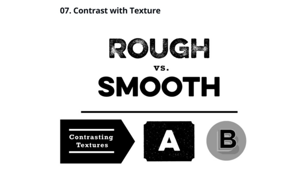
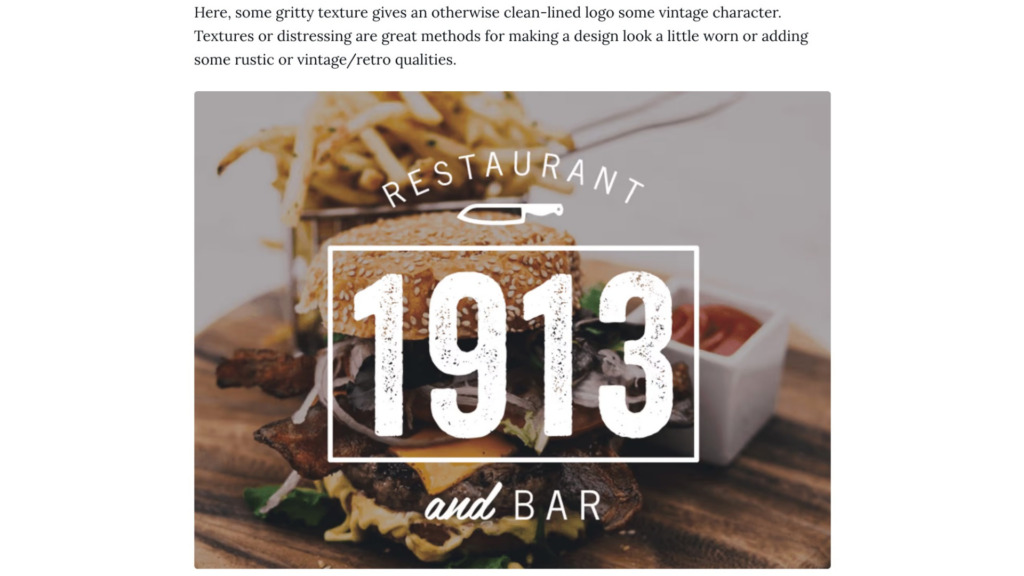
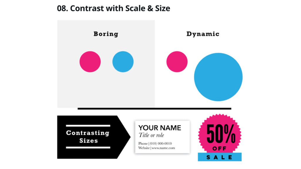
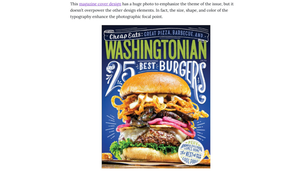
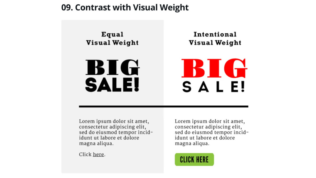
Contrast is a vital design principle used to organize information and establish a clear visual hierarchy.
In my professional workflow, I use contrast not just for aesthetics, but to signal the viewer on where to focus.
By mastering the balance between light and dark, large and small, and bold and thin, I ensure that the most
important message is never missed.