Stop guessing where elements should go! 🛑 Great design isn’t accidental; it follows structural rules that turn visual noise into absolute clarity.
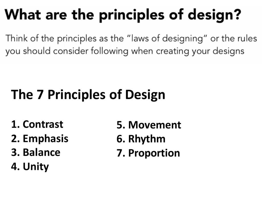
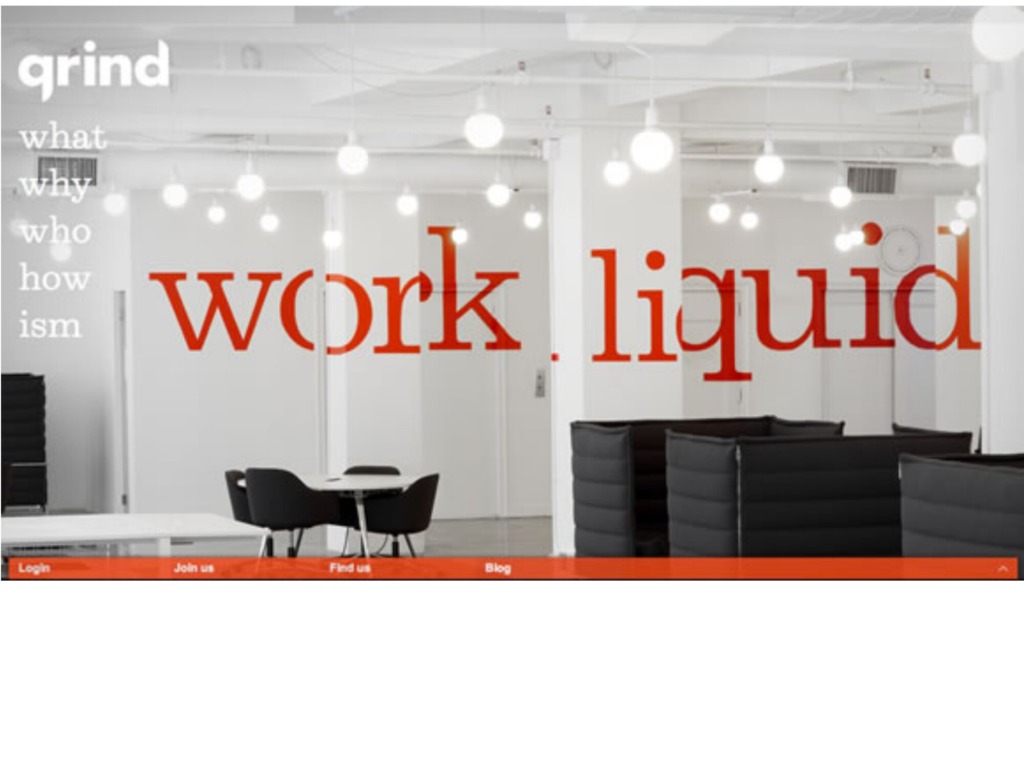
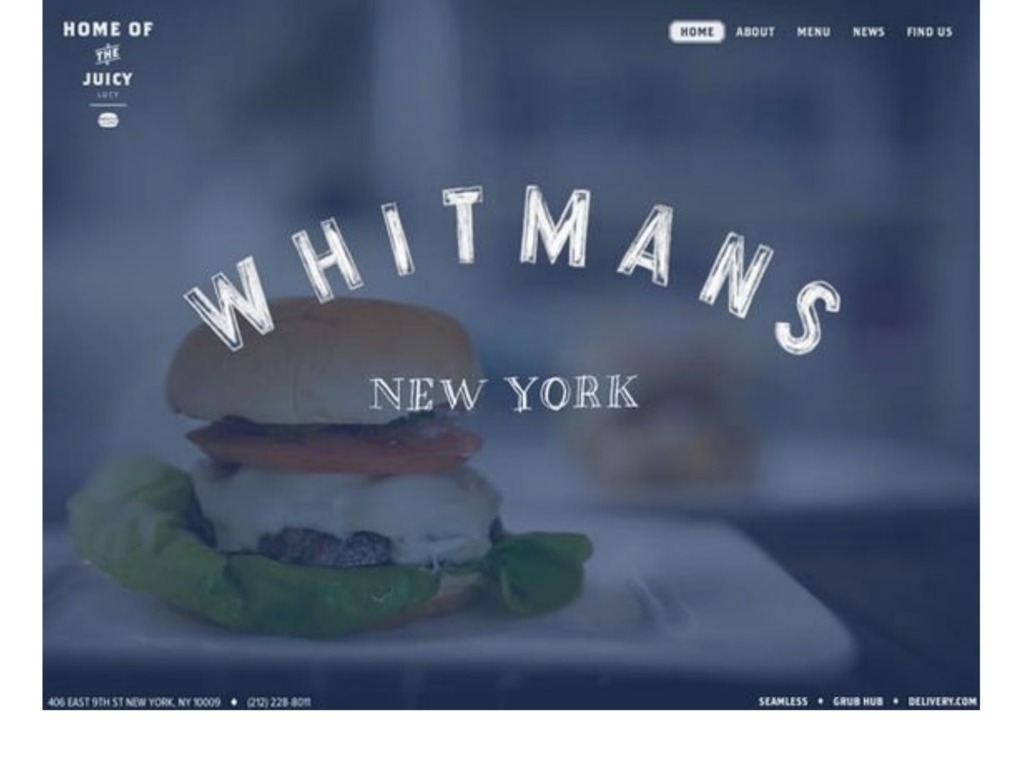
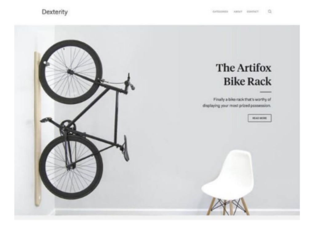
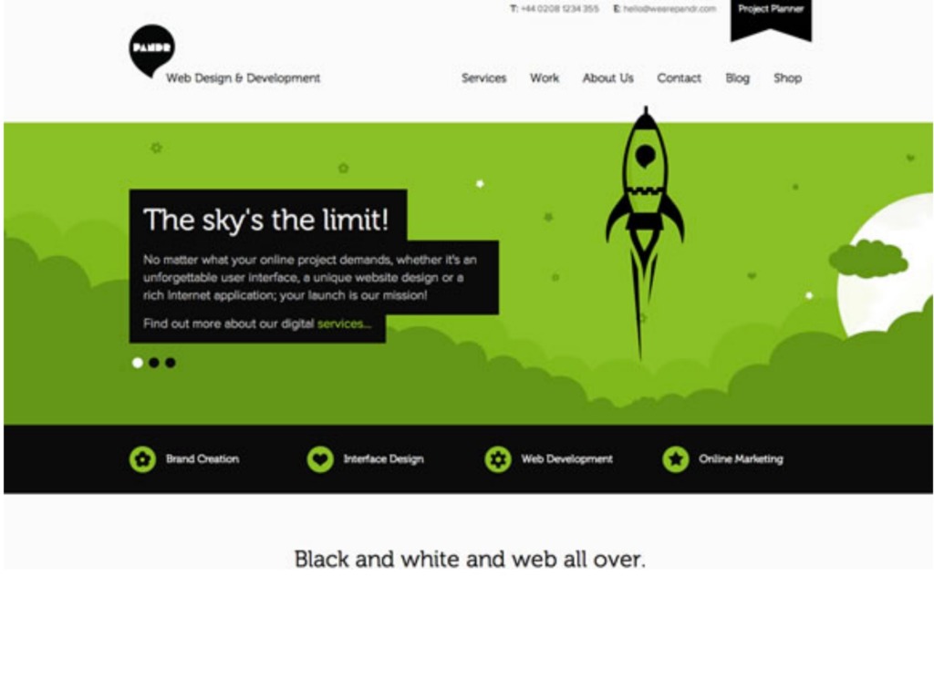





Here is your quick roadmap to mastering the essentials. 🗺
-
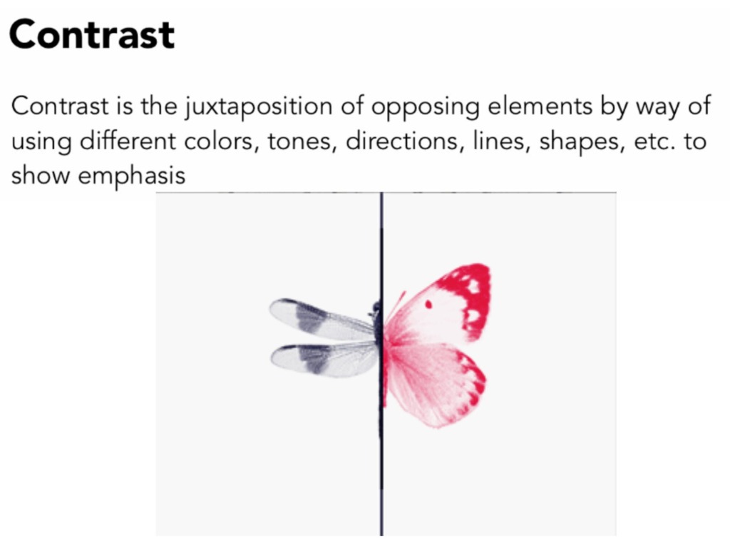
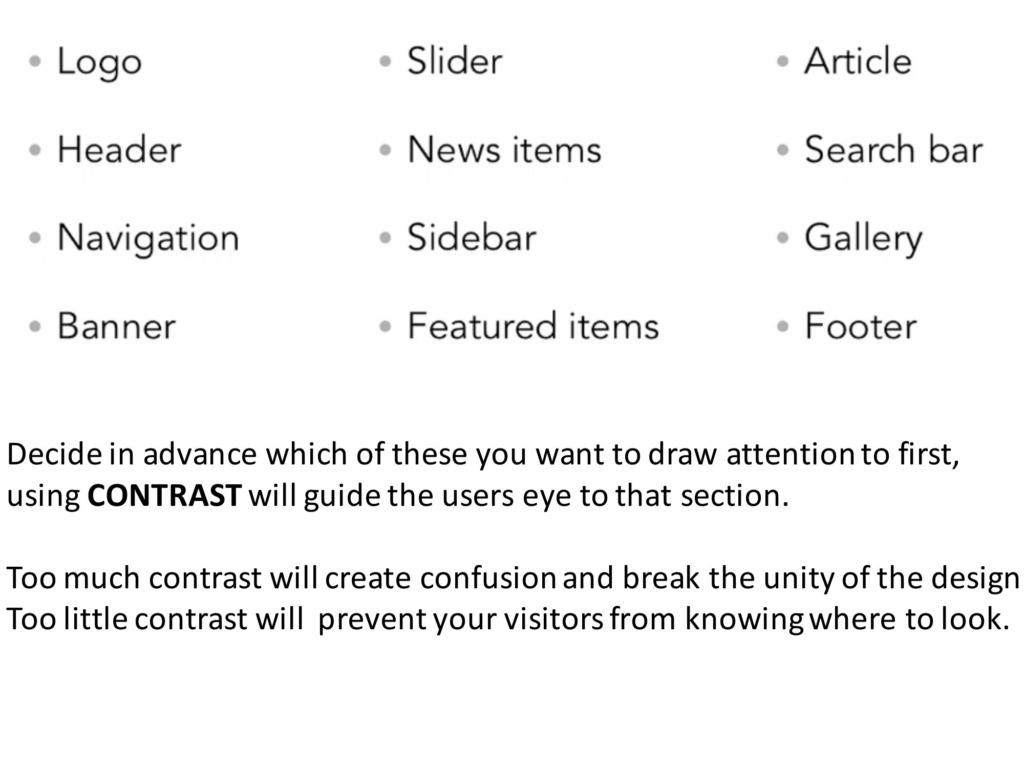
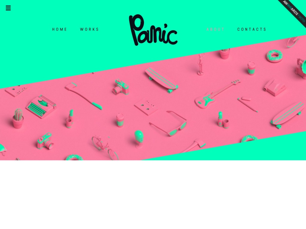
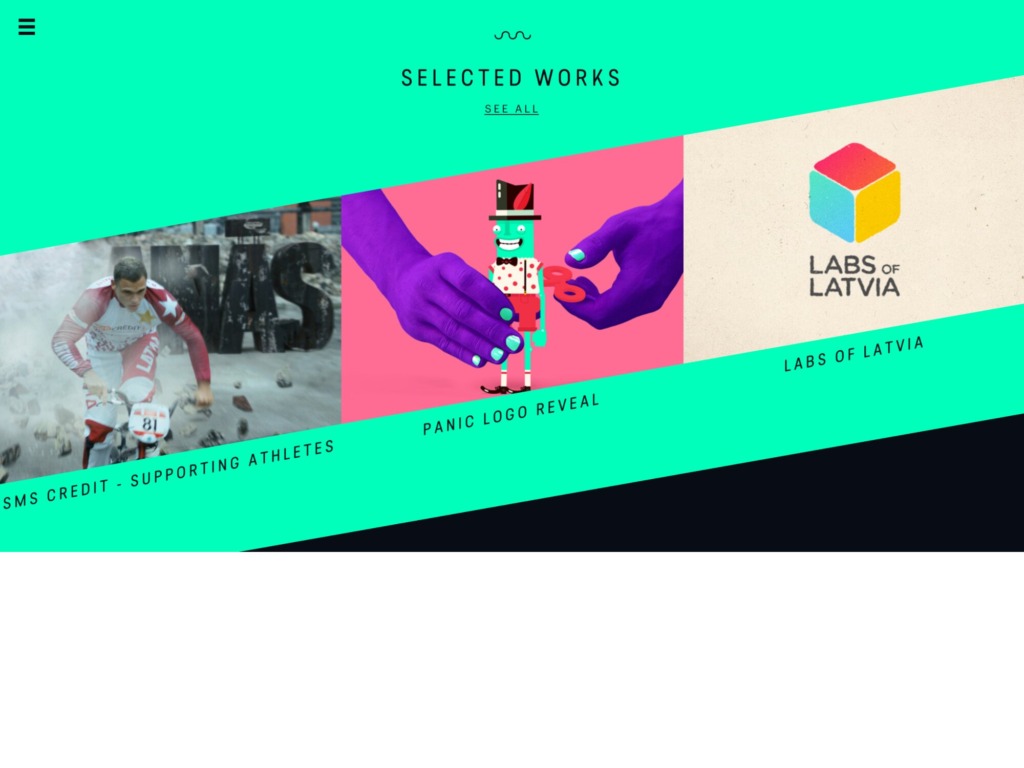
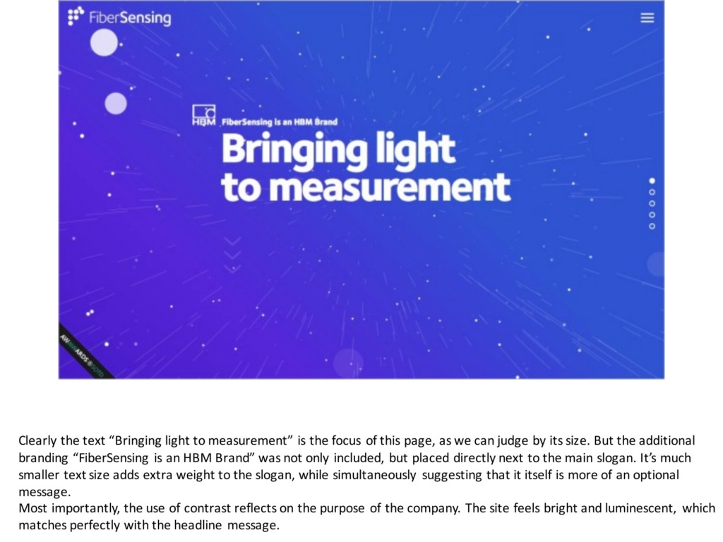
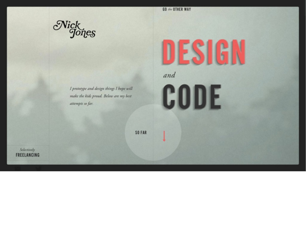
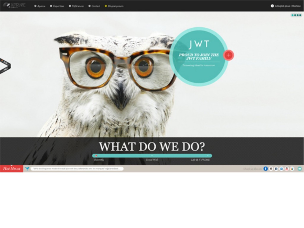
⚡ Contrast is Key: Too much creates confusion; too little makes it boring. Use it wisely to make your core message pop.
-
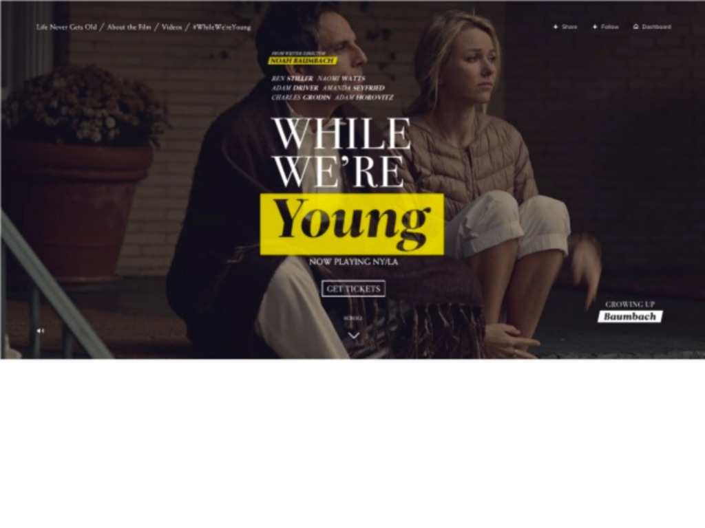
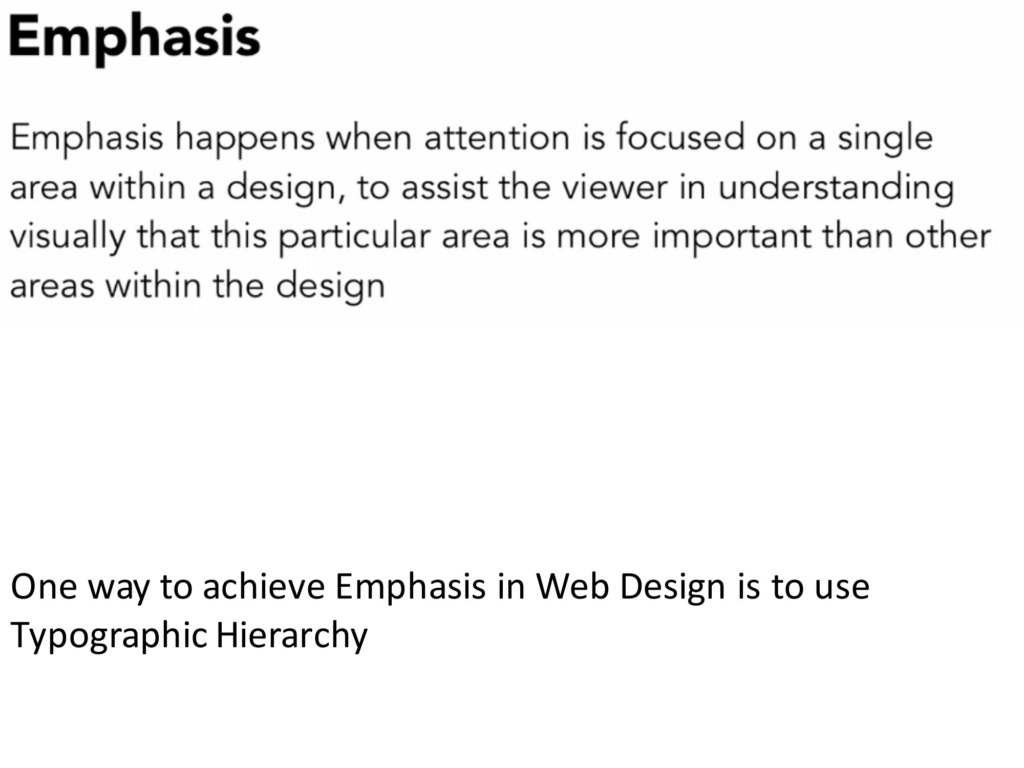
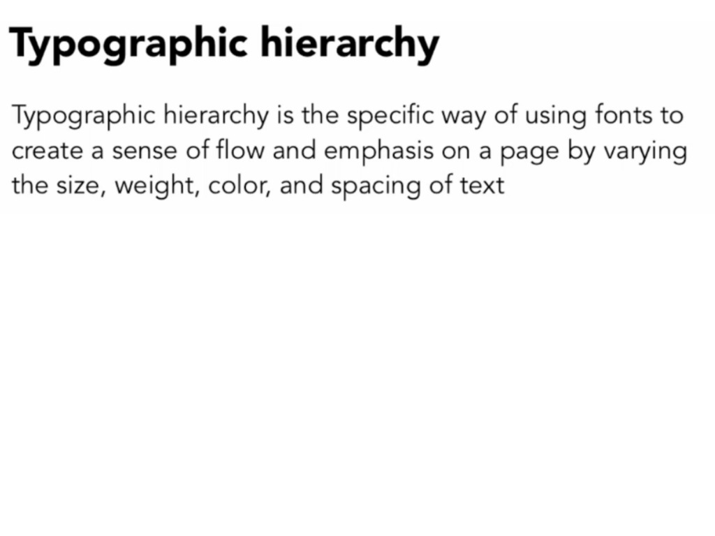
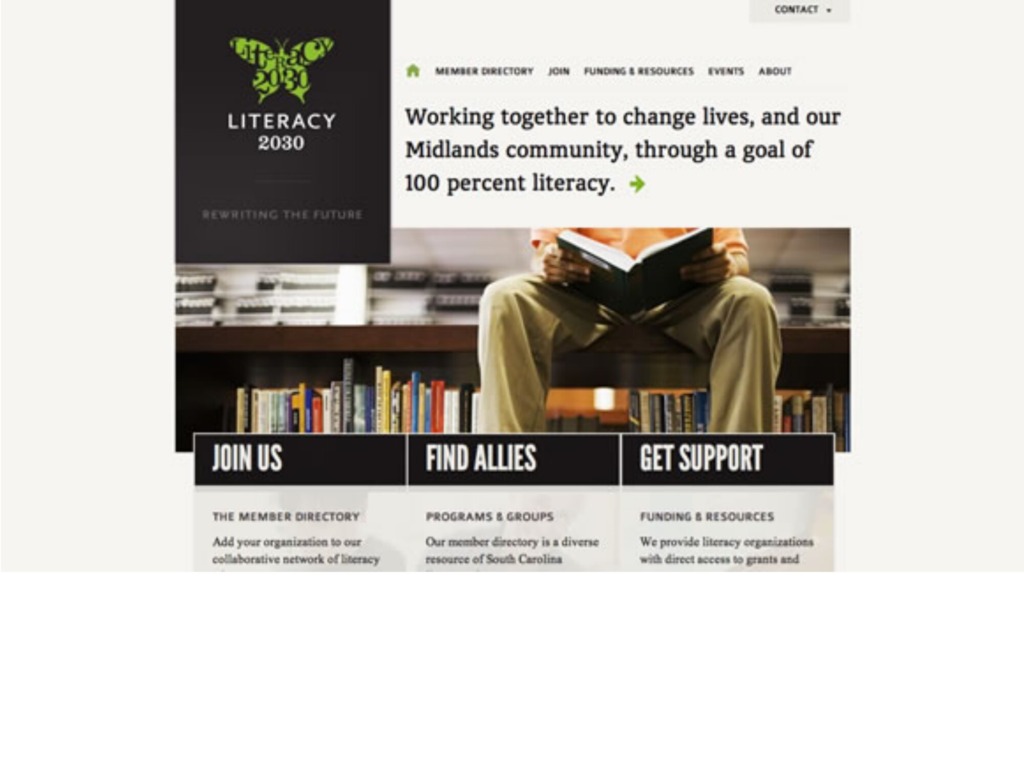
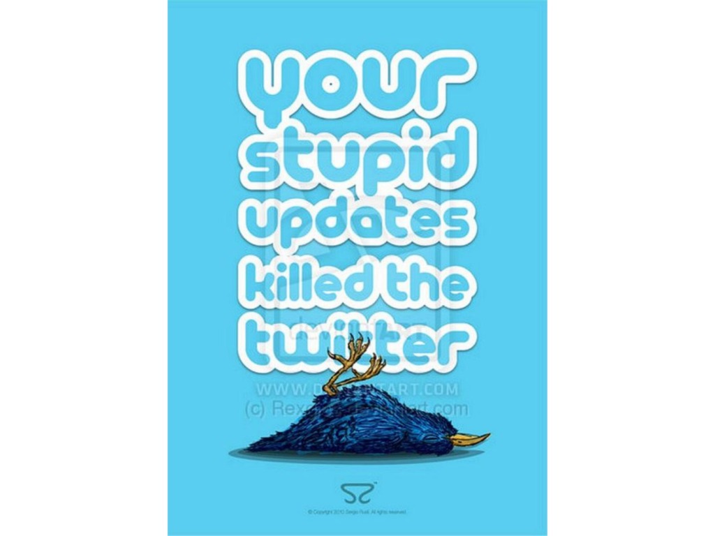
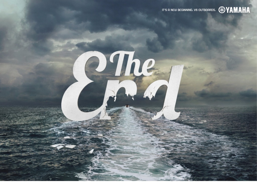
👑 Typographic Hierarchy: The ultimate tool for Emphasis. Varying sizes, weights, and spacing tells the user exactly what matters most.
-
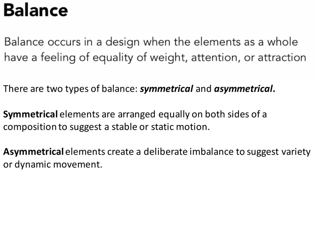
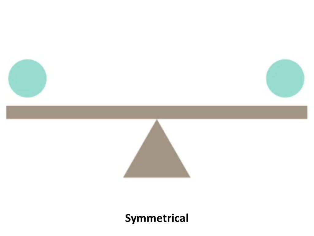
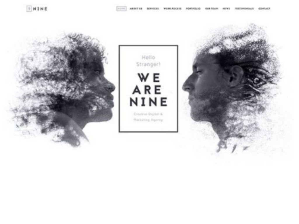
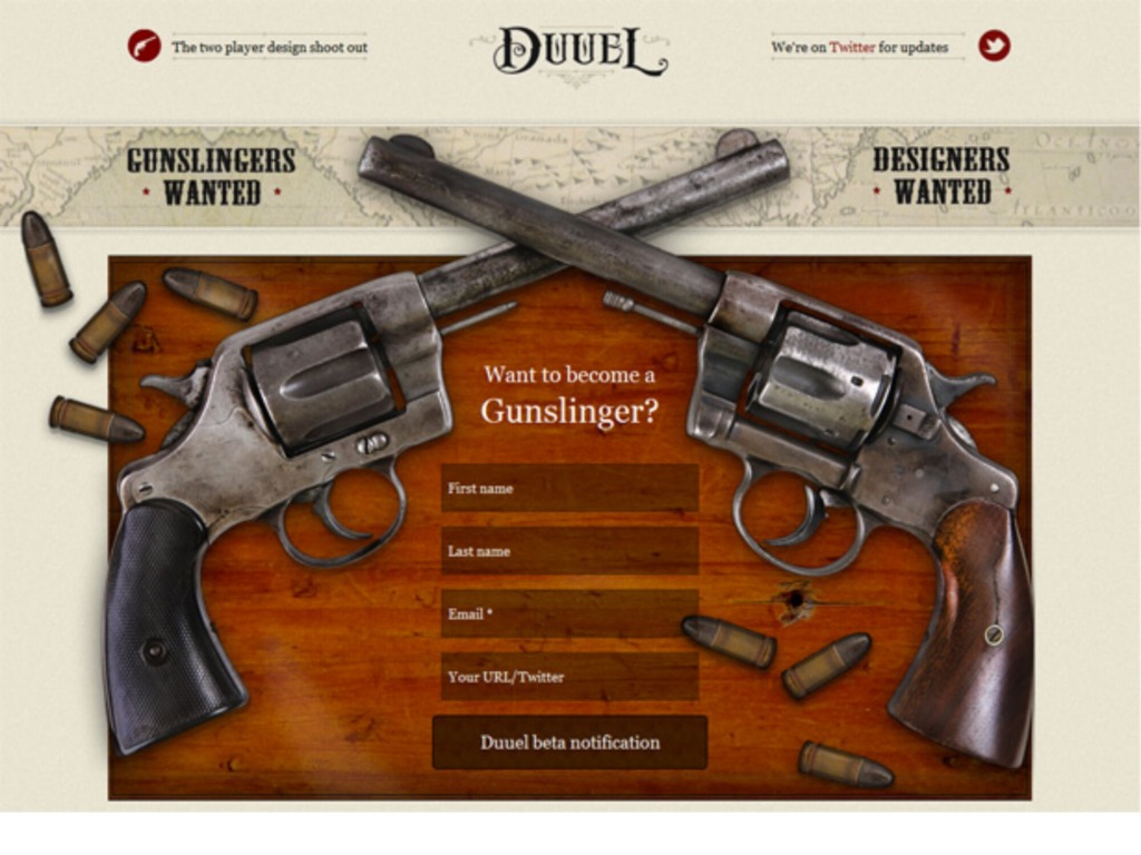
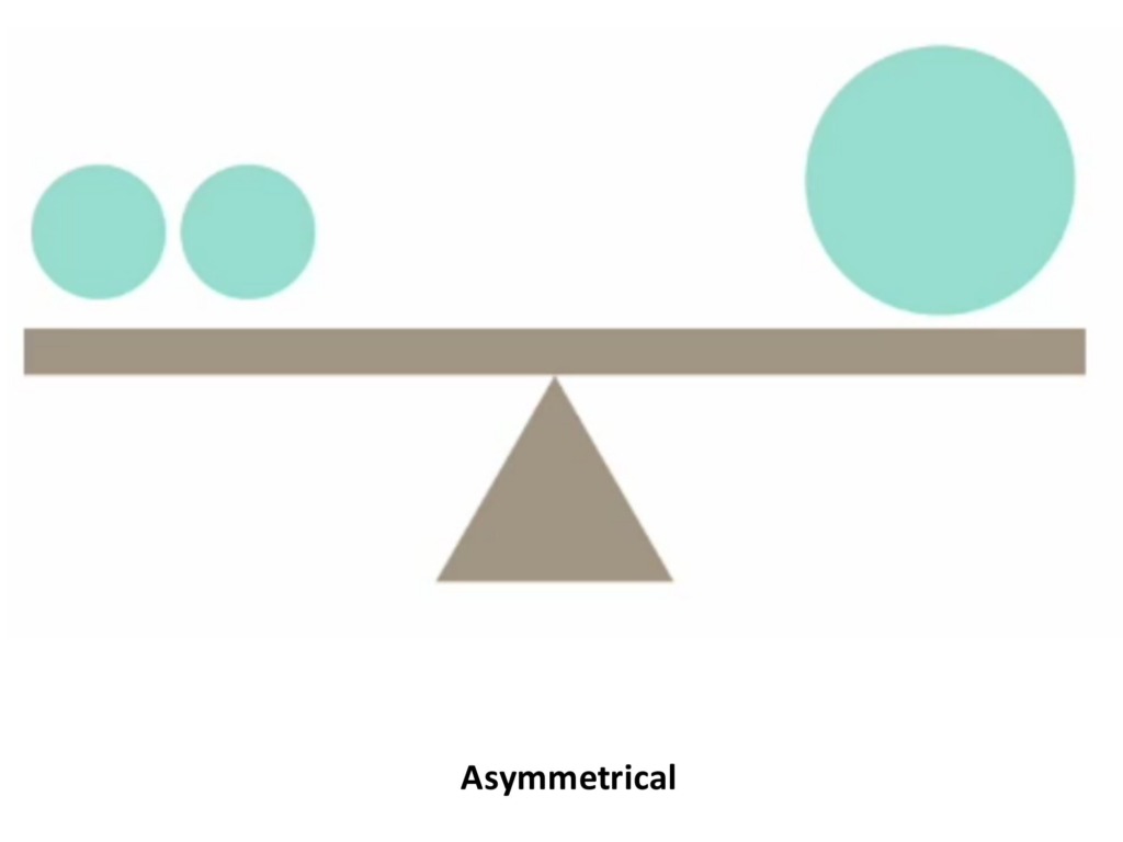
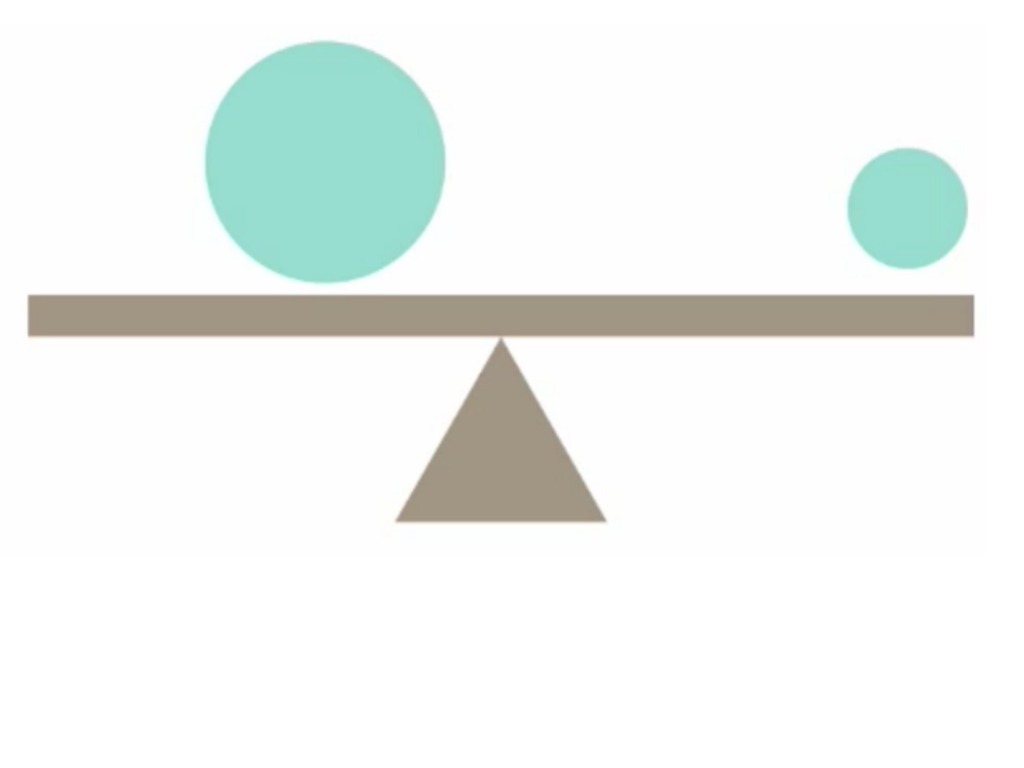
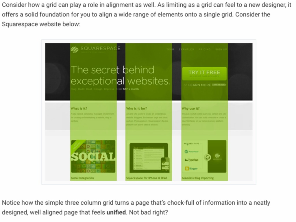
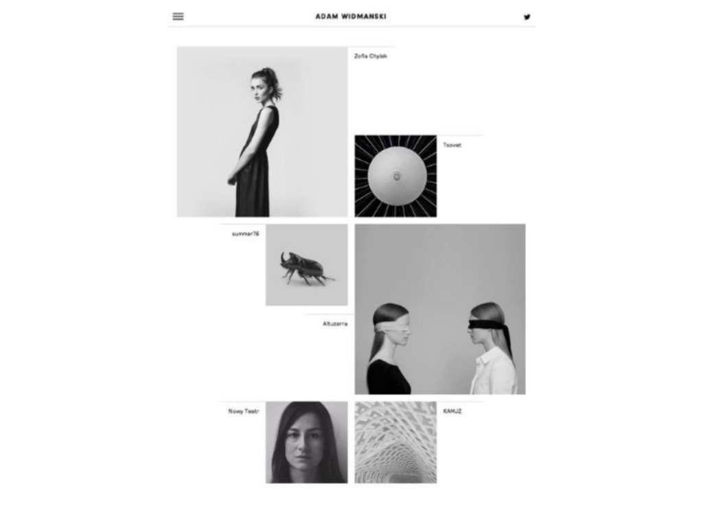
📐 Grid Systems: Want perfect Balance? A solid grid aligns disparate elements, keeping your column gutters consistent and clean.
-
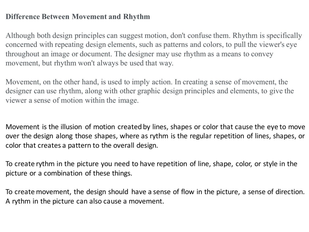
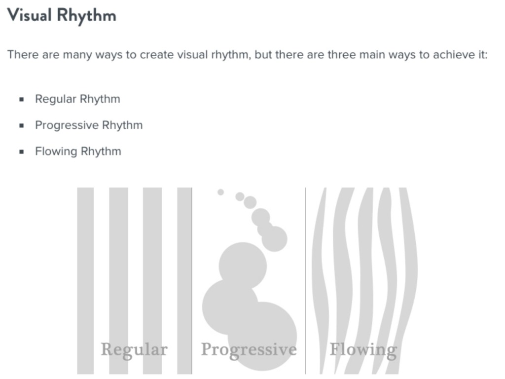
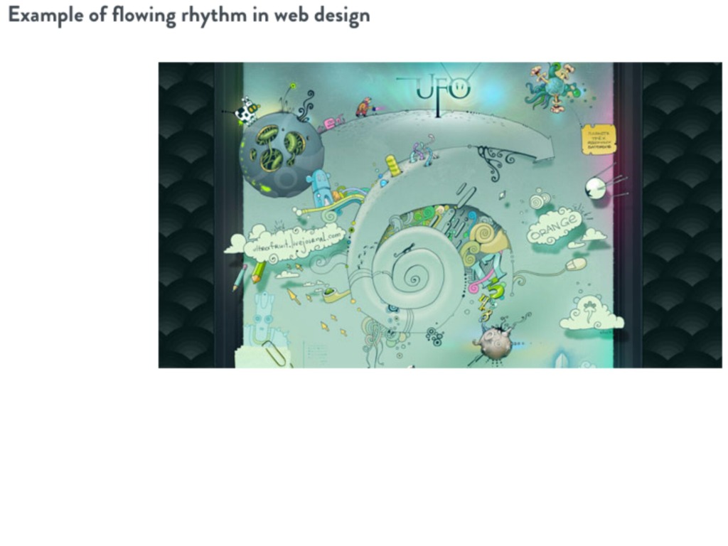
🔄 Repetition Creates Rhythm: Whether it’s Regular, Flowing, or Progressive, repeating styles gives your page a memorable pulse.
-
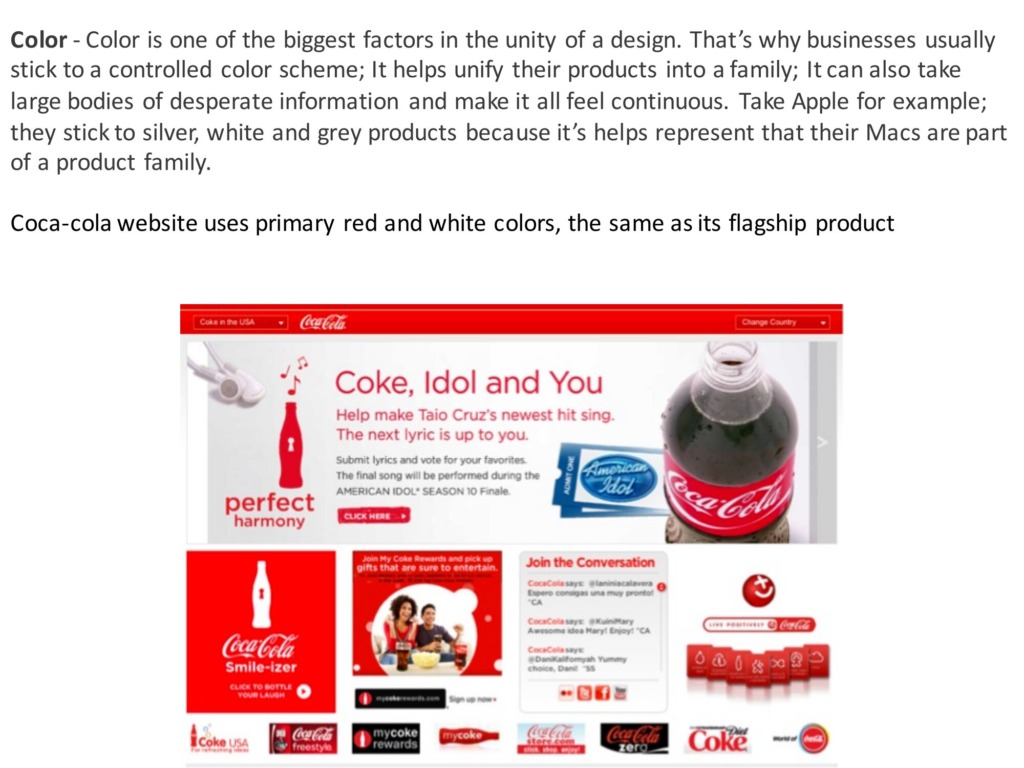
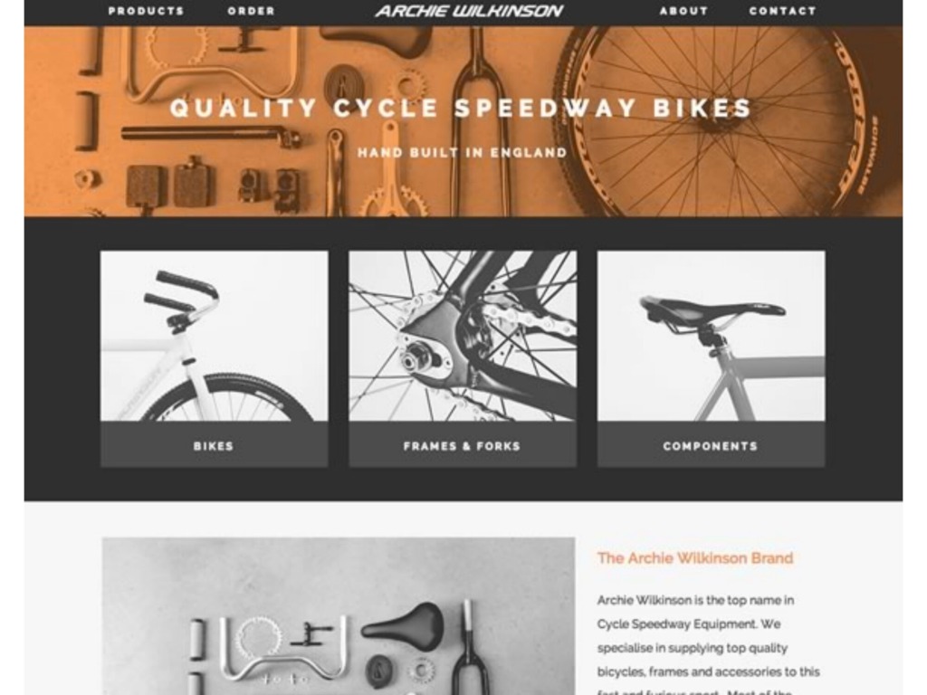
🎨 Controlled Color Schemes: One of the fastest ways to achieve visual Unity. It makes large bodies of information feel continuous.
When you master the relationship between scale, direction, and alignment, you create an effortless journey for the viewer. 💎 Which of these do you use the most? Drop a comment below! 👇
Prepared by Ali Bakhit
#alibakhitdesign #DesignThinking #VisualBranding #LayoutDesign #ArtDirection #CreativeIndustry #DesignInsights