Ever arrived on a website and felt completely lost on where to click? That happens when a layout lacks clear focal points. Emphasis is a powerful design principle used to establish an immediate visual hierarchy. By guiding a user’s attention seamlessly to the most crucial sections first, you can entirely transform their digital journey.
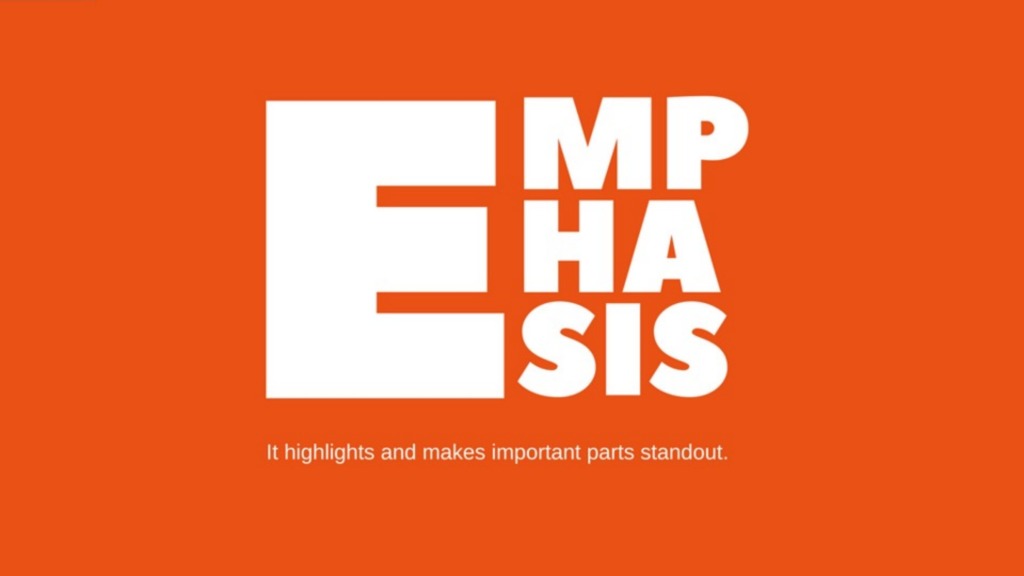
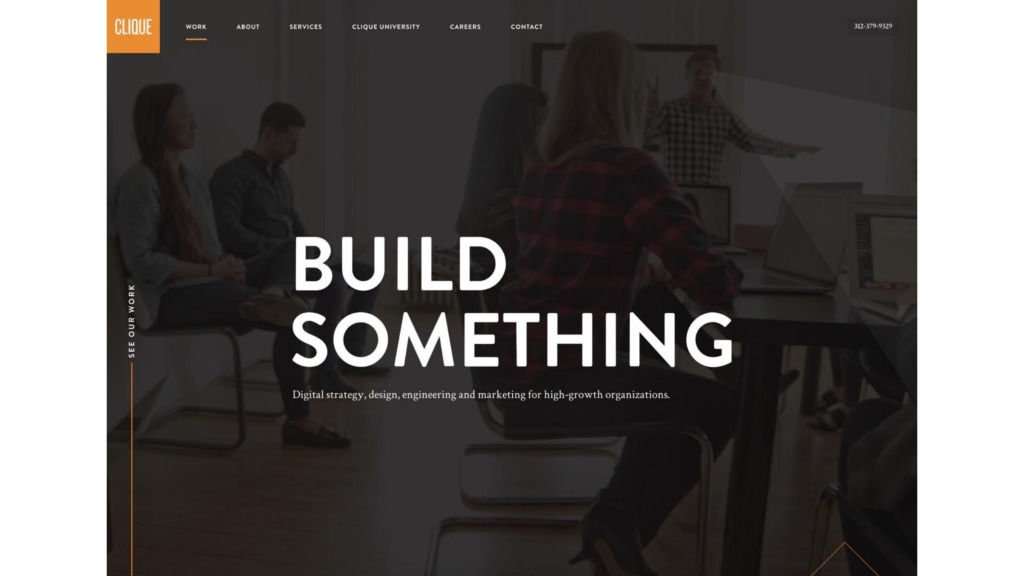
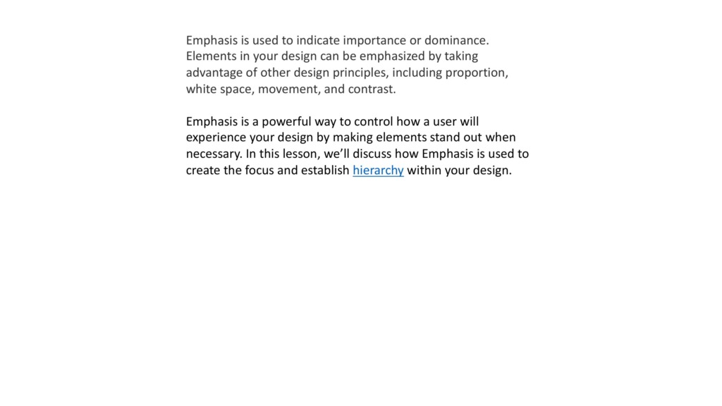
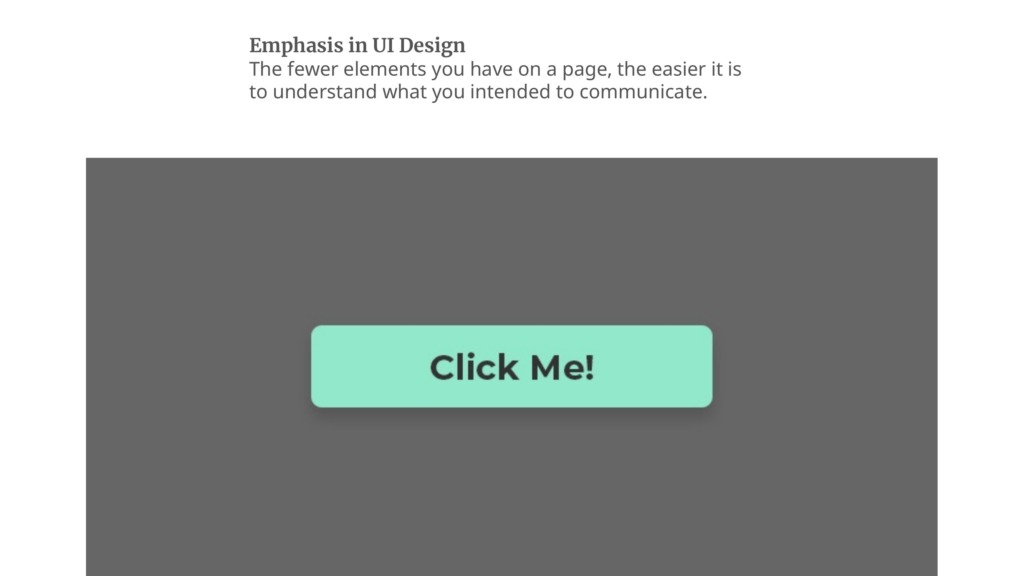
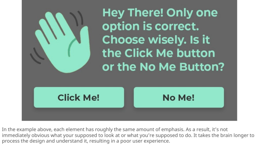
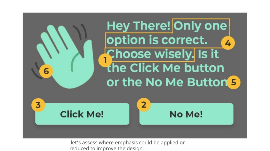

Great design doesn’t just display information; it actively dictates how a viewer moves through a canvas. At the heart of this movement is the balance between emphasis and subordination. By intentionally amplifying specific key elements and toning down others, you remove all processing friction for the brain.
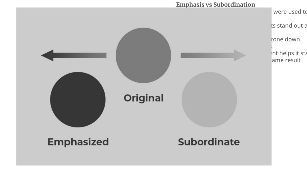
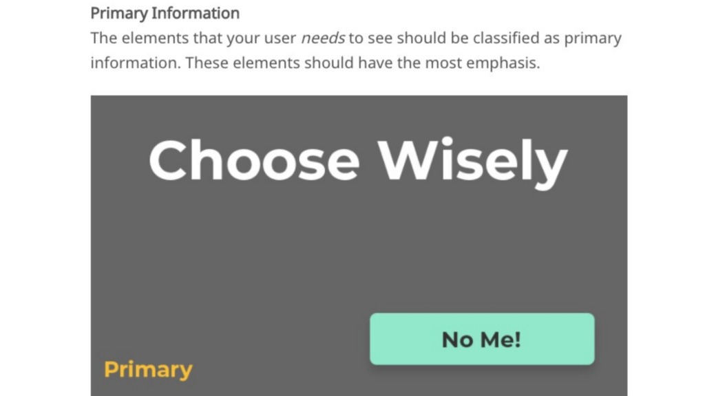
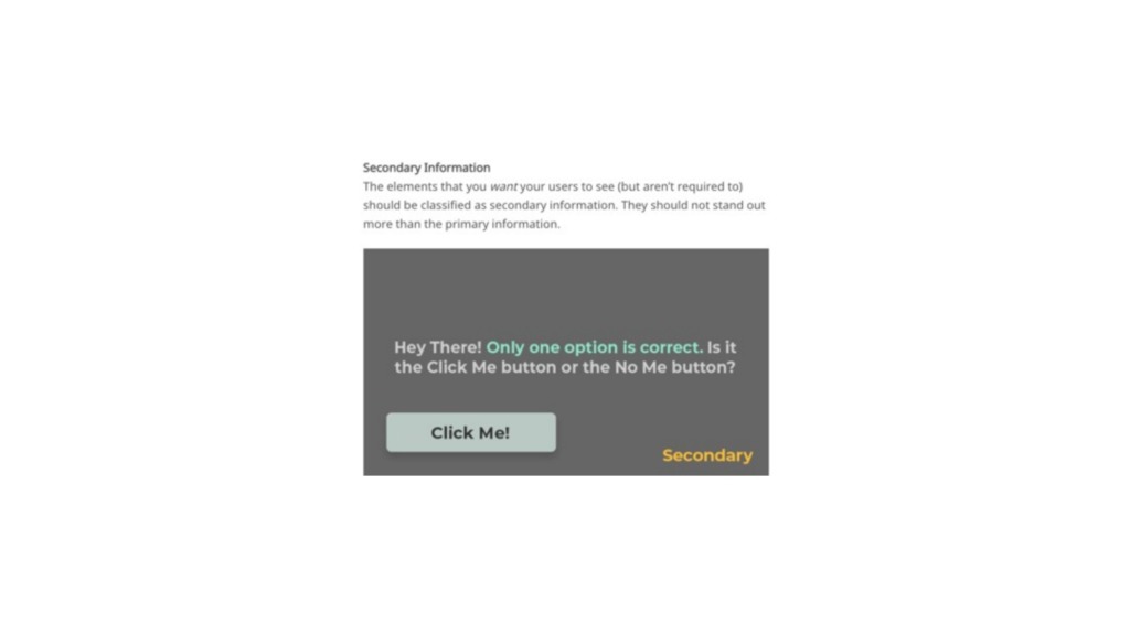
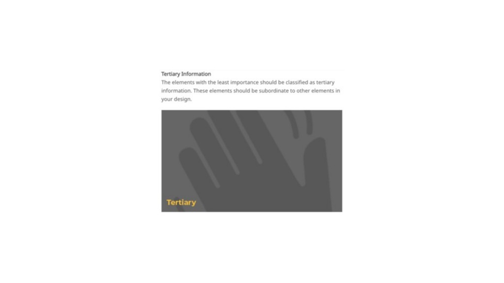
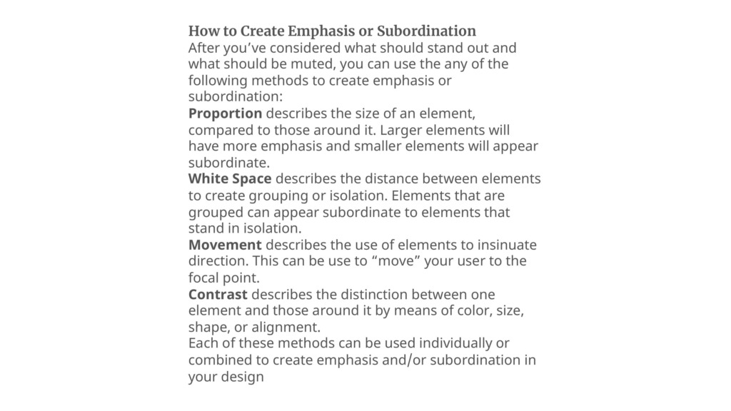


Here are the fundamental pillars to achieve this structural balance in your layouts:
-
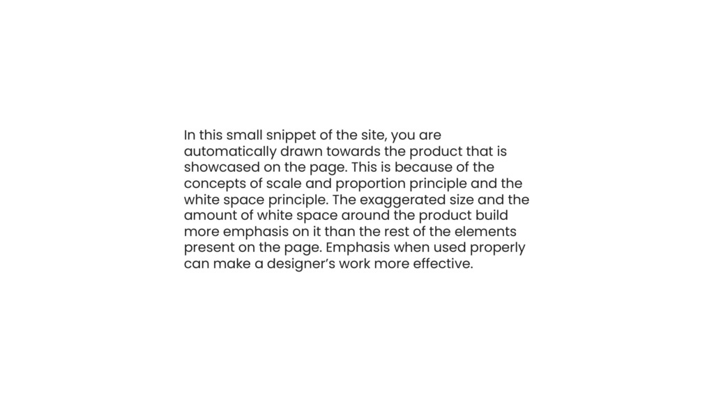
📏 Proportion & Scale: Larger structural elements naturally command the most attention. Adjusting sizes compared to surrounding assets creates an instant, undeniable hierarchy.
-
🌌 Strategic White Space: Isolating an element in open space instantly turns it into a magnet for the eyes. Conversely, grouping multiple smaller items together makes them visually subordinate.
-
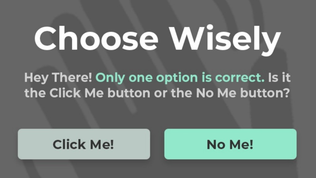
🎯 Dynamic Contrast: Utilizing unique color values, sharp shapes, or dramatic alignment shifts creates a distinct variation that breaks monotony and spotlights critical actions.
-
🧭 Visual Movement: Directing the user’s focus by using shapes, lines, or imagery to physically point toward your central message.

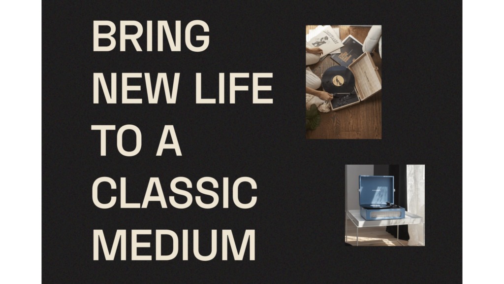

The fewer competing elements you have fighting for attention on a page, the cleaner your message becomes. Step back from your canvas, evaluate your structural layers, and make sure your visual weight tells a clear story. 💎
Prepared by Ali Bakhit
#alibakhitdesign #DesignInsights #LayoutDesign #ArtTheory #CompositionTips #WebDesign #VisualArchitecture