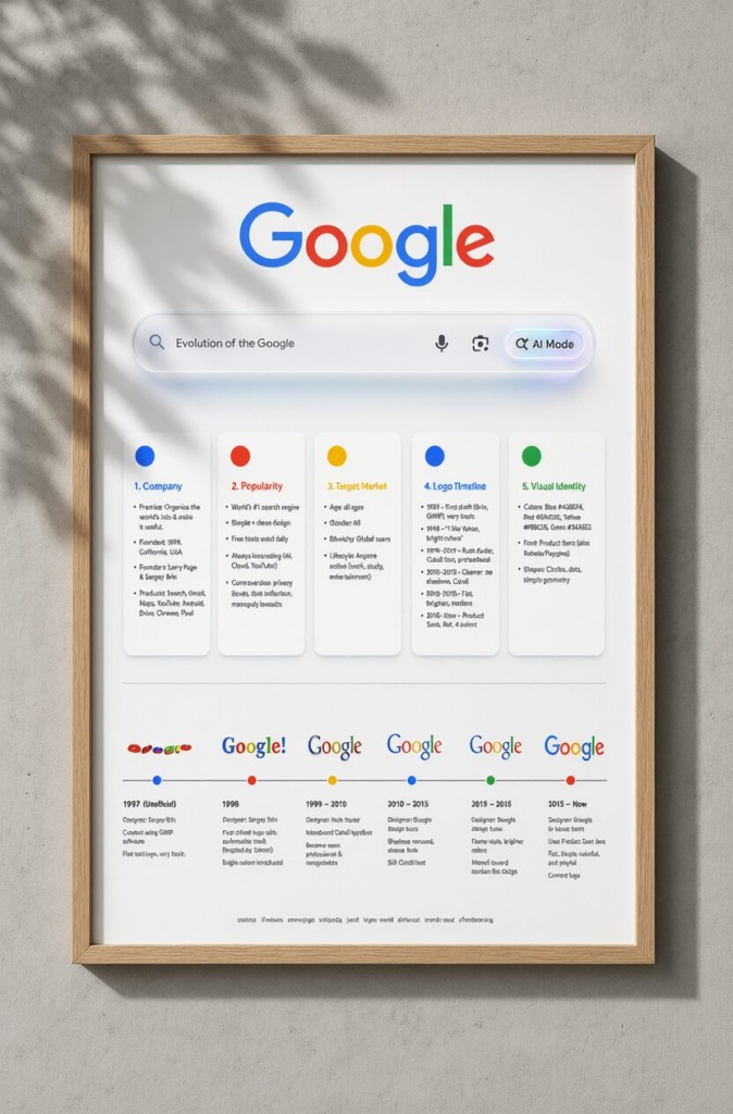
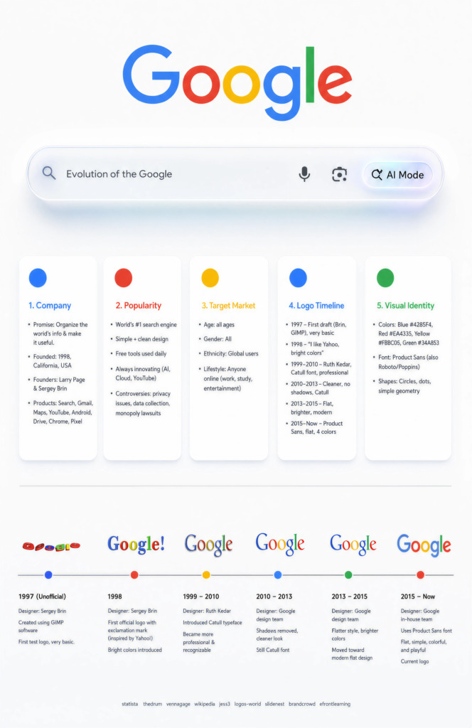
In commercial editorial design and visual identity analysis, referencing a brand’s real-world digital ecosystem creates an immediate connection for the audience. This case study details the concept-to-print workflow for the Evolution of Google Brand Poster, specifically engineered to mirror the ultra-minimalist aesthetic of Google’s current homepage interface. The architecture combines white-space composition, custom glassmorphism, UI card systems, and structured timeline typography in Adobe InDesign, Illustrator, and Photoshop.
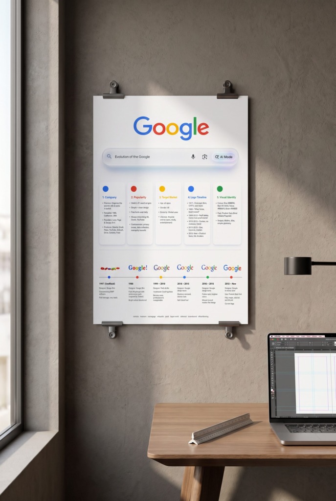
🌐 CREATIVE VISION: MODERN GOOGLE HOMEPAGE HOMAGE
-
🔍 Google Homepage Search UI Motif: Direct integration of Google’s clean, white-background homepage visual identity, featuring a photorealistic 3D translucent search bar with soft lighting effects, vector microphone, lens camera, and glowing AI Mode pill button.
-
🎴 Minimalist UI Card System: Utilizing five floating white cards with soft drop shadows to organize complex brand data pillars while keeping the surrounding canvas pristine, spacious, and clutter-free.
-
🔴🟢🟡🔵 Brand Palette Integration: Categorizing key research sections using Google’s primary identity hues—Blue (#4285F4), Red (#EA4335), Yellow (#FBBC05), and Green (#34A853)—anchored with clean circular color dots.
-
⏳ Chronological Node Timeline: Connecting six historical logo milestones along a subtle horizontal axis, linking Google’s 1997 GIMP draft to its current Product Sans geometric identity.
🧗 TECHNICAL CHALLENGES & DESIGN OBSTACLES
-
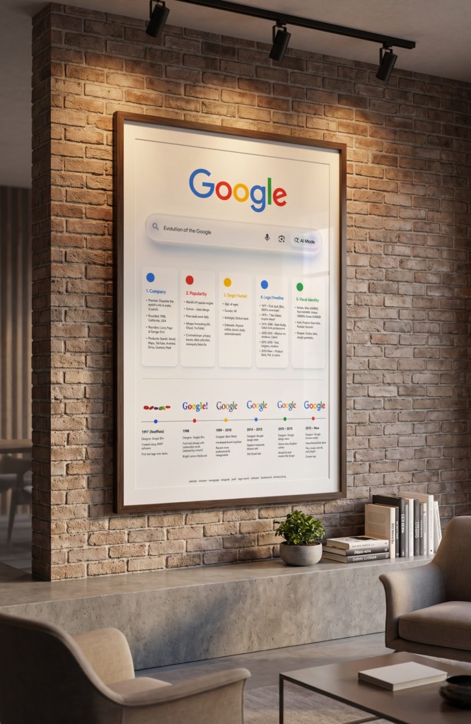
🧩 Minimalist White Space Control: Balancing five dense information pillars and six historical logos on a clean, white 11 x 17 inches layout without making the poster feel empty or overcrowded.
-
📸 Historical Logo Artifact Cleaning: Sourcing low-resolution legacy logo scans (such as the 1997 GIMP draft) and processing them in Photoshop using selective sharpening and frequency cleanup for 300 DPI print clarity.
-
👁️ Lighting & Contrast Hierarchy: Fine-tuning soft drop shadows and glassmorphism transparency in Illustrator and Photoshop to ensure full readability while maintaining a clean, modern aesthetic.
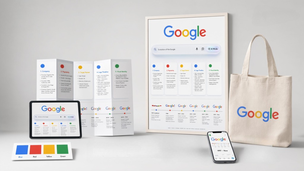
🛠️ SOFTWARE STACK & TECHNICAL WORKFLOW
-
📰 Adobe InDesign: Central publication layout engine used to set up the baseline grid, multi-column card guides, micro-typography styles, and export PDF/X-1a prepress files.
-
✏️ Adobe Illustrator: Applied for drawing vector search bar components, translucent glassmorphism gradients, rounded card boundaries, and node timeline markers.
-
🎨 Adobe Photoshop: Utilized for historical logo restoration, tonal curve tuning, CMYK color space calibration, and soft drop shadow rendering.

📐 PRINT & PREPRESS SPECIFICATIONS
-
📏 Poster Dimensions: Built on a standard 11 x 17 inches tabloid vertical format.
-
✂️ Bleeds & Margins: 0.125 inch outer bleed area with 0.5 inch interior safe margins.
-
🖨️ Color & Output: 100% CMYK color space, 300 DPI high-resolution linked assets, rendered with modern geometric sans-serif typefaces.
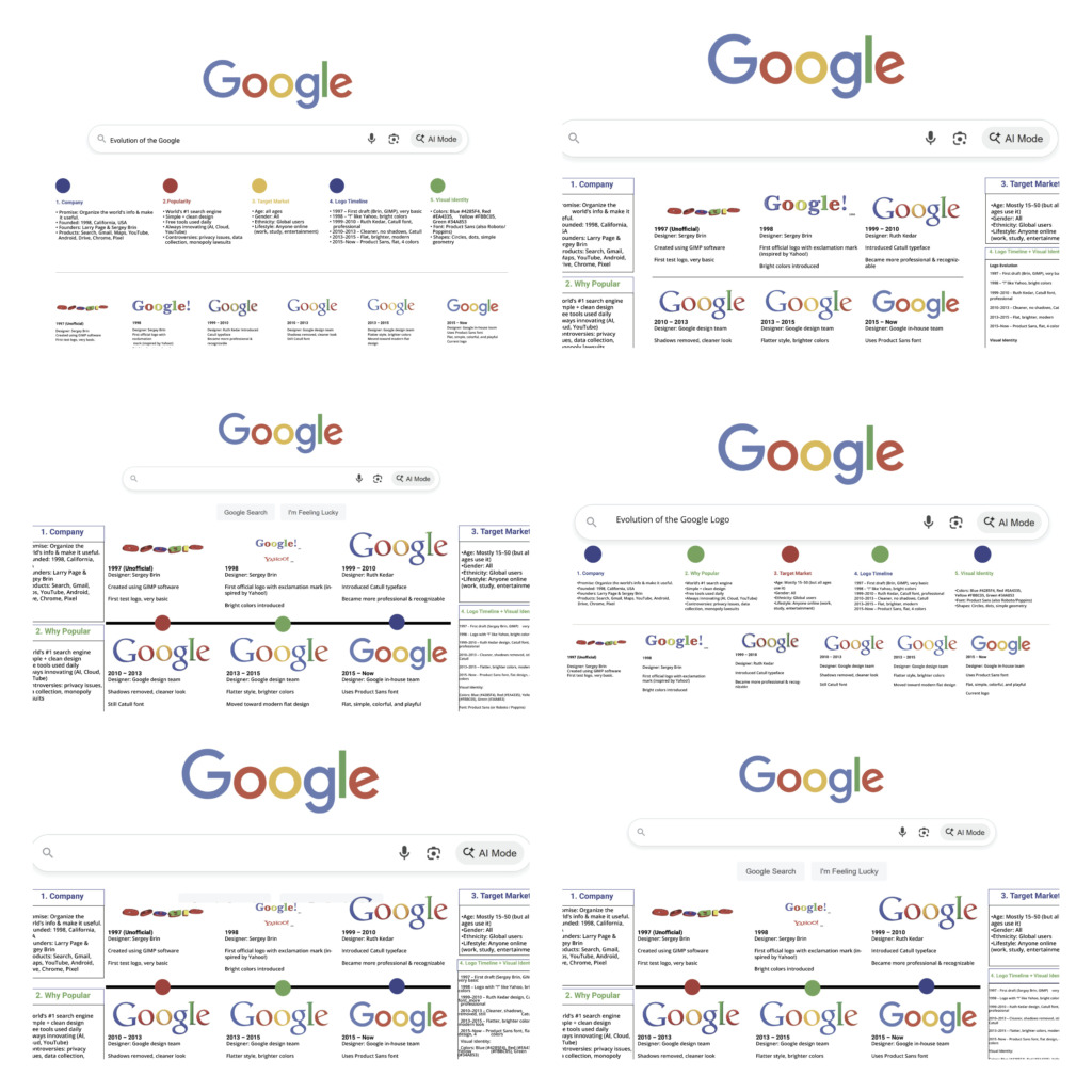
Old Version :
Every UI component choice, lighting depth, and editorial grid alignment proves complete command over brand research, modern web aesthetic adaptation, and publication engineering.
Designed by Ali Bakhit