🏛️ 1. PROJECT BRIEF & CONCEPTUAL FRAMEWORK
The Montreal Maple Leaf Negative Space project is a study in optical duality, visual economy, and municipal storytelling. Built as a core component of the Montreal Urban Branding Collection, the primary design objective was to solve a classic graphic challenge: how to seamlessly integrate two distinct cultural narratives—national Canadian identity and specific Montreal architecture—into a single, unified vector silhouette.
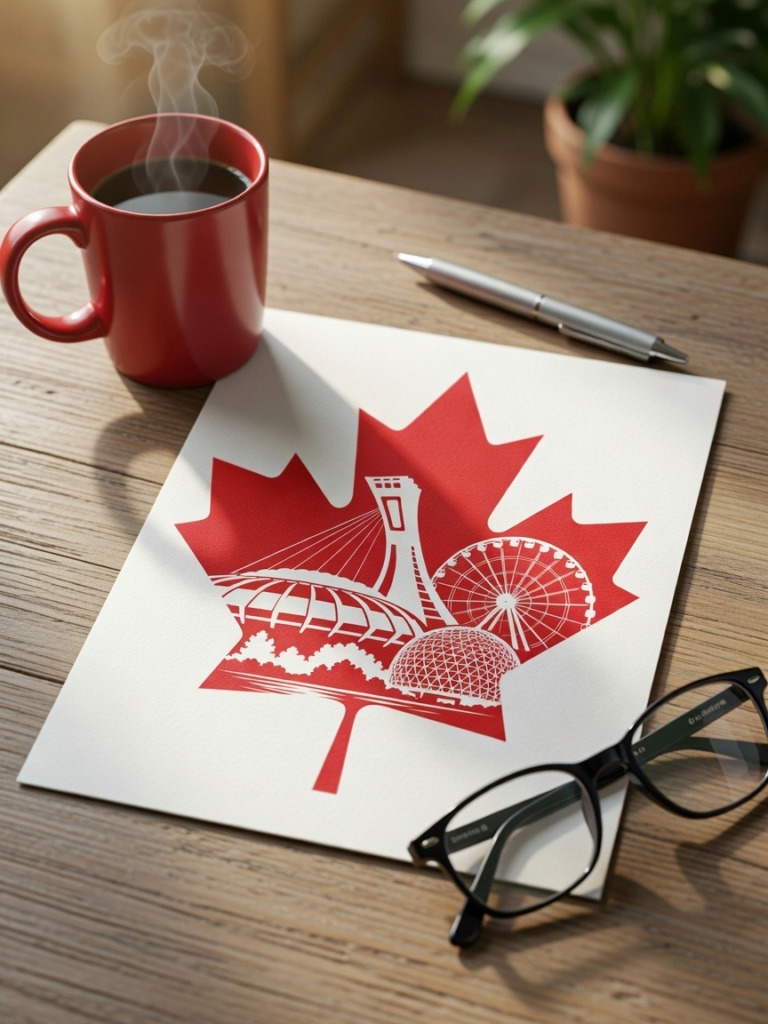
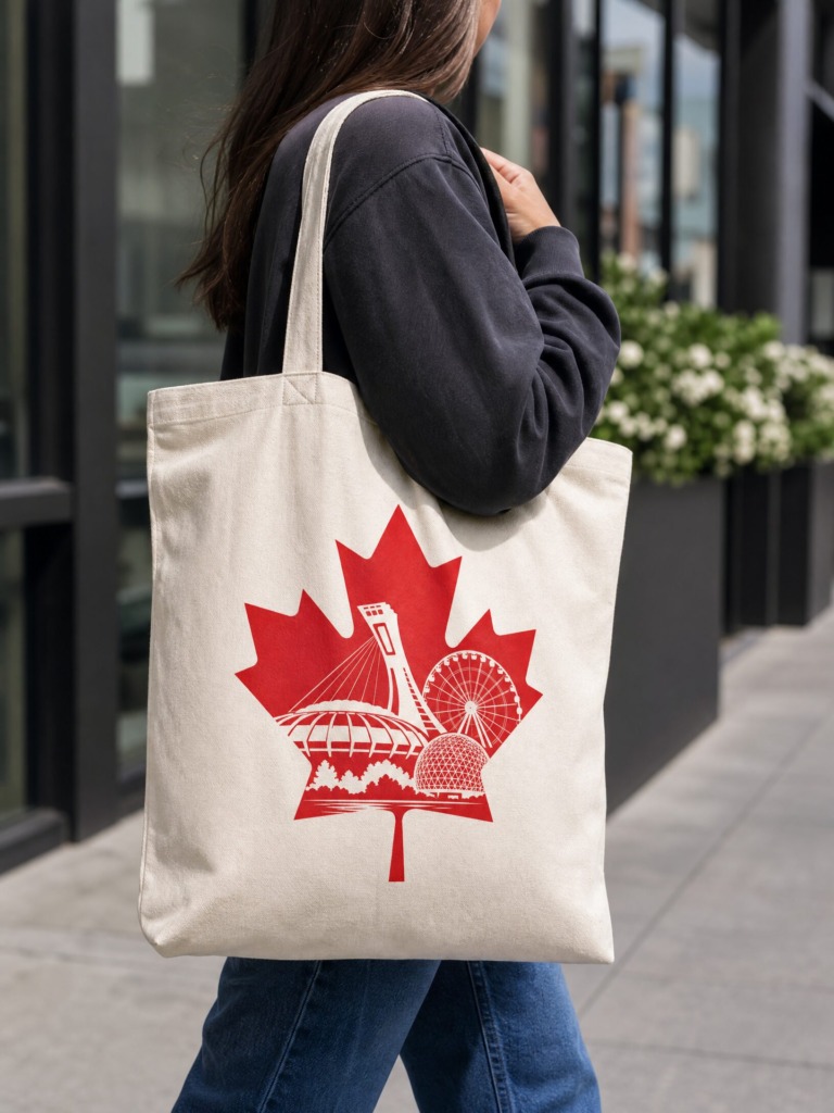
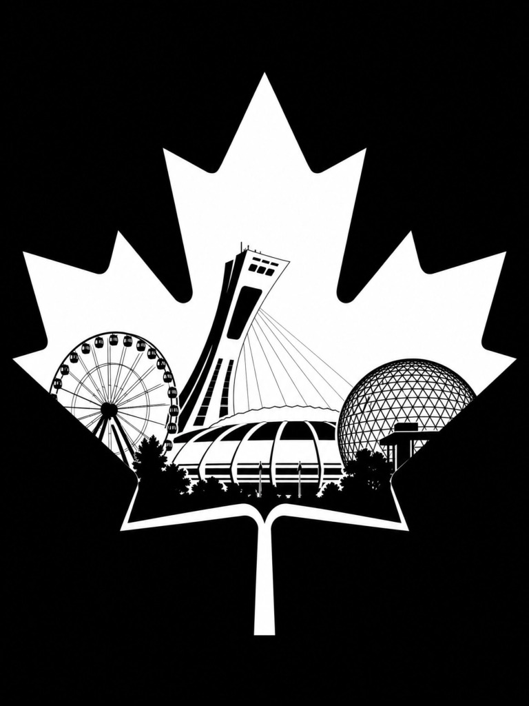
Instead of layering graphic elements on top of one another, which often results in visual noise and poor scalability, I utilized a negative space mechanism. By carving out the negative volume of a solid Canadian Maple Leaf silhouette, I revealed the architectural silhouettes of Montreal’s defining landmarks:
-
The Olympic Stadium Tower (representing structural innovation and sports history)
-
La Grande Roue de Montréal (representing urban life and modern leisure)
-
The Biosphere Dome (representing environmental architecture and heritage)
📐 2. TECHNICAL METHODOLOGY & DESIGN EXECUTION
✒️ A. Negative Space Vector Geometry (Adobe Illustrator)
-
Boundary Retention & Structural Integrity: The primary technical hurdle was maintaining a 100% recognizable outer contour of the Canadian Maple Leaf while subtracting complex architectural paths from its interior. If too much negative area is carved out, the leaf silhouette breaks down optically.
-
Surgical Path Construction: Using custom grid systems in Adobe Illustrator, I calculated the exact line weights and anchor points needed to translate intricate structures—such as the Biosphere’s geodesic dome triangles and the Ferris wheel spokes—into simplified, cut-ready vector shapes.
-
Optical Balance & Flow: The diagonal tilt of the Olympic Stadium tower was counterbalanced against the circular geometry of the Ferris wheel and dome, creating a natural visual rhythm that guides the viewer’s eye across the artwork.
🎨 B. Chromatic Science & Print Readiness (Adobe Illustrator & Photoshop)
-
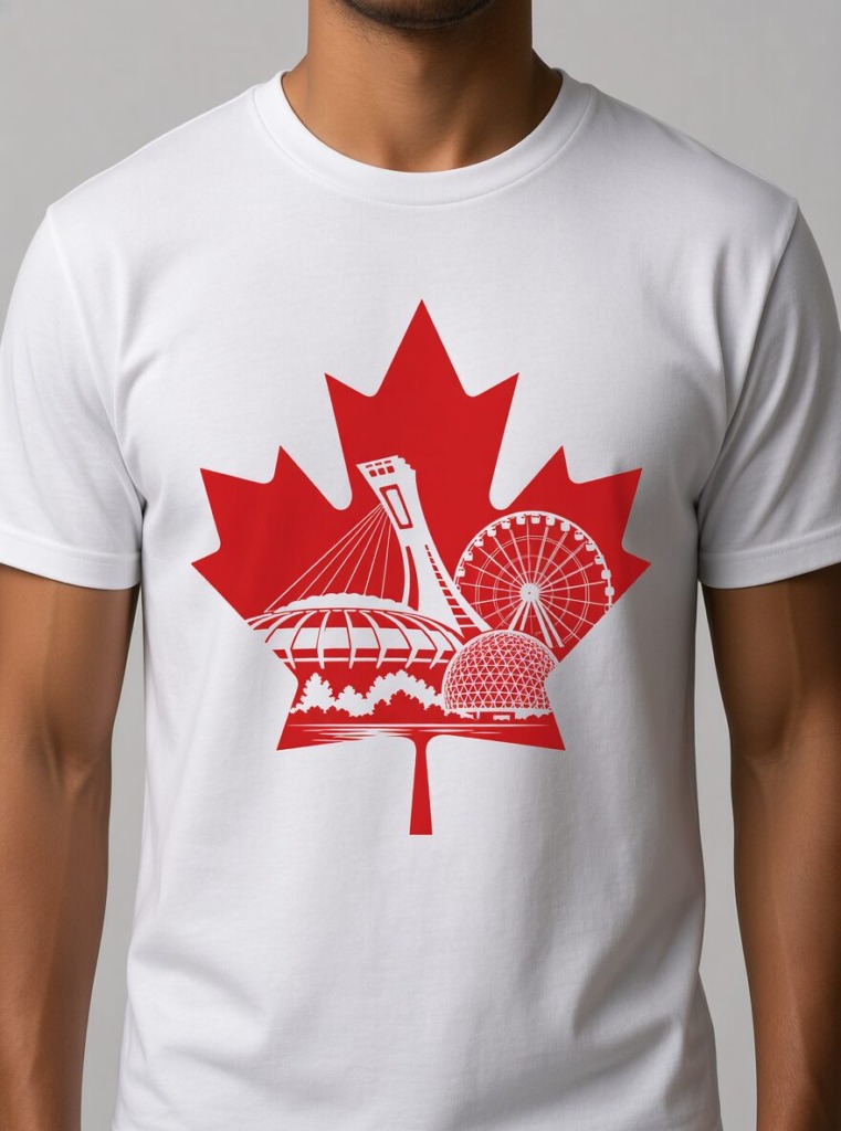
High-Contrast Dual Palette: The design was executed in two strategic colorways:
-
Stark Monochrome (Jet Black & Pure White): For technical clarity, laser cutting, and high-speed screen printing.
-
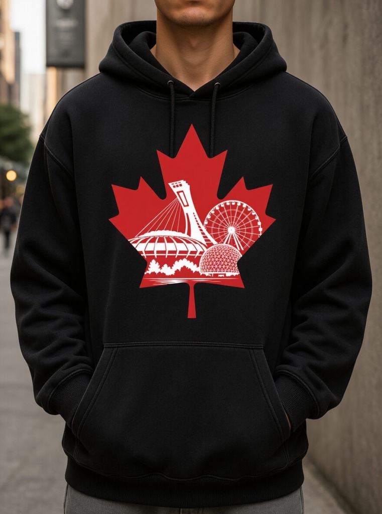
Canadian Crimson Red: For national brand alignment, souvenir merchandise, and civic applications.
-
-
Threshold & Edge Precision: In Adobe Photoshop, contrast thresholds were stress-tested at extreme micro scales to ensure that the fine negative gaps between buildings remain sharp and clear without ink-bleeding during physical production.
🖼️ 3. CONTEXTUAL BRAND APPLICATION & MOCKUP RENDERING
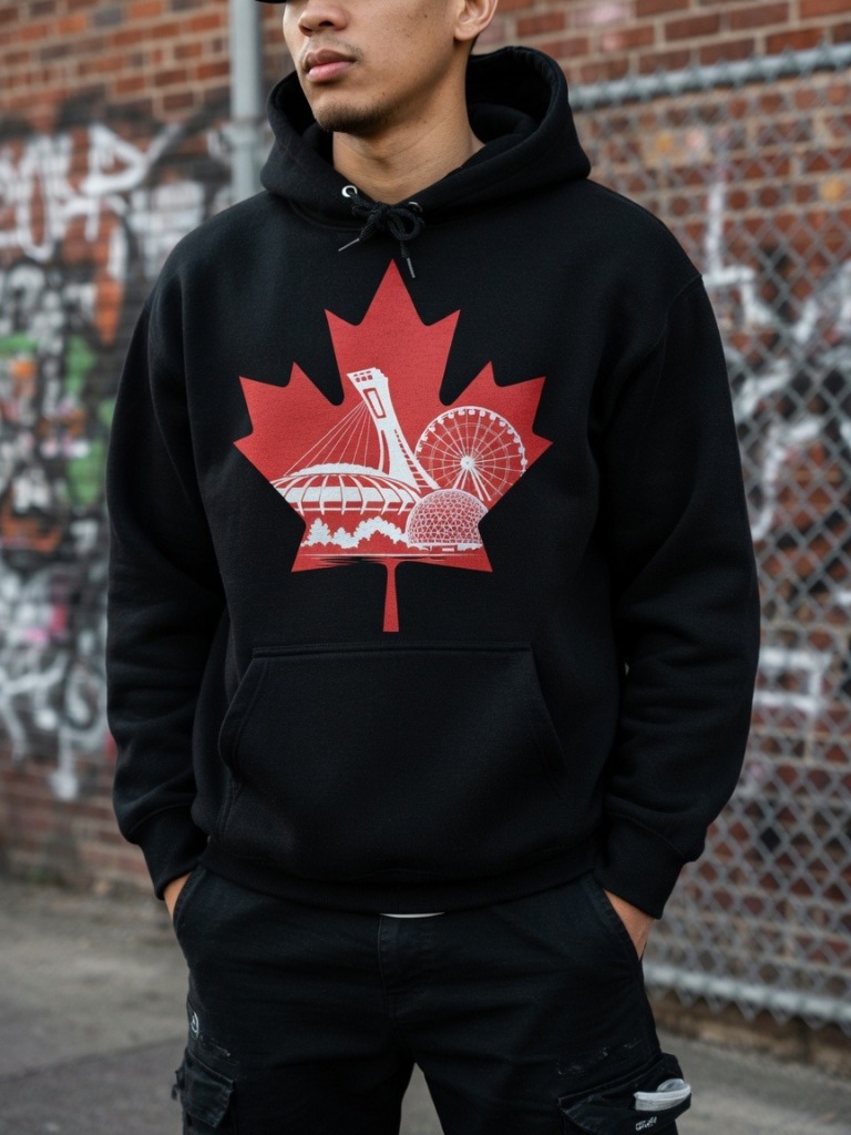
To demonstrate the design’s commercial versatility and real-world scalability, the vector mark was integrated into realistic product environments using Adobe Photoshop:
-
Streetwear & Textile Application: Applied to heavy-cotton hoodies and apparel mockups using displacement mapping. This allowed the vector ink to wrap realistically around physical fabric folds and textile textures, proving its strength as an apparel graphic.
-
Architectural Prints & Posters: Rendered on matte paper poster mockups with directional ambient lighting and glass surface reflections to evaluate its impact as a standalone fine art print.
🎯 4. FINAL SYSTEM OUTCOME
A timeless, high-impact graphic mark that delivers immediate optical engagement. By mastering negative space, this design bridges national symbolism with local municipal pride, presenting a versatile visual asset engineered for global brand recognition.

Old Versions & The Process

Project Title: Montreal Urban Branding
Design Discipline: Brand Identity, Vector Illustration, Spatial Mechanics
Lead Designer: Ali Bakhit
Software Stack: Adobe Illustrator (Negative Space Engineering), Adobe Photoshop (Contextual Lighting & Material Mapping)
Visual Identity & Vector Art Showcase by Ali Bakhit
“Negative space design requires absolute visual economy—forcing two distinct concepts to read simultaneously in a single graphic.”