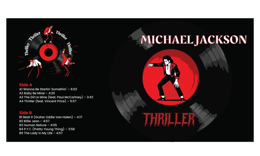
Album packaging functions as the primary tactile interface between auditory culture and visual communication. Reimagining Thriller—the highest-selling album in music history—demanded a rigorous approach that honors mid-1980s pop nostalgia while establishing a high-impact, contemporary visual identity system.
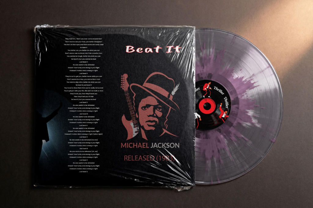
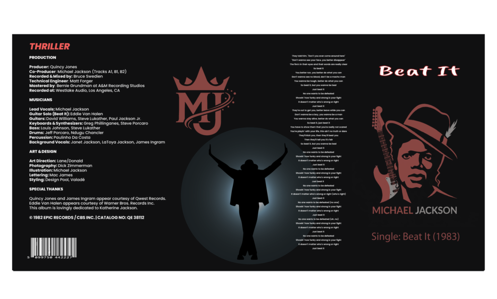
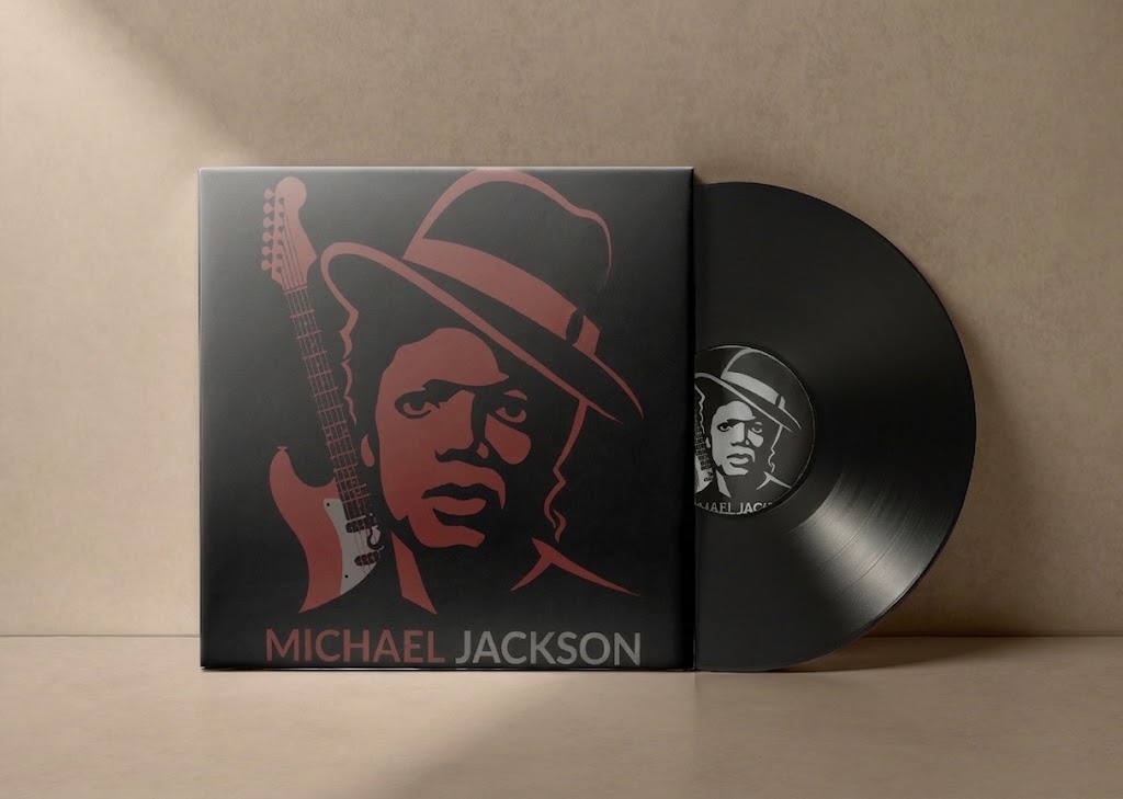
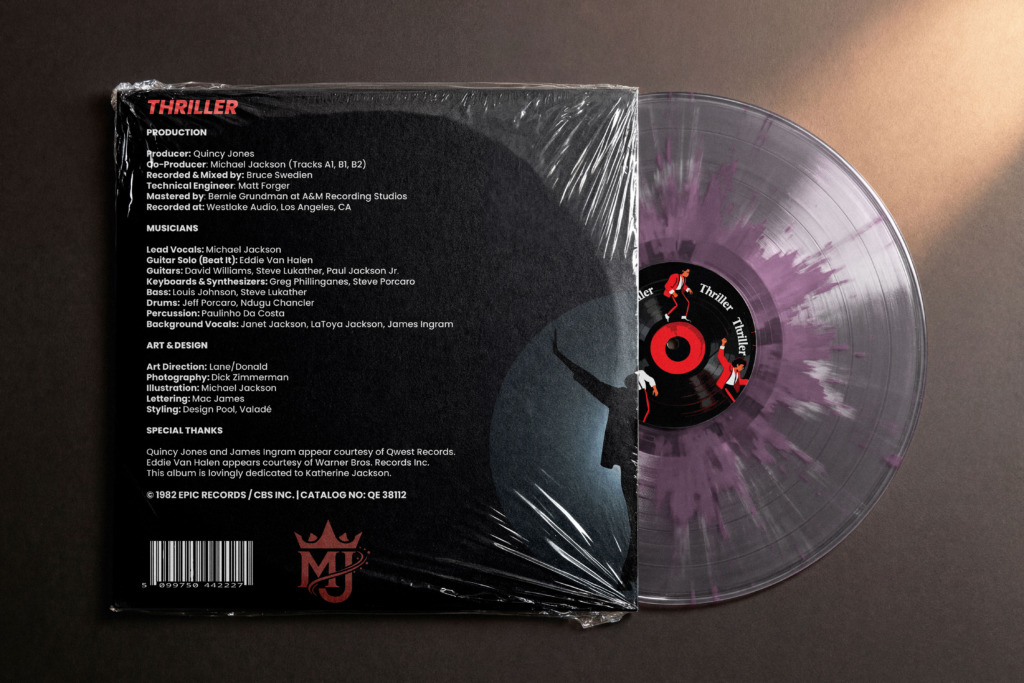
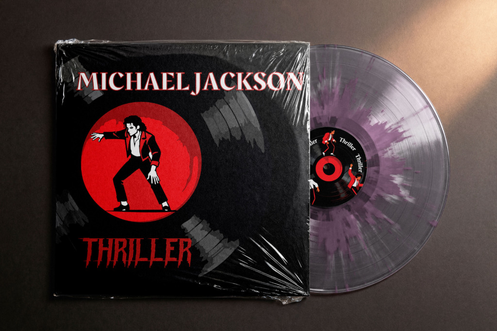
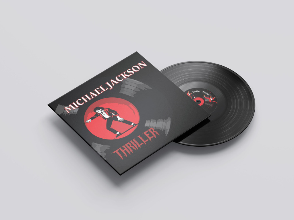
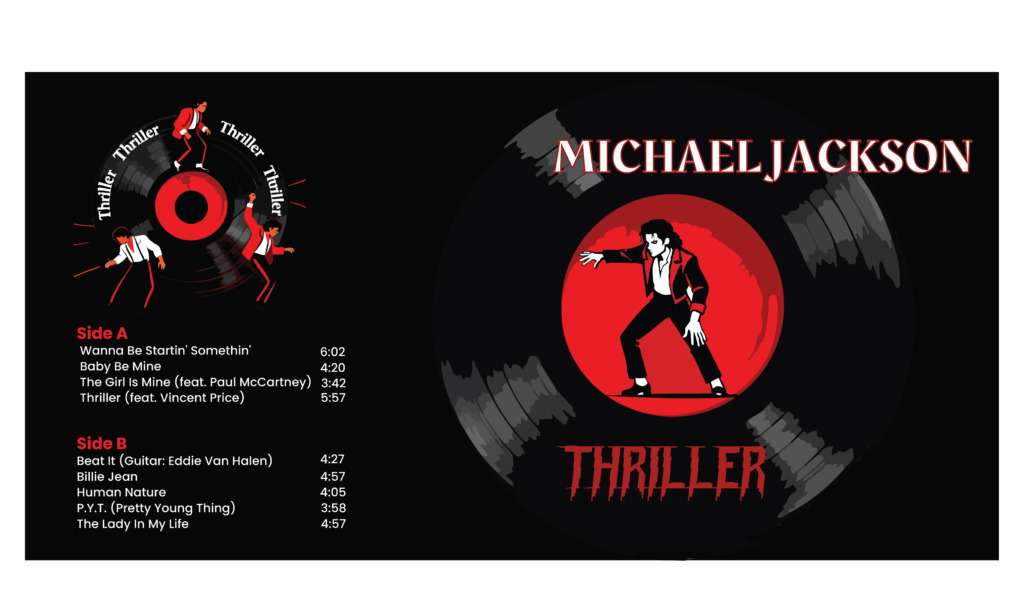
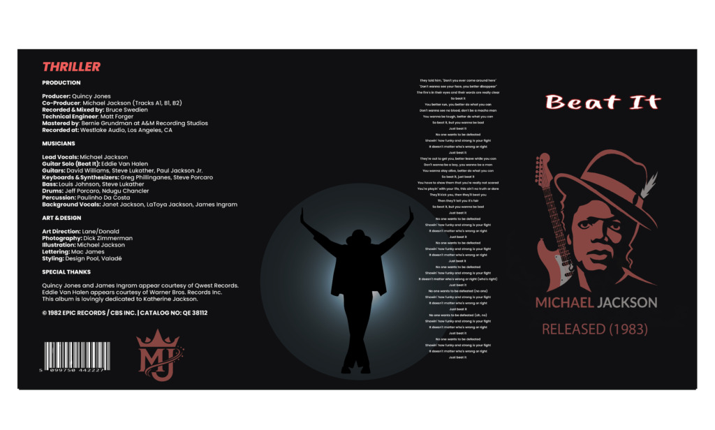
This project completely replaces generic photo-heavy templates with a custom vector character framework and a dual-red chromatic structure spanning the complete four-panel 12-inch vinyl format (outer Gatefold jacket front and back, alongside inner sleeve front and back). By filtering the inner sleeve lyrics down exclusively to the single Beat It, the spatial hierarchy shifts dramatically toward bold typographic geometry, structural grid alignment, and expansive negative space.
🔴 1. Core Visual Concept & Spatial Strategy
-
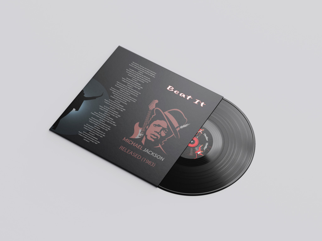
🎨 Dual-Tone Crimson System: Engineered two distinct, non-conflicting red palettes—a rich, muted crimson dedicated to the inner sleeve and a highly saturated crimson for the outer jacket. This chromatic split creates immediate visual contrast and depth during the physical unboxing experience as the inner sleeve is extracted from the outer jacket.
-
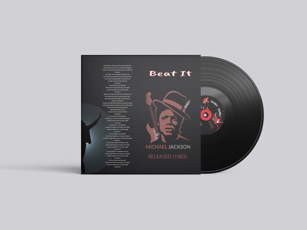
🎸 Focused Lyric Architecture: Streamlined the lyric panel by displaying only the lyrics for Beat It rather than crowding the sleeve with full album text. The typography is set in a tight vertical center column, framed by broad negative space margins to ensure maximum legibility and visual poise.
-
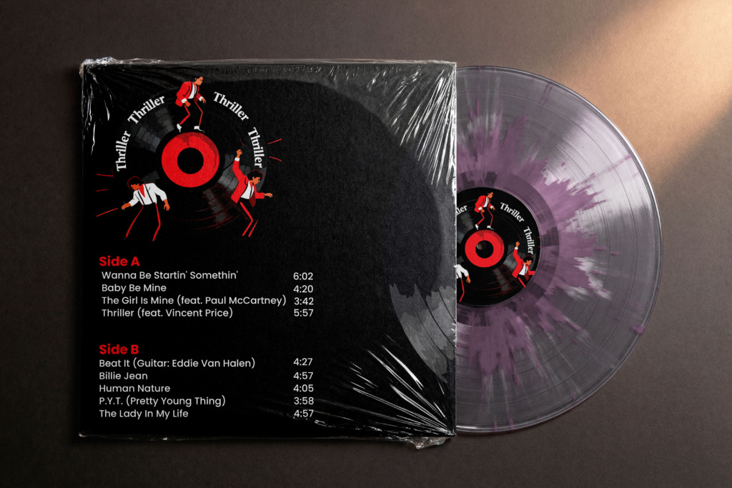
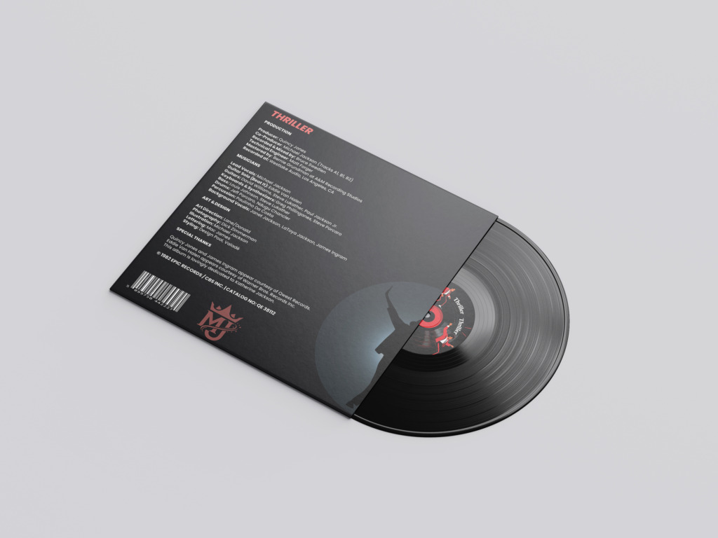
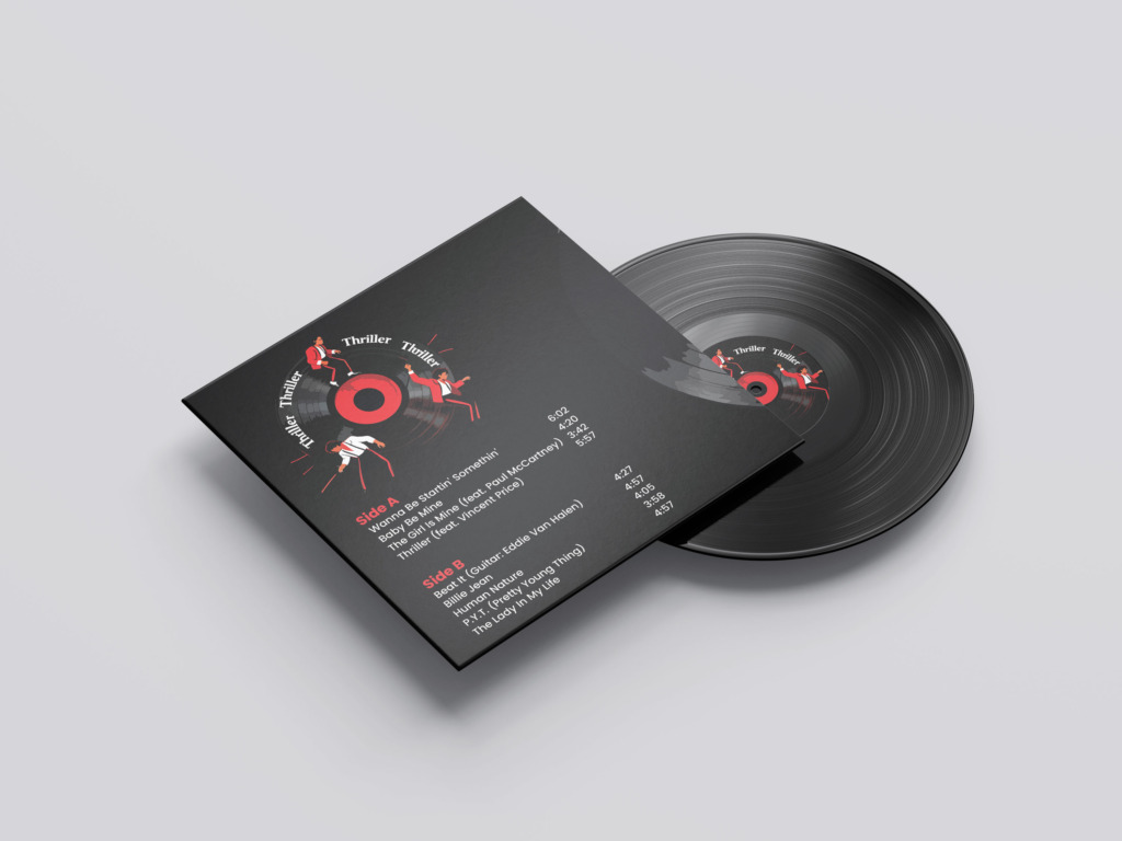
💿 Vinyl-Centric Compositional Axis: The physical vinyl record acts as the central geometric pivot across all four packaging layouts. The jacket back features a full-scale vector vinyl record with dancing silhouettes along its outer arc, complemented by a central silhouette figure illuminated within a spotlight beam on the inner sleeve.
-
✒️ Custom Vector Illustration System: Replaced stock photography with original, hand-crafted vector artwork. The hero illustration features a high-contrast portrait of Michael Jackson with his iconic fedora alongside an electric guitar, setting a strong rock-pop aesthetic tailored to Beat It. Every path was manually built with the Pen tool to eliminate auto-trace artifacts and preserve crisp vector edge fidelity.
-
🏷️ Custom Branding & Technical Metadata: Integrates a custom-designed “MJ” monogram logo, precise track duration listings for Side A and Side B, comprehensive production credits, legal copyright text, catalog numbers, and vector barcode assets.
-
🖌️ Texture & Expressive Overlays: Incorporated subtle splash and spray-paint textures across background elements to evoke the edgy urban street culture central to the Beat It music video concept.
🛠️ 2. Software Pipeline & Technical Execution
-
✒️ Adobe Illustrator: Primary vector graphics engine used for path-level illustration drawing, node manipulation, pen-tool geometry, custom logo development, radial text wrapping along circular vinyl paths, and exact 12-inch mechanical template setup with precision bleed/trim margins.
-
🖼️ Adobe Photoshop: Utilized for source photo threshold mapping, lighting mask contrast adjustments, custom spray and splash texture brush generation, and tonal adjustments before final vector conversion.
-
📐 Adobe InDesign: Employed for master typographic grid structures, leading and kerning controls for large body copy blocks, baseline grid alignment for credit columns, and pre-press document preparation for print output.
💡 3. Critical Design Refinements & Solutions
-
⚠️ Issue 1: Visual Clutter in Tracklist Alignment
Analysis: Inconsistent numerical spacing between song titles and track durations created visual noise along the right margin.
Refinement: Isolated track lengths into a dedicated, right-aligned secondary text column in Adobe InDesign, locking all timestamps along a clean vertical grid line.
-
⚠️ Issue 2: Typographic Redundancy on the Sleeve
Analysis: Repeating the track title “Beat It” in identical font weights on the right panel created competing focal points.
Refinement: Replaced the lower redundant title with a clean, understated RELEASED (1983) metadata tag set in wide-tracked uppercase typography.
-
⚠️ Issue 3: Vinyl Rim Overlap & Edge Tangency
Analysis: The main artist title “MICHAEL JACKSON” at the top of the jacket back touched the outer edge of the vector vinyl graphic.
Refinement: Shifted the typographic header upward by 10 points, restoring safe negative space padding around the vinyl disc geometry.
-
⚠️ Issue 4: Contrast Maintenance Over Textured Backgrounds
Analysis: Heavy black-and-red spray textures threatened to reduce the contrast ratio of fine credit text and legal copyright info.
Refinement: Applied selective vector masks to keep text areas clean, maintaining a minimum 4.5:1 contrast ratio for optimal readability.
Old Version