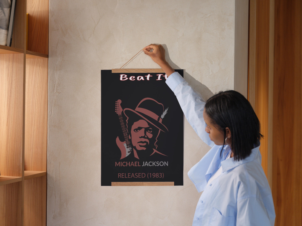
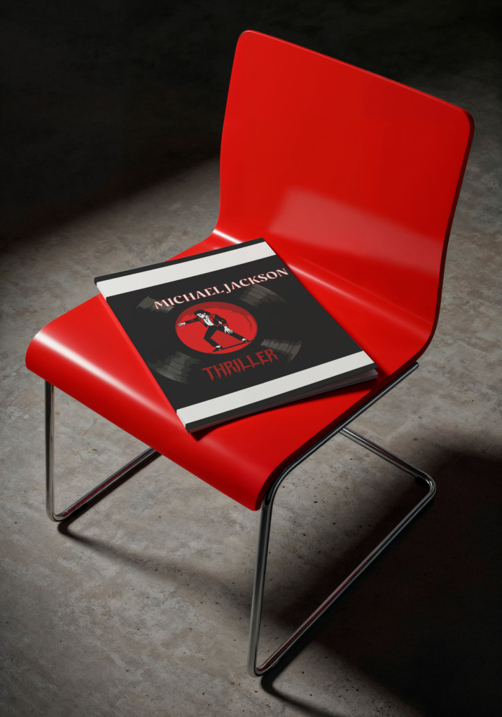
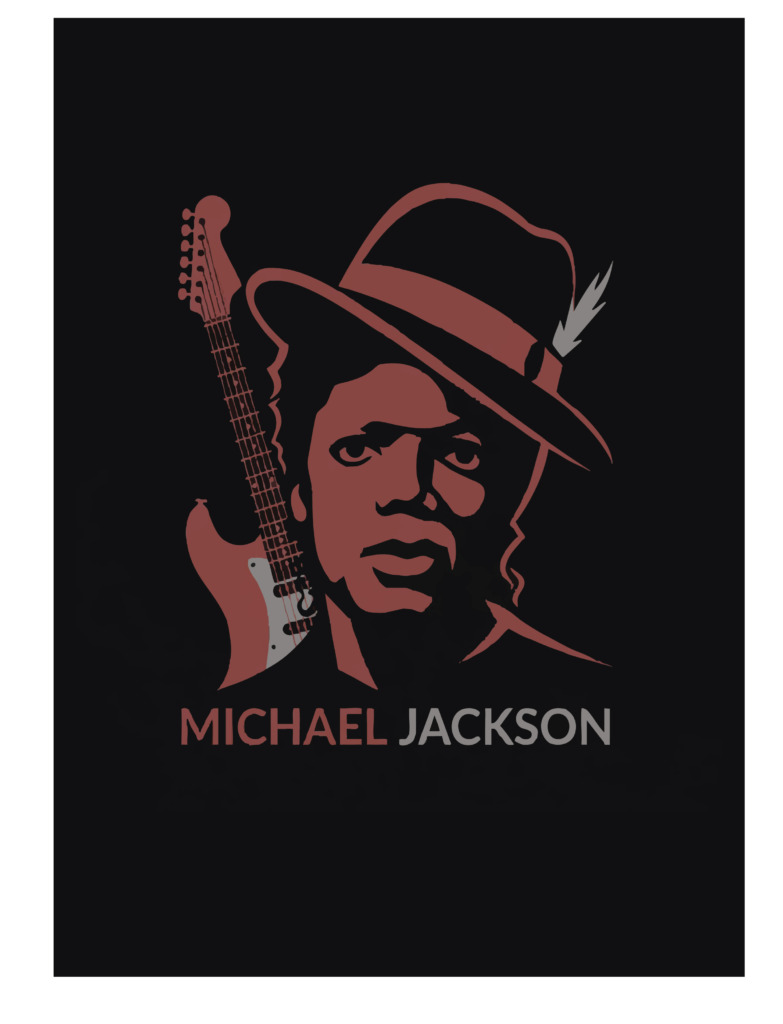
Poster design requires transforming musical energy into a static, high-impact visual interface. Reimagining Michael Jackson’s iconic 1983 single Beat It as an independent graphic poster demanded a structured vector execution that bridges 1980s pop nostalgia with high-contrast minimalist graphic design. Moving away from photo-driven layouts, this poster system relies on manual vector path construction, balanced negative space, and strict typographic hierarchy. Built on an A3 grid format (297 x 420 mm), the composition balances a central portrait illustration with an electric guitar element to capture the rock-pop fusion of the track.
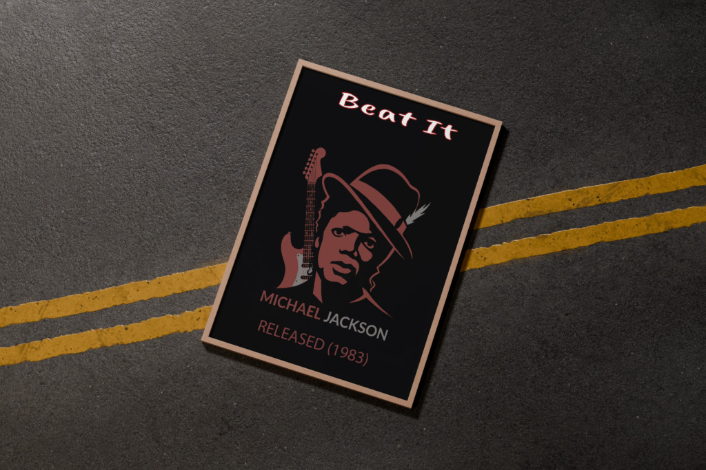
🔴 1. Visual Strategy & Technical Execution
-
🎨 High-Contrast Muted Palette: Engineered a dark charcoal base (#121212) paired with a deep muted crimson (#8B2626) and clean white typography. This chromatic system eliminates high-frequency noise, ensuring the main vector art stands out while maintaining readability across various physical print materials and lighting conditions.
-
🎸 Vector Character Architecture: Replaced raster photography with a custom vector portrait of Michael Jackson wearing his fedora hat alongside an electric guitar. Constructed every path manually using the Pen tool in Adobe Illustrator to maintain clean vector edges at any scale.
-
📜 Typographic Hierarchy & Grid: Structured around three main typographic anchors. The top headline Beat It is rendered in an expressive brush script font, while the artist name MICHAEL JACKSON and metadata tag RELEASED (1983) use clean sans-serif type set with wide tracking (+120) to ground the base of the design.
-
🛠️ Cross-Software Pipeline & Assets:
-
✒️ Adobe Illustrator: Used for vector drawing, node alignment, anchor point editing, exact A3 bleed/trim setup, and SVG/EPS production exports.
-
🖼️ Adobe Photoshop: Utilized for threshold mapping, lighting contrast masks, hue/saturation balance, and rendering 3D mockups.
-
📐 Adobe InDesign: Employed for baseline grid alignment, typographic kerning, tracking controls, and export of PDF/X-1a print-ready files.
-
📸 Design Resources: Asset inspiration curated via Unsplash (street textures, urban lighting) and Adobe Color for precise CMYK/RGB color balance testing.
-
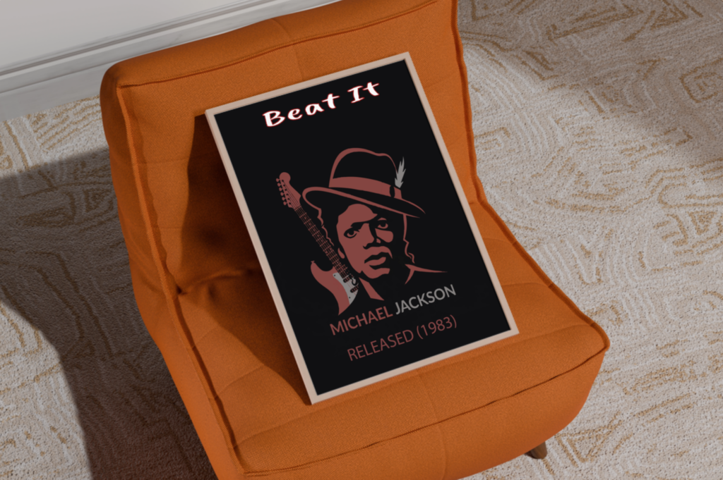
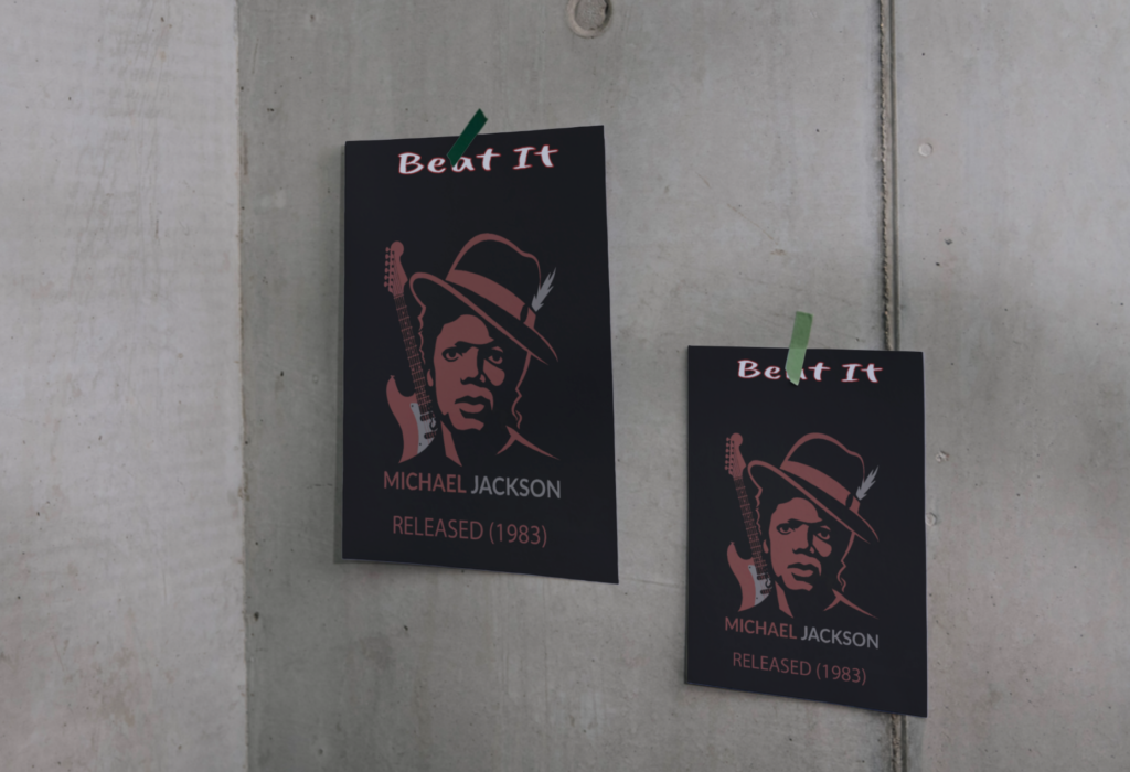
💡 2. Critical Design Refinements & Solutions
-
⚠️ Issue 1: Low Text Contrast on Muted Backgrounds
Analysis: The muted crimson text for RELEASED (1983
)blended into the dark charcoal background, reducing legibility from a distance.Refinement: Boosted the color brightness by 15% and increased tracking to improve character separation and maintain WCAG AAA compliance.
-
⚠️ Issue 2: Spatial Crowding at the Top Margin
Analysis: The headline Beat It sat too close to the top trim edge, creating visual tension.
Refinement: Shifted the title down by 18 points, establishing an even negative space buffer around the upper border.
-
⚠️ Issue 3: Guitar Neck Line Weight Instability
Analysis: Finer lines on the guitar neck lost definition when scaled down in small mockups.
Refinement: Expanded vector strokes into filled paths and adjusted stroke weight to a minimum of 1.5 pt for consistent rendering.