Visual identity in the music industry has always been more than a mere protective sleeve; it is the bridge between auditory emotion and physical aesthetics. Analyzing iconic record sleeves reveals how visual hierarchy, typography, spatial layout, and custom illustration directly shape the listener’s perception before a single note is played.








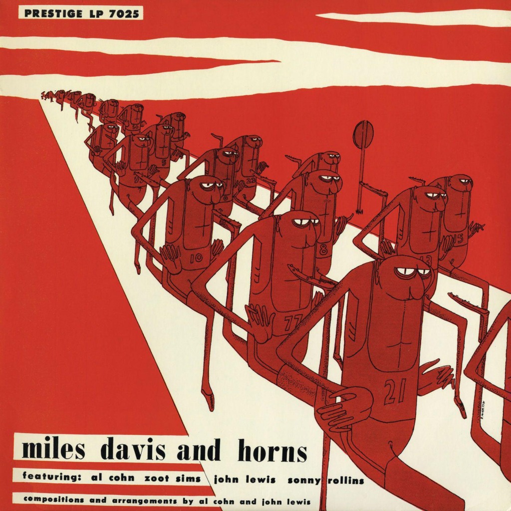

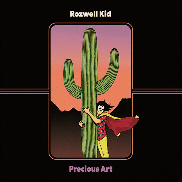
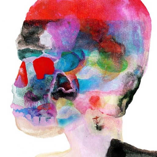

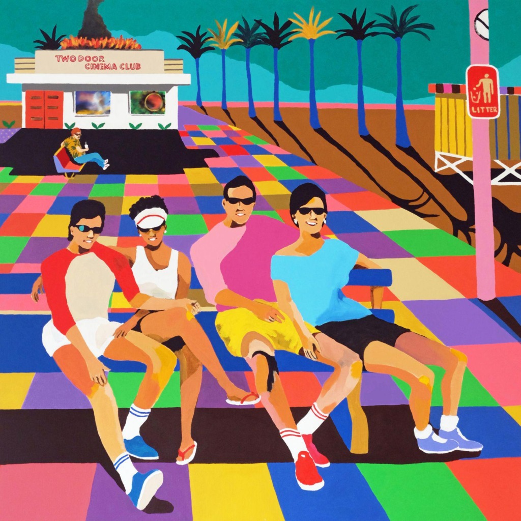






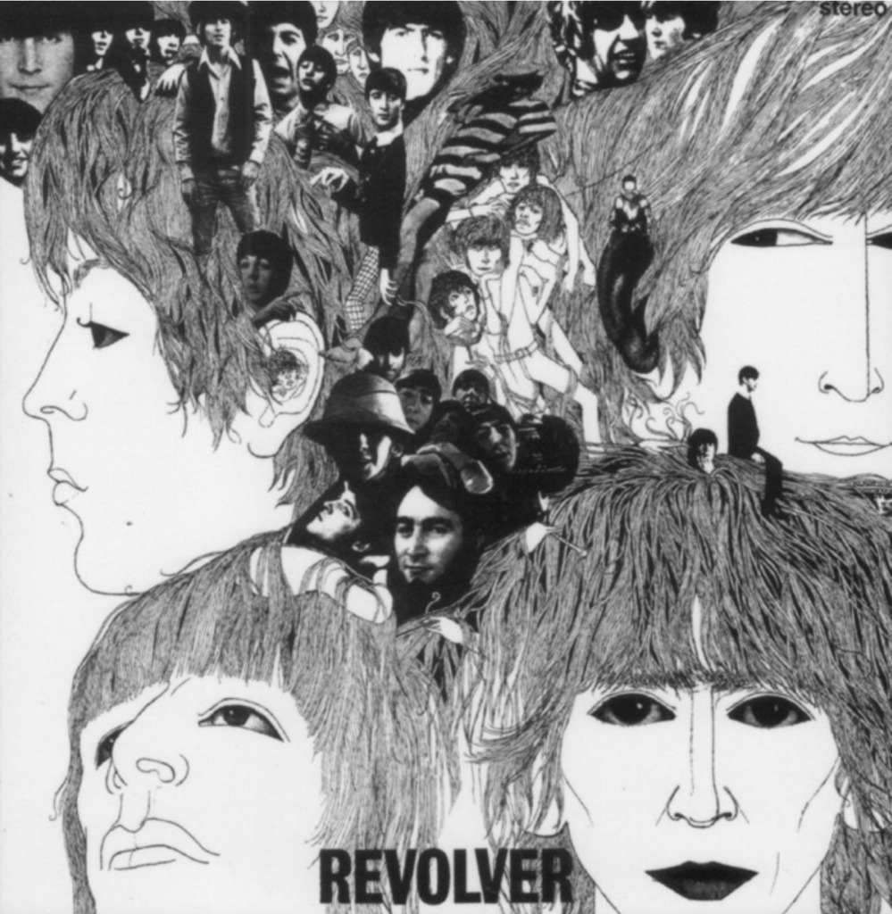
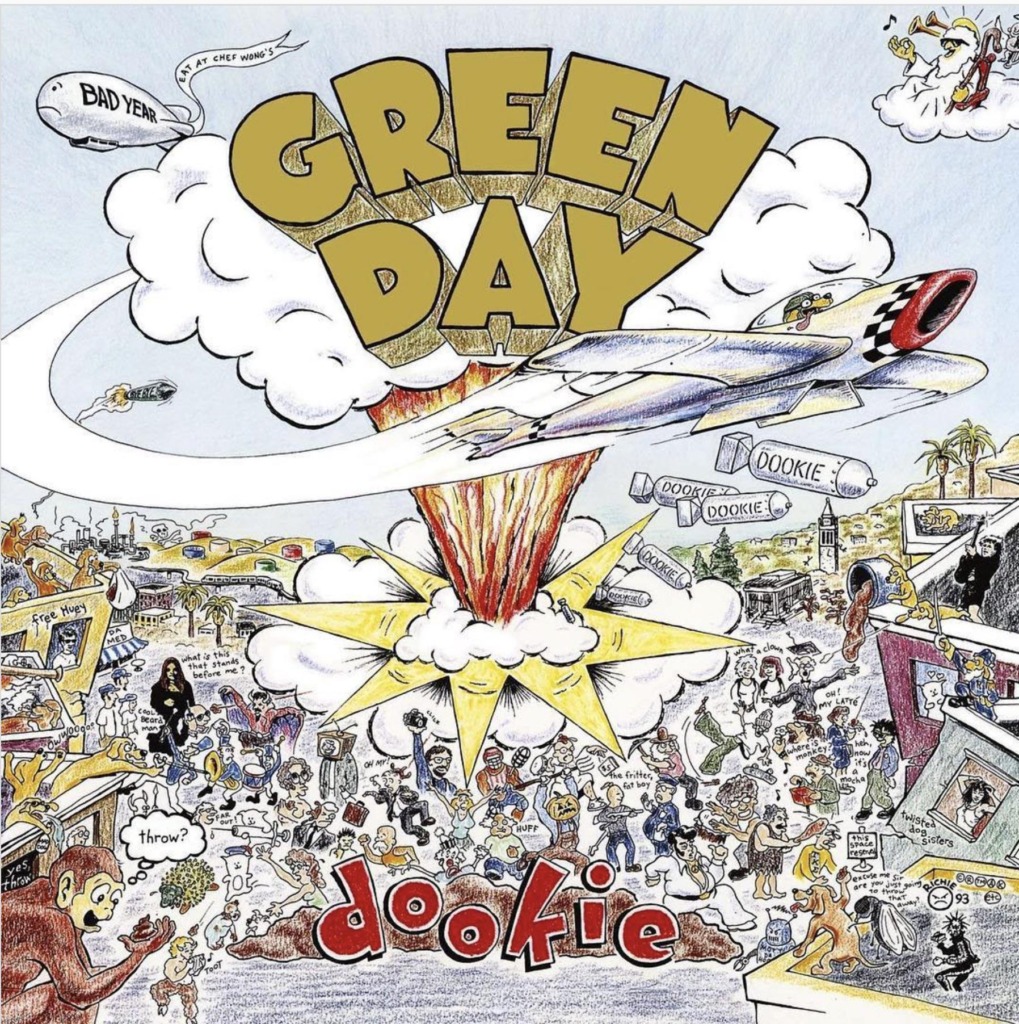


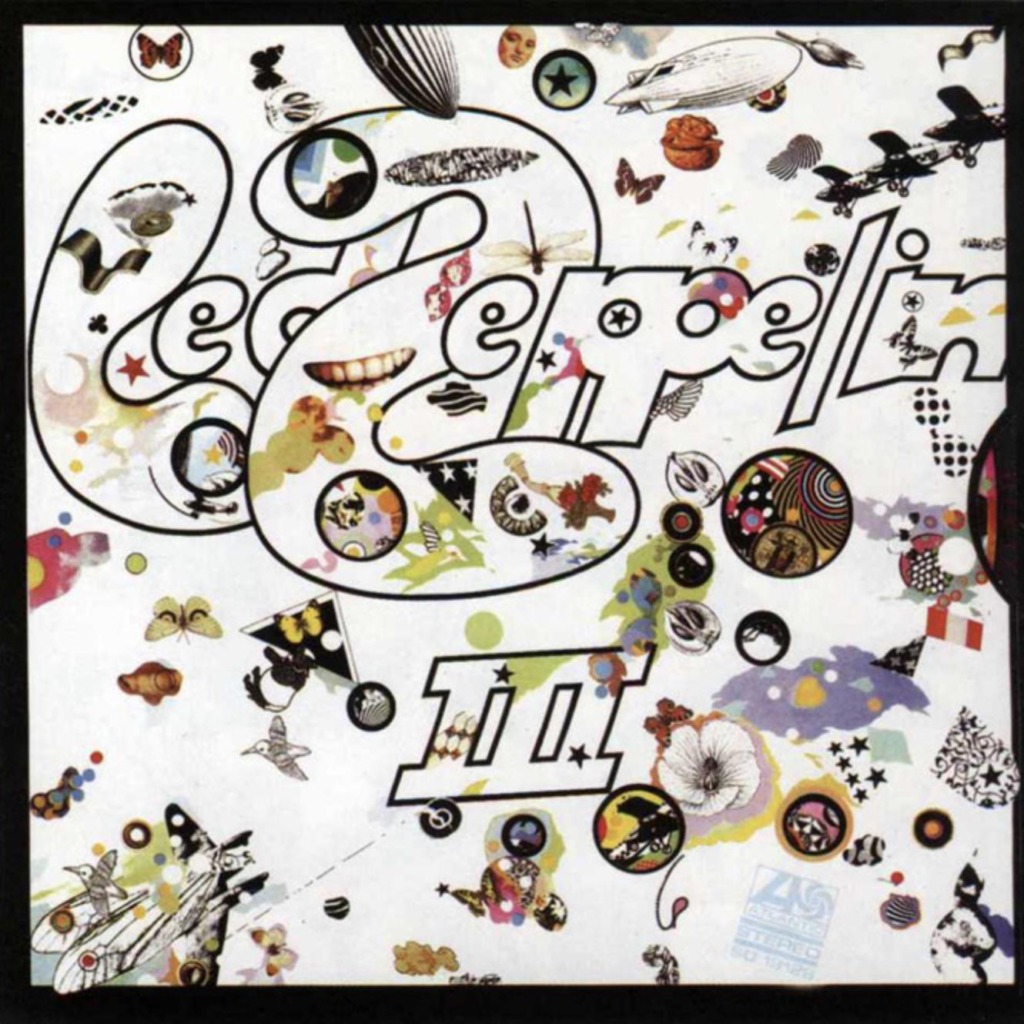
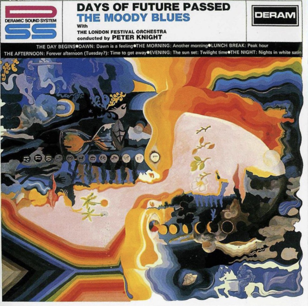
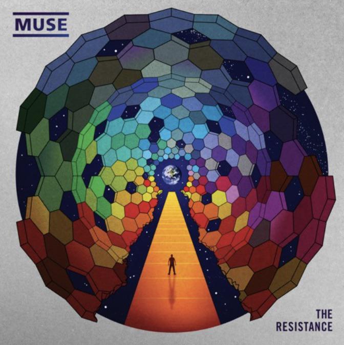

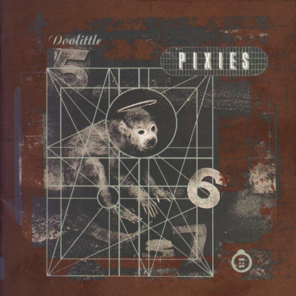
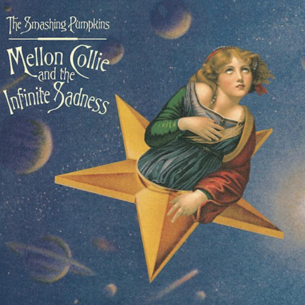



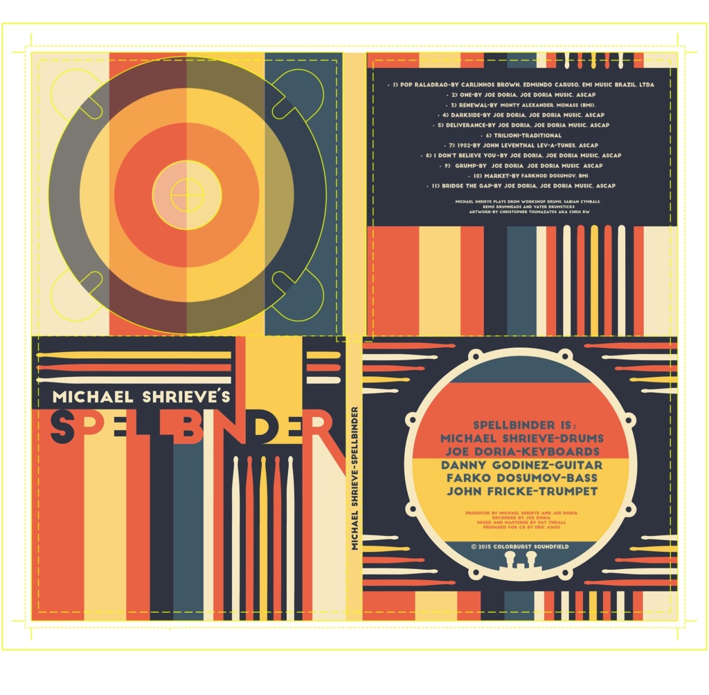
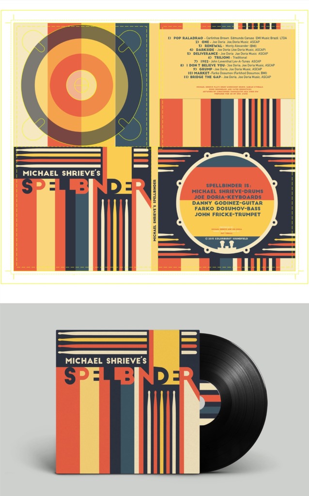
Visual Foundations & Design Framework 📌
-
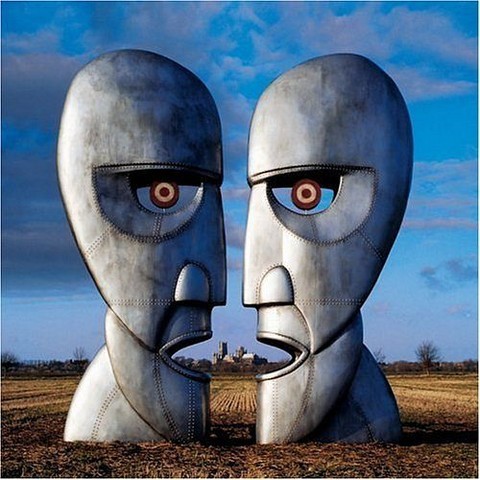
🖼️ Conceptual Composition: Album covers use central focal points, surrealism, and photographic collage to instantly communicate the album’s genre, mood, and thematic universe.
-
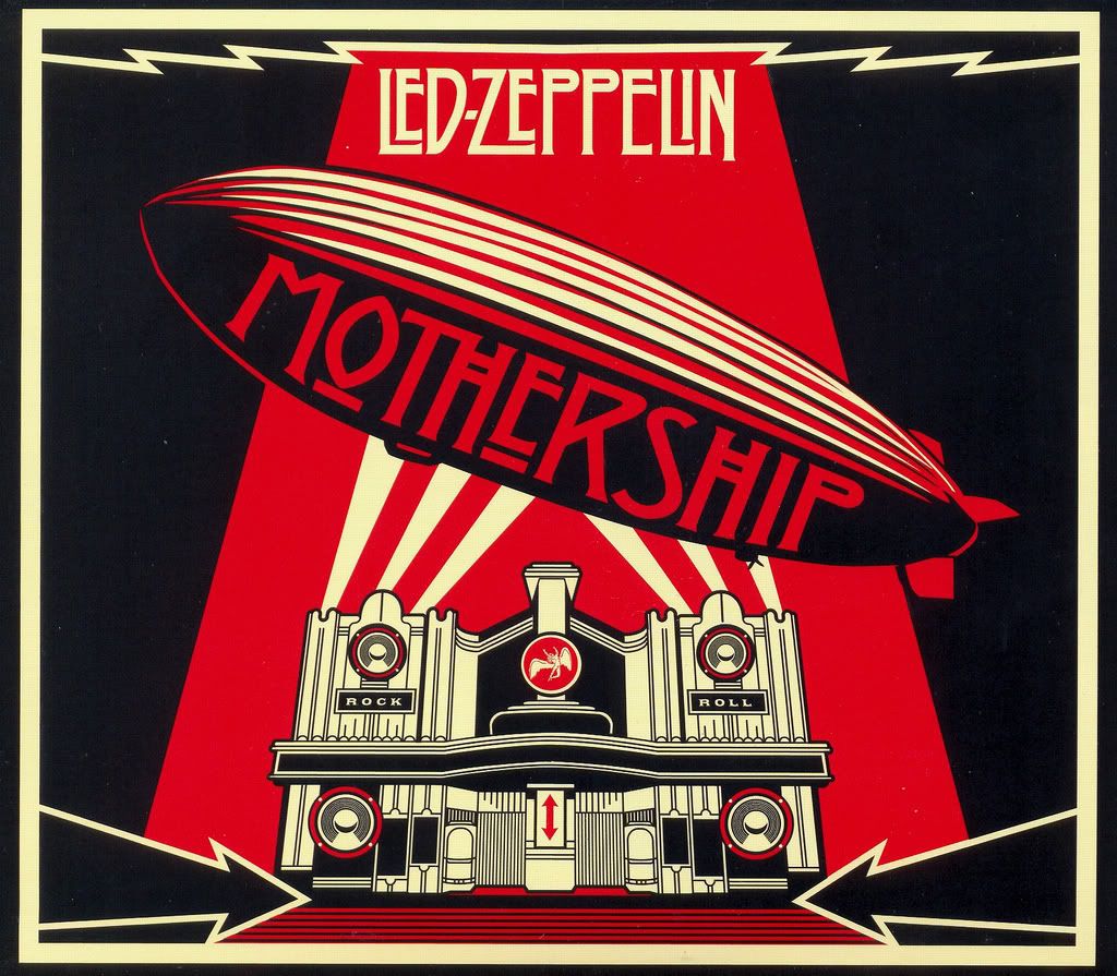
🔤 Typographic Personality: From bold gothic calligraphic scripts to strict grid-based modernist layouts, typography is selected to reflect the artist’s identity and musical texture.
-
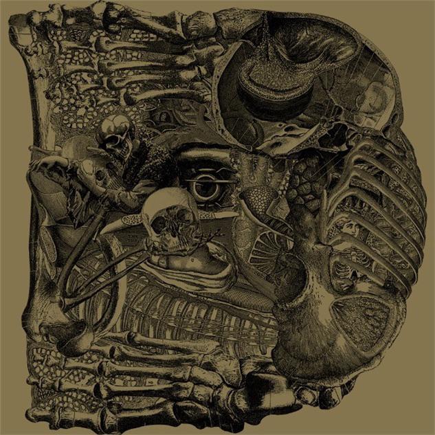
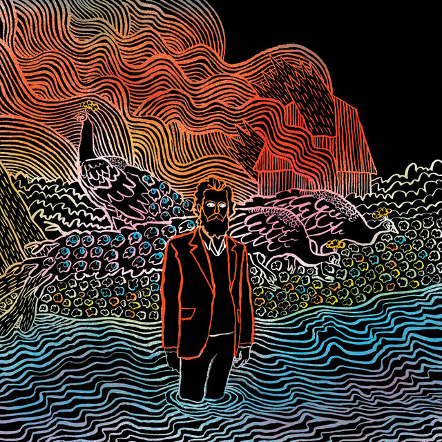
🎨 Color & Contrast Dynamics: Color palettes range from vibrant psychedelic contrasts to dark minimalist monochromatic schemes, designed to capture attention on physical shelves and digital streaming platforms.
-
💡 Metaphor & Imagery: Visual artists incorporate abstract symbolism, detailed line art, and high-contrast portraits to transform complex album themes into single, unforgettable visual statements.
Creative Impact & Practical Application 🛠️ Understanding these graphic techniques empowers visual creators to build cohesive brand identities, striking packaging, and narrative-driven portfolio projects. By balancing artistic experimentation with deliberate layout structure, design transforms music into an enduring visual experience.