Final Version:
-
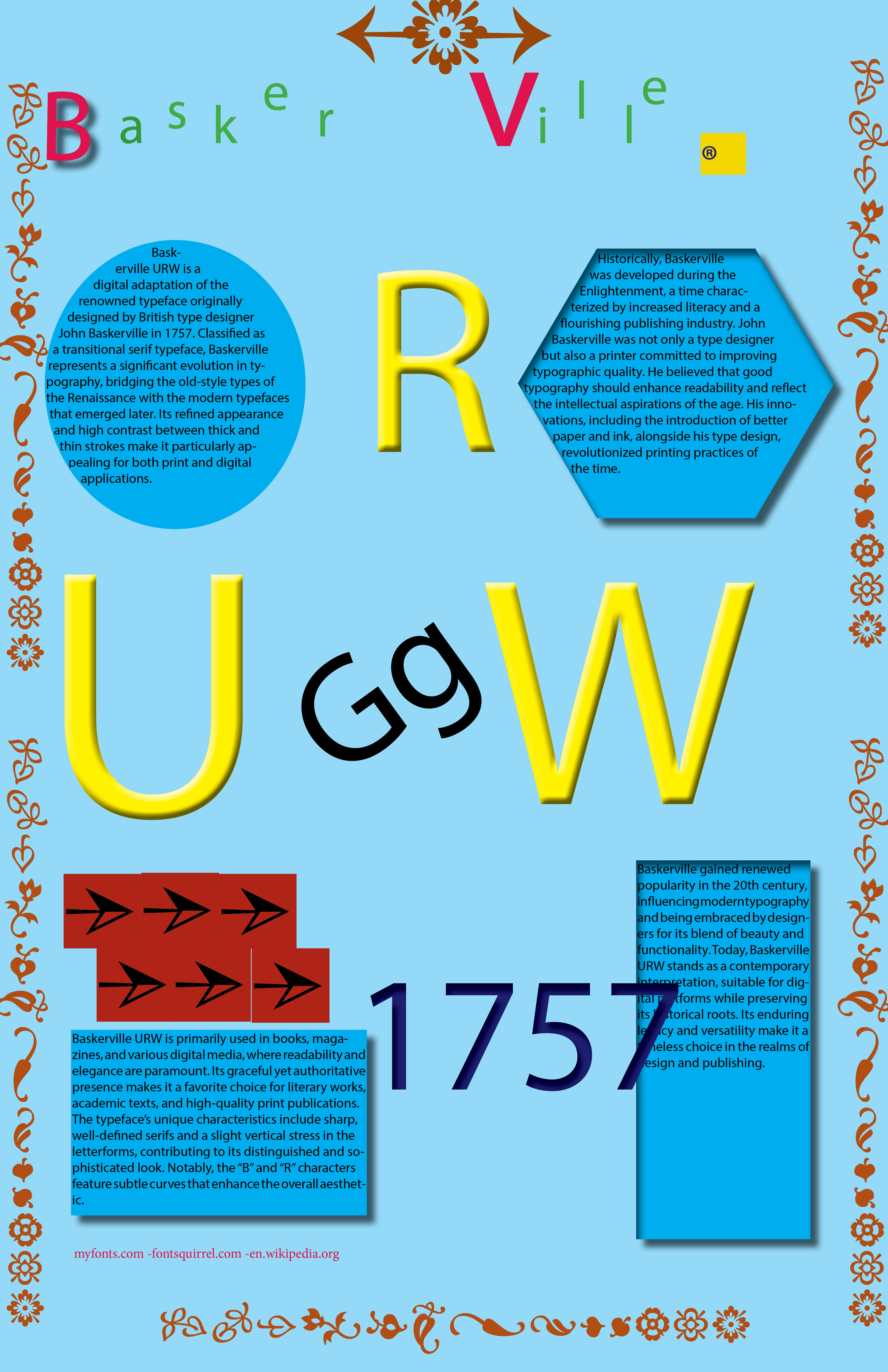
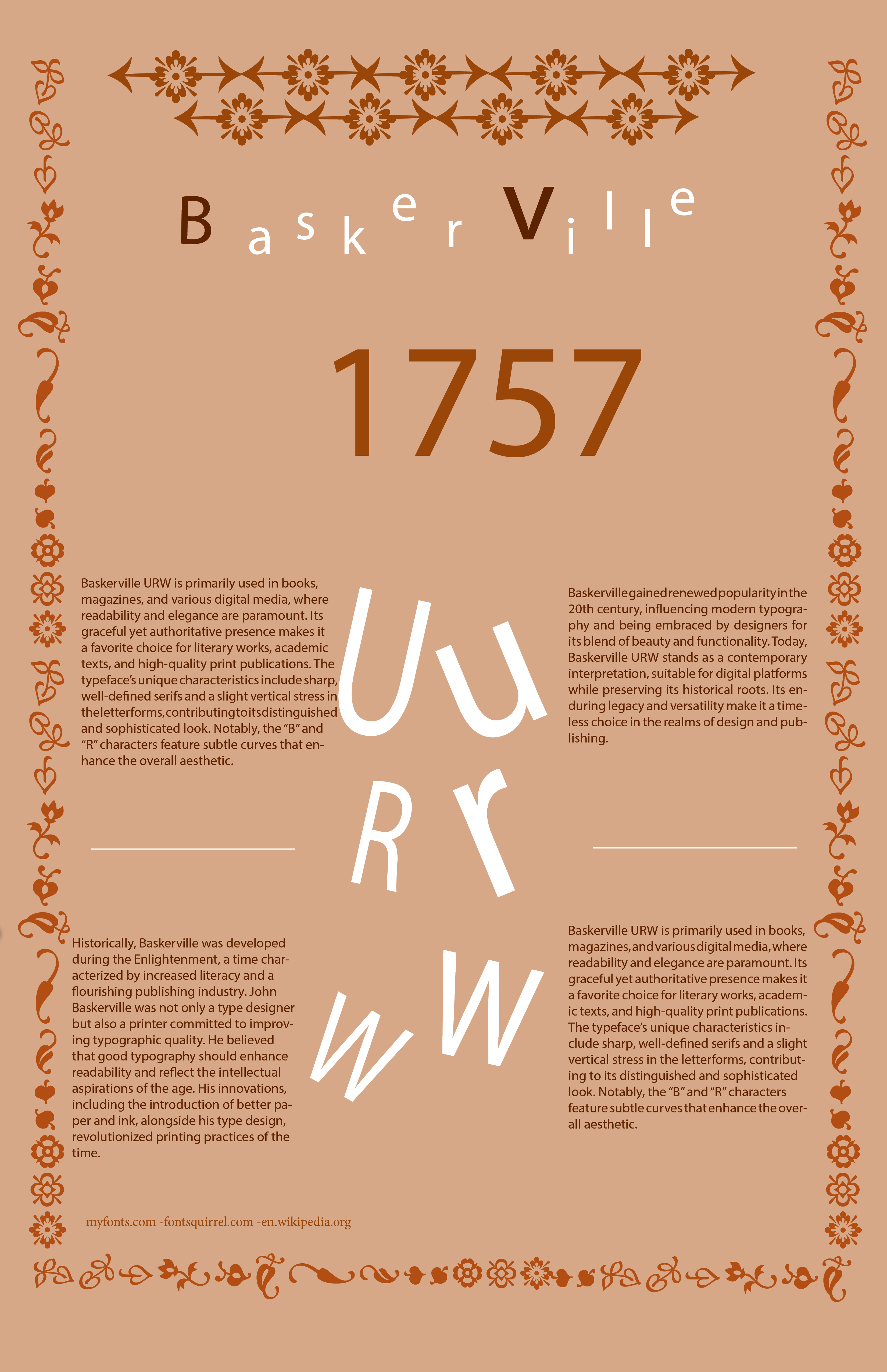
The “Shape Trap” & Geometric Errors: “In the early stages, I attempted to organize the layout using geometric shapes like trapezoids and hexagons. I soon realized these were ‘visual crutches’ that distracted from the typeface’s natural elegance. I made the strategic decision to remove these forms and let the letterforms themselves define the grid.”
-
Color & Effect Missteps: “One of the major challenges was moving away from digital effects. I initially experimented with drop shadows and glows, but they clashed with Baskerville’s 18th-century heritage. Refining the palette to a sophisticated, flat-color harmony was essential to achieving a professional look.”
-
The 350-Word Puzzle: “Managing a massive block of text in a single poster was a significant hurdle. Without the aid of illustrations, I had to master InDesign’s leading and tracking tools to ensure the research remained legible while contributing to the overall visual flow.”
-
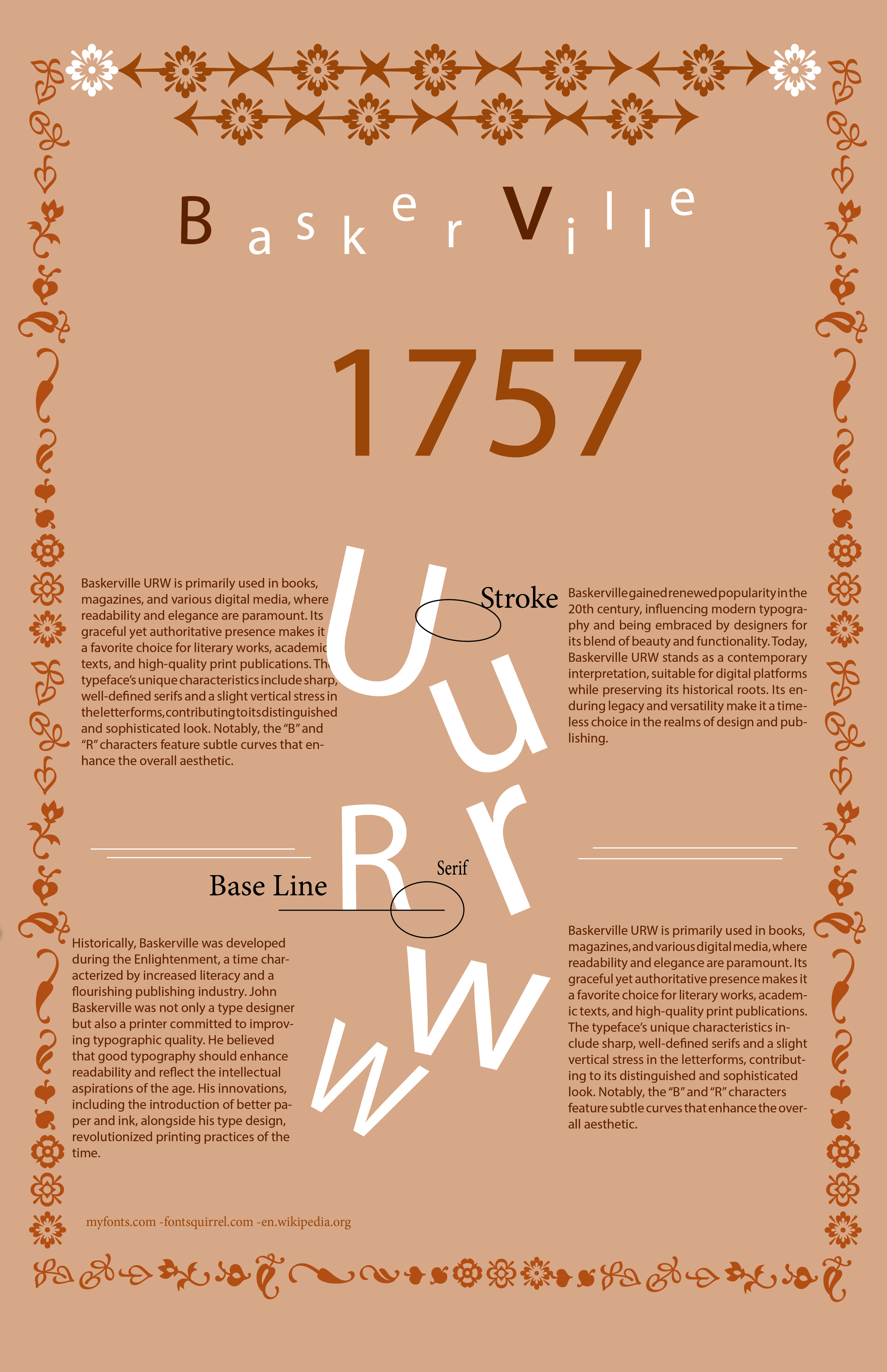
Technical Precision: “The requirement to map technical terminology (Stroke, Serif, Base Line) onto large-scale characters demanded extreme precision. It was a battle of millimeters to ensure the anatomy was clear without cluttering the composition.”
Sketch :
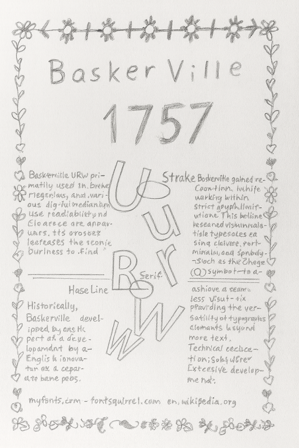
Draft :