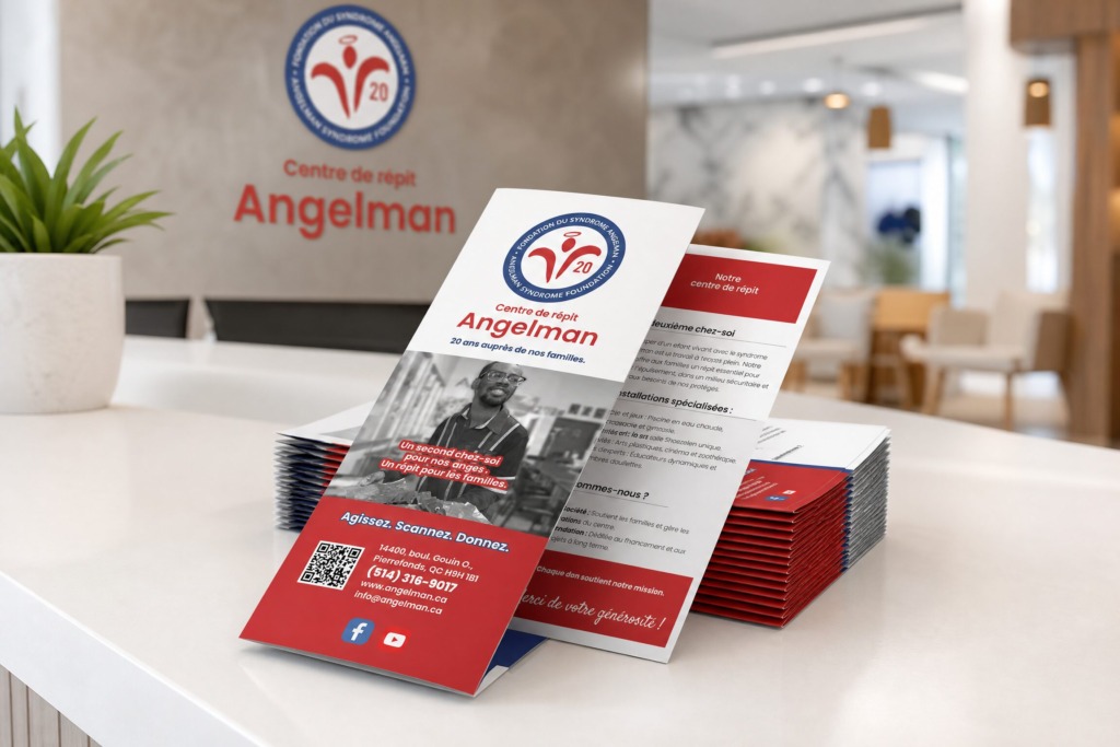
📌 Project Strategy & Editorial Concept
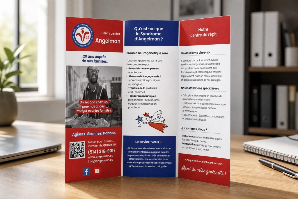
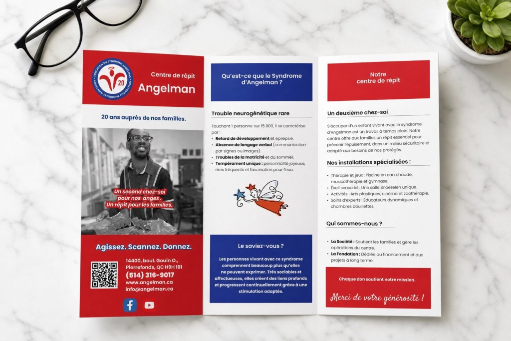
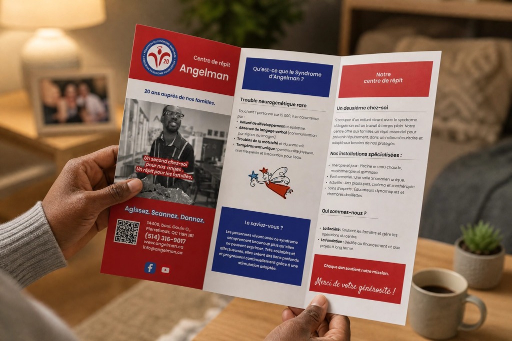
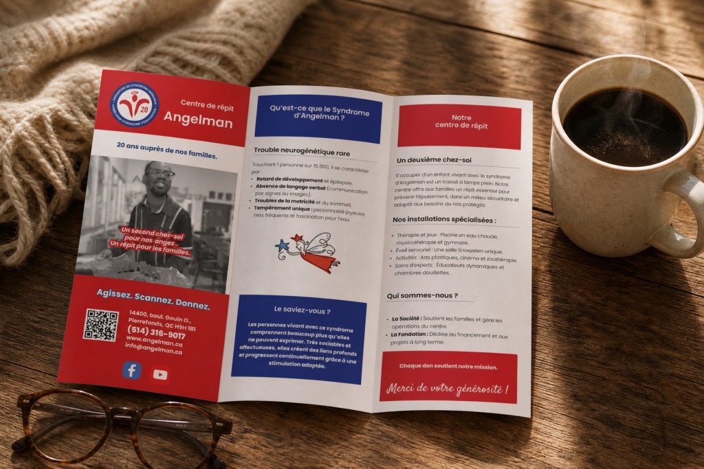
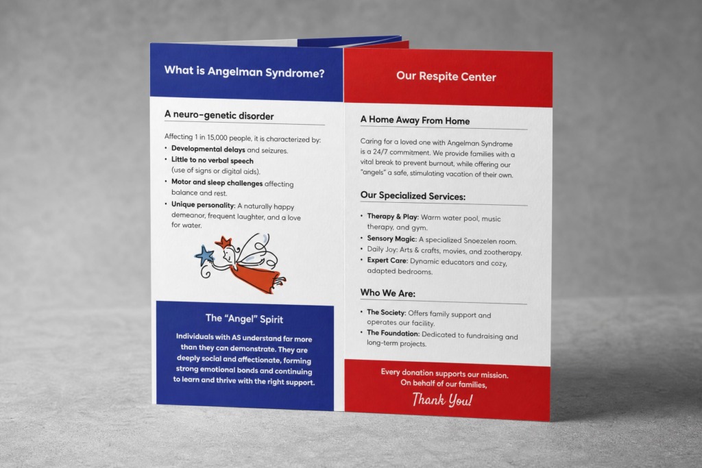
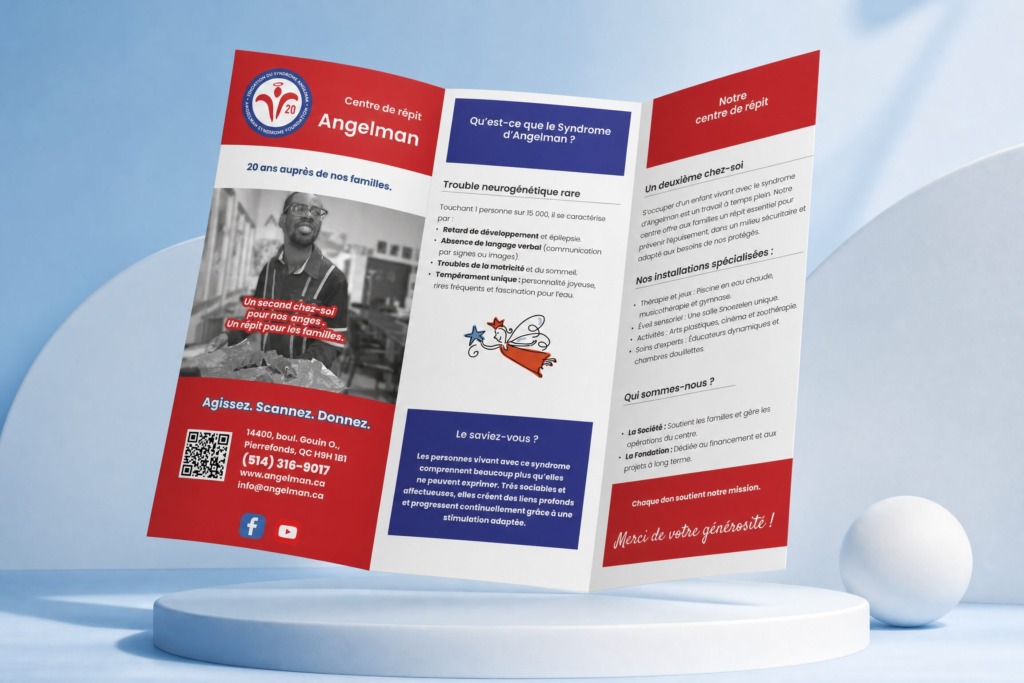
This project showcases a high-end, bilingual Z-fold brochure designed for the Angelman Syndrome Foundation (Fondation du Syndrome Angelman). Built in both English and French, the design translates complex medical and advocacy information—such as neuro-genetic characteristics, respite center services, and donation pathways—into an approachable, highly empathetic visual narrative. The Z-fold architecture was selected for its natural tactile unfolding experience, allowing readers to seamlessly navigate between institutional background, diagnostic insights, and call-to-action sections.
🛠️ Multi-Software Technical Workflow & Production
1. Adobe Photoshop (Raster Processing & Image Enhancements)
-
Monochrome Conversion & High-Contrast Retouching: Converted candid center photography into rich, high-contrast greyscale imagery with fine-tuned tonal curve adjustments to emphasize emotion and dignity without visual noise.
-
Selective Color Overlays & Duotone Treatments: Engineered non-destructive adjustment layers (Gradient Maps, Solid Color Fill with Multiply/Overlay blending modes) to apply vibrant red callout banners over raster photos while ensuring total text legibility.
-
Alpha Channel Selection & Edge Masking: Isolated background elements and processed line art graphics (such as the illustrated angel character) using precise Alpha Masks and Smart Objects to maintain non-destructive scalability.
2. Adobe Illustrator (Vector Graphic Engineering)
-
Logo Vector Optimization & Badge Rendering: Re-built and cleaned up vector paths for the 20th Anniversary seal emblem (“20 ans auprès de nos familles / 20 Years of Caring for Our Families”) with razor-sharp circular typography wrapping.
-
Custom Line-Art Illustration: Extracted and refined the whimsical angel illustration vector paths, balancing stroke weights and color fills for seamless integration into InDesign frames.
-
Iconography & QR Systems: Vectorized social media badges, contact symbols, and custom QR codes engineered for instant camera scanning.
3. Adobe InDesign (Panel Architecture, Grid Systems & Pre-Press)
-
Z-Fold Panel Compensation Grid: Built a precision 6-panel Z-fold template with strict fold-line safety margins and custom panel-width offsets (compensating for physical paper folds).
-
Bilingual Paragraph & Character Styles: Established synchronized dual-language typography hierarchies using robust sans-serif typefaces with custom leading, tracking, and optical kerning to handle French text expansion relative to English.
-
Decorative Typography & Banner Anchoring: Created floating decorative text blocks anchored with solid background fills and rounded corner stroke effects to draw immediate visual focus to key quotes like “Un second chez-soi pour nos anges” / “A home away from home for our angels”.
🎨 Brand Color System
-
🔴 Primary Foundation Red: HEX #E11D2A (High-energy callout banners, primary brand identity, and headline highlights)
-
🔵 Deep Institutional Blue: HEX #1E3A8A (Foundational seals, primary body text, and structural dividers)
-
⚪ Neutral Canvas White: HEX #FFFFFF (Clean panel backgrounds and inverted typography)
-
🪙 Soft Off-White / Light Grey: HEX #F3F4F6 (Subtle section backing panels and contrast blocks)
🎨 Technical Design Execution & Software Interoperability
-
📸 Photoshop Layer Management: Smart Objects were utilized for all hero image frames, permitting non-destructive cropping and real-time color grading tweaks.
-
📐 InDesign Baseline Grid Alignment: Applied a strict baseline grid across all panels to keep dual-language body text horizontally aligned across panels.
-
✒️ Illustrator Vector Links: All badges, seals, and line illustrations were linked via Creative Cloud Libraries for instantaneous vector updating.
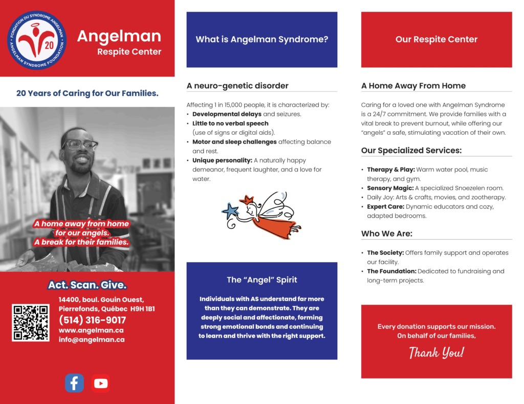
📑 Panel-by-Panel Structural Breakdown
-
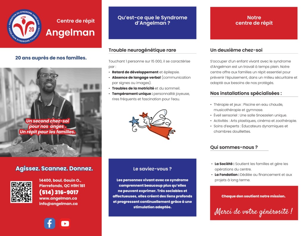
📄 Front Cover Panel: High-impact hero layout combining the anniversary badge, brand logo, expressive monochrome portraiture, and bold red banner typography (“A home away from home for our angels / Un second chez-soi pour nos anges”).
-
📄 Inside Panel 1 (Understanding Angelman Syndrome): Clear, structured layout explaining neuro-genetic traits, developmental details, and unique personality characteristics using custom bullet indicators.
-
📄 Inside Panel 2 (Respite Center & Facilities): Specialized service breakdown detailing therapy pools, Snoezelen sensory rooms, and expert care facilities using organized subheadings.
-
📄 Inside Panel 3 (The “Angel” Spirit & Community Insight): Highlighting emotional connection, social potential, and advocacy messaging in clean, readable typography blocks.
-
📄 Back Panel 1 (Who We Are & Governance): Explaining the operational roles of the Society vs. the Foundation in structured comparison cards.
-
📄 Back Panel 2 (Call to Action & Contact Routing): Prominent QR code integration (“Act. Scan. Give. / Agissez. Scannez. Donnez.”), full address metadata, phone, email, and web links