

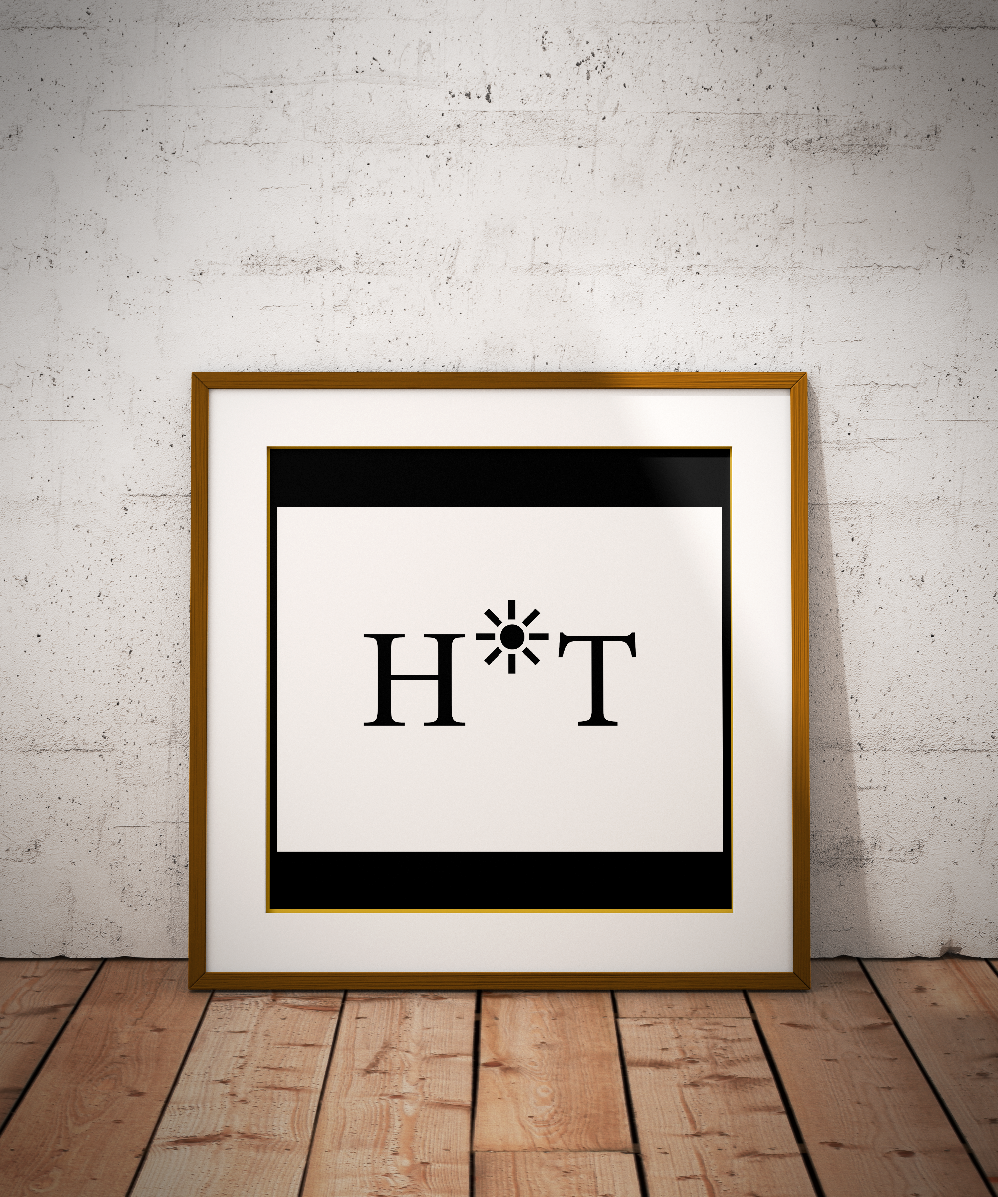
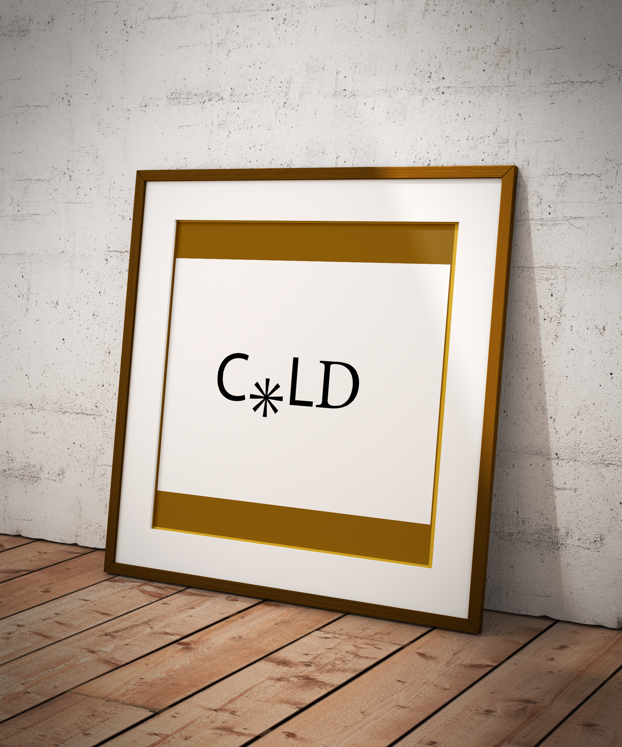
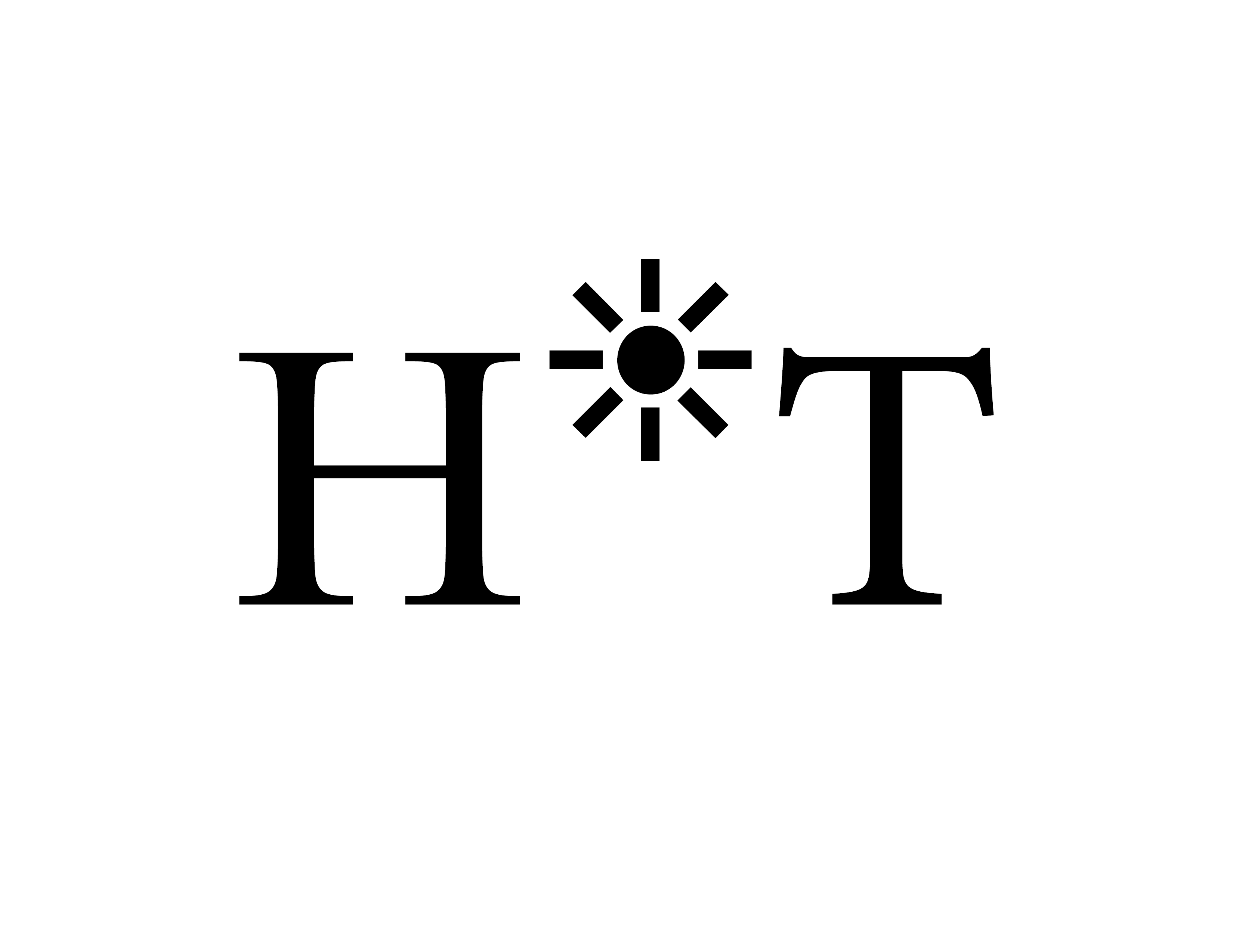
Project Concept: “This project explores the visual representation of opposing temperatures using only letterforms and glyphs. The core concept relies on vertical positioning to convey meaning: ‘Hot’ is placed at the top of the canvas to symbolize rising temperatures and the sun, while ‘Cold’ is situated at the bottom to represent dropping temperatures and freezing ground.”
The Creative & Technical Hardships:
-
The Conceptual Struggle: “The main challenge was to communicate abstract feelings of heat and cold without relying on color or images. I had to find a way to make the viewer ‘feel’ the temperature solely through the spatial arrangement of the characters.”
-
Glyph Exploration: “Finding the perfect glyphs to replace letters (like using a star or sun-like character for the ‘O’ in Hot) required extensive searching through various typeface libraries. Every character was chosen to enhance the metaphor without breaking the legibility of the word.”
-
Execution in InDesign: “Using Adobe InDesign, I focused on precise alignment and white space management. Balancing the two words across the 11×17 layout while ensuring they didn’t feel disconnected was a technical exercise in visual hierarchy.”
Ali Bakhit