
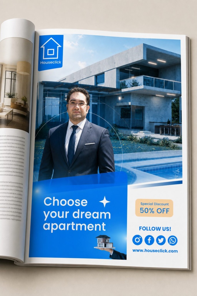
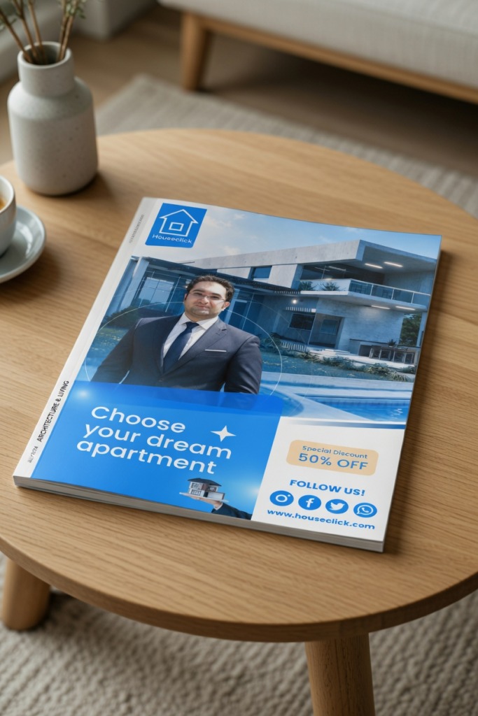
In premium real estate art direction, a compelling advertising asset must establish an unbreakable narrative and structural bond between completely separate visual elements. This comprehensive case study explores the visual reconstruction and commercial engineering of the premium print advertisement for the modern real estate entity, Houseclick. Built on a professional 7×10 inches commercial magazine layout, the core objective was to execute an expert asset fusion. The visual pipeline required seamless, calculated interaction between three distinct structural pillars: a high-resolution corporate subject, a luxury modern architectural villa, and a high-converting typographic framework.
The primary design challenge involved neutralizing an overcrowded initial layout, optimizing negative space, and ensuring maximum contrast between the text blocks and the complex imagery underneath.
🚀 The Core Strategic Framework:
-
🎯 Corporate Branding Alignment: Transforming a standard property visual into a premium marketing asset that communicates corporate authority and instant consumer trust.
-
👁️ Visual Equilibrium: Securing absolute structural balance between the human subject, the geometric lines of modern architecture, and the call-to-action blocks.
-
🤝 Commercial Conversion Metrics: Proving how advanced digital imaging, color systems, and strict grid discipline elevate raw photography into a high-end portfolio asset.
🛠️ Advanced Software Synthesis & Technical Execution:
-
📸 Dynamic Portrait Engineering & Masking (Adobe Photoshop): Sourced high-resolution architectural backdrop assets from premium stock libraries and integrated a dedicated corporate representative portrait. To replace a casual look with an executive aesthetic, the subject was engineered into professional corporate attire. The isolating process required advanced Select Subject and Refine Edge mask configurations to secure hair details and clean fabric lines. The bottom half of the subject’s suit was smoothly blended into the lower graphic elements using gradient transparency masks to create a flawless transition.
-
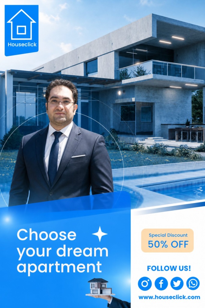
🎨 Atmospheric Color Grading & Blending: To inject a corporate, trustworthy, and modern mood, a selective monochromatic color system was enforced. The real estate villa backdrop was graded using a specific blue overlay (#487fb6) applied via a Soft Light adjustment blend layer. This technical grading flattened distracting secondary environmental hues, immediately drawing the viewer’s eyes directly toward the foreground subject and the main message.
-
📐 Vector Typography & Layout Hierarchy (Adobe Illustrator & InDesign): The complete grid architecture was built using crisp variations of the Poppins typeface family. The main headline, “Choose your dream apartment”, was styled in bold white vector lettering to guarantee long-range legibility over the blue graphic background. To drive immediate psychological conversion, a localized, high-contrast beige (#ffdeb2) discount asset was engineered, creating a powerful warm-and-cool color interaction that immediately captures consumer focus.
-
🔗 Call-To-Action & Asset Integration: The branding elements—including the vector Houseclick logo, official social media contact vectors, and the holding hand asset—were structured cleanly inside a generous white-space container at the bottom right, ensuring a perfect visual hierarchy that guides the reader’s eye naturally from the headline to the contact info.
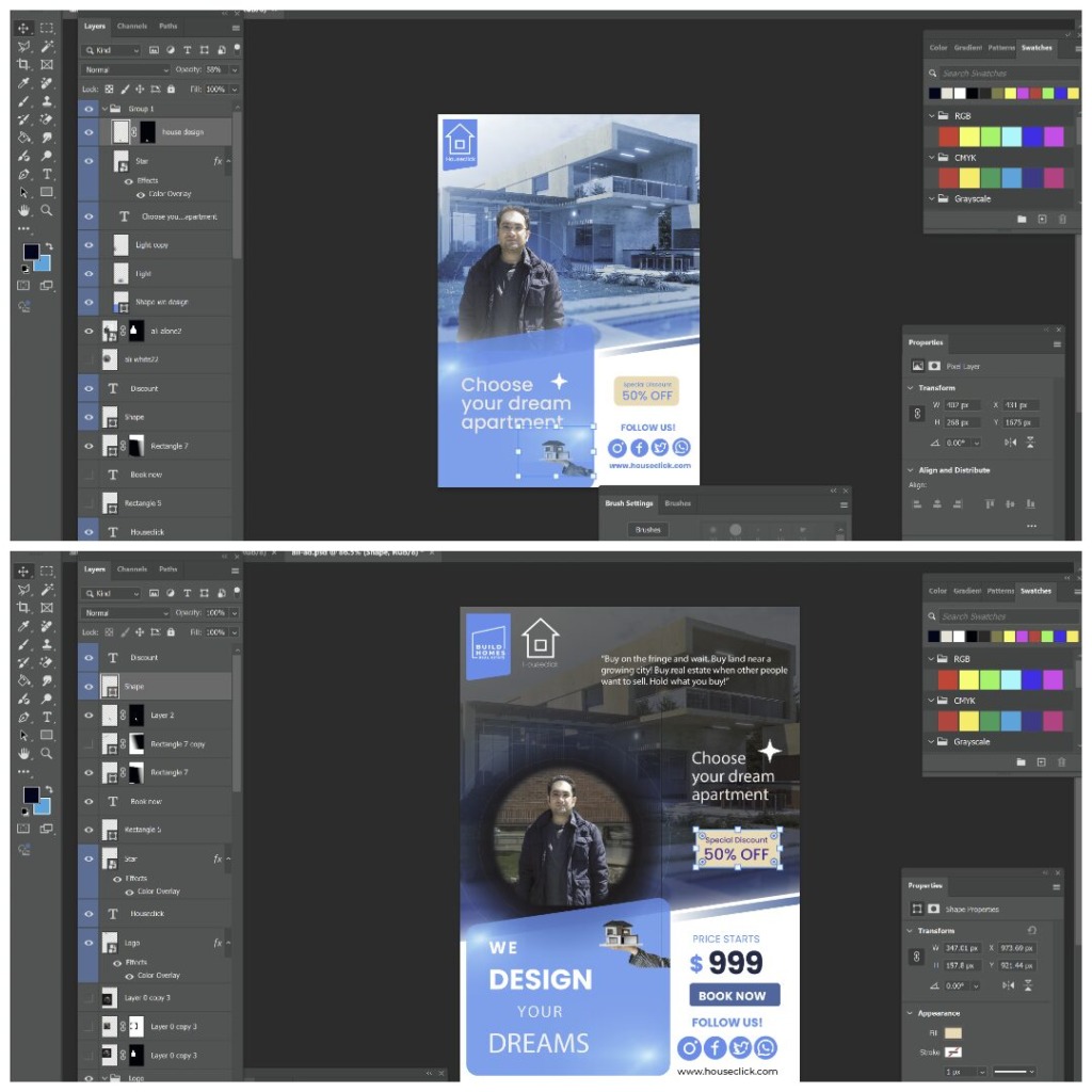
Every meticulous choice—from the precise color harmony to the calculated tracking of the sans-serif typography—proves how technical precision can transform scattered individual assets into a seamless, high-impact commercial print campaign.
✨ Designed by Ali Bakhit
#alibakhitdesign #GraphicDesignPortfolio #CaseStudy #PrintAd #LayoutDesign #VisualHierarchy #PhotoshopMastery #RealEstateMarketing #MinimalistDesign #AdvertisingDesign #ArtDirection #CorporateBranding #PoppinsFont #BeforeAfter