
ESSENTIAL BRANDING ARCHITECTURE
Understanding foundational branding terminology is critical for delivering high-impact visual identity systems. This design insight guide breaks down 20 core logo and design concepts—from core brandmarks to advanced typographical execution—creating a shared vocabulary for designers and clients alike.
🌐 COMPREHENSIVE TERMINOLOGY BREAKDOWN
-
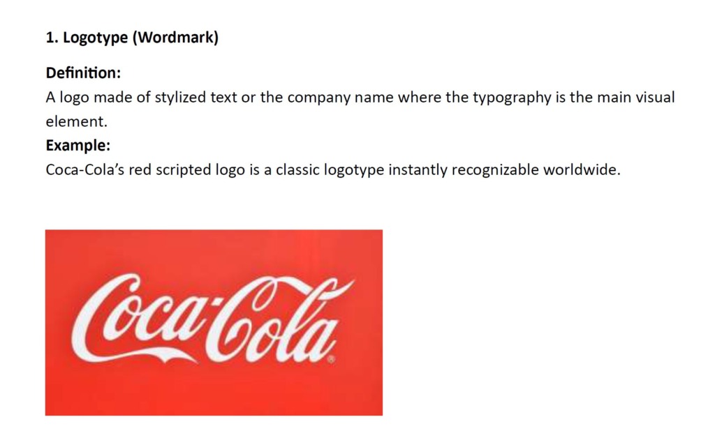
✍️ Logotype (Wordmark): A logo formed purely from stylized text or brand name typography, as seen in Coca-Cola’s iconic red script.
-
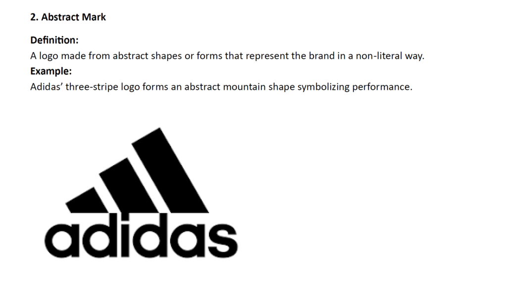
📐 Abstract Mark: A geometric or non-literal form that symbolizes brand values, such as the Adidas three-stripe mountain representing peak performance.
-
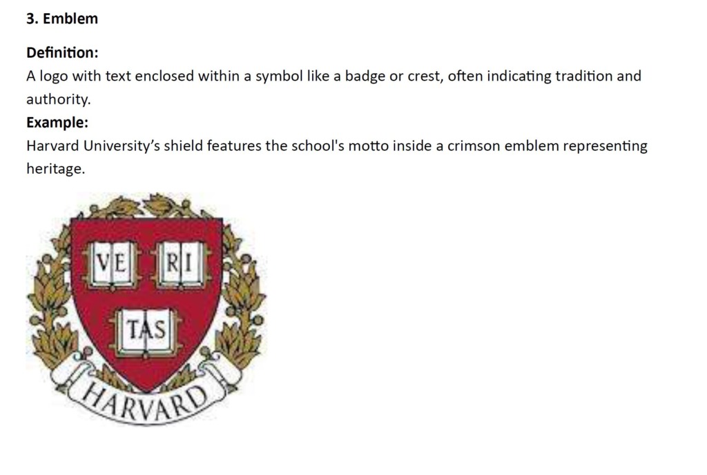
🛡️ Emblem: Encapsulates text within a crest, shield, or badge to signify tradition and authority, like Harvard University’s historic emblem.
-
🍏 Pictogram: A clean visual symbol representing a recognizable object, exemplified by Apple’s bitten apple icon.
-
🔤 Monogram: Intertwined or overlapped letters—often initials—forming a unified emblem, as demonstrated by Louis Vuitton’s “LV” mark.
-
🏢 Lettermark: A typographic logo utilizing brand initials for clear, direct recognition, such as IBM’s bold three-letter layout.
-
🤖 Mascot: An illustrated character or figure embodying brand personality, exemplified by the iconic Michelin Man.
-
🍔 Combination Mark: A hybrid layout integrating both text and custom icons, seen in Burger King’s burger frame layout.
-
⚡ Brandmark: A purely symbolic mark functioning independently without text, such as the Nike Swoosh.
-
🎨 Typography: The intentional art, arrangement, and design of letterforms for optical legibility and aesthetic balance, as seen in Google’s custom font.
-
📐 Kerning: Fine-tuning individual horizontal spaces between characters for perfect optical spacing, demonstrated in Adobe’s logo.
-
🖋️ Serif: Typefaces with classic decorative terminal strokes that add elegance and tradition, such as Times New Roman.
-
📱 Sans Serif: Modern, clean typefaces devoid of terminal strokes for crisp digital clarity, like Facebook’s branding.
-
🌈 Color Palette: A curated spectrum of colors engineered to trigger targeted emotional responses, as seen in McDonald’s energetic red and yellow.
-
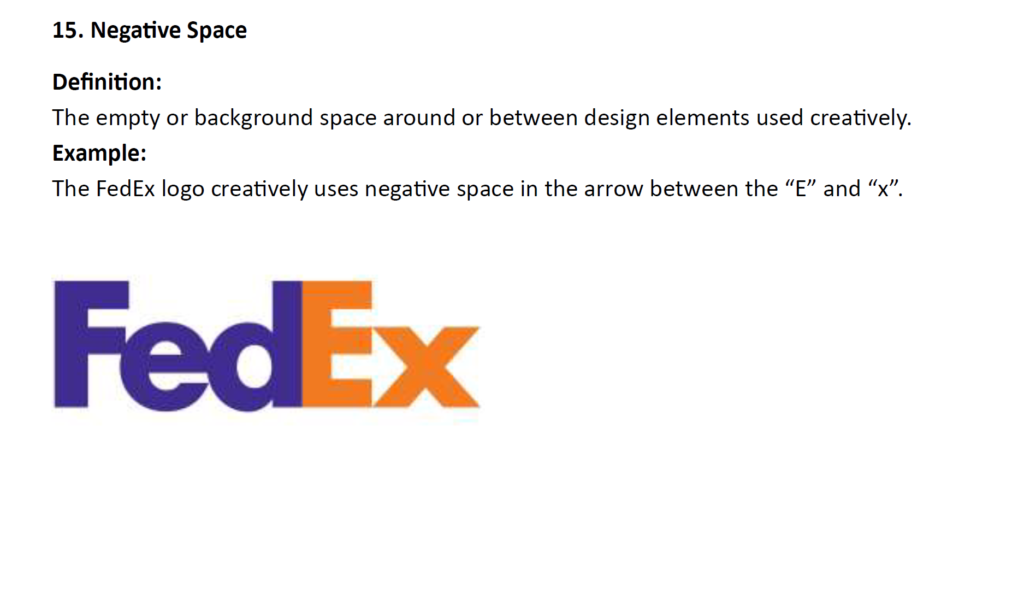
👁️ Negative Space: Strategic use of white space to form secondary visual elements, creatively demonstrated by the hidden arrow in FedEx.
-
🔍 Scalability: A mark’s ability to retain clarity from tiny smartwatch displays up to massive highway billboards, demonstrated by Apple.
-
✒️ Vector Graphic: Resolution-independent graphics built using mathematical paths, allowing infinite scaling like the Starbucks Siren.
-
⚖️ Trademark: A legally registered and protected design mark indicating exclusive brand ownership, such as the Nike Swoosh.
-
💎 Brand Identity: The complete visual system (logo, typography, colors) that shapes public perception, exemplified by Apple’s minimalist ecosystem.
-
📊 Brand Equity: The tangible commercial value generated through consumer trust and global brand recognition, like Coca-Cola’s market presence.
🎯 STRATEGIC IMPACT & VALUE
Mastering these 20 fundamental concepts allows creative leaders to make informed design decisions, communicate design logic effectively, and engineer scalable visual systems that drive brand equity.