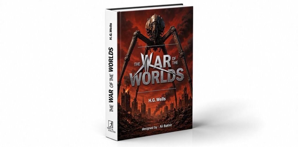
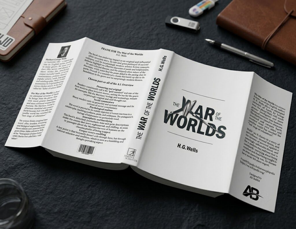
In commercial publishing and editorial identity design, a book jacket must transcend flat digital layouts to establish architectural presence, tactile intrigue, and visual recognition on physical bookstore shelves. This case study details the complete concept-to-print workflow for the The War of the Worlds dust jacket redesign, demonstrating custom typographic surgery, advanced vector construction, complex prepress calibration, and photorealistic 3D presentation.
The core objective was to engineer an immersive dust jacket structure—spanning the front cover, spine, back cover, and interior flaps—that marries movie-inspired concept art with strict editorial typesetting standards.
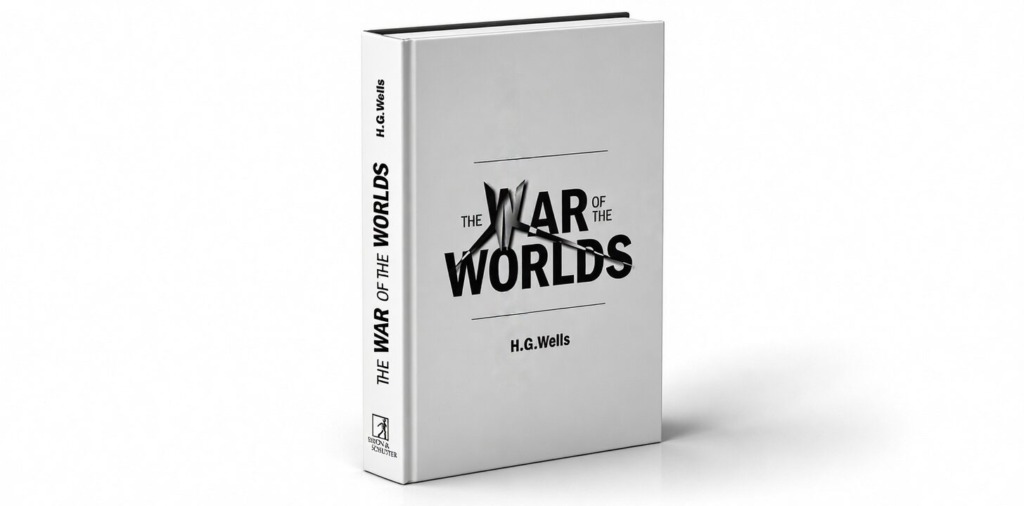
🛸 Custom Alien Typography & Conceptual Vision: Inspired directly by the iconic extraterrestrial tripods and alien spaceships from The War of the Worlds, the visual focal point centers on a custom-built title treatment. The primary letterform “W” in the title was manipulated across multiple draft iterations in Adobe Illustrator, morphing the character into an abstract, alien tripod silhouette while preserving absolute legibility. 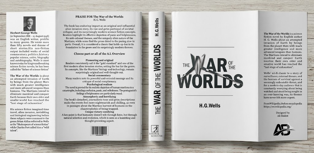
🧗 Technical Challenges & Design Obstacles:
-
🧩 Legibility vs. Expressive Form: Structuring a complex graphic figure inside the character “W” without making the title unreadable required fine optical adjustments and kerning balancing.
-
🎨 CMYK Gradient Fidelity: Converting vibrant, multi-tone RGB vector gradients from Illustrator into print-ready CMYK profiles without color dulling or banding artifacts on final paper stock.
-
👁️ Contrast & Background Overlays: Preserving body text legibility on interior flaps and back blurbs over dark, dramatic atmospheric background photography.
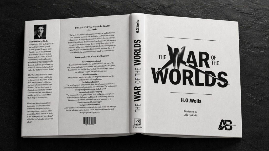
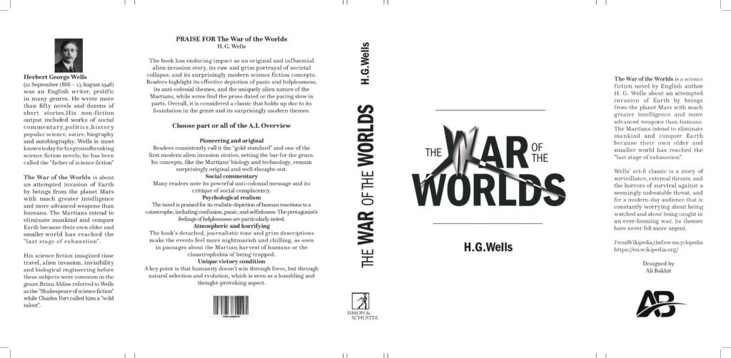
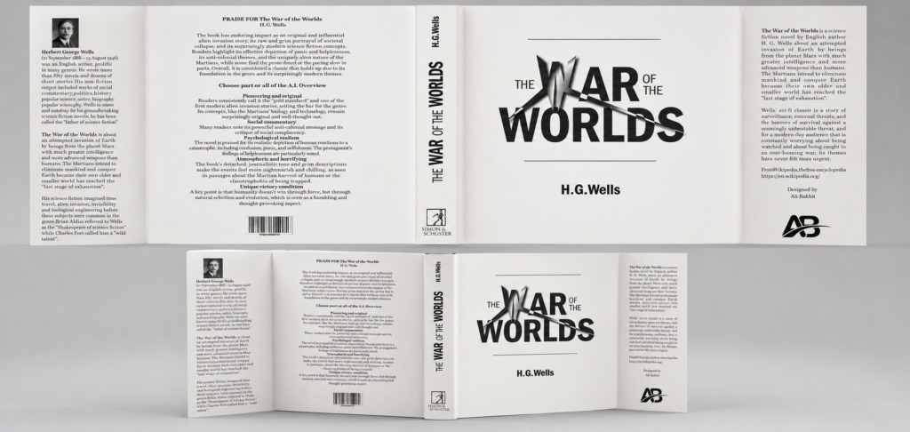
✍️ Vector Surgery & Dieline Precision (Adobe Illustrator): The alien tripod letterform “W” and supporting title graphics were drawn in Illustrator using vector paths and bezier curves. Multi-stage custom gradients were applied to give the alien shape dimensional pop and metallic highlights. Prepress dielines, trim guides, barcode art, and spine fold markers were locked to exact mechanical tolerances.
🖼️ Atmospheric Retouching & Contrast Layering (Adobe Photoshop): Background artwork sourced from stock repositories was color-graded in Photoshop using tonal curves, selective color adjustments, and multi-pass frequency separation. Solid dark gradient overlay layers and color fill fields were placed behind body text to maintain 100% contrast and optical clarity without flattening the background texture.
📰 Editorial Layout & Prepress Execution (Adobe InDesign): The jacket master layout was constructed in InDesign using a strict baseline grid and multi-column structure. Paragraph and character styles were established alongside strict Hyphenation & Justification (H&J) rules to eliminate widows and awkward line breaks.
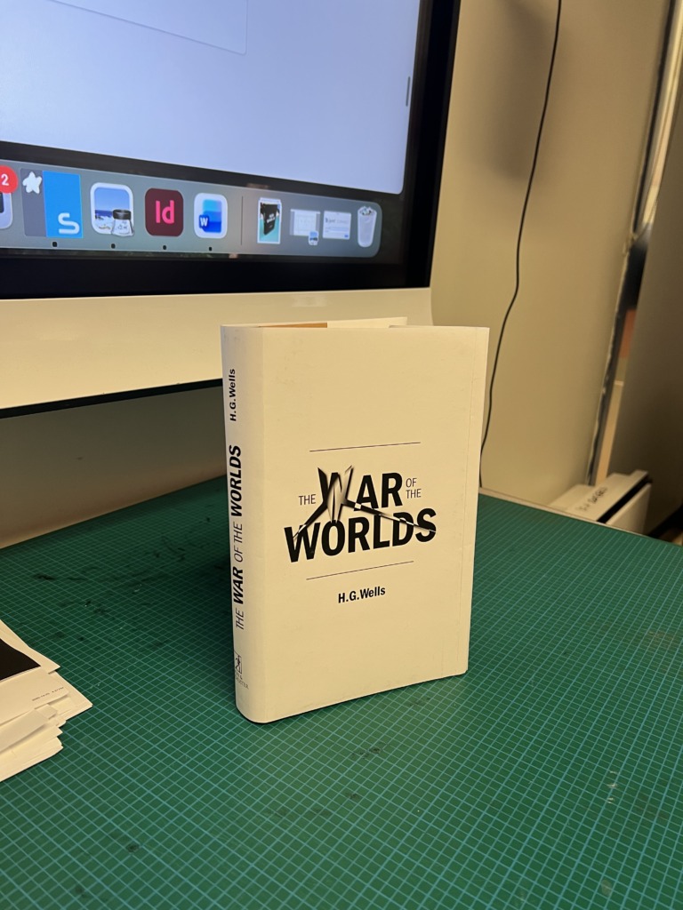
📐 Print Specifications:
-
📏 Trim Size: 6 x 9 inches per page with an exact spine calculation and 3.5 inches flap width.
-
✂️ Bleeds & Margins: 0.125 inch outer bleed on all edges, 0.5 inch interior safe margins.
-
🖨️ Color & Resolution: 100% CMYK color space, 300 DPI high-resolution asset linking, exported as PDF/X-1a with active crop and registration marks.
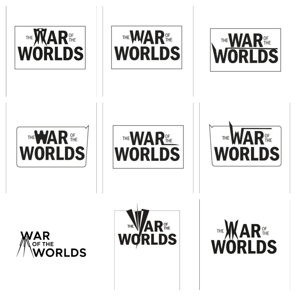
Every typographic decision, vector path, and contrast overlay proves command over commercial publishing standards, print geometry, and high-impact visual storytelling.
Designed by Ali Bakhit
#alibakhitdesign #BookDesign #DustJacket #EditorialDesign #GraphicDesign #PrintDesign #InDesign #Photoshop #Illustrator #Typography #VisualIdentity #CoverDesign #PublishingDesign #Prepress