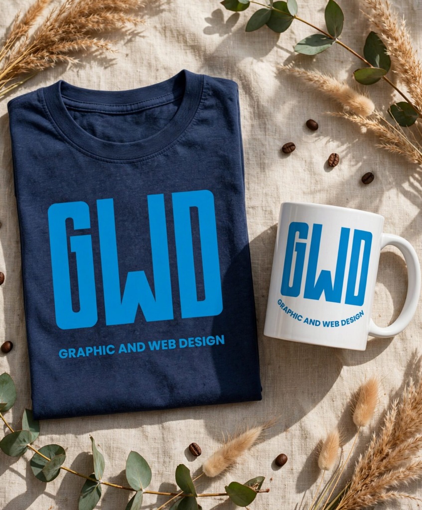
⚡ DESIGNING A MINIMALIST “GWD” BRANDMARK
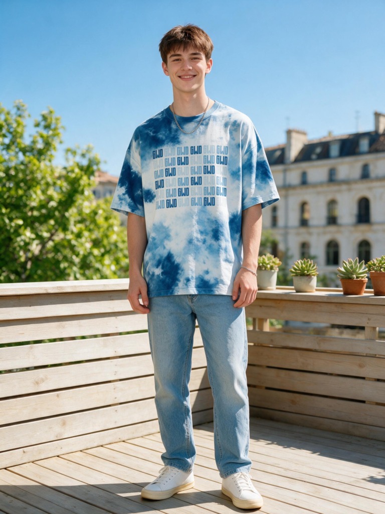 In commercial visual identity design, constructing a memorable brandmark for a creative department requires transcending repetitive design clichés such as paintbrushes, pens, or computer monitors. This case study details the complete research, typographic exploration, vector craftsmanship, and physical scalability testing for the Graphic and Web Design (GWD) Visual Identity System.
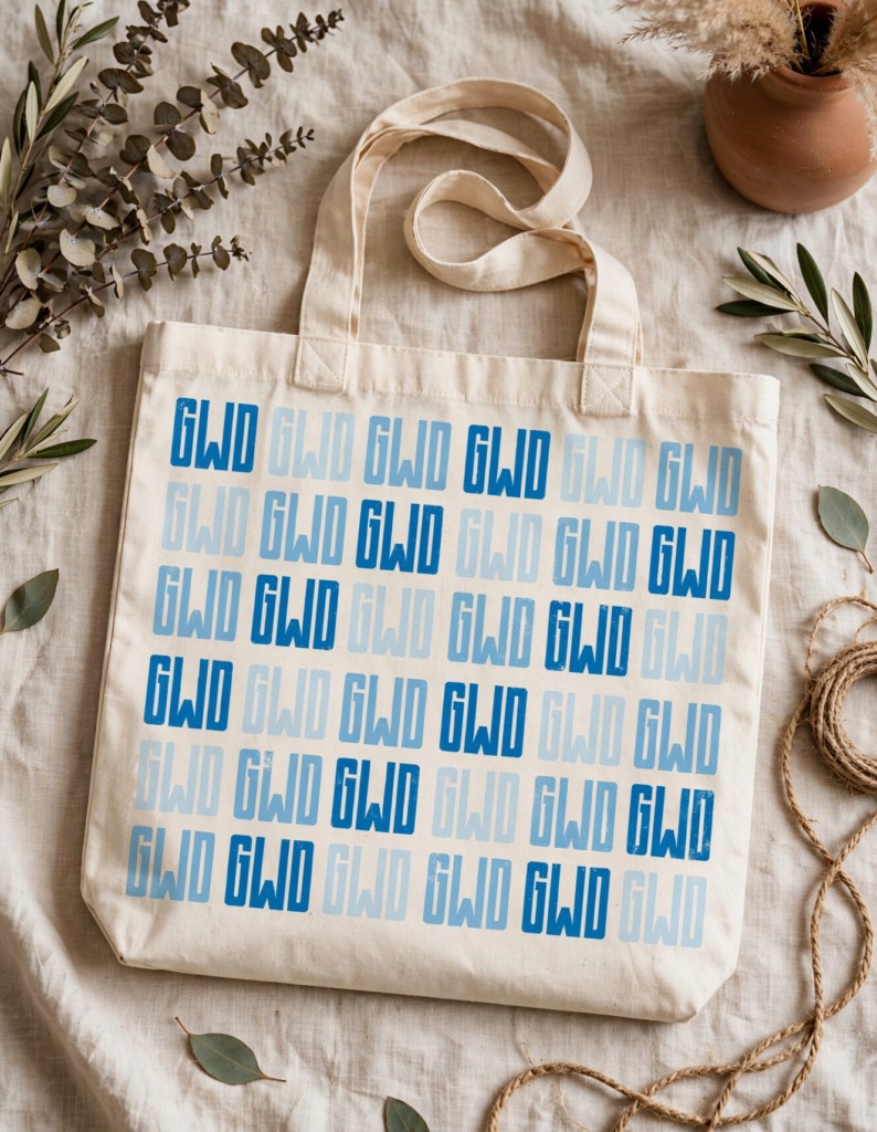
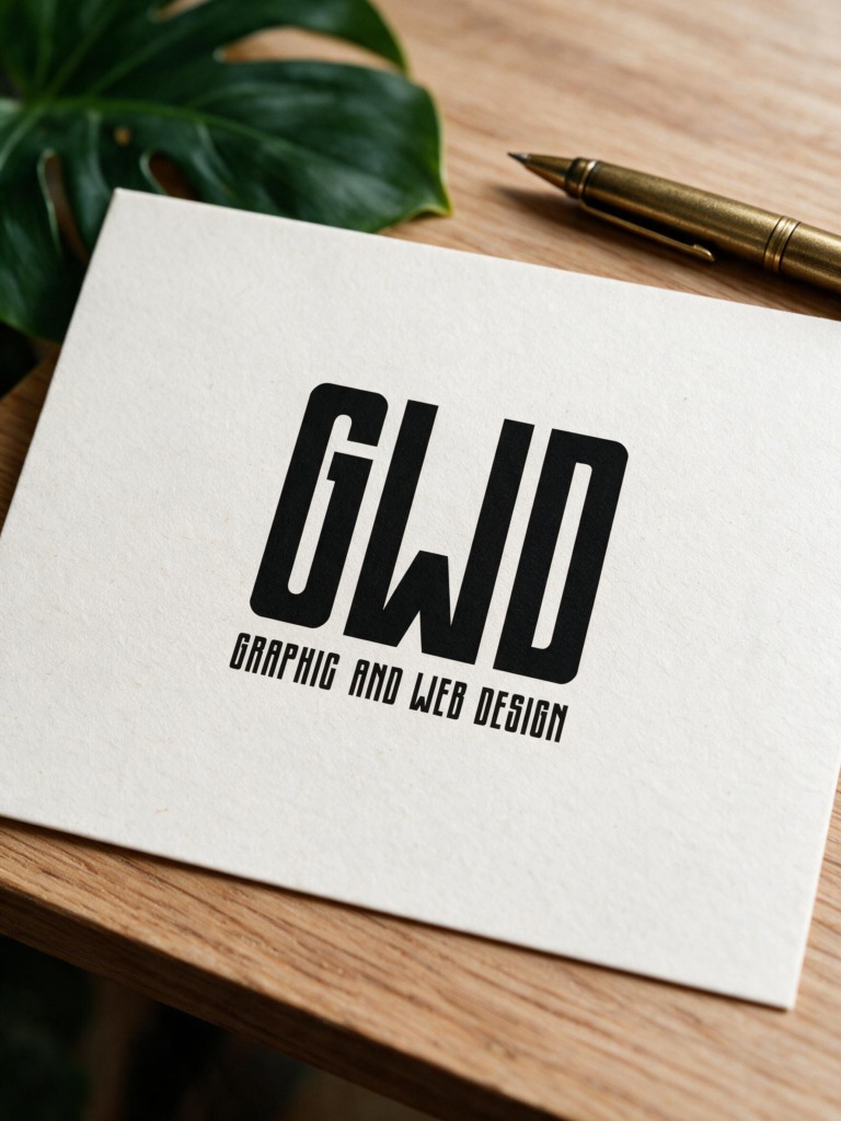
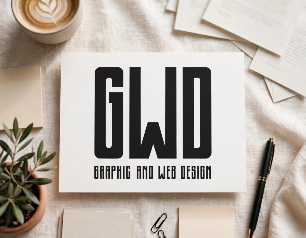
The primary objective was to engineer a high-impact, minimalist monogram mark (“GWD”) paired with a supporting wordmark (“Graphic and Web Design”) that delivers high legibility across digital, print, and small-scale applications
🌐 BRAND STRATEGY & TYPOGRAPHIC EXPLORATION
-
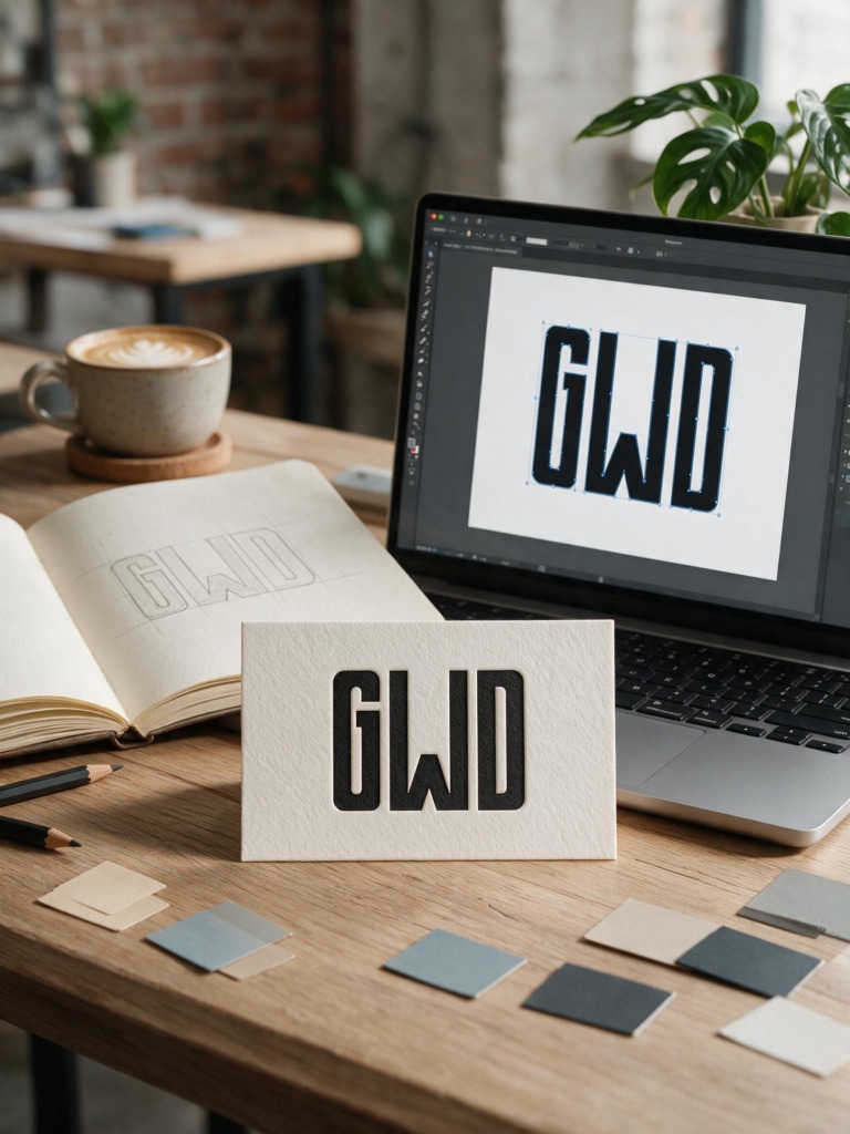
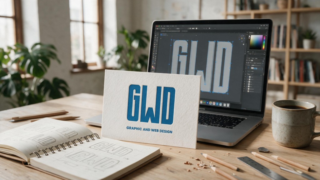
✏️ Manual Sketching & Concept Discovery: Began with paper sketches to explore structural relationships between letterforms, testing how the letters G, W, and D interact geometrically.
-
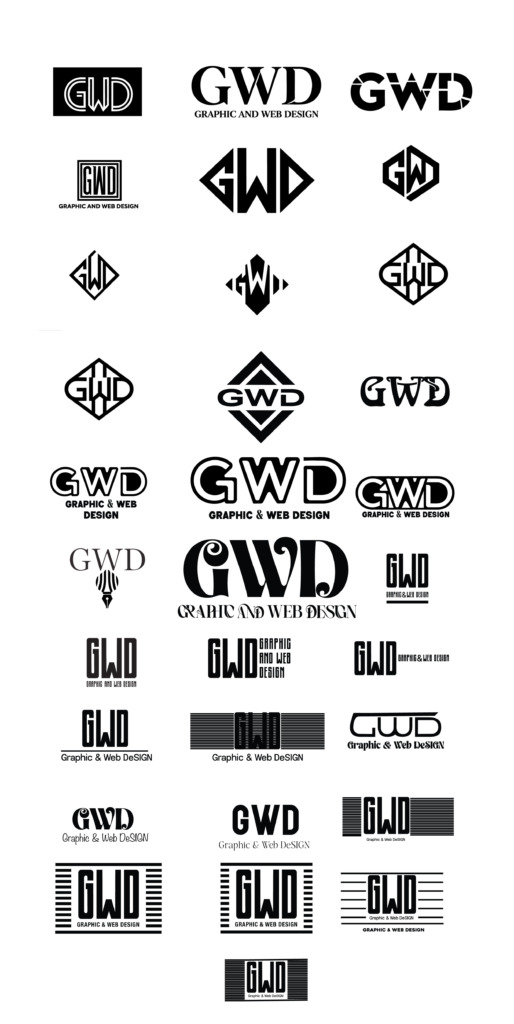
🔠 Extensive Typographic Matrix Testing: Systematically tested dozens of font variations across 4 separate matrices covering sans-serif lowercase, sans-serif uppercase, serif lowercase, and serif uppercase. This rigorous exploration identified optimal counter-spaces, stem weights, and character proportions.
-
🚫 Avoiding Clichés: Deliberately avoided overused design icons (paintbrushes, mouse cursors, screens) to build a timeless, minimalist identity that lets strong typography lead the brand image.
🧗 TECHNICAL CHALLENGES & DESIGN OBSTACLES
-
🧩 Custom Vector Bezier Surgery: Refining letterforms in Adobe Illustrator using the Direct Selection tool to balance stem widths, interior counter-spaces, and outer corner radii across G, W, and D.
-
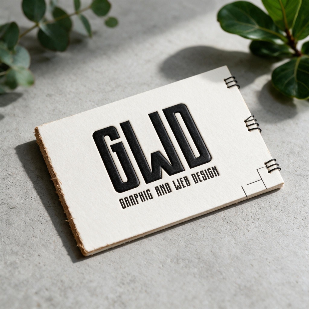
👁️ Extreme Scalability & Micro-Legibility: Testing the mark at micro-scales (down to 0.25 inches) to ensure interior counter-spaces remain open and clear on mobile headers, favicon icons, and business cards.
-
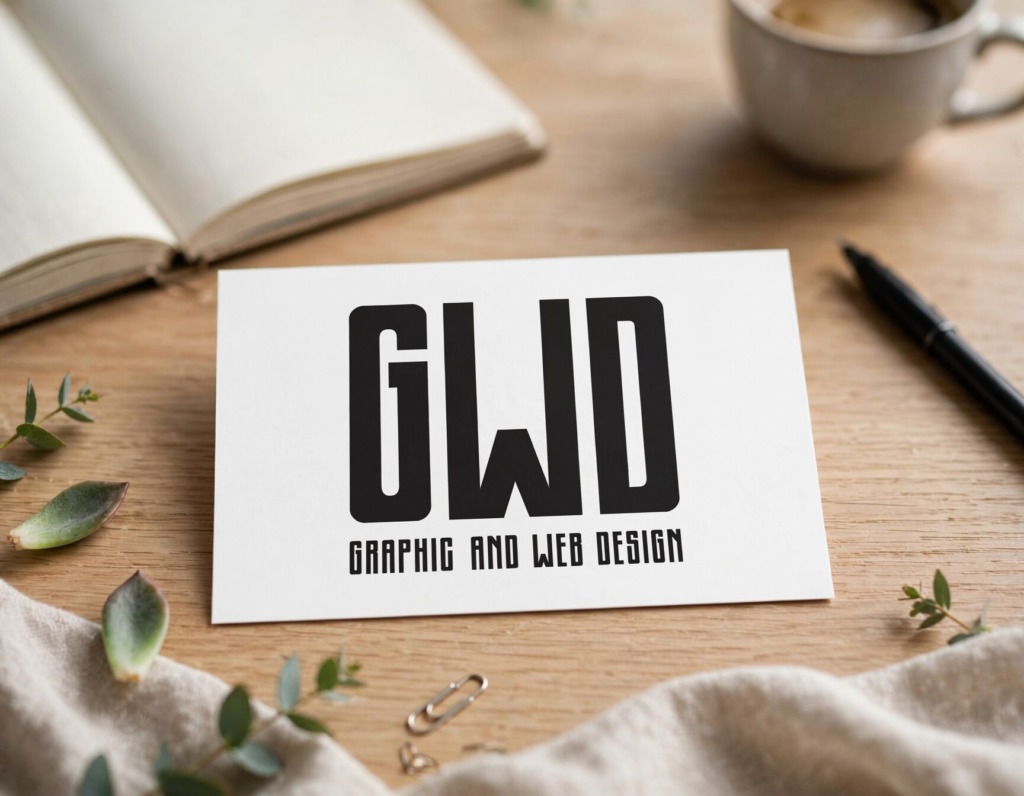
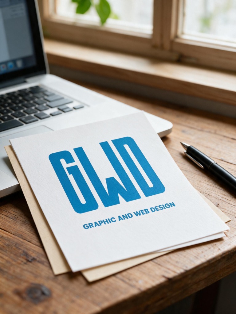
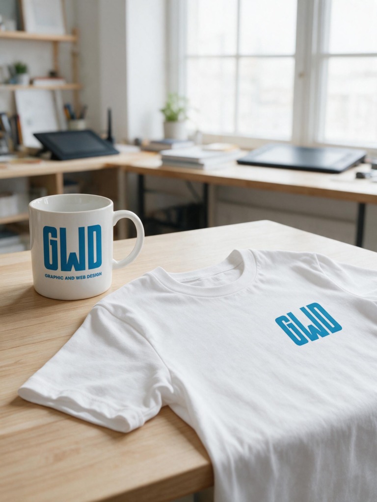
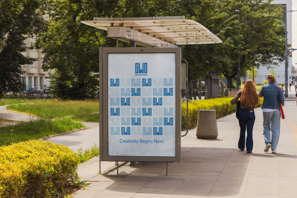
📸 Real-World Surface Validation: Testing the brandmark on physical mockups (business cards, signage, apparel, and digital interfaces) to verify structural integrity under different lighting conditions and substrate textures
🛠️ SOFTWARE STACK & TECHNICAL WORKFLOW
-
✏️ Adobe Illustrator: Primary vector creation tool used for path construction, anchor point alignment, Direct Selection adjustments, kerning, and building the custom “GWD” monogram structure.
-
📰 Adobe InDesign: Used for assembling multi-page typographic exploration matrices, grid alignment, layout hierarchy, and preparing presentation boards.
-
🎨 Adobe Photoshop: Applied for real-world digital and print mockup testing, texture blending, color-space CMYK calibration, and environmental presentation rendering.
📐 BRAND SPECIFICATIONS & SYSTEM GUIDELINES
-
📏 Grid & Geometry: Custom tall condensed geometric monogram with uniform stroke weights and subtle rounded corner radii.
-
🎨 Color Identity: Monochrome (Black / White) primary mark, with secondary adaptive electric cyan/blue hue options for digital screens.
-
🖨️ Output & Export: 100% vector EPS, SVG, and high-resolution CMYK print files scaled for applications from 0.25 inches to large environmental banners.
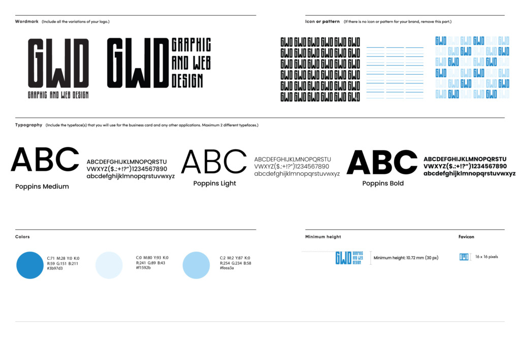
Project Guidelines
Old Versions:
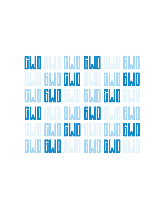
Pattern :
Every anchor point adjustment, counter-space calibration, and scalability test demonstrates complete command over visual identity engineering, typography, and logo system development.