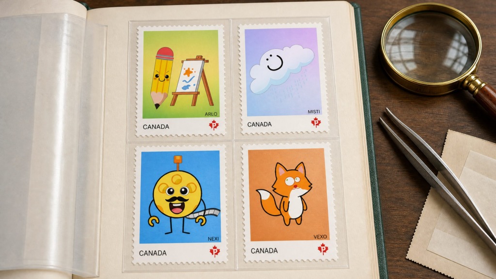
📌 Project Overview
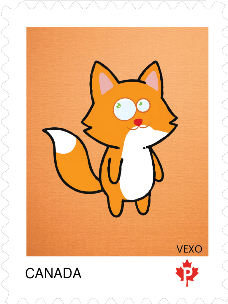
The Pixelo Postage Stamp Collection is a brand identity extension commissioned for Pixelo Animation Studio, a Montreal-based creative hub. Designed to meet Canada Post design and postal standards, this series translates dynamic character design into functional, micro-scale vector collectibles. The collection bridges studio storytelling with official philatelic layout requirements.
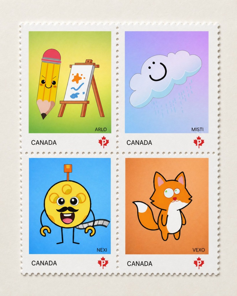
🦊 The Characters & Concept
-
🦊 VEXO: A curious fox with quick thinking and playful energy.
-
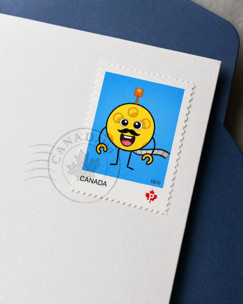
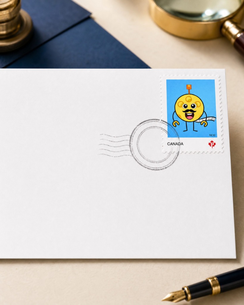
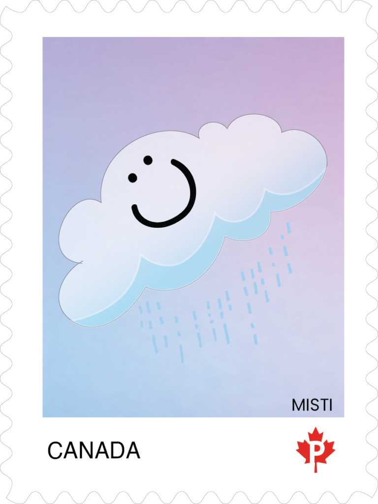
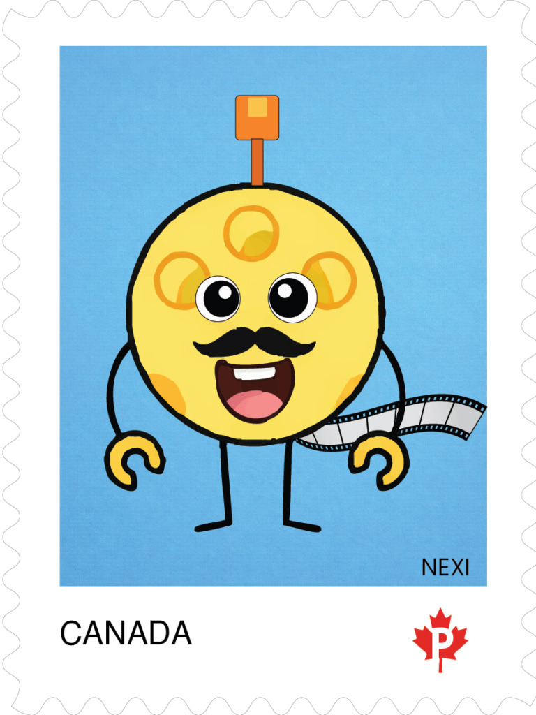
🤖 NEXI: A cheerful robot who loves creativity and motion.
-
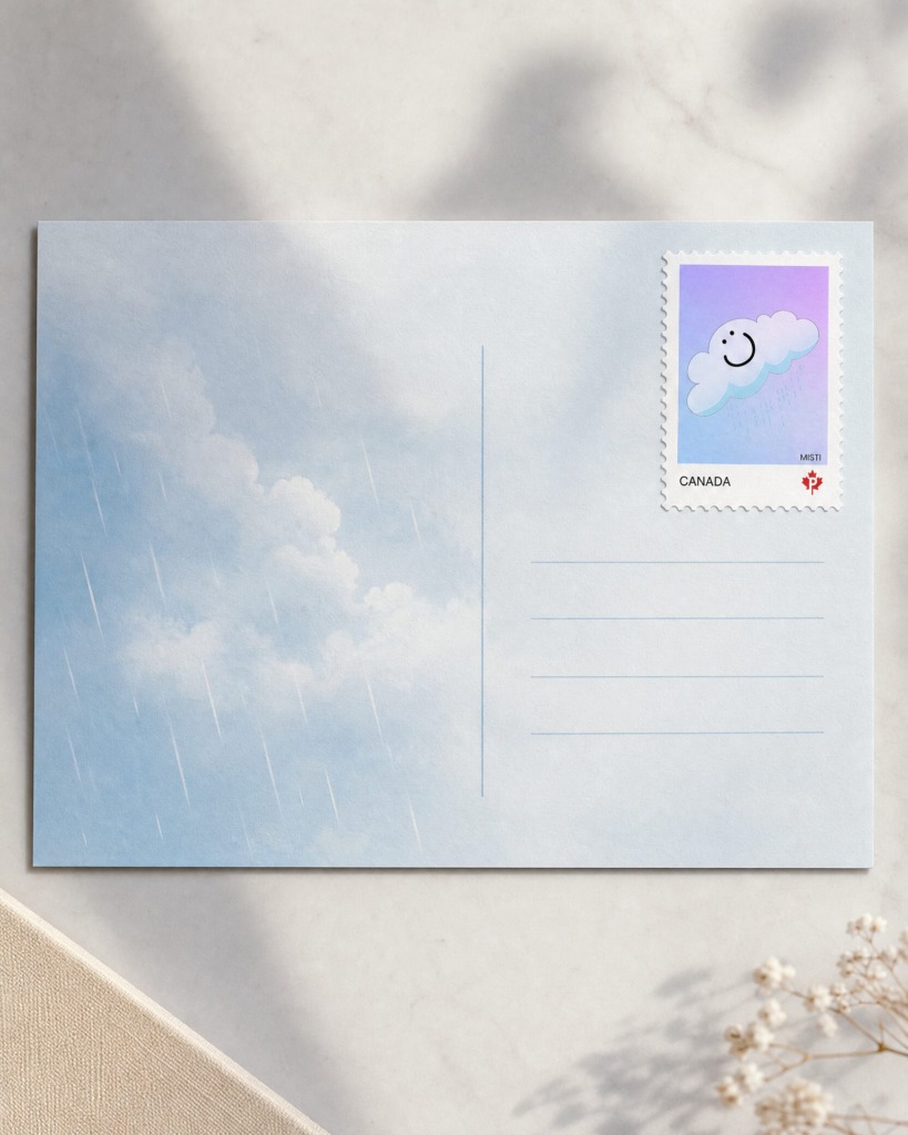
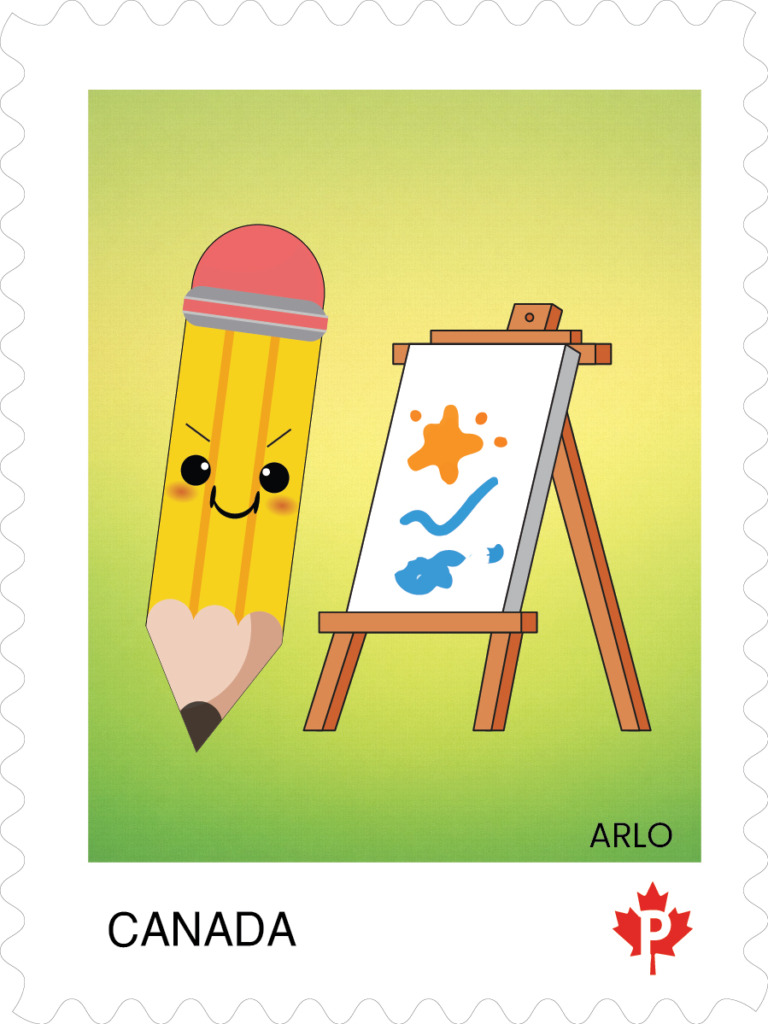
☁️ MISTI: A gentle cloud bringing calm, rain, and charm.
-
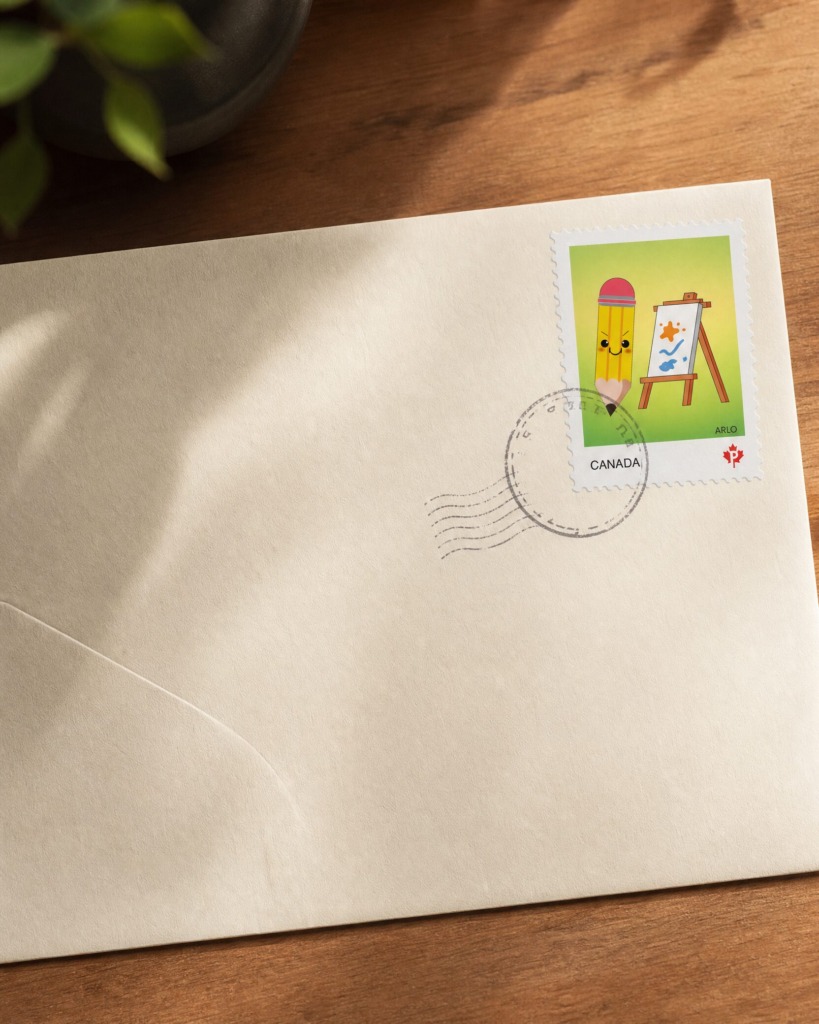
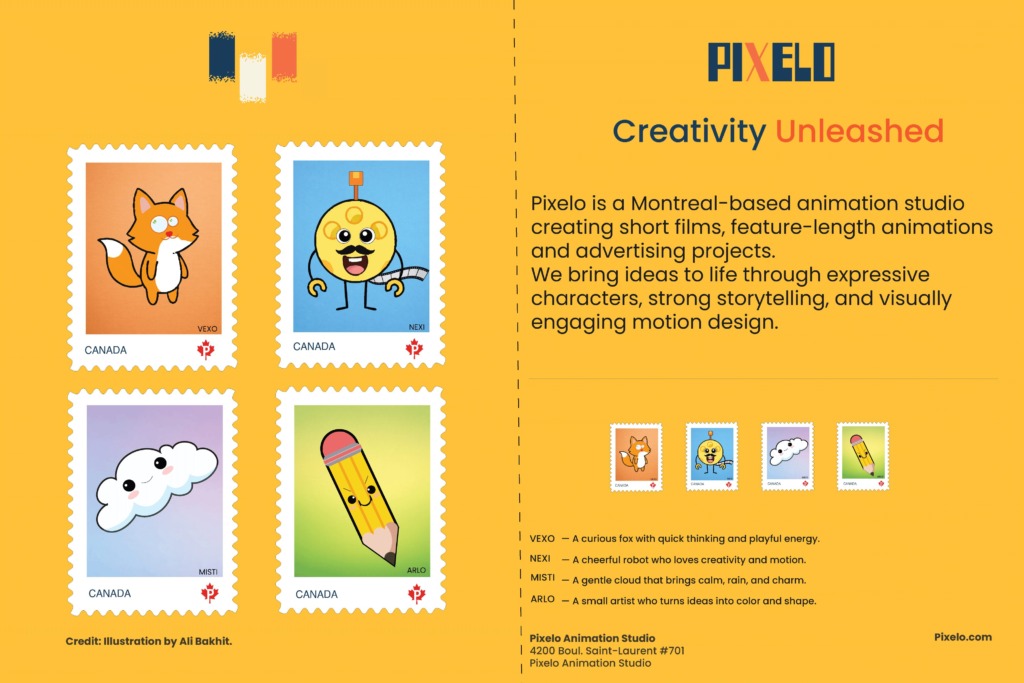
✏️ ARLO: A small artist who turns ideas into color and shape.
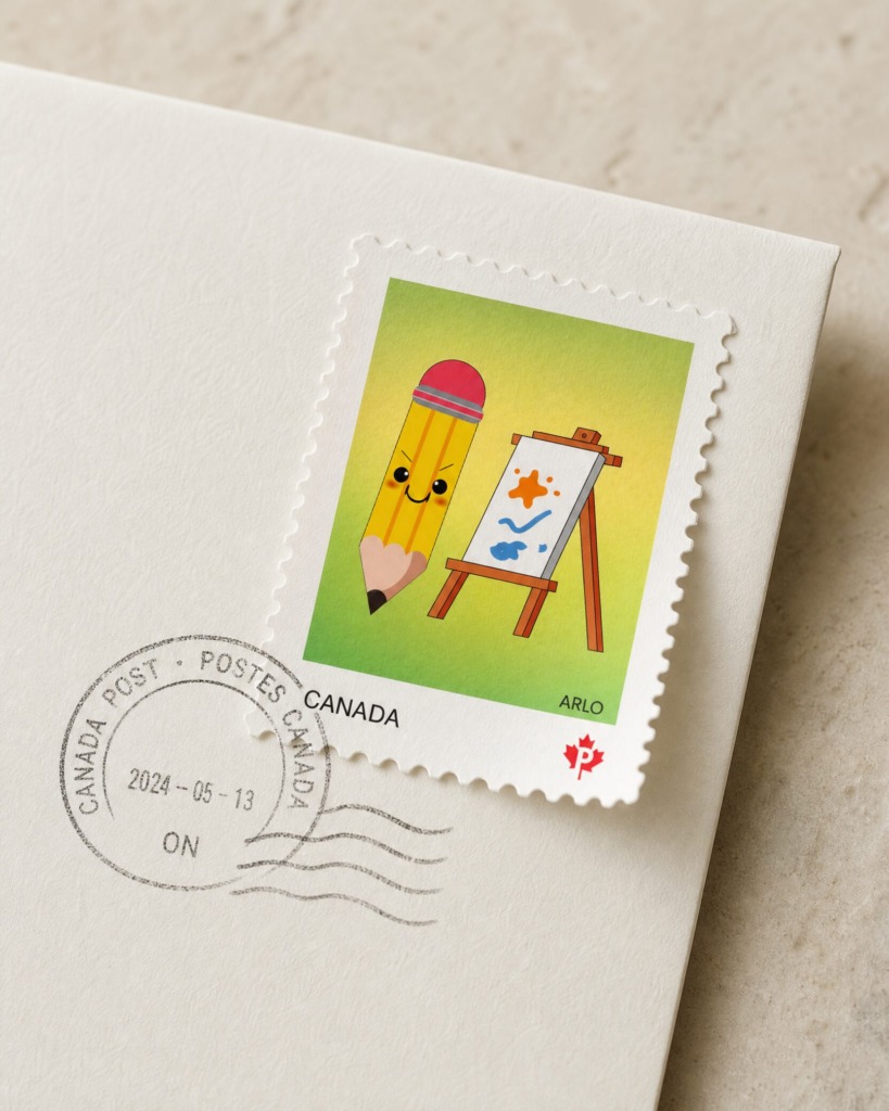
🎯 Key Objectives & Requirements
-
Brand Alignment: Seamlessly integrate Pixelo’s core brand identity and characters—Vexo, Nexi, Misti, and Arlo—into a cohesive 4-stamp series.
-
National Postal Standards: Adhere strictly to Canada Post layout guidelines, incorporating official branding elements, typography hierarchy, and “CANADA” postal identifiers.
-
Collection Presentation: Deliver a complete 12 x 18 inch presentation layout mimicking an official Canada Post collector booklet with structured credit lines and studio metadata.
-
Technical Quality: Produce 100% scalable vector artwork engineered for print production.
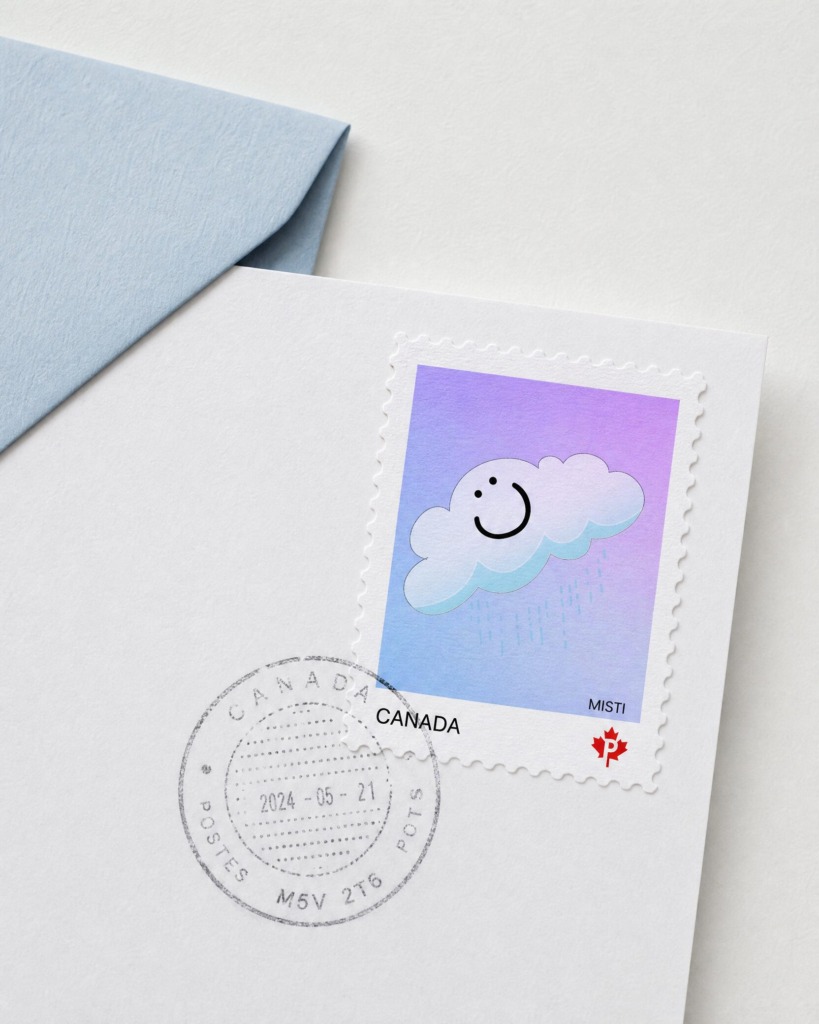
🛠️ Technical Workflow & Software Usage
1. Adobe Illustrator (Primary Vector Production)
-
Precise Vector Drafting: Used the Pen Tool, Shape Builder, and Direct Selection Tool to build smooth, crisp geometry for each character (Vexo, Nexi, Misti, Arlo).
-
Perforation Patterning: Created precise outer stamp serrations and dashed fold lines on the 12 x 18 inch booklet spread.
-
Typography & Layout Hierarchy: Engineered clean typographic pairings with sans-serif lead-ins and precise alignment for character bios.

2. Adobe Photoshop (Texture, Grading & Image Enhancements)
-
Paper & Surface Textures: Applied subtle paper grain overlays to stamp backgrounds to simulate tactile stamp stock.
-
Color Grading & Adjustments: Refined saturation, contrast, and tone across all four stamp cards to maintain unified lighting and visual harmony.
-
Non-Destructive Layers: Utilized adjustment layers, layer masks, and smart filters to preserve non-destructive editing workflows.
3. Adobe InDesign (Publication Layout & Prepress Prep)
-
Master Page Setup: Established precise grids, margins, and bleed settings (0.125 inch bleed) for print compliance.
-
Exporting & Production: Ensured high-resolution PNG export settings (150 ppi / 300 ppi print setup) with accurate CMYK color profiles.
Color System
-
Warm Amber Gold (Background): HEX #F4B41A / RGB 244, 180, 26
-
Vexo Orange (Fox Character): HEX #E86A24 / RGB 232, 106, 36
-
Nexi Sky Blue (Robot Background): HEX #8ECAE6 / RGB 142, 202, 230
-
Misti Soft Purple (Cloud Background): HEX #D8B4E2 / RGB 216, 180, 226
-
Arlo Lime Yellow (Pencil Background): HEX #D4E157 / RGB 212, 225, 87
-
Deep Charcoal (Text & Accents): HEX #1E1E1E / RGB 30, 30, 30
Assets & Imagery Sources
-
Characters: Custom vector illustrations designed in-house.
-
Icons & Logos: Official Canada Post maple leaf logo mark and Pixelo Animation Studio logotype

💬 Challenges & Design Solutions
Challenge 1: Legibility at Micro Scale
-
Issue: Micro-scale printing can cause detailed vector elements and small text to blur or become illegible.
-
Solution: Simplified outline paths, increased stroke contrast, and placed the “CANADA” text in bold, high-contrast sans-serif type.
Challenge 2: Brand Consistency Across Diverse Characters
-
Issue: Four distinct characters with differing color palettes risked feeling disconnected.
-
Solution: Unified the collection using a consistent white stamp border, standardized serration counts, identical Canada Post logo positioning, and matching background texture styles.