
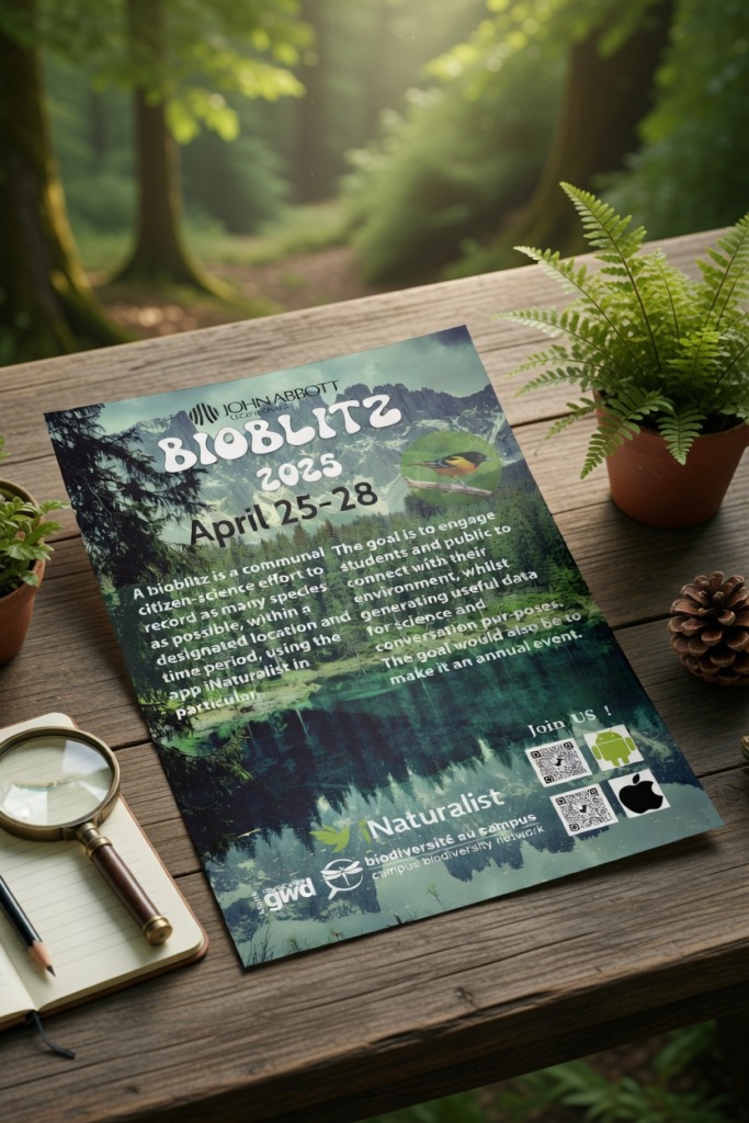
🌿 Environmental Campaign Engineering: Designing High-Impact Print & Digital Media for Bioblitz
In modern art direction, creating a high-converting promotional campaign for environmental initiatives requires seamlessly bridging digital product design with large-format print architecture. This comprehensive case study analyzes the complete campaign workflow, digital wireframing, technical adjustments, and print finalization for the Bioblitz Environmental Campaign. Built on a dual-canvas configuration—transitioning from a digital UI workspace (836×1199 px) to a high-resolution 11×17 inches commercial print format—the goal was to build a clean visual narrative that encourages community engagement and biodiversity tracking.
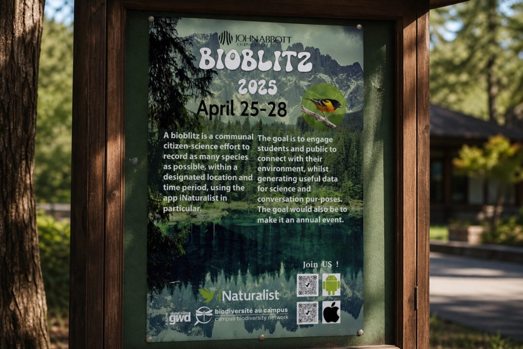
The primary challenge involved eliminating visual clutter, resolving color contrast issues against rich natural landscapes, and establishing an undeniable typographic hierarchy across multi-platform layouts.
-
🌲 Environmental Branding Alignment: Engineering a high-end promotional asset that blends corporate sponsor identities with raw natural imagery to drive public participation.
-
📐 Cross-Platform Scalability: Designing an agile layout architecture that transitions seamlessly from digital UI previews to large-format print media without loss of fidelity.
-
🎯 Conversion-Driven Hierarchy: Structuring complex technical instructions, dates, and interactive app download links into clean, scannable reading zones.
-
🎨 Asset Sourcing & Color System Pipeline (Figma & Unsplash): High-resolution landscape photography and fauna imagery were curated from Unsplash to establish an authentic environmental tone. In the initial UI layout phase, the layout was structured within Figma on an iPad Pro canvas (836×1199 px) using Kanit Extra Bold (26 pt) in crisp white to maintain strong legibility over dark foliage backgrounds. Color palettes were harmonized directly with official iNaturalist and environmental network branding guidelines.
-
🛠️ Photo Manipulation & Color Grading (Adobe Photoshop): Sourced raw nature photography was brought into Photoshop for advanced tonal adjustments. To prevent text from dissolving into complex forest backgrounds, custom adjustment layers and soft dark gradient overlays were applied to lower quadrant zones. High-pass sharpening was executed on local wildlife imagery (replacing stock photos with native species assets) to guarantee crisp focal points.
-
✒️ Vector Layout Architecture & Type Optimization (Adobe Illustrator): The digital layout was transferred to Illustrator to finalize the 11×17 inches print production. Body typography was transitioned to Myriad Variable to maximize physical print clarity. Vector layers were locked into dedicated groupings (Margin, Icons, Headings, Credits, Layer 4, Wildlife Pic) to maintain complete non-destructive control.
-
📰 Print Prepress & Final Execution (Adobe InDesign): The finalized assets were imported into InDesign to lock down absolute mechanical margins, print bleed lines, and color space conversions (RGB to CMYK). Symmetrical QR code modules for cross-platform app downloads (iOS & Android) were integrated with clean padding, ensuring instant scannability for field participants.
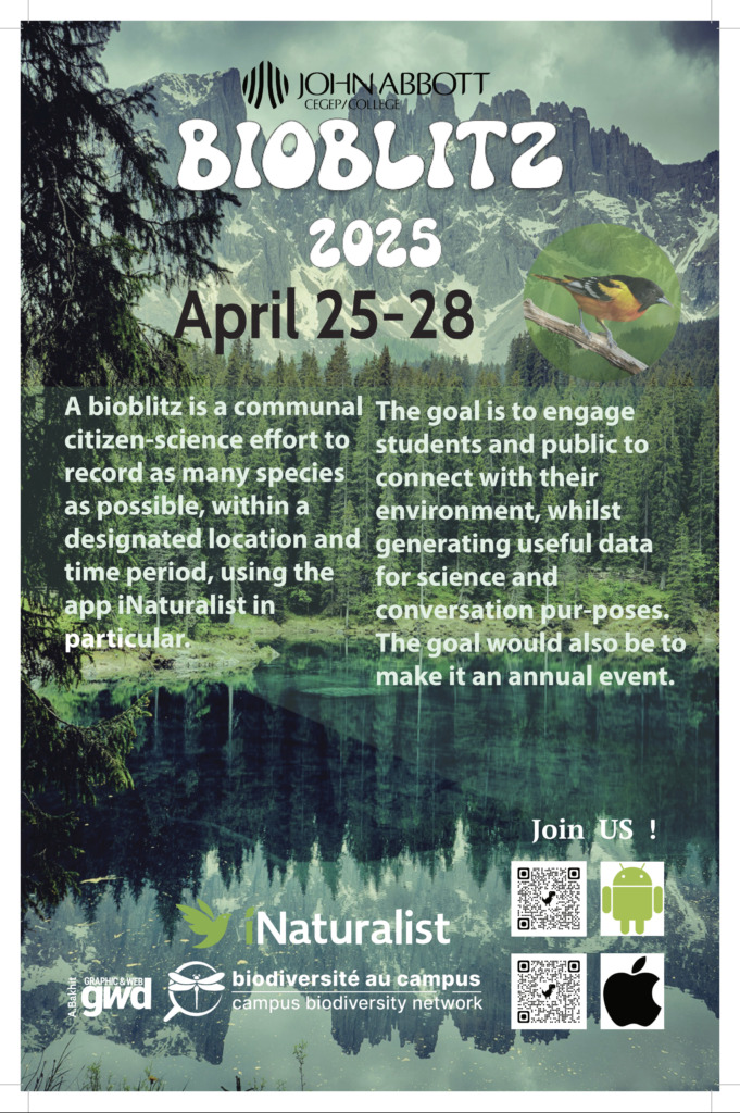
Every technical choice—from layer organization to precise font selection—proves how multi-software synthesis transforms complex environmental data into a sleek, agency-grade public relations campaign.
Designed by Ali Bakhit
#alibakhitdesign #GraphicDesignPortfolio #CaseStudy #PosterDesign #VisualHierarchy #Bioblitz #EnvironmentCampaign #FigmaToIllustrator #PhotoshopEditing #PrintAd #LayoutArchitecture #GraphicDesigner #AdobePhotoshop #AdobeIllustrator #InDesignWorkflow