
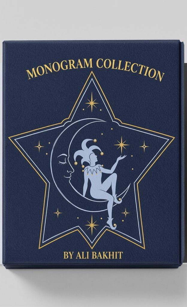
In modern visual communications and brand strategy, designing an impactful monogram goes beyond combining letters and figures—it requires precise typographic integration, structural balance, and negative space mastery. This comprehensive case study analyzes the conceptual engineering and typographic construction of five specialized monograms: the Elephant Letter “E”, the Negative Space Dog Letter “A”, the Celestial Moon Crest, the Serpent Letter “S”, and the Forest Deer Crest Letter “A”.
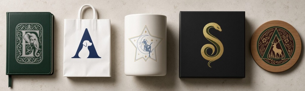
The primary artistic objective was to construct complex monogram marks that seamlessly merge distinct animal forms and symbolic elements with classic letterforms, maintaining functional recognition across both print and digital mediums.
-
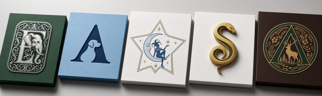
🐘 Elephant Monogram Letter “E”: Engineered as an ornate, baroque-inspired drop-cap monogram blending intricate floral scrollwork with a detailed elephant profile.
-
🐕 Negative Space Dog Monogram Letter “A”: A sleek, modern lettermark utilizing high-contrast negative space to form a clean dog silhouette within the inner counter of the letter “A”.
-
🌙 Celestial Jester Moon Monogram: Built with delicate geometric line-art, integrating a crescent moon and a jester figure inside a five-pointed star frame.
-
🐍 Serpent Monogram Letter “S”: Designed as a fluid, luxury snake mark coiled into the organic curve of the letter “S” with fine scale detailing.
-
🦌 Forest Deer Monogram Letter “A”: A botanical circular crest embedding a stag silhouette within a bold triangular letter “A”, framed by natural leaf patterns.
-
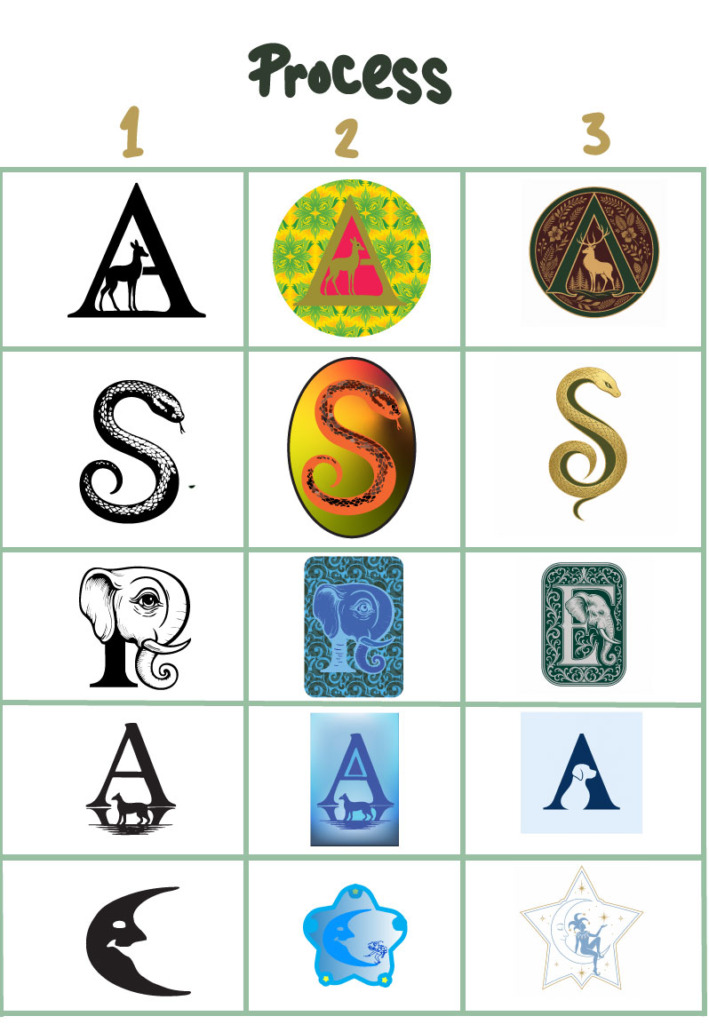
✍️ Vector Construction & Bezier Engineering (Adobe Illustrator): Initial monogram sketches were drawn and vectorized in Illustrator using precise anchor points. Special focus was placed on maintaining balanced line weights and clean negative space cut-outs—such as the dog contour inside the letter “A”—to prevent visual closure or line distortion when scaled down.
-
📸 Tactile Material Translation & Lighting (Adobe Photoshop): Vector SVG files were exported into Photoshop to test how the monograms translate to physical substrates. Smart Objects, Displacement Maps, and Curve Layers were applied to render realistic debossing, 3D metallic gold foil stamping, and engraved wood textures with accurate shadow drop.
-
🎨 Color Palette Strategy: Color combinations were picked to reflect brand positioning: Forest Green (#1B3B2B) for heritage feel, Royal Navy (#1A2B4C) for modern trust, Cream White (#F7F5F0) for elegance, Matte Black (#121212) for luxury contrast, and Warm Gold (#D4AF37) for premium accents.
-
📰 Layout Grid & Presentation (Adobe InDesign): Monogram boards and typography specifications were arranged in InDesign using a strict horizontal grid, with bleed margins and CMYK settings locked for high-resolution portfolio output.
Every vector path, kerning choice, and material test demonstrates complete technical mastery over monogram architecture, letterform manipulation, and commercial identity design.
⚡ Engineering High-Impact Monograms & Lettermarks
A great monogram is the ultimate test of a designer’s mastery over typography, form, and negative space. This design breakdown showcases five custom monogram concepts, exploring how letters and visual symbols can be blended into iconic brand identity marks.
Transform basic letterforms into iconic, agency-grade monogram marks!
Designed by Ali Bakhit
#alibakhitdesign #MonogramDesign #CaseStudy #GraphicDesignPortfolio #Lettermark #LogoDesign #VisualHierarchy #GraphicDesigner #AdobePhotoshop #AdobeIllustrator #InDesignWorkflow #LuxuryBranding #TypographicDesign #TypographyArchitecture #VectorArt